Eugenie Groh was born in what is known today as the Czech Republic. She came from an artistic family - both her parents encouraged her from childhood to express her creativity. She recalled her father buying her her first paint sets in oil and watercolours. Her mother's fashion magazines fascinated her and were her childhood inspiration.

Groh remembered with great fondness Sunday coffee house visits with her mother and sister.

They gave her the opportunity "to dive into glossy foreign magazines, Femina, Harper's Bazaar, Vogue, etc., which were hanging off a wall on rattan spines" where she caught her first glimpses of the work of fashion illustration masters like Carl (Eric) Erikson and René Bouché.

Later, when her college studies in art were disrupted by the war, she was at least able to take away three important lessons about the nature of fashion illustration:
One: drawings need not be realistic; simplicity is very powerful.
Two: fashion colours have a philosophy of their own; they should not be too clean.
Three: fashion figure should never be static; quick sketches reveal the essence of fashion, which is momentum.
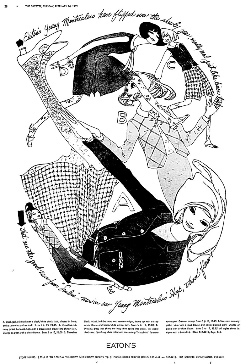
In 1943, Groh was hired to work in the art department at Prague's largest publishing house, Melantrich, where she did illustrations for fashion and women's interest articles. After the war ended, she took on the editorship of Malé Mody, a then-new monthly fashion magazine - but it was discontinued by the ruling communist party in 1948. In '49 Groh and her husband left Prague for Canada. They settling in Montreal.

Eugenie Groh began securing freelance fashion art assignments almost immediately from Ogilvy's department store and rival, T. Eaton's Co. Only six weeks after arriving in Montreal, she secured a staff position in Eaton's art department. Recalling those early days in Montreal she said she was "burdened by emotional and economic problems of a political refugee. For some time, only some of my energy could go into my work."

Be that as it may, Groh expressed great excitement at the prospect of adapting to what was for her a dramatically different culture of fashion illustration in her new home. In Prague, fashions were made to measure - everyone had a dressmaker. In Canada, the focus was on ready-to-wear, and subsequently fashion illustration reflected that marketing sensibility.
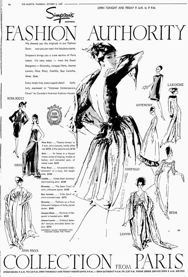
Groh said, "All the time I was learning new ways and absorbing new information." She poured through American and Canadian magazines, which were dominated by the popular "Expressionist" sketch style of Eric, Bouché and other pre-war fashion illustration giants.
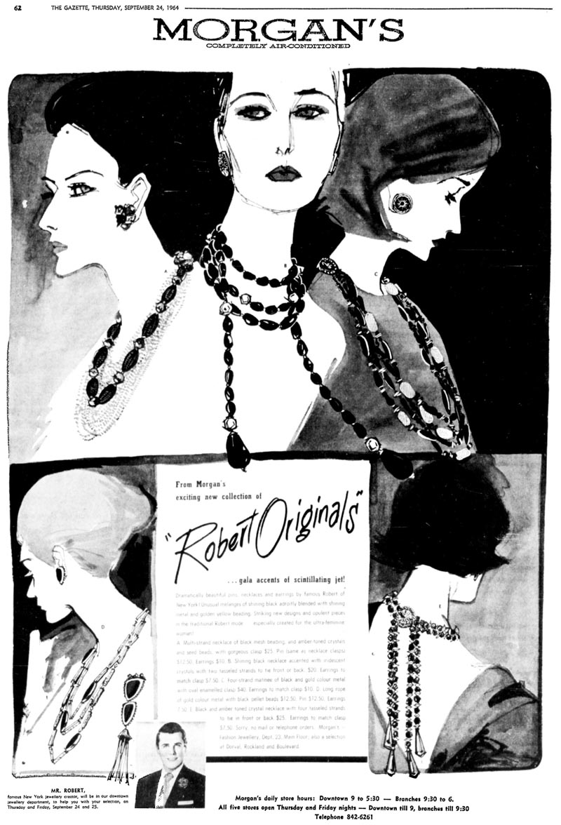
Most large U.S. department store chains employed artists who worked in this style. At the time Groh landed her staff position at Eaton's in Montreal, Morgan's, Ogilvy's, Simpson's and other Canadian stores did so as well. Groh remembered how, when she arrived in 1949, ads from the New York Times and other publications were clipped and saved in the Eaton's art department and "used as textbooks."
In 1953, Eugenie Groh became aware of a new style emerging in some U.S. fashion advertising. She said, "a very stylized advertising art started surfacing from a few prestige stores in Texas and California. I saw just a few bits of evidence of what was being done at Joseph Magnin in San Fransisco and Neiman-Marcus in Dallas. This new style was in line with my own tendency to change the technique currently being used and greatly encouraged me to do so."
Groh must surely be talking about the work of Betty Brader at Joseph Magnin in SF...
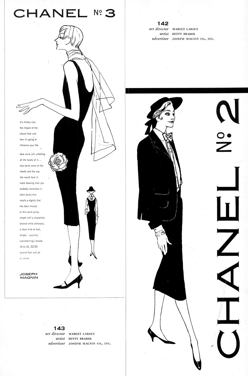
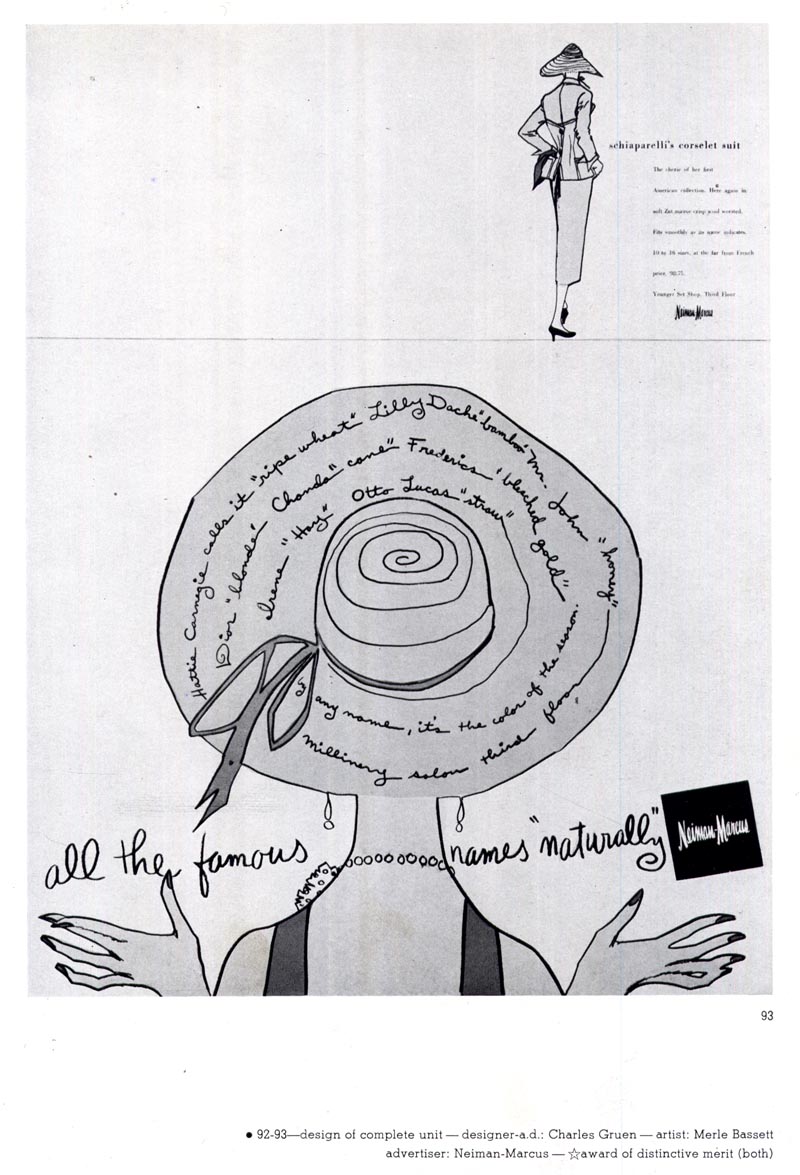
... and Merle Basset who had worked with Brader before being head-hunted by N-M in Dallas.
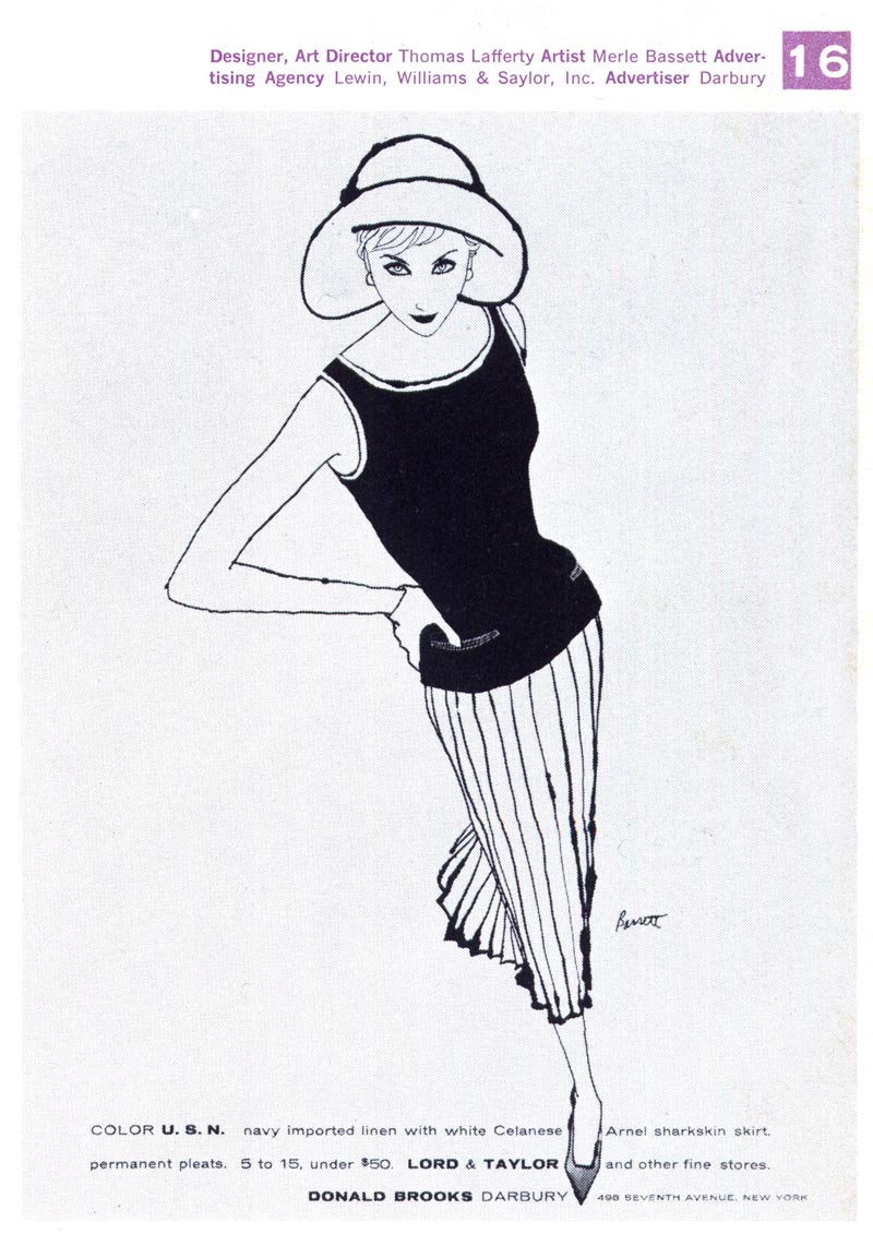
When I interviewed Merle for TI, he told me "It was a great time... each day was an adventure — I never knew what I'd be illustrating when I came to work. We were allowed to experiment and do things that had not been done before in newspaper advertising. Neiman-Marcus was getting a lot of attention and so were the artists involved. Up until then, retail store illustrators were really not well respected and never represented in the AD annuals."
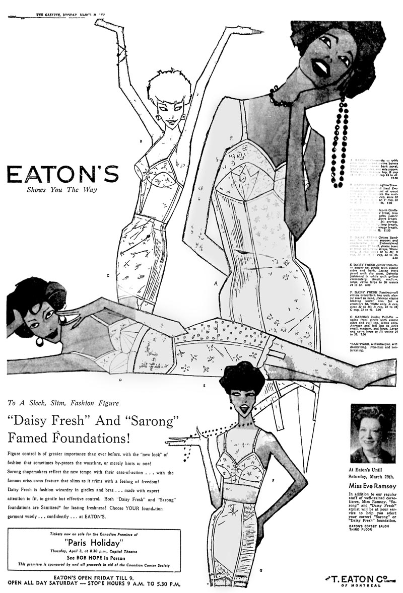
In Montreal, Eugenie Groh and Eaton's were discovering similar results. Initially, no one at Eaton's could quite understand what Groh was up to, but when the new style ads began attracting attention, Groh said "this was good for business and Eaton's of Montreal got the message."
* Continued next week.
* Information about and quotes from Eugenie Groh in today's post are from Katherine Bosnitch's thesis, which is © 2000, Katherine Bosnitch.
I find the seemingly casual line to be very exciting to look at. There's so much experience and knowledge buried inside each off-handed-looking edge... it's impressive.
ReplyDeleteI like the fact that as art, these are quite interesting and compelling but as ads, they make absolutely no sense, since they cannot possibly give an accurate view of what the clothing looks like on a person, even as a high ideal. The bra and girdle ads are particularly absurd. Of course, for selling purposes, you don't need much, not even much of an ideal. Anything that catches the eyes and sticks in the brain might be enough to generate sales. Still it would be interesting to know how successful these ads were. My guess is they were fine, but I wouldn't be suprised if they were a flop too. Nice posts.
ReplyDeleteWes
If someone asked me:
ReplyDelete"What is Elegance?"
I'd answer:
"Look a TI's latest entry and you will know..."
Leif ment to tell you the other day in class but here is a link to one of my friends stuff. She is a ration illustrator in London, England now and doing well for herself. http://daniellemeder.com/
ReplyDeletePatrice Hill
ReplyDeletei check your site , i found it interesting thanks for the link .
These Are Amazing. To take a look back into time and see how we have evolved through certian aspects of creation is allot of fun!!
ReplyDelete