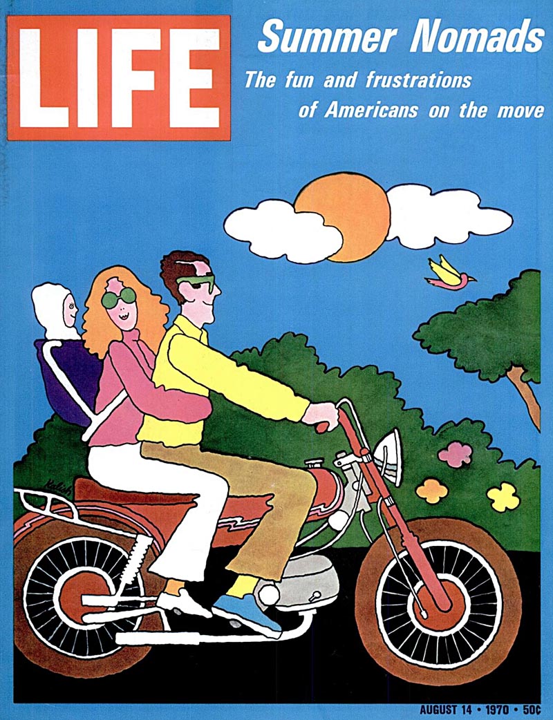
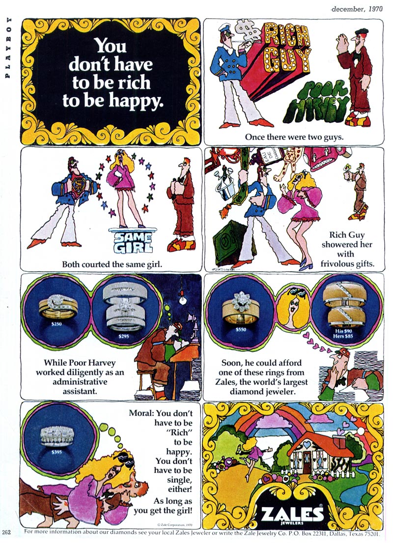
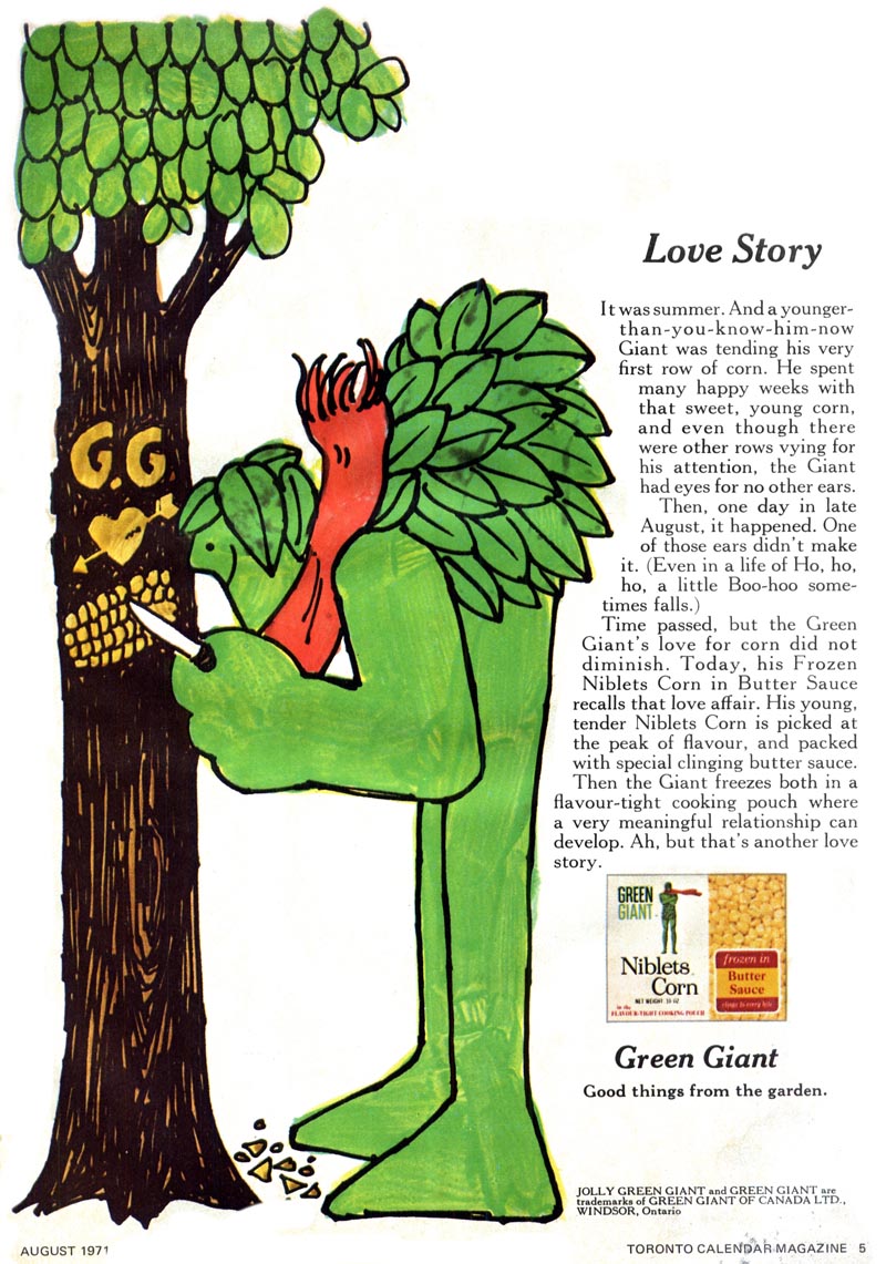
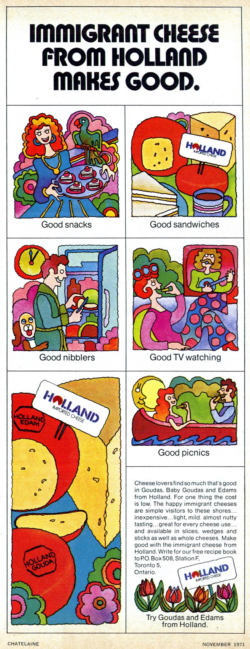
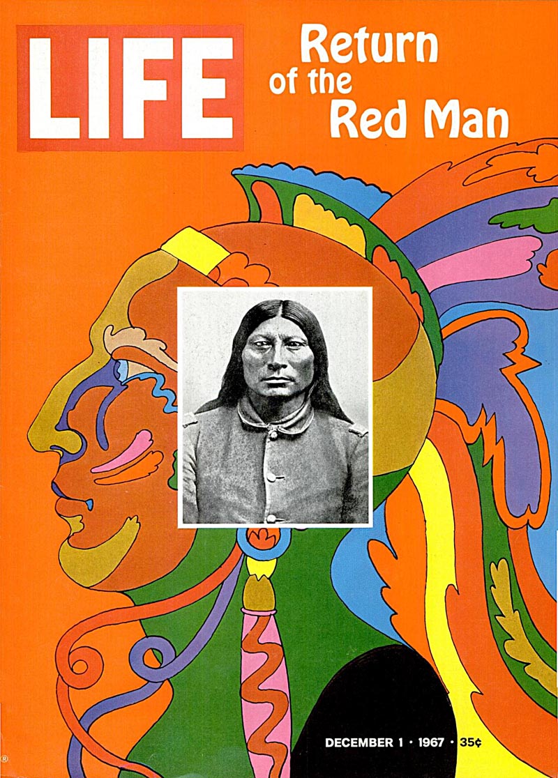
When viewed as a snapshot of a specific period in illustration, the widespread appearance of this type of cartoony art...
... in all its minor variations...

is almost overwhelming.
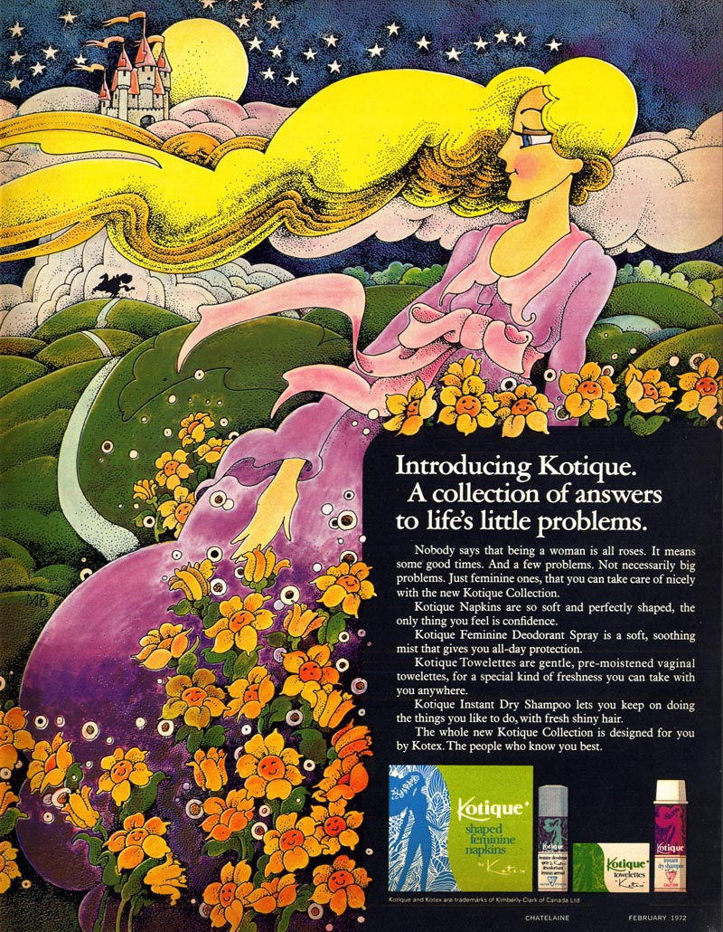
It very nearly seems to have been the only illustrative alternative to photography at the time - especially in advertising.
A lot of the credit for its popularity must go to the ripple effect of Heinz Edelmann's work on the Beatle's Yellow Submarine animated film...
... but I have a sneaking suspicion that many illustrators and art directors would lay most of the credit at the feet of one group of artists at one specific studio.
We'll investigate this further... tomorrow.
If you want to see a good moving representation of the style (which this article totally reminded me of) I recommend the first of the original Schoolhouse Rock cartoons "3 is a Magic Number" - I'm sure it's on Youtube somewhere...
ReplyDeleteDid you see this blog?: http://www.grooveisintheart.com/
ReplyDeleteIf you lived through this period, the flower-power design became overwhelming, ubiquitous and ultimately somewhat tedious. Moreover, it seemed to have driven out the more skillful art traditions -- perhaps permanently. Still, it was a happy and simple style, and these examples are very nice. The Beatle's hippie phase was remarkably short lived, and "Yellow Submarine" was never considered to be much of anything -- artwise. Peter Max was incredibly influential. But you know what kept the style going longer than anything else? Those flower power stickers on hippie vehicles. Even into the 1990's, you'd occasionally see bedraggled ones on old beater vans and VW buses.
ReplyDeleteWes
Not sure if they had this up in Canada but we had a Saturday morning cartoon called "the Mighty Heroes" that was pretty far ahead of the curve, design wise. You can youtube the opening credits. I also remember my mother buying a pair of Peter Max converse hightops for our Art Director friend.
ReplyDeleteA more specific studio?
ReplyDeleteMaybe The Push Pin?
You got it, Gino :^)
ReplyDeletePush Pin did the art direction for the very first issues of the National Lampoon, but there their style didn't work at all. The Lampoon only hit its stride afterwards.
ReplyDeleteawesome cartoons , all images are very well created .
ReplyDeleteI love the green giant ad!!!
ReplyDeleteThis stuff is exactly why I got into Mid-Century illustration.Contrived pseudo counter culture wackiness!Youi see old illustration annuals full of this crap.
ReplyDeleteThank god it's all over.