My wife got me the 1970 and '71 NYAD Annuals for Christmas and that lead me to ask Murray Tinkelman to clarify a few things about trends in illustration and graphic design at the time. Yesterday Murray explained how Pushpin Studios influenced the industry during that period. Today we discuss the role of the typographer during the same period... ~ Leif Peng
LP: From looking through these books and from flipping through magazines from the early 1970s, it seems like often the concept or solution to almost any ad or design was entirely typographic. Can you tell me a little about Herb Lubalin? I've heard his name for a very long time - I see it again and again in these early 1970s NYAD Annuals - and I'm wondering if he was one of the people who shifted the visual landscape in commercial art.
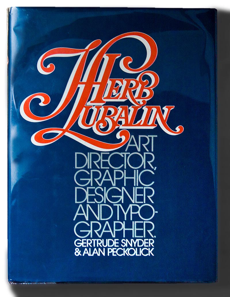
MT: Absolutely. He was an "illustrator with type."
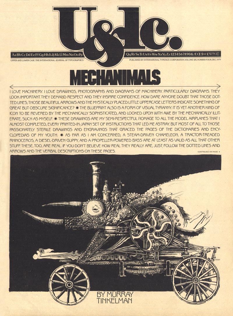
Herb was the most talented and best graphic designer I ever worked for. Whether it was when he was with U&lc (Upper & Lower Case) or some other client, he made every job I ever did for him look infinitely better after he got through with it.
(Below, the December 1979 issue of U&lc, art by Murray Tinkelman, design by Herb Lubalin)
MT: He would make additions - not on my art, but in the typography and design - he was a genius; a true, true genius.
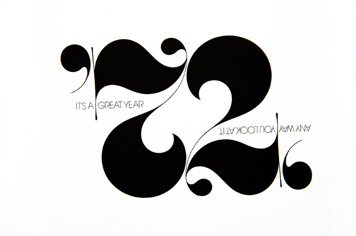
(Below, from the 50th NYAD Annual, design & art direction by Herb Lubalin, 1970)

LP: And the thing is, Murray, I can't help but think that the beauty of working with type - in the manner Herb Lubalin did - is lost on most of today's designers. Do you know what I mean?
MT: Yes I do.
LP: Like, I don't think there's that same appreciation for how beautiful and vital letterforms are, the way it was when he and his fellow designers... When I look at that early '70s period in graphic arts, that typifies that period; that loving treatment of typography at that time.
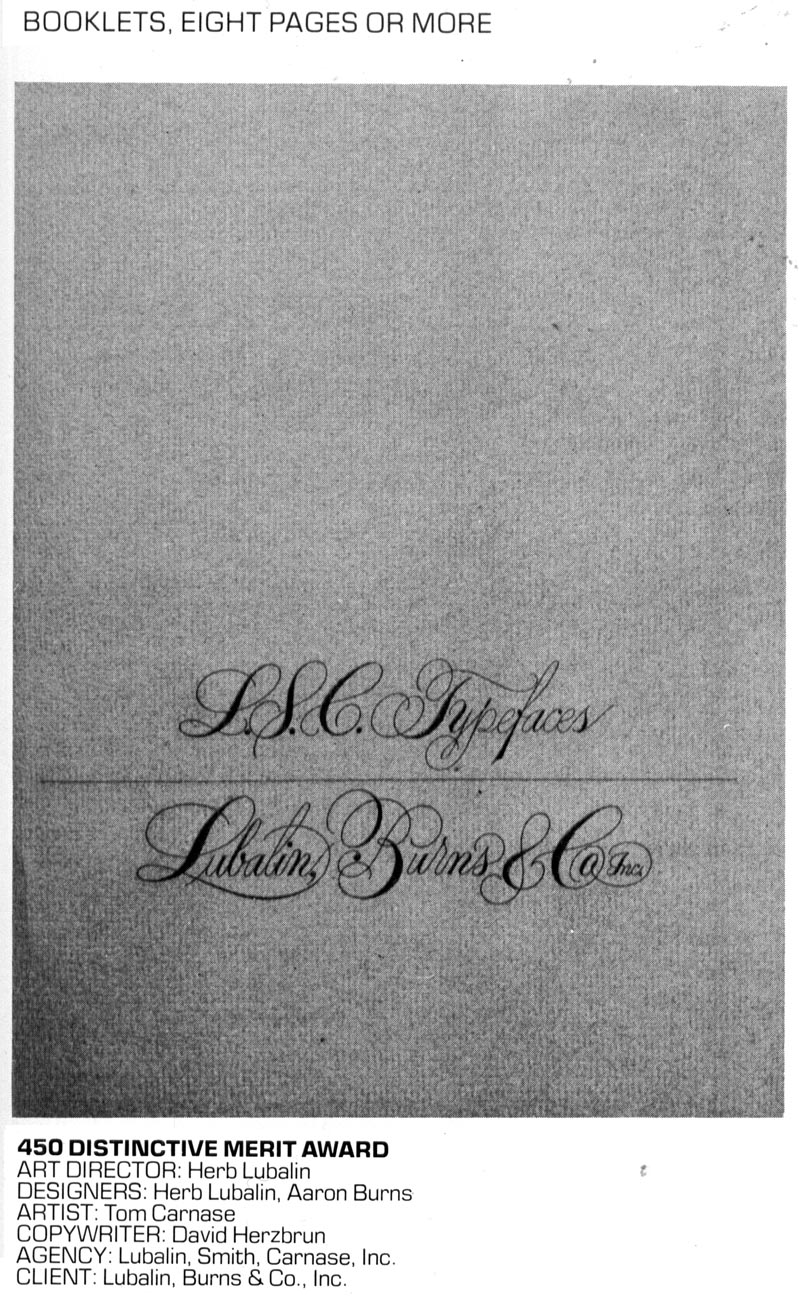
MT: Yes it does. And the use of hand lettering. Tom Carnase did a lot of the hand lettering for Lubalin.
(Below, from the 50th NYAD Annual, hand lettering by Tom Carnase, design & art direction by Herb Lubalin, 1970)
LP: Right.
MT: It was, in those ways, really a golden era and I was lucky to have come on the scene at that time and work with Herb Lubalin. You know, in one of our earlier conversations I mentioned that breakthrough I had at the Saturday Evening Post... and Herb Lubalin was acting art director at the Post when that piece got published.
LP: Oh my gosh!
(Below, Saturday Evening Post DPS by Murray Tinkelman, October 1961, art direction by Herb Lubalin)
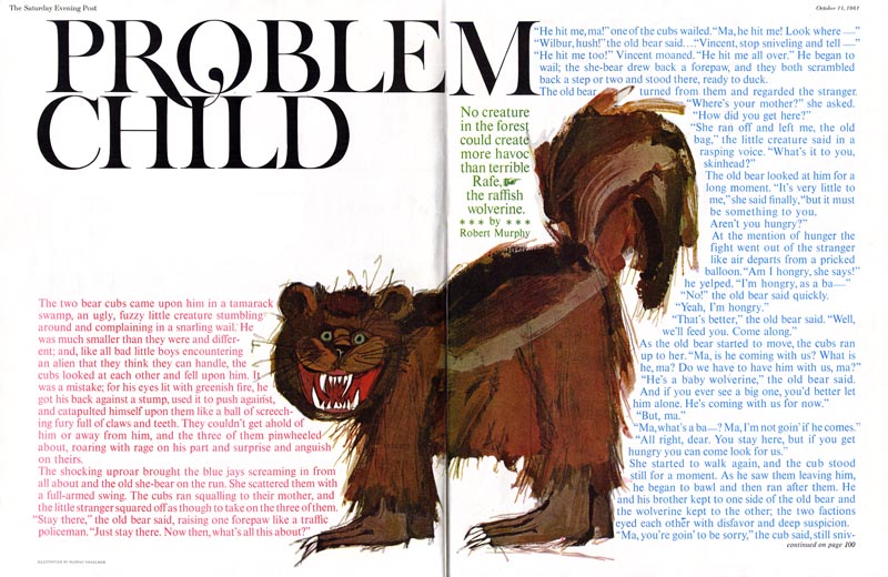
MT: Yeah. I did a painting, 18" square of this wolverine and it had a tree in the background and a little bear climbing the tree and a little collage butterfly, a pink sky... and when I picked up the magazine at a newsstand; seeing it printed for the first time ever, I thought, "My God! Where's my piece?! It's been destroyed!" And then it took about ten seconds for me to realize it was so much better now, with all that crap removed and his incredible typography surrounding what was left of my painting. (Murray chuckles)
That got in every show; it got in the Type Directors' Show (not because of my painting, because of Herb's type), it got into the Art Directors' Show (because of Herb's art direction), it got into the Illustrators' Show (that, at least, was because of my painting).
LP: Although this early '70s ad series below isn't by Herb Lubalin, I find it demonstrates in the most spectacular fashion the effectiveness of strong typography as an integral element in a powerful graphic design.
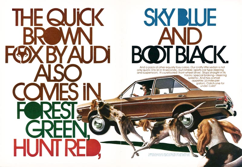
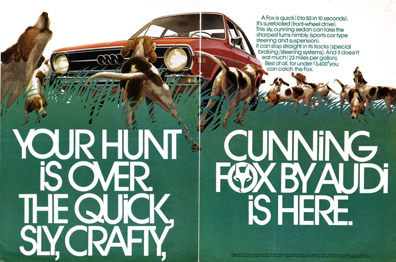

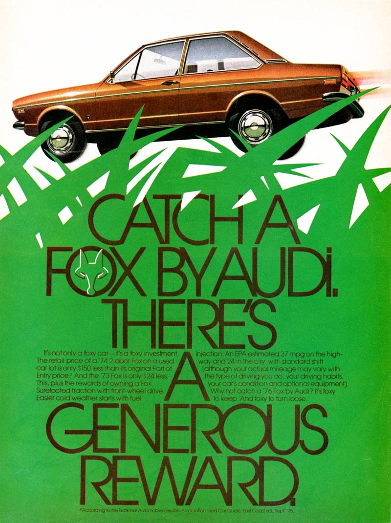
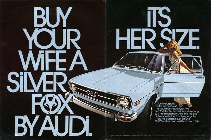
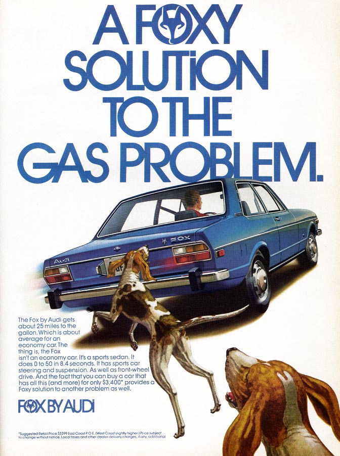
LP: Lubalin said "You can do a good ad without good typography but you can't do a great ad without good typography." I think this series proves his point.
Continued tomorrow
* Murray Tinkelman has won Gold Medals from The Society of Illustrators, The New York Art Directors Club and The Society of Publication Designers. He has over 200 Awards of Merit from The Society of Illustrators. Murray is the director of Hartford Art School’s limited-residency Master of Fine Arts in Illustration program.
LP: From looking through these books and from flipping through magazines from the early 1970s, it seems like often the concept or solution to almost any ad or design was entirely typographic. Can you tell me a little about Herb Lubalin? I've heard his name for a very long time - I see it again and again in these early 1970s NYAD Annuals - and I'm wondering if he was one of the people who shifted the visual landscape in commercial art.
MT: Absolutely. He was an "illustrator with type."
Herb was the most talented and best graphic designer I ever worked for. Whether it was when he was with U&lc (Upper & Lower Case) or some other client, he made every job I ever did for him look infinitely better after he got through with it.
(Below, the December 1979 issue of U&lc, art by Murray Tinkelman, design by Herb Lubalin)
MT: He would make additions - not on my art, but in the typography and design - he was a genius; a true, true genius.
(Below, from the 50th NYAD Annual, design & art direction by Herb Lubalin, 1970)
LP: And the thing is, Murray, I can't help but think that the beauty of working with type - in the manner Herb Lubalin did - is lost on most of today's designers. Do you know what I mean?
MT: Yes I do.
LP: Like, I don't think there's that same appreciation for how beautiful and vital letterforms are, the way it was when he and his fellow designers... When I look at that early '70s period in graphic arts, that typifies that period; that loving treatment of typography at that time.
MT: Yes it does. And the use of hand lettering. Tom Carnase did a lot of the hand lettering for Lubalin.
(Below, from the 50th NYAD Annual, hand lettering by Tom Carnase, design & art direction by Herb Lubalin, 1970)
LP: Right.
MT: It was, in those ways, really a golden era and I was lucky to have come on the scene at that time and work with Herb Lubalin. You know, in one of our earlier conversations I mentioned that breakthrough I had at the Saturday Evening Post... and Herb Lubalin was acting art director at the Post when that piece got published.
LP: Oh my gosh!
(Below, Saturday Evening Post DPS by Murray Tinkelman, October 1961, art direction by Herb Lubalin)
MT: Yeah. I did a painting, 18" square of this wolverine and it had a tree in the background and a little bear climbing the tree and a little collage butterfly, a pink sky... and when I picked up the magazine at a newsstand; seeing it printed for the first time ever, I thought, "My God! Where's my piece?! It's been destroyed!" And then it took about ten seconds for me to realize it was so much better now, with all that crap removed and his incredible typography surrounding what was left of my painting. (Murray chuckles)
That got in every show; it got in the Type Directors' Show (not because of my painting, because of Herb's type), it got into the Art Directors' Show (because of Herb's art direction), it got into the Illustrators' Show (that, at least, was because of my painting).
LP: Although this early '70s ad series below isn't by Herb Lubalin, I find it demonstrates in the most spectacular fashion the effectiveness of strong typography as an integral element in a powerful graphic design.
LP: Lubalin said "You can do a good ad without good typography but you can't do a great ad without good typography." I think this series proves his point.
Continued tomorrow
* Murray Tinkelman has won Gold Medals from The Society of Illustrators, The New York Art Directors Club and The Society of Publication Designers. He has over 200 Awards of Merit from The Society of Illustrators. Murray is the director of Hartford Art School’s limited-residency Master of Fine Arts in Illustration program.
* Many thanks to Tony Gleeson for providing the scans of the Audi Fox ad series
Wonderful stuff indeed! I wanted to point out the the font used in those Audi ads was Avant Garde, a face designed by Lubalin-- originally for use in Ralph Ginzburg's magazine of the same name. At the time it was almost brand-new and was truly an avant-garde type design. Using it in those ads in 1973 was pretty edgy!
ReplyDeletegreat stuff. i really liked it
ReplyDeleteI love the line, "He was an illustrator with type" because that's the way I always felt about him. I still have those Audi ads in my ad design files. Boy, to have the time to cut out, file and save ads and illustrations, would be nice. Thanks Murray!
ReplyDeleteGreat article on Lubalin's work and influences. I teach in the VCD program at the Art School and I agree that nowadays, is much harder to find that subtle craft with type in the age of free fonts and thousands of choices. There are still very crafty designers, but less appreciation for the time spent in such typographic art.
ReplyDeleteforgotten about him. He sounds like a nice guy, and his adult kids sound pretty good tooPsychologist in South Delhi
ReplyDeleteGreat article on Lubalin's work and influences. I teach in the VCD program at the Art School and I agree that nowadays, is much harder to find that subtle craft with type in the age of free fonts and thousands of choices. There are still very crafty designers, but less appreciation for the time spent in such typographic art. Coworking space in South Delhi
ReplyDeleteThanks for sharing the information Great article Hair Transplant is very big problem for 20's and 30's people suffering for this problem meet Dr.P.K Talwar. He Provide Best Solutions
ReplyDeleteThanks for sharing us great post Mr. Tanuj provides accurate prediction you can search Famous Tarot Reader Near Me
ReplyDeleteBest Astrologer in Khan Market
Great and super informative post, provides best services for skin and hair Best Fillers Treatment in Delhi
ReplyDeleteBest Hair Transplant in Delhi
Nice post depression counselling in south delhi
ReplyDeleteDietitians in Delhi
Depression can be very dangerous if not treated on time.depression counselling in south delhi
ReplyDeleteDietitians in Delhi
Coworking space is an arrangement in which several workers from different professional backgrounds share the office space. It saves a lot on cost as all the resources like infrastructure, utilities, other resources are shared by all the members of the coworking. It's highly suitable for freelancers, you tubers, individual contractors, individual scientists, people who are always traveling, professionals who don't need a full-time office and work from home. Are you searching for such a space? If yes then it should be considered work co-working space in Nehru. office space in Night Shift
ReplyDeleteCoworking Space Near Me
shared office space in Delhi
office space in Night Shift
ReplyDeleteWe offer the best facilities that help start-ups to grow faster and achieve new heights of success.Coworking Space Near Me
shared office space in Delhi
situs judi slot
ReplyDeletempo99
Thanks for sharing
ReplyDeleteOnline Rishta
Pakistani Rishta
photo booth rentals in australia
photo booth rentals in usa
Custom Packaging Boxes
ReplyDeleteI seriously love your website.. Excellent colors & theme.
Did you create this amazing site yourself? Please reply back as I’m attempting to create my own site
and want to know where you got this from or just what the theme is named.
Cheers!
Review my webpage - 오피 (jk)