* Things are a bit hectic for me at this time so, as you may have noticed, new posts will be intermittent (depending on my schedule). Sorry for that... I should be able to get back to a stable schedule in a week or two. ~ Leif
About a year ago I posted some examples of 1950s album cover art by a Chicago illustrator named Fred Steffen...
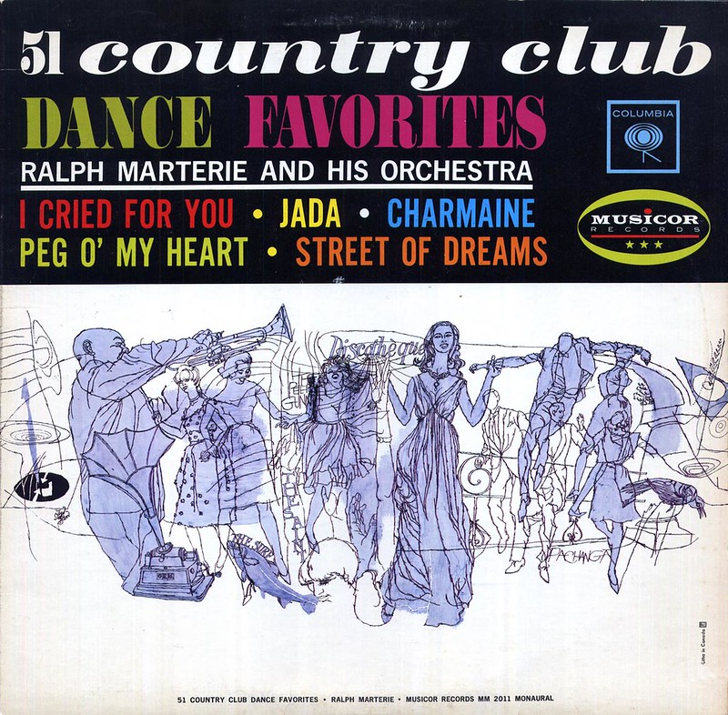
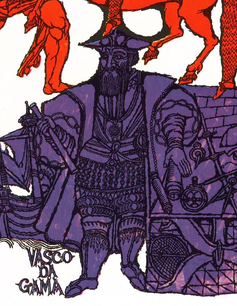
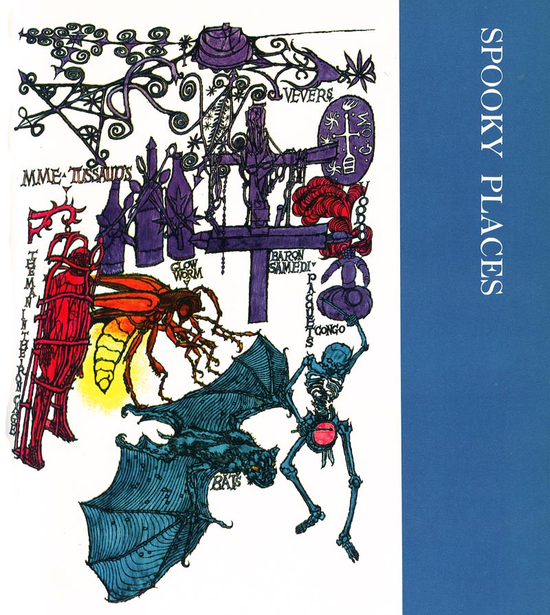
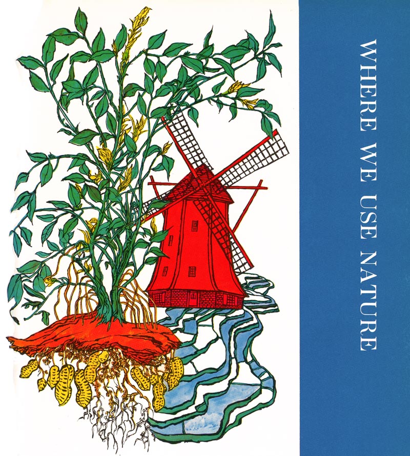
Recently I happened upon some 'new' artwork by Steffen - this time from the 1970s. Fred Steffen provided title page artwork for each chapter in Volume 10 of the 1972 edition of Childcraft, The How and Why Library.
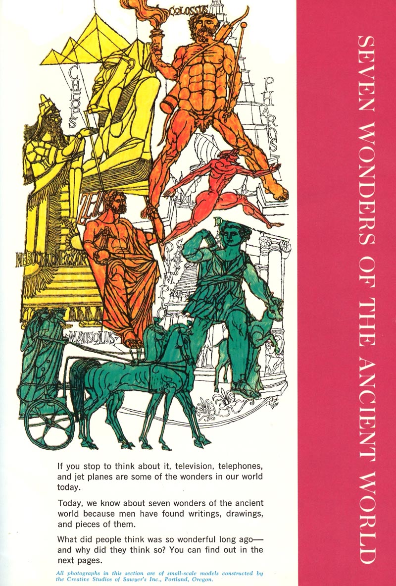
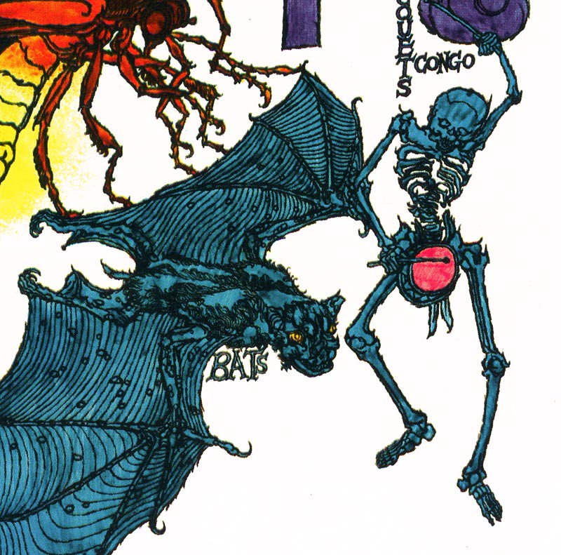
Seen at actual printed size, these illustrations are bit indecipherable.
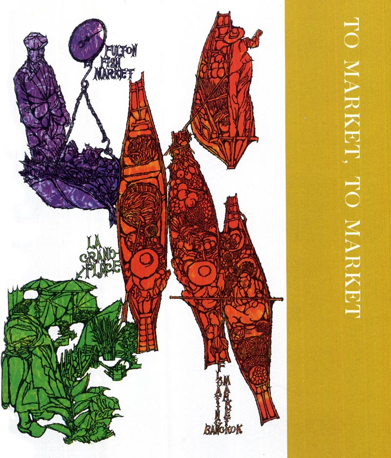
But have a look: when we zoom in on the individual elements... they're wonderful!
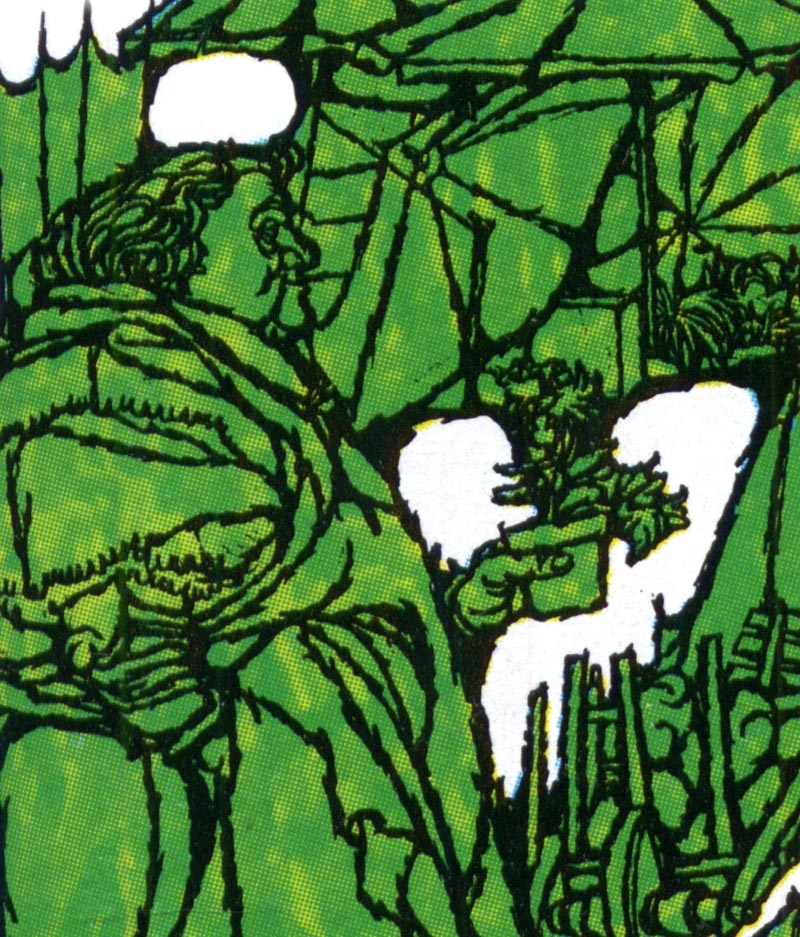
Here you can see Steffen's distinctive linear ink line style and complex but well organized use of detail.
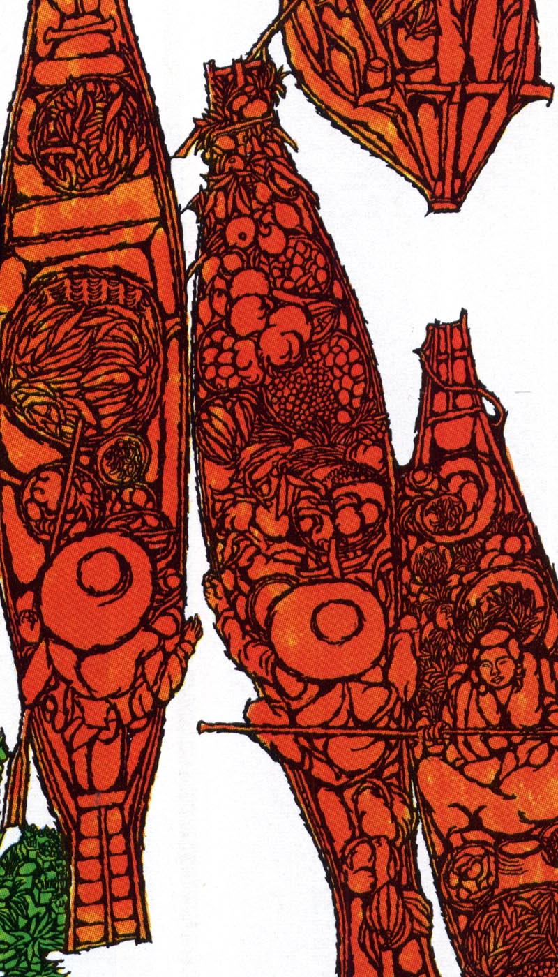
As a group, these illustrations have a trippy look so reminiscent of the era in which they were created.
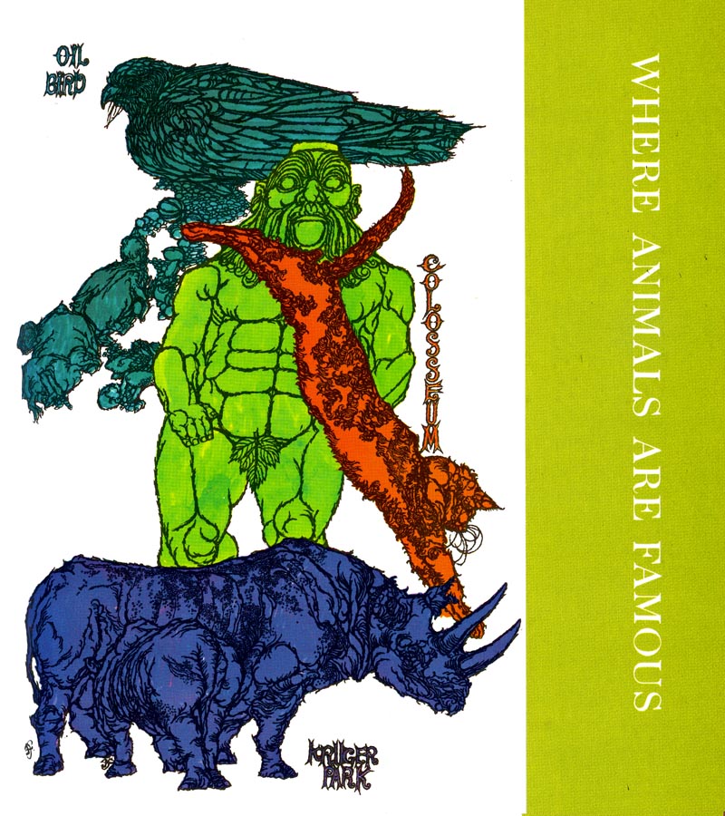
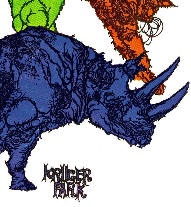
I don't really have any new information of Steffen, so I'll just leave you to scroll through this series and enjoy their groovy quirkiness.
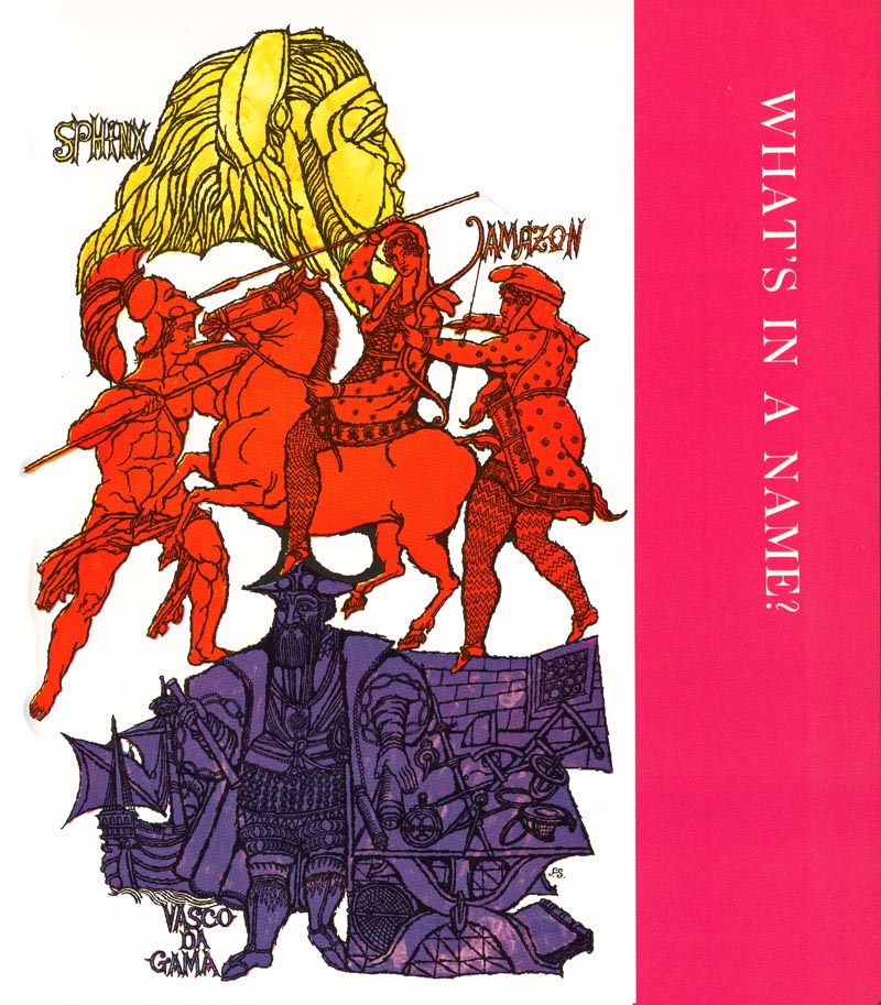


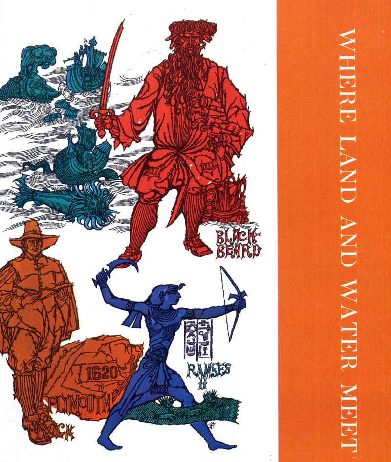
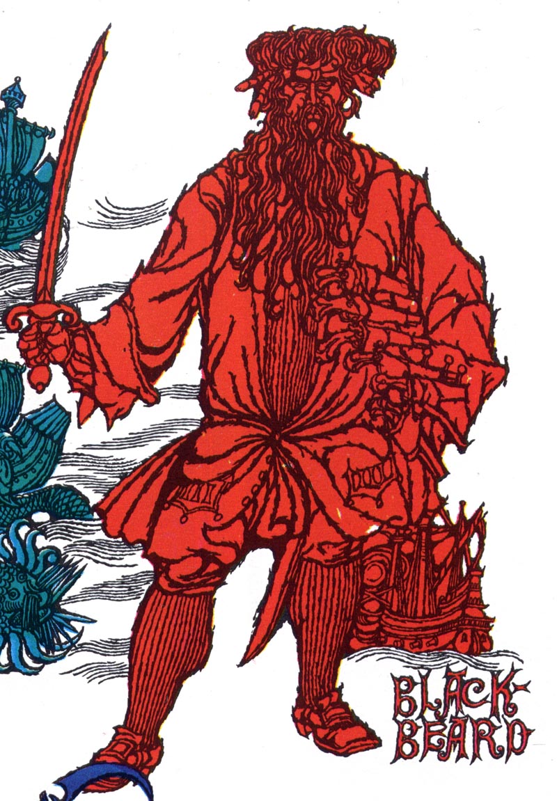
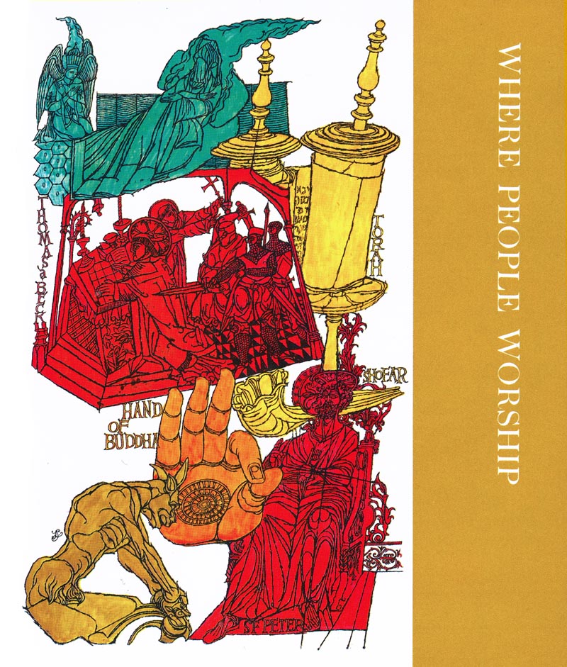
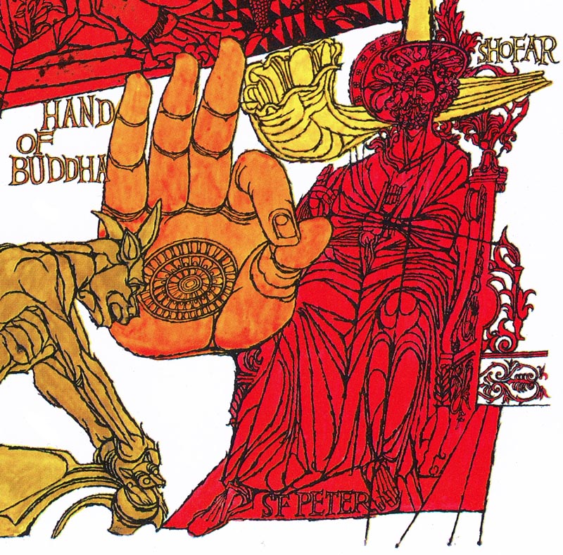
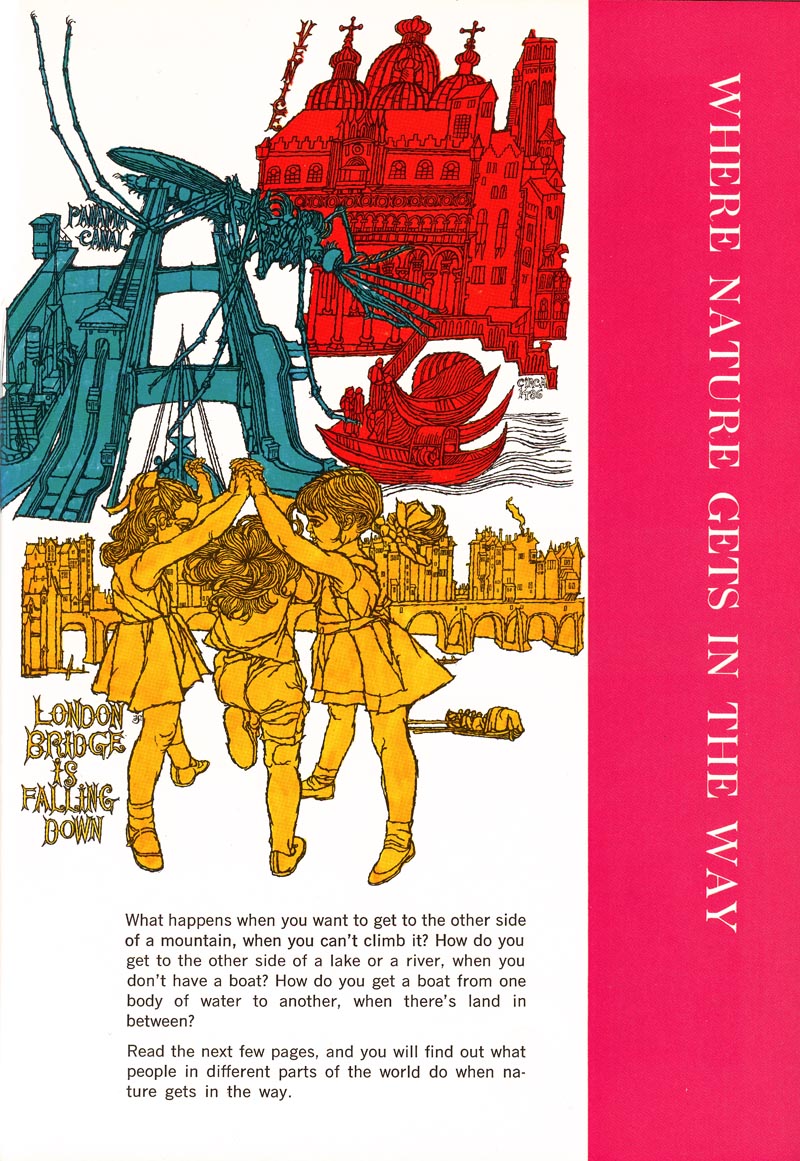
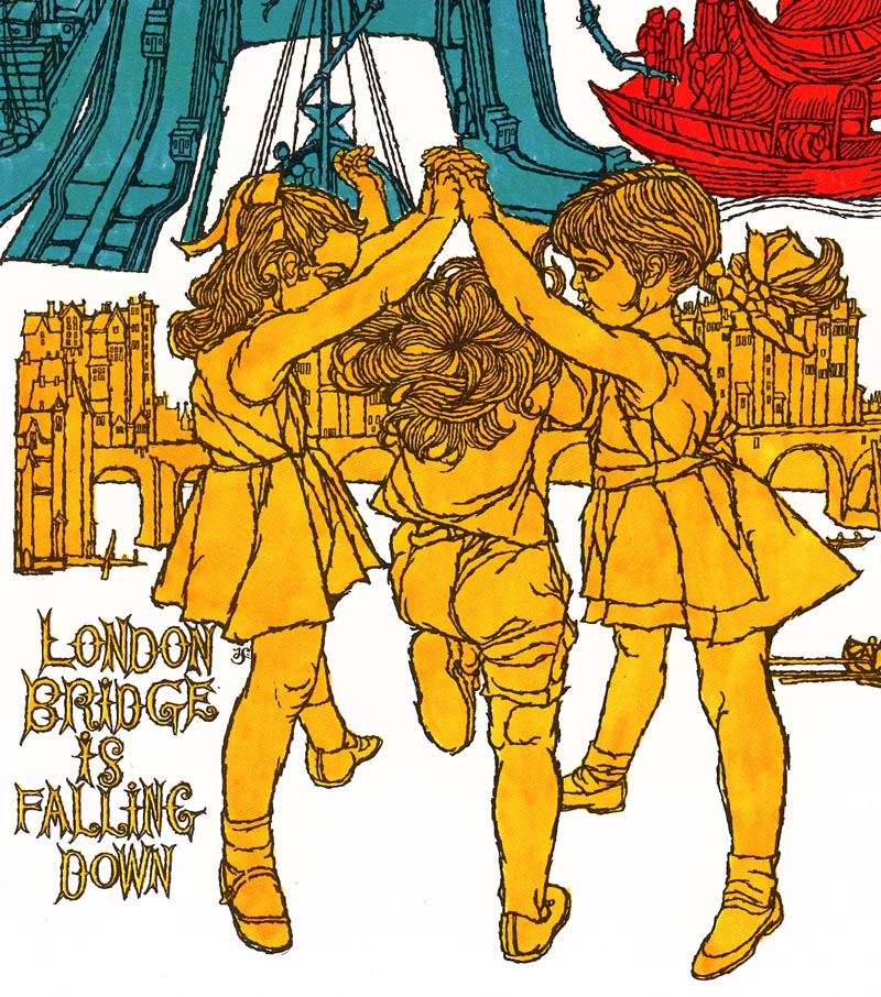
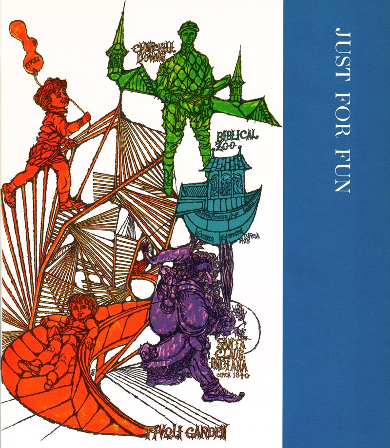
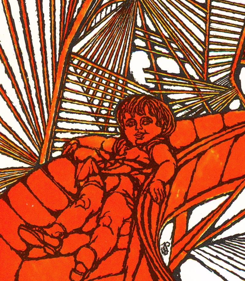
* This week, as time allows, I'll be featuring more artwork by a variety of illustrators from the 1970s editions of Childcraft, The How and Why Library.
I KNEW I knew those illos! We got those when we were kids in the 70s and I couldn't get enough of them. I am an illustrator today, and couldn't let that set get sold when we boxed up my parent's house. I still browse through them and marvel at the quality of those old-style artists. Those guys (and gals) knew how to DRAW.
ReplyDeleteThanks so much for sharing these.
Super-cool! I love the adjectives you use: "distinctive" "trippy" and "groovy". Steffen's work seems much more contemporary to me than many of the illustrations of that era. And I loved those books as kids; looking forward to what you have coming up!
ReplyDeleteAs soon as I saw the first image I was suddenly, and pleasantly, thrown back in my days growing up and staring at those drawings over and over again. I especially remember the "Spooky Places" chapter illustrations along with one of Theodore Roosevelt.
ReplyDeleteI can easily count this as one of my inspirations in art during my upbringing and I'm currently an illustrator for an ad firm.
- Thanks for posting really cool stuff.
As a kid my brothers and I would pore over those books. They had a Places to Travel book from that series that I jealously guarded. A great set of books to grow up with.
ReplyDeleteBringing back old memories. Thanks for sharing.
ReplyDeleteI did a post awhile back on Childcraft in which I showed a paper sculpture/3D paper art by Russell Jackson. I've been searching for
ReplyDeleteinformation on him but have hit a dead end. I'd like to do a post on him as I've been asked about him a few times. Do you have any information on him or ideas where to search? I would appreciate any help!
Hi there. My name is Graham. I used to be a caregiver in 2010 for Fred Steffen's son in, Fred Jr, who died in Evanston in Illinois (Chicago suburb) in 2013. Fred senior's beautiful 45s sleeve designs were all around his son's apartment. Fred Sr. actually used his own image a fair bit in the drawings; sure if you look close enough you may well see a recurring character. That was him. Fred Sr. got a call one time from the NAACP telling him he had won their Black Artist of the Year award. Only thing was, the German-ancestored Fred was...white. That's all I have, really, but I thought you might appreciate those couple of small details.
ReplyDeleteYour articles are always very informative
ReplyDeleteagen bola terpercaya
ReplyDeletempo99
ReplyDeleteThanks for sharing
we are Roofing Repair company contact uss canada(604 655 8486)
roofing contractor
gutter company
Pakistani Rishta
photo booth rentals in australia
photo booth rentals in usa
Welcome to the new world.
ReplyDeletexn--l3cmydjn3b8f.com
sportufabet.net