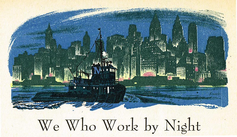
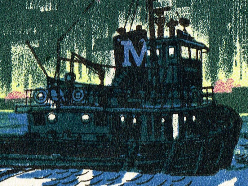
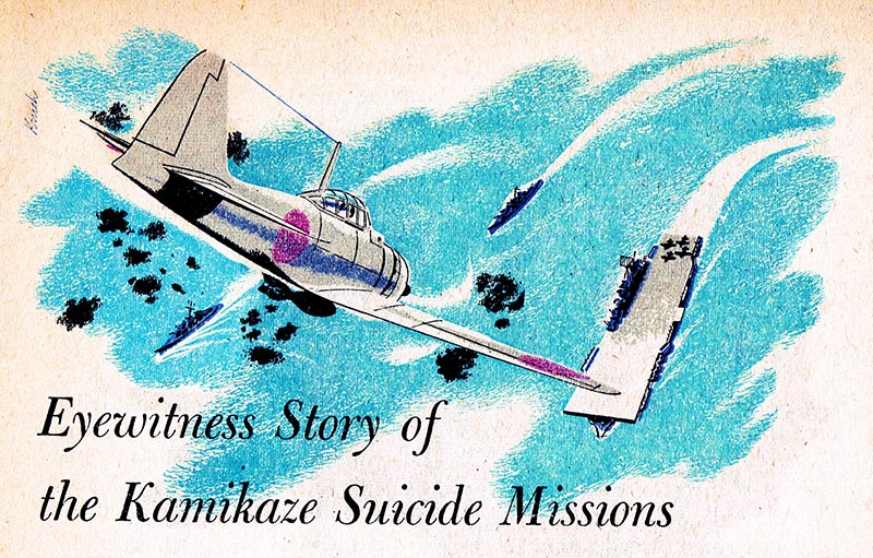
I had no idea who this "Krush" was, but was astonished at the effort (he?) had put into artwork that would be printed at both a small size and on poor quality paper. This tugboat, for instance, is just one inch wide as it appears in the header of an article.
Thumbing through several other copies of Reader's Digest from 1953 and '54, I would occasionally find other strong, appealing works by this "Krush" person. I made a mental note to keep and eye out for more.

Years later it occurred to me that there could only be so many illustrators working during the mid-20th century with a name like Krush. But the Reader's Digest artwork was so dramatically different from the work Beth and Joe Krush had done for The Borrowers that I couldn't imagine them being responsible for anything like the images you here.
It was only when I happened upon an article about Beth and Joe Krush in the March 1952 issue of American Artist magazine - and more recently, a web page about the Krushs at The University of Southern Mississippi's de Grummond Children's Literature Collection - that the pieces started to fall into place.
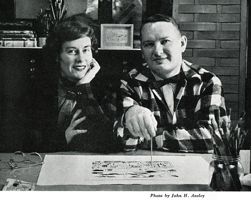
In the American Artist article, Henry C. Pitz, the Krush's old instructor from their days at the Philadelphia Museum School of Art explains that aside from his many collaborations with wife Beth, Joe Krush was responsible for a great variety of other work, done largely on his own.
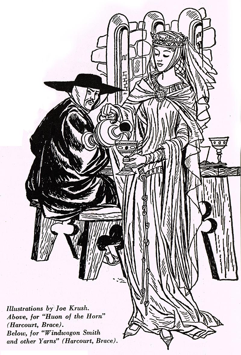

Much of the sensibility of this work could be traced back to Joe's time as a graphic designer in the U.S. Army during WWII. Shortly after the inseparable young couple graduated, married and began freelancing, Joe was called up and assigned to the Office of Strategic Services. For the next four years his work included designing "posters, graphs, displays and printed materials."
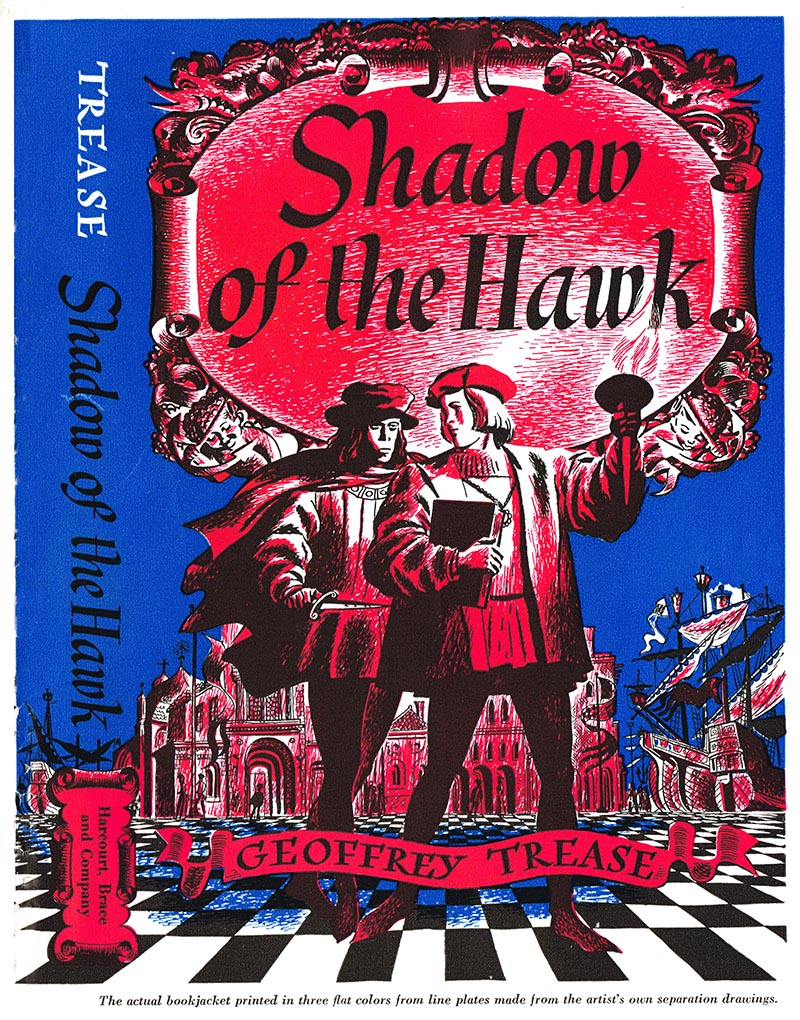
He developed expertise in many reproduction processes which he later called upon for freelance assignments. For instance, below is one of Joe Krush's book covers executed as a series of line art separations.
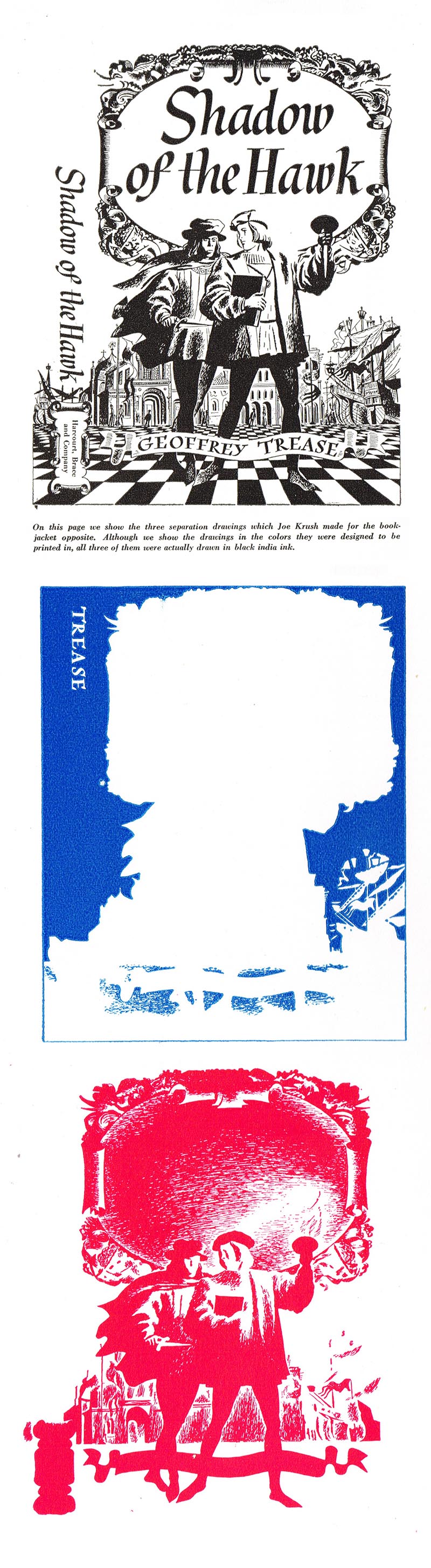
This is pretty much identical to the process Krush would have used for the Reader's Digest illustrations at top.
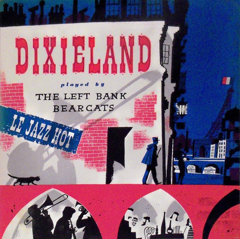
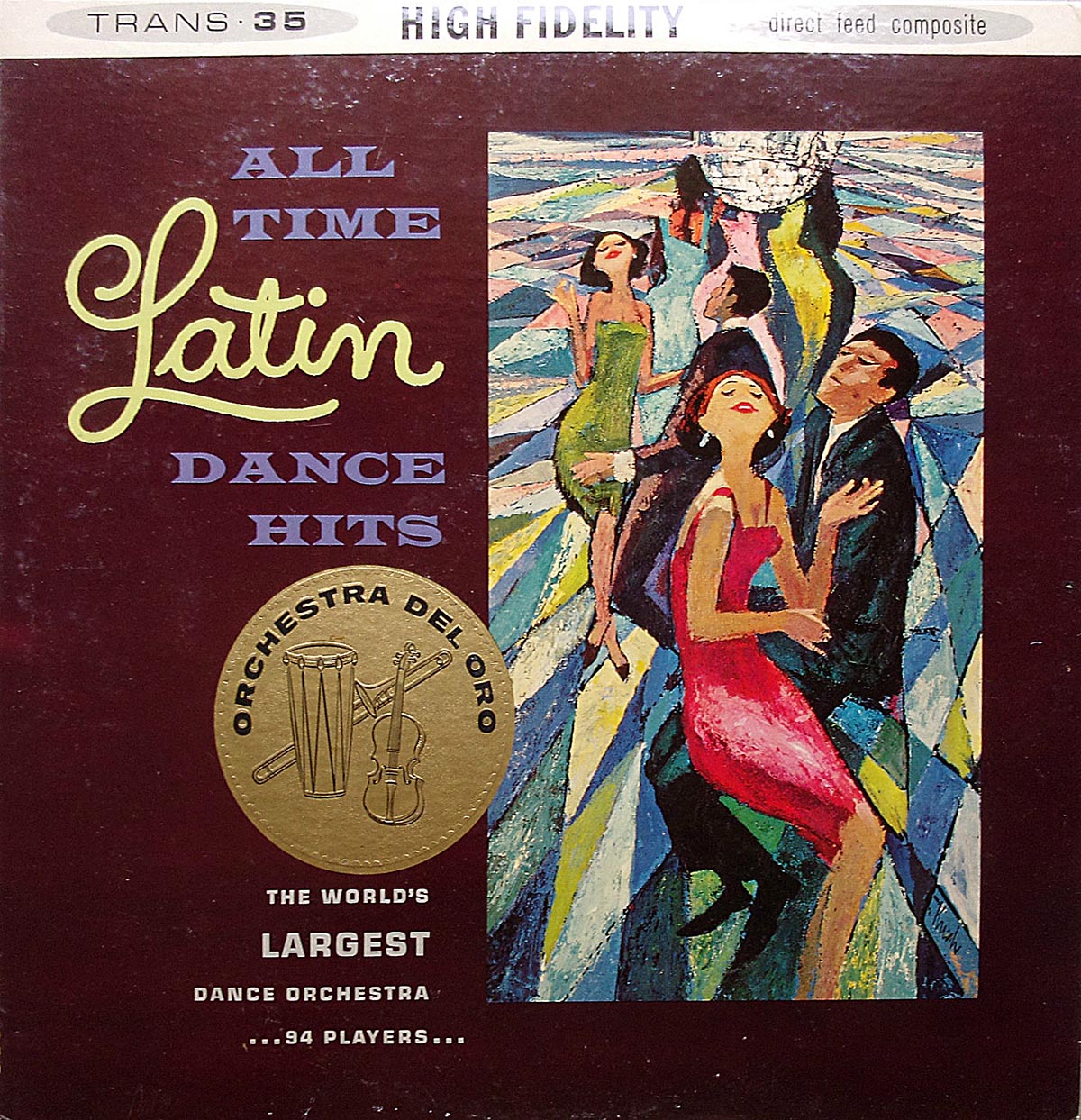
RCA Victor Records was another important post-war client for Krush. It's difficult to say just how many record jackets Krush designed and illustrated, but at the time of Pitz's 1952 article, he had already been working on them for ten years. The small sampling of Joe Krush album covers below are all dated after 1952 - even into the mid-1960s - so we can only imagine just how many he may have executed.
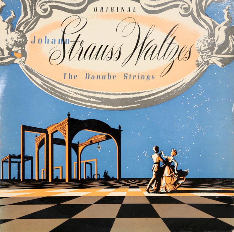


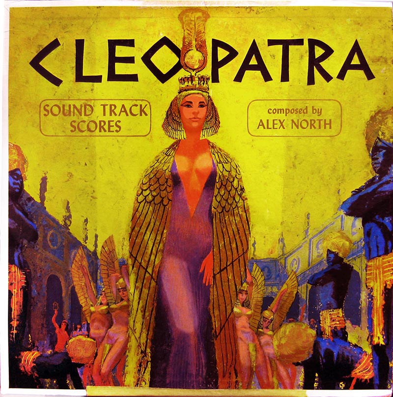
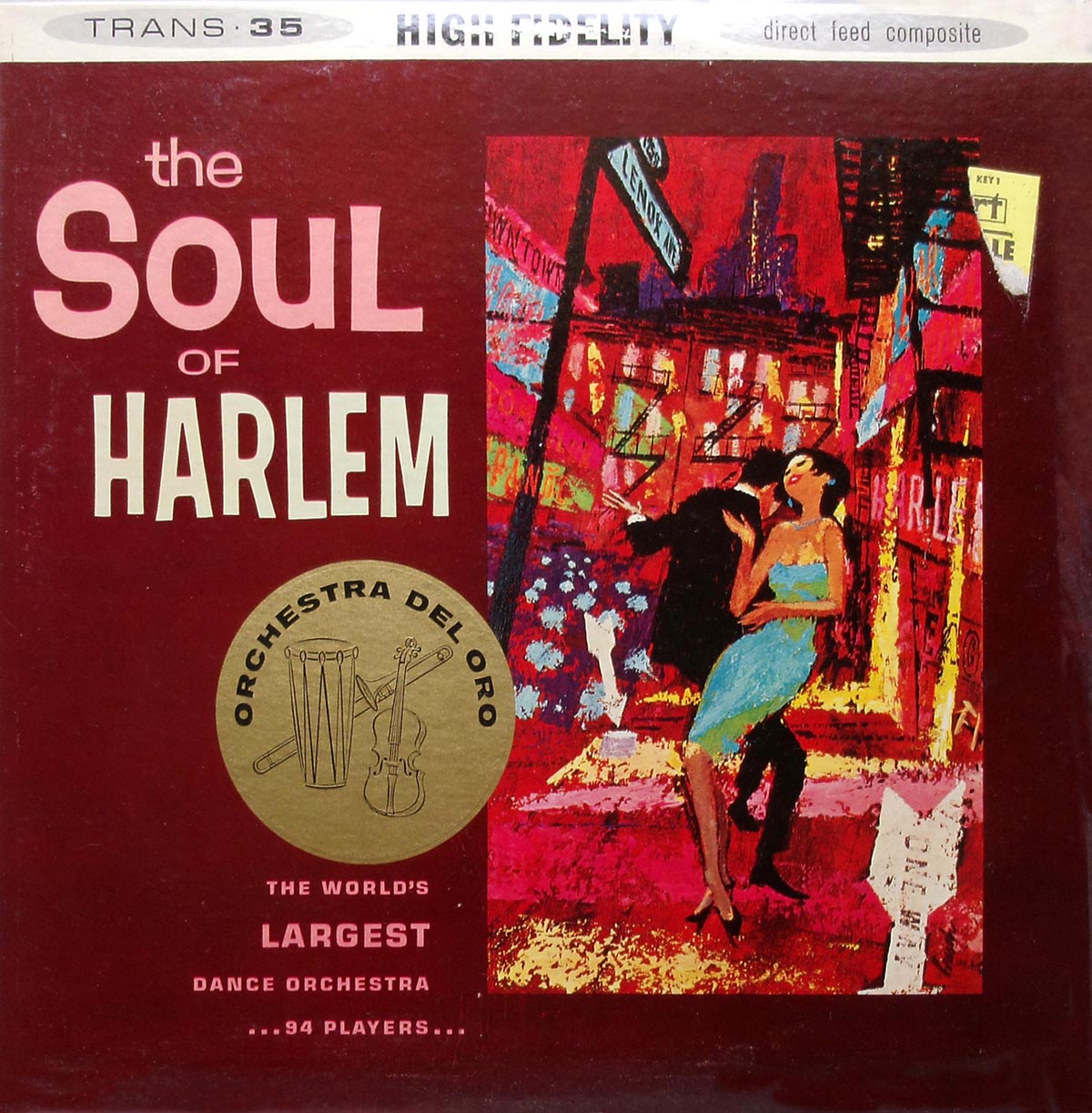
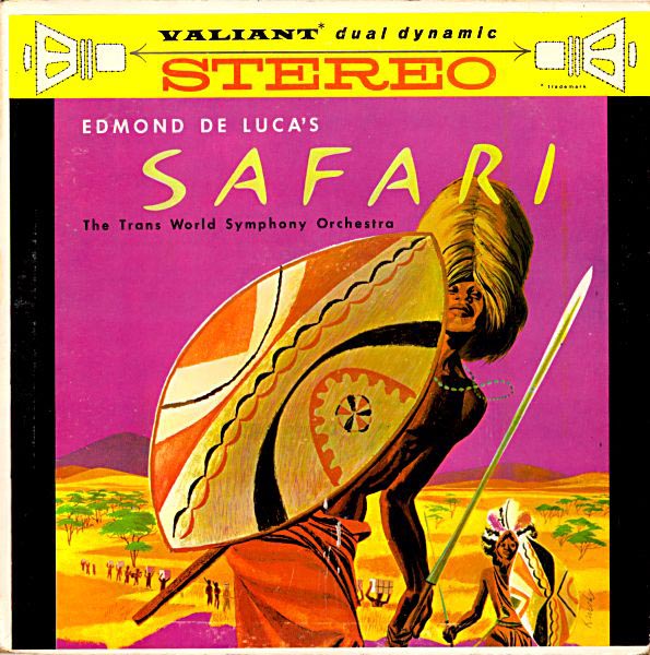
The variety of styles and design solutions Krush employed on these album covers are impressive, to say the least. They look like the work of an artist having a good time.
Henry Pitz put it this way: "It's a tribute to his versatility that he has been designing them for more than a decade, for few fields of illustration have changed so rapidly in so short a time."
"The designer who relies on pat solutions has little place in this field."
The deconstruction of the Shadow of the Hawk cover is very interesting, and the result looks really great.
ReplyDeleteGreat discovery (again)!
Wow! Joe Krush's works look amazing. I might have come upon some old copies of RD magazine, which he might have drawn on, which I've always found fascinating. Another thing that's great about him is that he epitomizes the graphic design art before the dawn of the digital design era. Thank you for highlighting his works on this post!
ReplyDeleteDouglas Gaster @ Controlled Color
You have propagated an incredible specifics of website design , design , website design london . Which are incredibly beneficial for all of us. Thanks
ReplyDeleteI love your blog. Think you will also enjoy reading this article about best geofencing apps.
ReplyDeletesitus judi bola
ReplyDeletempo99
The main difference between graphic design and illustration is how and where you use them. Typically, graphic design leans more commercial, while illustration is related to fine art. You can learn more about it by visiting: https://www.futuretech.com.pk/
ReplyDelete