Showing posts sorted by relevance for query "mitchell hooks". Sort by date Show all posts

Tuesday, February 08, 2011

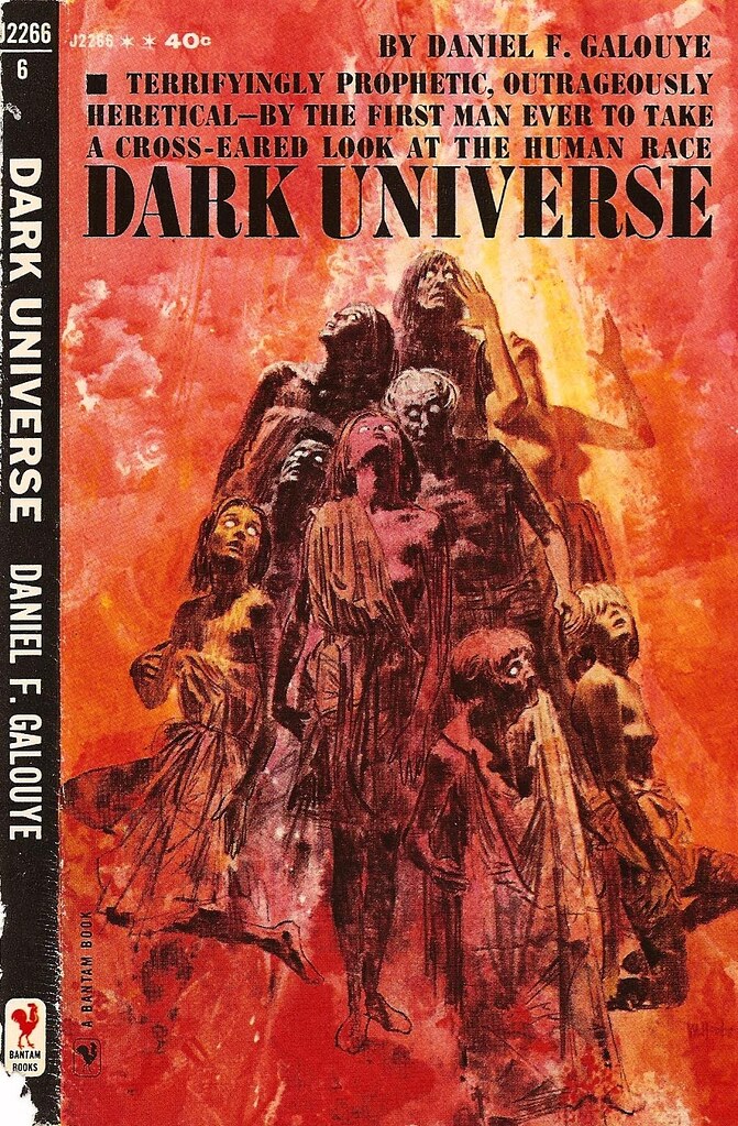
Mitchell Hooks: Some More Paperback Covers 1950 -1960

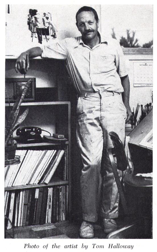
For some reason I've been thinking about Mitchell Hooks recently. I had the great pleasure - honour, actually - of meeting Mitchell in person last summer. He is both an incredible artist and a truly fine gentleman. Spending a couple of hours over lunch at the Society of Illustrators with Mitchell, Murray Tinkelman and Bob Levering will always be one of my most cherished memories.
Hooks10

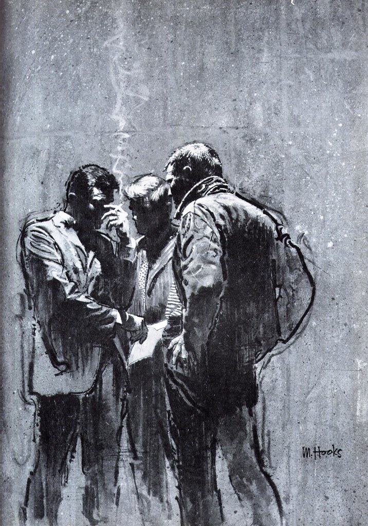
I've previously written about Mitchell's career so there won't be a lot of text accompanying this week's posts - but I did want to share more of his artwork with you. Since writing about Mitchell I've noticed more of and more of his work - especially his paperback covers - is beginning to appear on blogs, websites and especially on Flickr, among those who archive old paperback covers.
Hooks44a

Chief among those doing the good work of preserving Mitchell Hooks' legacy in paperbacks is my friend, Uilke (AKA UK Vintage). Most of today's scans are from Uilke's Mitchell Hooks Flickr set - a truly stunning, always growing collection that currently comprises 72 covers - so many thanks, Uilke, for generously sharing these treasures with us!

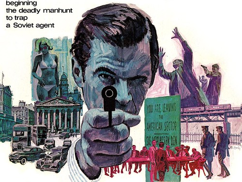
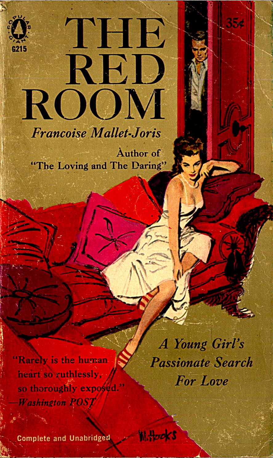
As you scroll down, just look at how Mitchell's style changed over the first half of the '50s...

1950
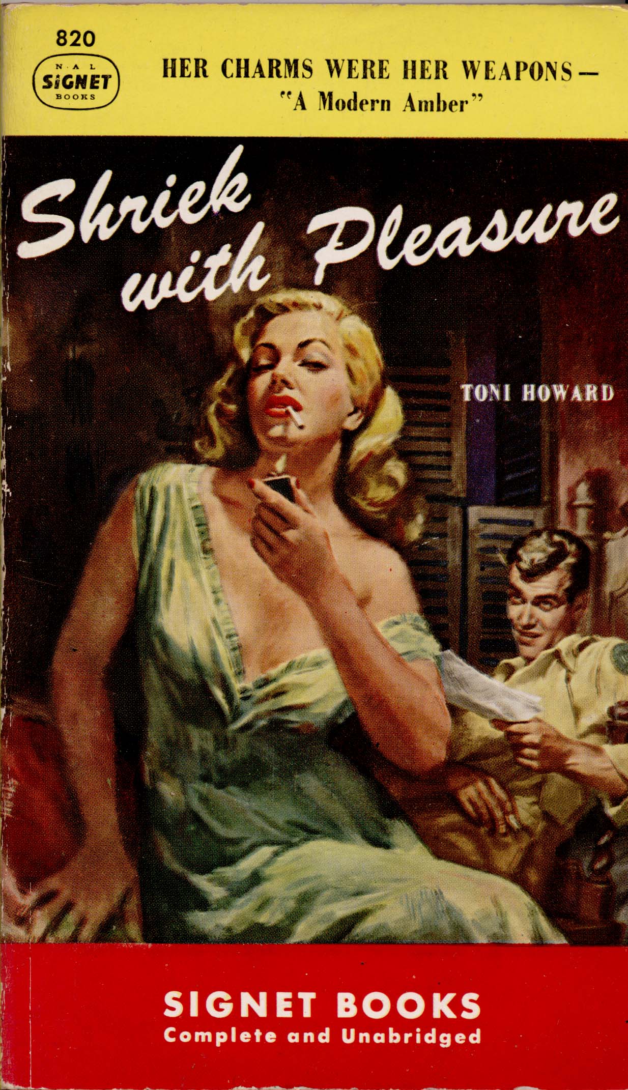
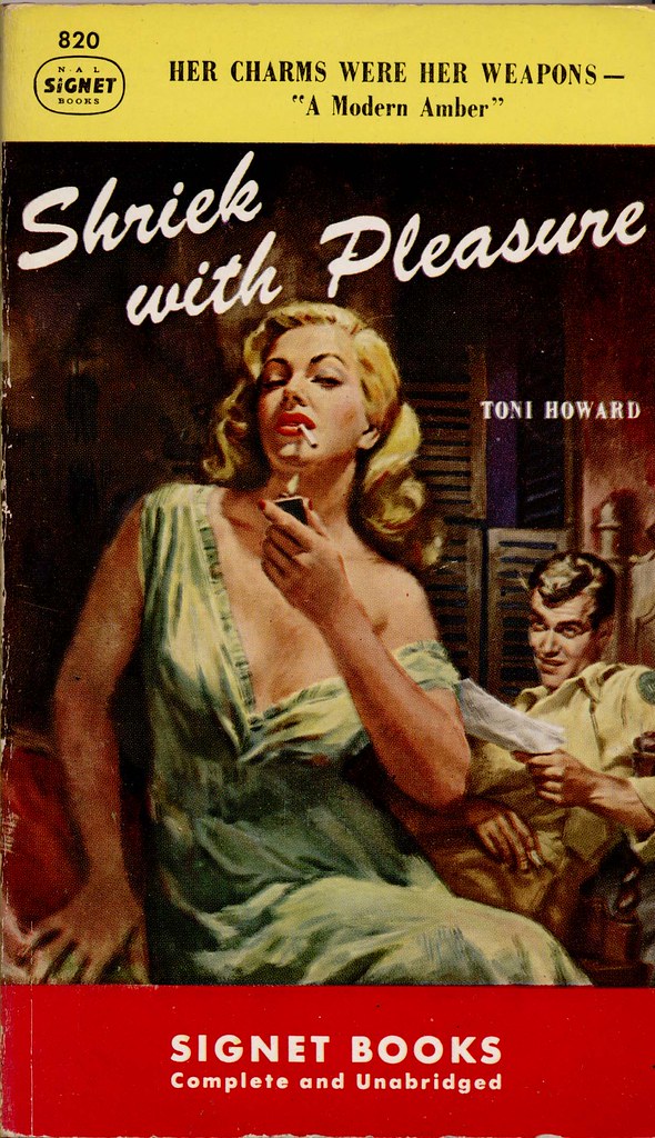
1950 - Signet 820

1951

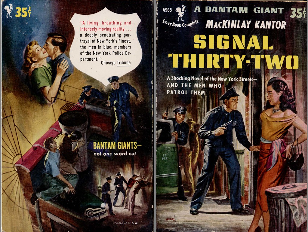
1951 - Bantam 965 + Backcover

1952

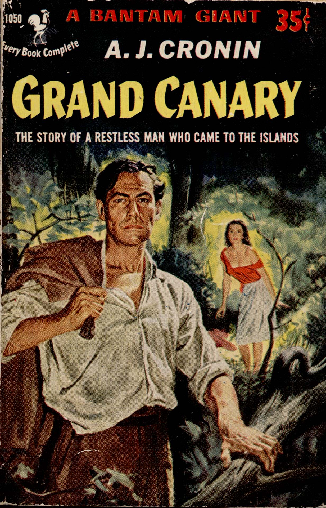
1952 - Bantam 1050a

1953

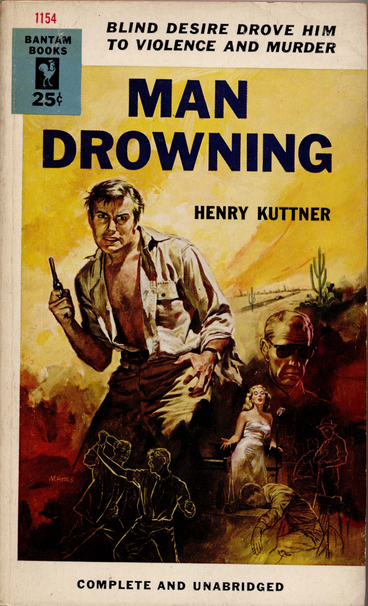
1953 - Bantam 1154

1954

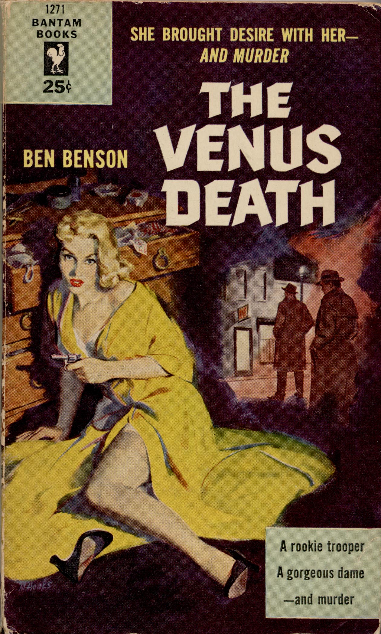
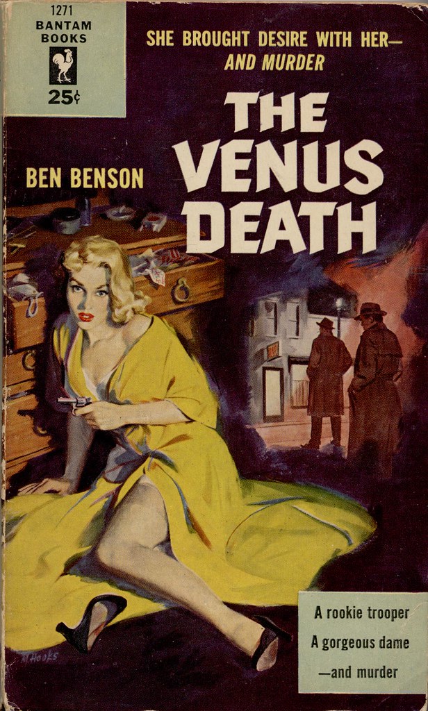
1954 - Bantam 1271 _ Mitchell Hooks

1955

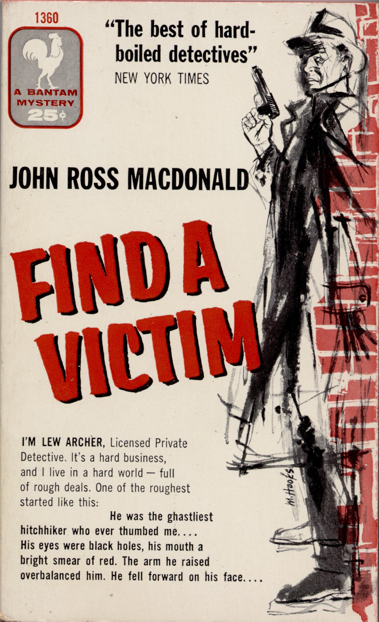
1955 - Bantam 1360

1956

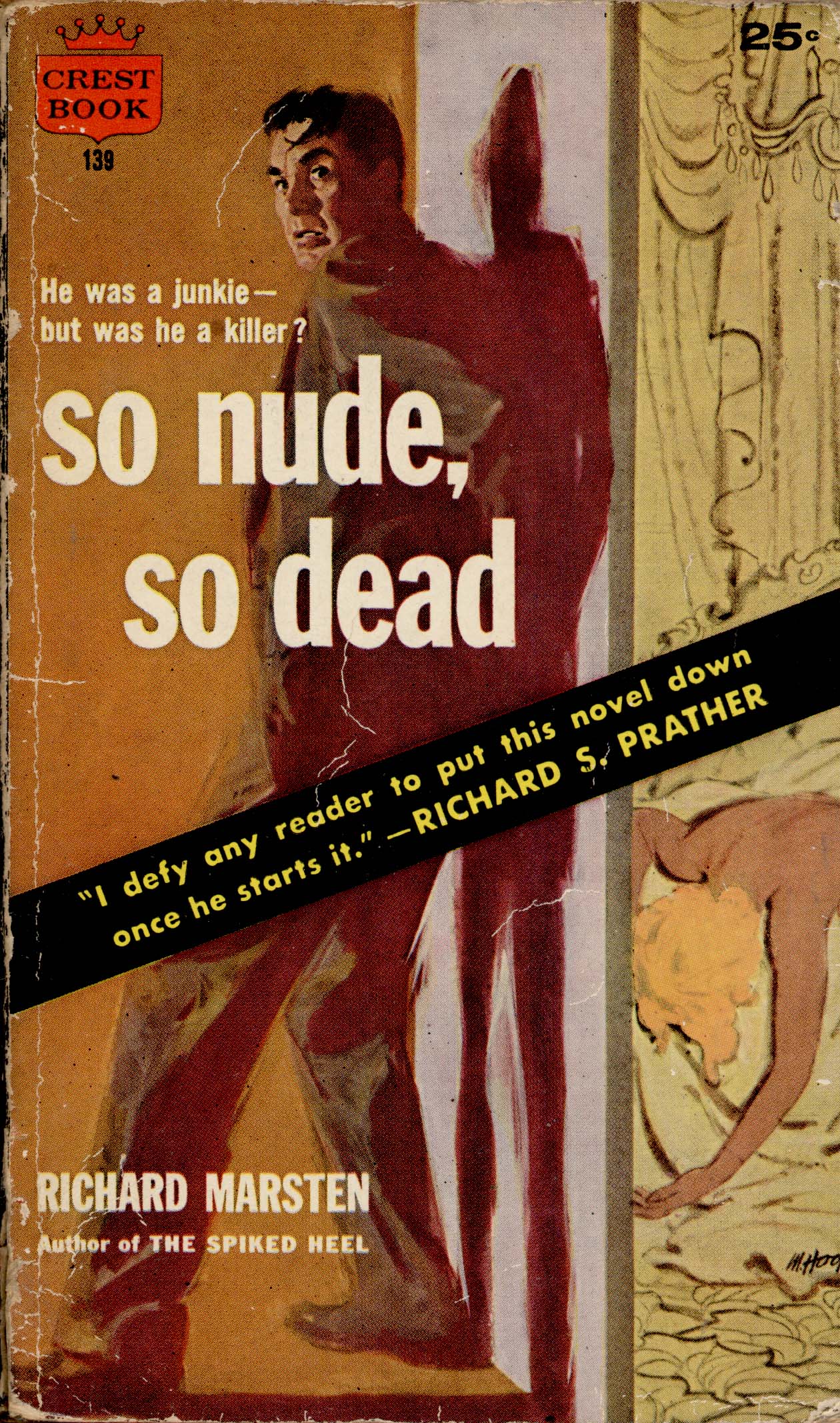
1956 - Crest 139

1957

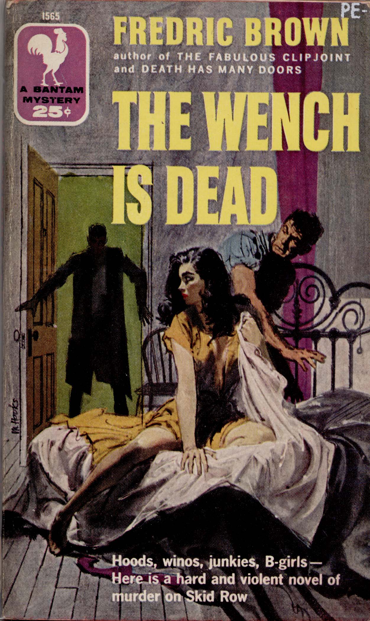
1957 - Bantam 1565

1958

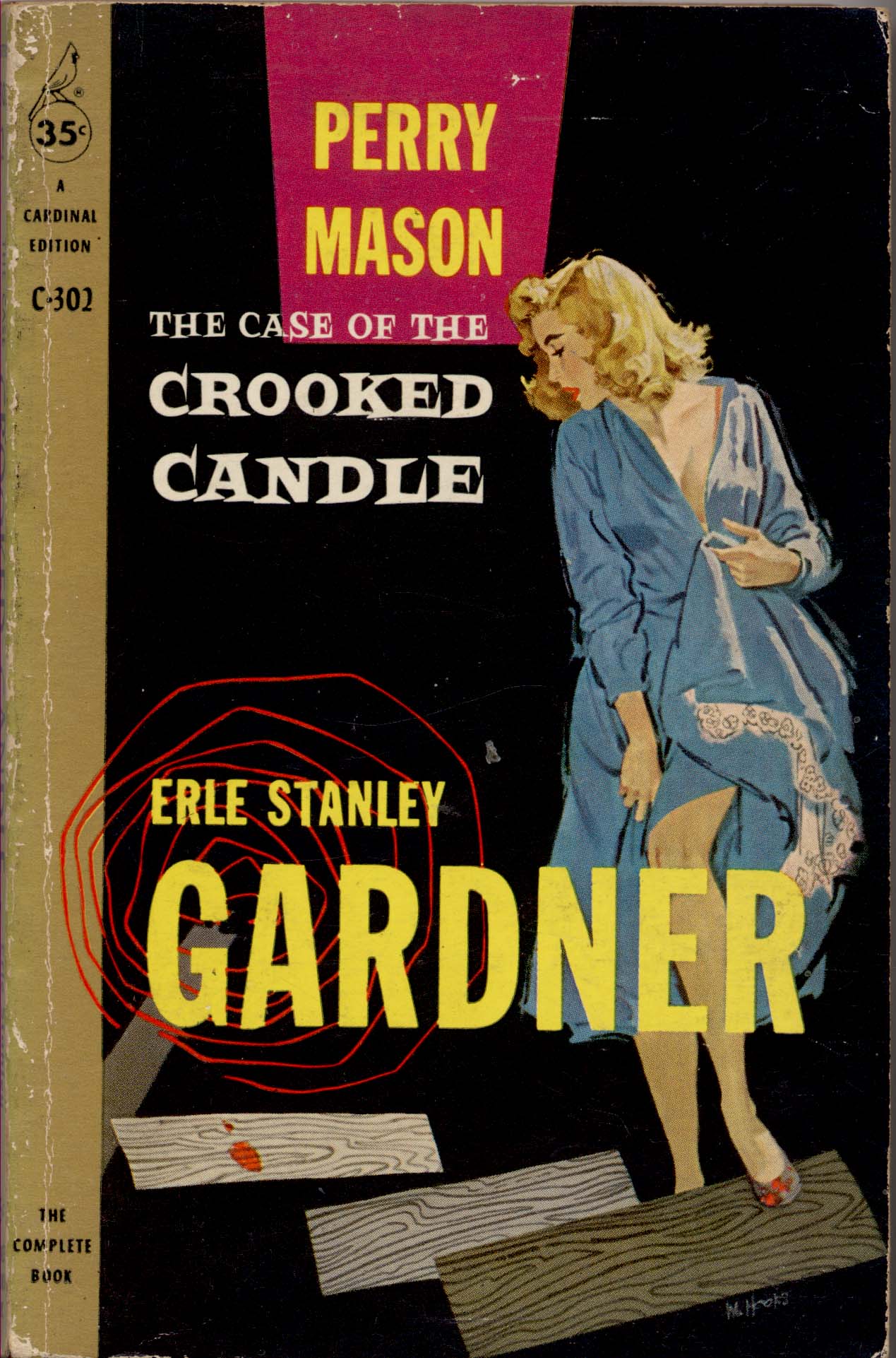
1958 - Cardinal C 302

1959

The Two Lives of Dr. Stratton

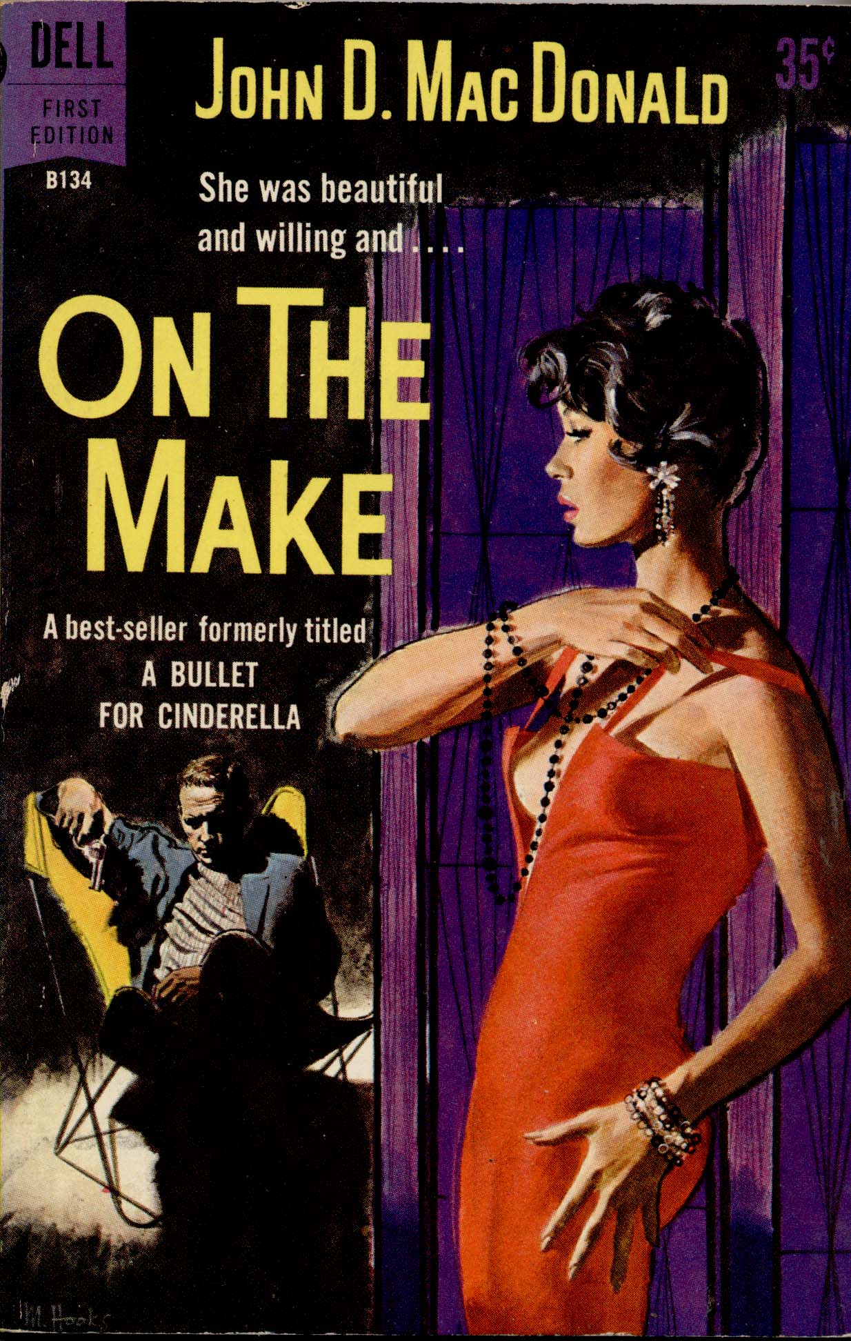
1960

1960 - Dell B 134

These last two are from Flickr member Kay Atkinson (AKA The Woman in the Woods) and are from 1955...
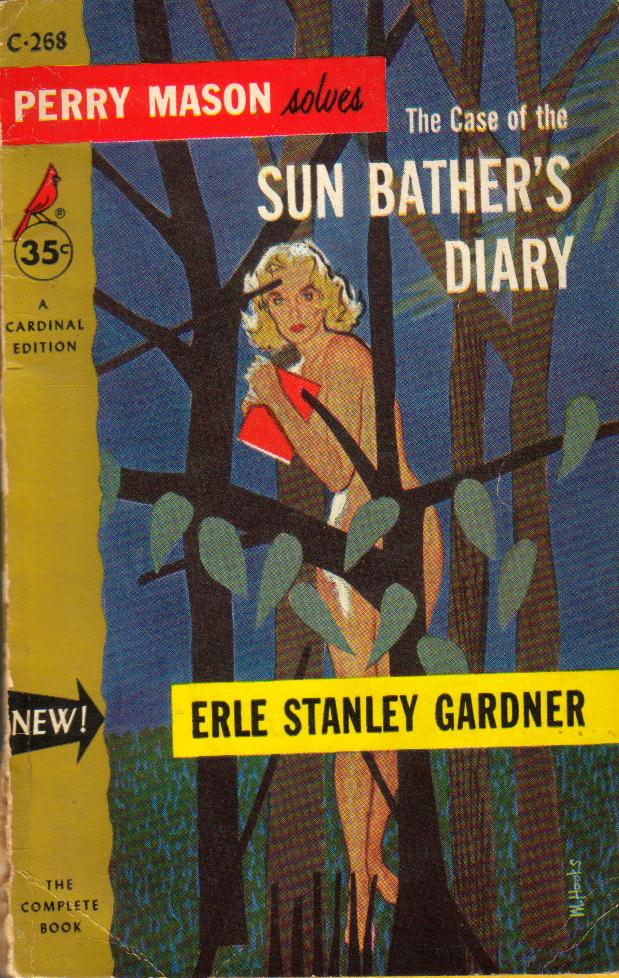
The Case of the Sun Bather's Diary by Erle Stanley Gardner

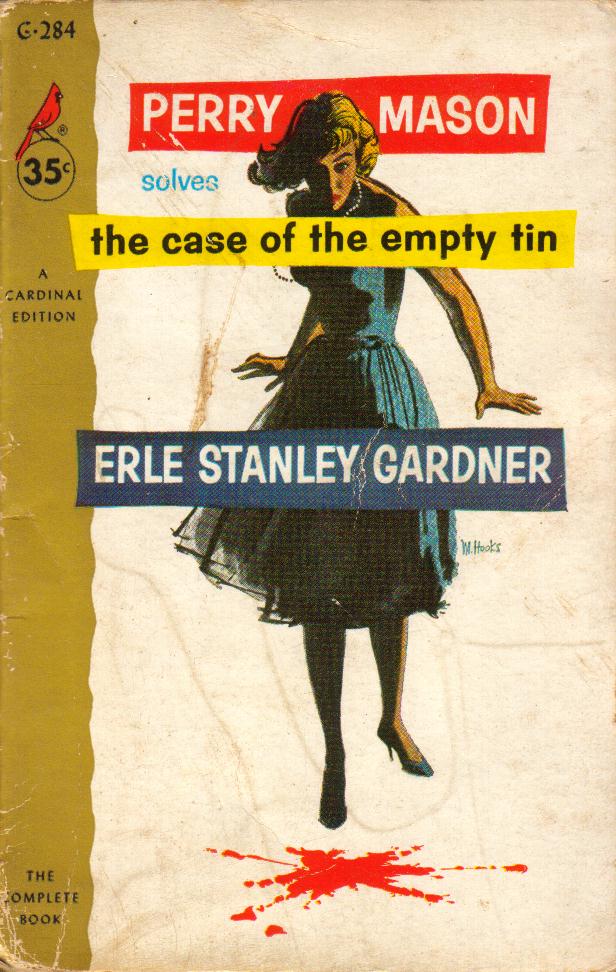
... and 1958, respectively.

The Case of the Empty Tin by Erle Stanley Gardner

The bold, graphic treatment Mitchell developed makes his work during the second half of the '50s among my favourite of all time.

To see many more examples of Mitchell Hooks' paperback cover art, visit UK Vintage's Flickr set.

Thursday, March 21, 2013

Good-bye Mitchell Hooks (1923 - 2013)


A couple of days ago on Facebook, Dan Zimmer of Illustration Magazine shared some sad news: last weekend, Mitchell Hooks passed away.

Hooks96

How particularly strange to hear Mitch was gone, having just featured his work once again only a couple of weeks ago right here on the TI blog. I had some wonderful phone conversations with Mitch and, in 2010, I actually got to meet him, talk with him in person over a long lunch at the Society of Illustrators and shake the hand of one of my illustration idols. I will always cherish those memories. Mitchell Hooks was a spectacularly talented artist and a warm, humble and generous person.

Hooks10

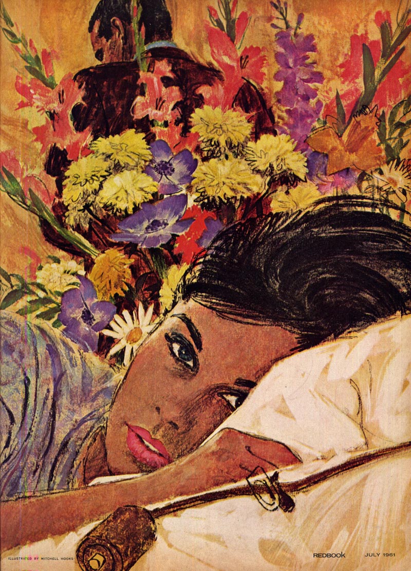
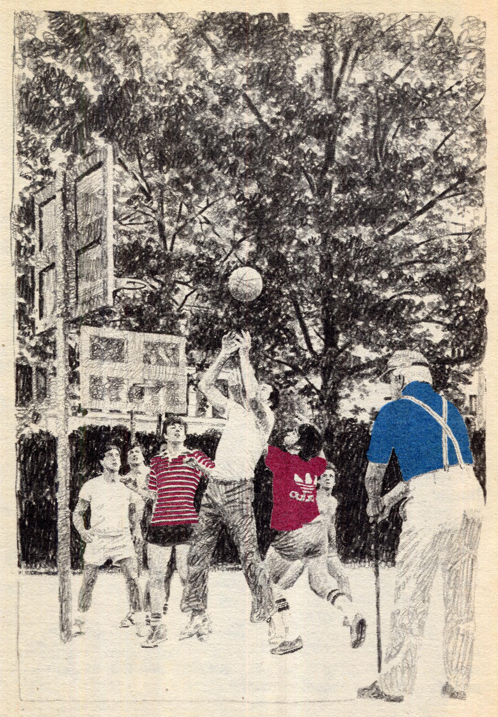
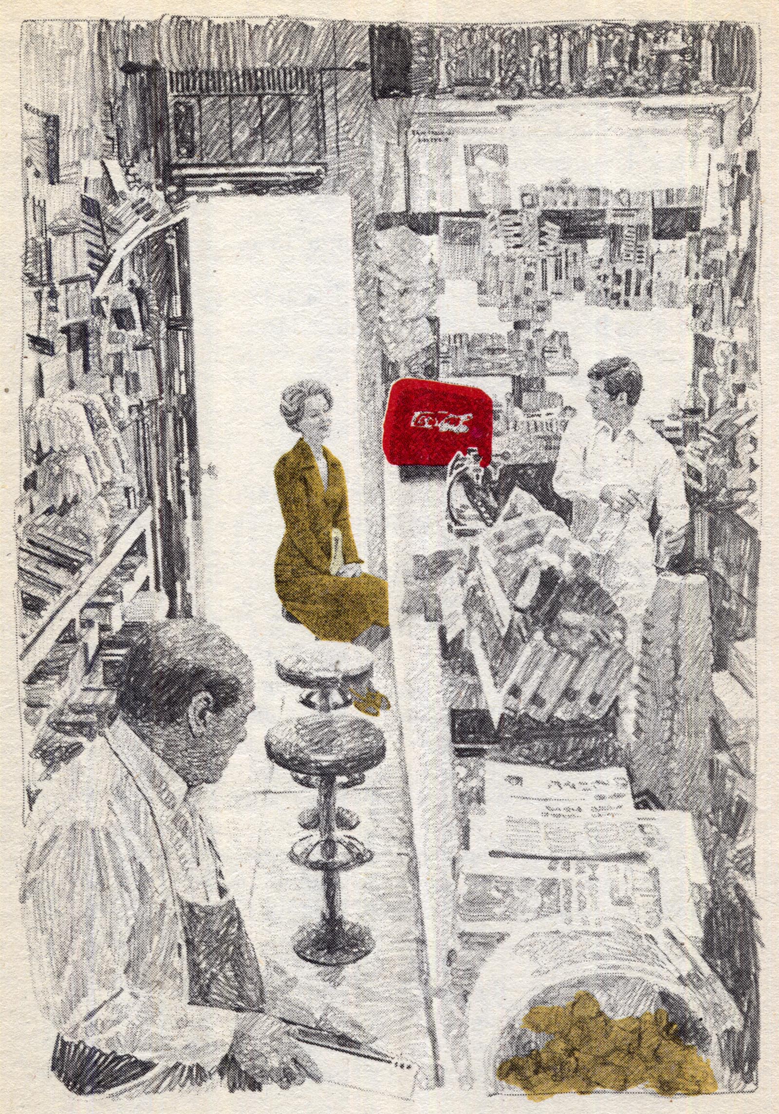
The illustration at the top was published in Redbook magazine in July 1961. The one immediately below in April '61.

Hooks97

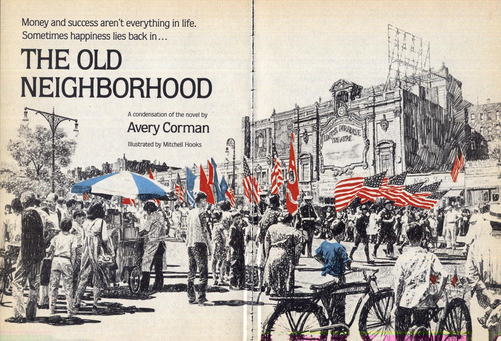
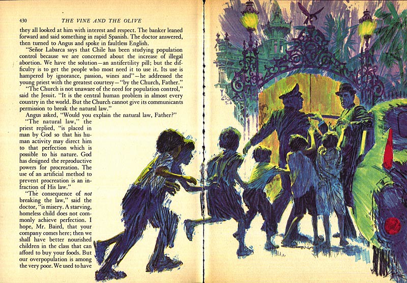
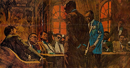
Here are a few more pieces by Mitchell that I haven't previously presented. These are from Reader's Digest Condensed Books, circa 1980.

Hooks101
Hooks100
Hooks99
Hooks98

In Mitchell's memory, I'm re-presenting Part 1 of my interview from 2008...


Mitchell Hooks: "I always drew..."
(First presented on Tuesday, September 09, 2008)

Mitchell Hooks was born in 1923 in Detroit. He didn't come from a particularly artistic family, though he did have an uncle whom he describes as 'quite a good self-taught artist' who encouraged his interest in art. Says Mitch, "I always drew."


His earliest influences were the adventure strips in the newspaper, especially Alex Raymond's Flash Gordon, Jungle Jim and Secret Agent X-9. "As a boy, I followed Raymond's work avidly," chuckles the artist today, "even to the point of clipping out the strips and keeping them in a scrapbook. I'd meticulously cut out the figures of Flash, Dale and Dr. Zarkov."

"I've always had an affinity for anatomical drawing and, in retrospect, I can attribute my abilities to the long hours spent studying Raymond's beautiful drawings."


Mitch attended CAS Technical High School in Detroit, "A marvelous school," that had been created for those city kids who really had no hope of ever attending college."The way we grew up," says Mitch, "we didn't even know how to spell 'college'."

Hooks22

"CAS was loaded with professional illustrators, designers and such, just great people, who taught us everything we needed to know to get a job in the profession."

"I was thrown in with a bunch of kids who were really enthusiastic about illustration. We all knew what was going on out there in the magazines... knew about Al Parker and the Cooper guys and all that, and CAS prepared us to go out in the field - and we did - we all went out and got jobs in the field, straight out of high school!"

Hooks50

"CAS was where I made my big leap from Alex Raymond to wanting to be a professional illustrator, and I knew I wanted to be in New York."


When Mitch graduated from CAS he first found a job at General Motors. The war was on, GM had been converted to supplying the American army with equipment, and Mitch was assigned to take two dimensional blueprints and convert them to three dimensional drawings. "It was important work," says Mitch, "and I hated it."

Hooks67

Hated it so much that just a couple of years later, when he joined the army, he made sure they knew nothing about his artistic abilities. "I was so afraid that they'd assign me to do more of those drawings that I intentionally flunked any tests that might reveal my skills." Mitch decided he's rather risk the shooting war than get stuck doing any more dreaded blueprint drawings! He became an infantryman in 1944 - and served as a second lieutenant with the U.S. occupation forces in Germany after the war ended.


Upon his return to the States, he made his way to New York. He had freelanced in Detroit for a year or so after leaving GM, and had diligently prepared a portfolio of samples he hoped would land him the sort of work he wanted to do. A previous visit to the the Big Apple before his army service had resulted in an opportunity with a minor studio called T.J. Peters. "Peters had a small bullpen of artists and I got on staff there," says Mitch. But all the while he was looking for something bigger, and that came in the form of freelance work done on the side for Al Chaite.


Chaite would go on to form, with artist Harry Fredman, one of the major players in the New York commercial art scene: the high-profile Fredman/Chaite Studios... but for now he was managing a smaller operation called Trager-Phillips. Mitch, while working at Peters, found plenty of freelance opportunities with Trager-Phillips, and "it caused a small conflict with my boss at T.J. Peters."


You can read what became of that conflict - and much, much more - in the remaining three instalments of my 2008 interview with Mitchell Hooks:

Part 2

Part 3

Part 4

* Tomorrow I'll present a raft of illustrations by Mitchell from Reader's Digest Condensed Books.

*More art in my Mitchell Hooks Flickr set.

Monday, February 25, 2013

A Visit with Mitchell Hooks, Part 1

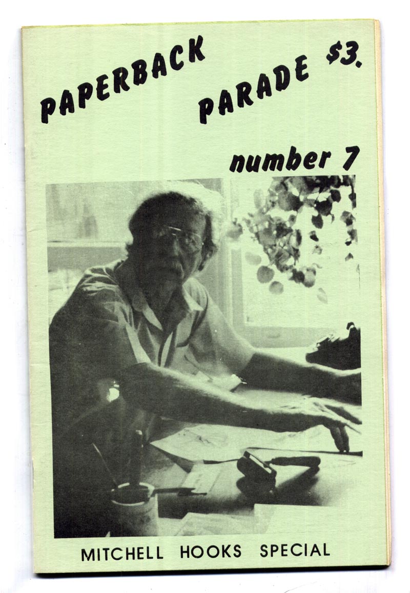
In 1988 Gary Lovisi, editor and publisher of Gryphon Books visited Mitchell Hooks at his Manhattan home/studio. The resulting interview, entitled "A Visit with Mitchell Hooks", was published in Paperback Parade #7, a copy of which I acquired some time ago. This week - with Gary's permission - I'm presenting that interview in five daily instalments... ~ Leif Peng

Hooks70

GL: I would like to begin by asking you what was the first paperback cover painting that you did and how it came about?

MH: That's an interesting question. I've never been asked that. The very first one I did was the result of having made a sample painting for paperback publishers. I took the sample to Signet Books and they liked it. There was a man and a woman in it -- a very sexy woman.

1950 - Signet 820

MH: This was back in the early fifties, when absolutely every book had to have a sexy cover. It didn't matter what the book was, it could have been a cook book. It had to have a woman on the cover with prominent bosoms.

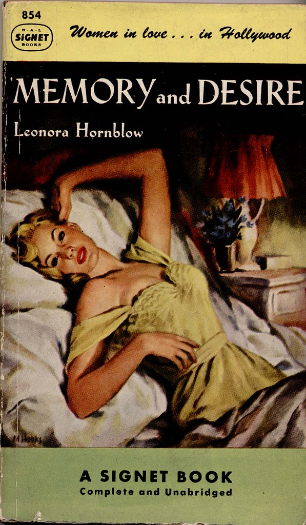
1951 - Signet 854

MH: Well, they decided they could use the cover, but some changes were made in it to fit a particular book they had in mind. So they had me paint out the guy and put in a different guy. That was the first cover I did.

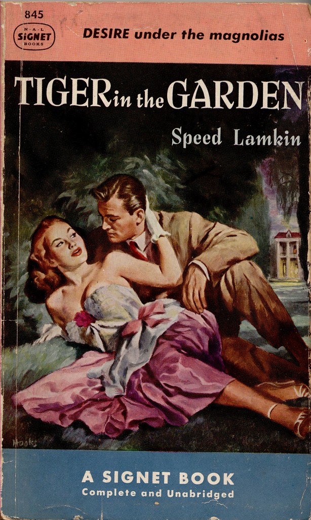
1951 - Signet 845 _ Mitchell Hooks

GL: How did they make that decision? Was it the publisher, editor, or did they have art directors in those days?

MH: Oh yes, it's the same structure as it is now, it was editorial in some way that I wasn't in on. The painting was a bedroom scene, and most covers in those days were bedroom scenes, at least in serious novels. That's what this one was.

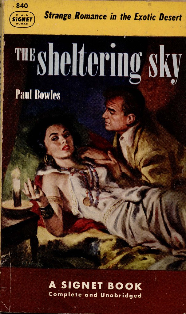
1951 - Signet 840

GL: How do you choose which scene to illustrate for a paperback cover?

MH: That comes about in different ways and often depends on the publisher that you're working for. When I was doing art for Bantam Books when Len Leone was there, invariably I made a sketch after he decided what he wanted to be on the cover.

1954 - Bantam 1271 _ Mitchell Hooks

MH: He was such a fine art director. He was in on their cover meetings and their cover subjects were decided in that conference before I was ever called in. That was Bantam's way of working.

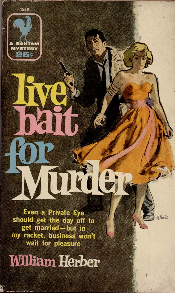
1955 - Bantam 1589

MH: I'm not working for Bantam now so I'm not sure if they still do that.

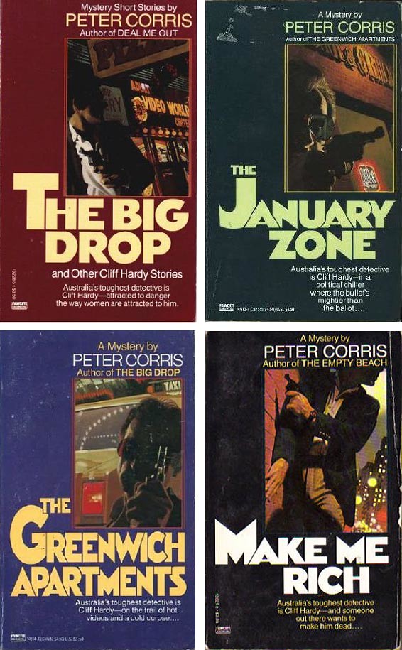
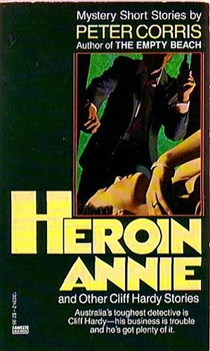
I'm working now on quite a few covers for Ballantine Books, a series of mysteries by Peter Corris, the creator of an Australian private-eye. I've done half a dozen or so of those. The instructions I get from Ballantine Books are to show the hero in some kind of dramatic urban scene.

Hooks68

GL: Hardboiled?

MH: Not necessarily hardboiled, but in some sort of a suspenseful setting, which pretty much means a night scene of some sort. With strong colors, like neon lights, that kind of gaudy, cheap, sleazy type of city scene. These scenes are never supposed to show the features of his face, which are always supposed to be in deep shadows.

Hooks69

MH: So with those instructions the rest is up to me and I go out and try to find some kind of interesting background to put him in, and some sort of interesting thing to have him doing. That's the way those came about. There are different ways at arriving at what's going to be on a cover, there's nothing set about it.

* Continued tomorrow

* The text above is copyright 1988 & 2013 by Gary Lovisi and originally appeared in Paperback Parade #7 (Gryphon Books)

Gary's website: www.gryphonbooks.com


* Thanks to UK Vintage for the use of his Mitchell Hooks paperback cover scans in today's post.

Tuesday, February 26, 2013

A Visit with Mitchell Hooks, Part2

In 1988 Gary Lovisi of Gryphon Books visited Mitchell Hooks at his Manhattan home/studio. He then published the resulting interview in Paperback Parade #7. With Gary's permission I'm presenting that interview this week, broken into five daily instalments... ~ Leif Peng

GL: I think a lot of people thought that in the forties and fifties an artist just read the book and decided all by himself what he wanted to do for the cover, then just did it. I see it's a lot more complicated than that.

Hooks72

MH: Well it can be done that way too, but you've always got to submit a sketch of what you're going to do and either get it approved or knocked down.

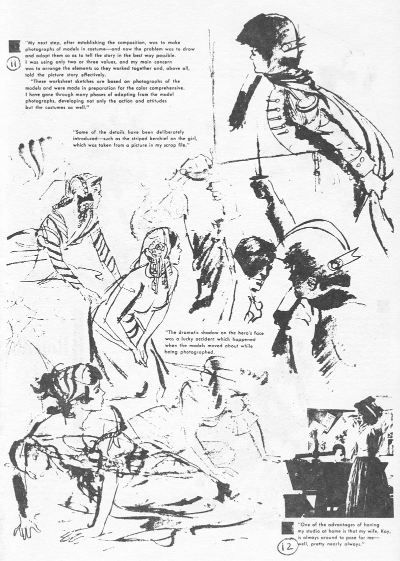
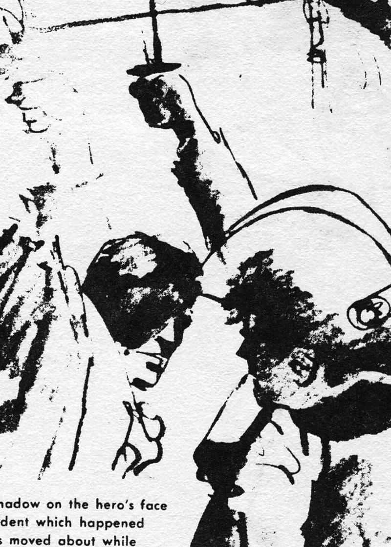
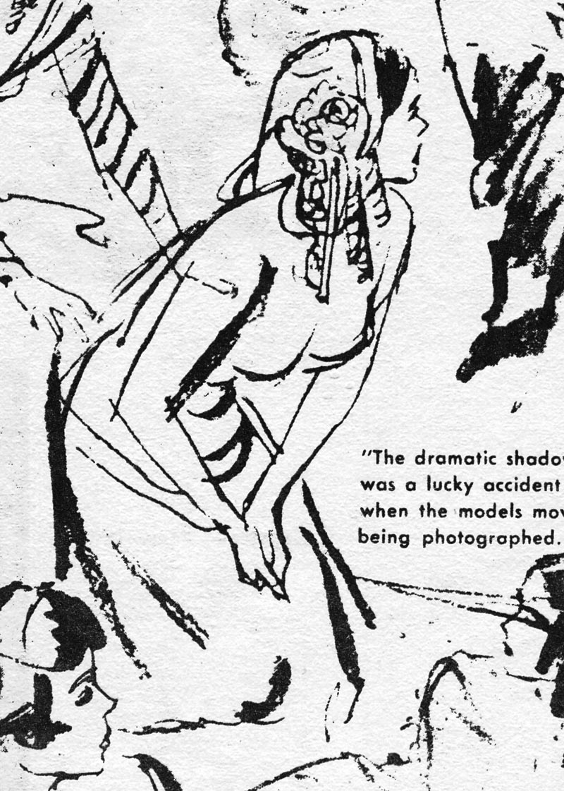
(Below, a page of sketches done for the 1956 Bantam Books cover above, from American Artist magazine, Summer 1957)
Hooks71

GL: What medium is your favorite to work in?

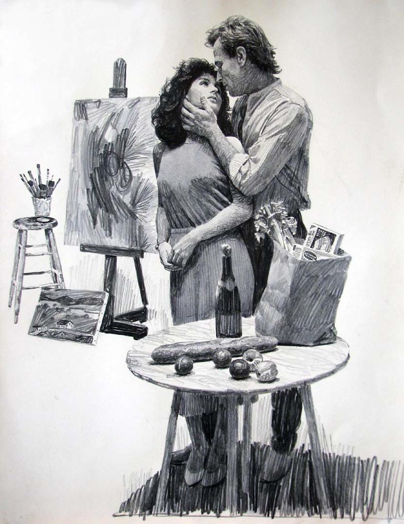
MH: I work in oils. I work in an underpainting of inks, with my basic painting inked over pencil drawings. Then I isolate that with varnish and do the finished painting in oils.

GL: Do you use photographs? Sketches?

MH: All the time. I also use models. If I have some background material that's going to show, if it's at all possible, I go out and photograph it.

Hooks71.detail03


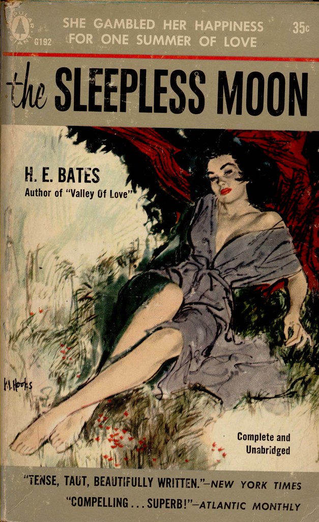
GL: Some of the women you've painted for paperback covers are very beautiful and sensuous, such as the woman on "Sleepless Moon," "Someone to Love," and "Gentle Annie" to name a few.

1957 - Popular Library G 192

GL: Are these models or from imagination?

Hooks71.detail01

MH: They're all models. But I'm like anybody, I appreciate drawing beautiful women, but I like them to have character, to have a niceness about them.

Hooks71.detail02

GL: I think that certainly comes through. They're not cheap or sleazy at all, they have class and elegance, but with a beauty and sensuousness that also comes through.

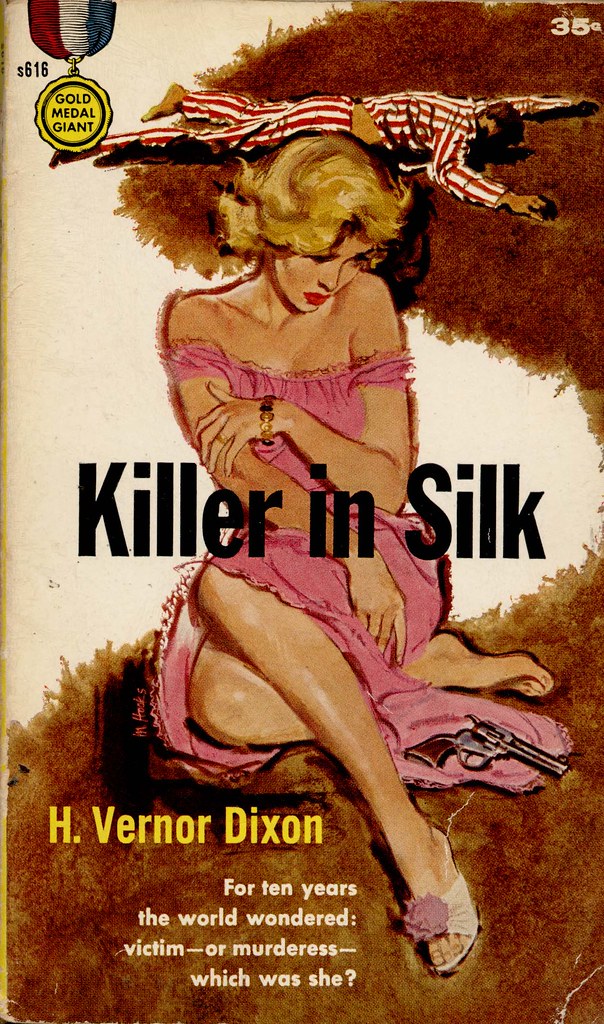
1956 - Gold Medal 616

MH: I'm glad you see that because that's exactly what I always try to show.

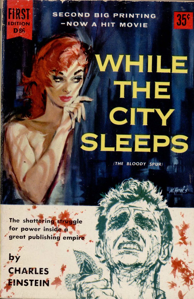
1956 - Dell First Edition 86

GL: I've noticed that some of your covers are done in a very sharp and clear, almost sketch-like linear style;

1956[1969] _ Popular Library 60-2379 _ Mitchell Hooks

... then on newer works, like "The Dying Trade" the art is almost like a photograph. It's almost like different people are doing the painting.

(Below, a Mitchell Hooks painting circa 1990)
Hooks40

MH: Well it is. I've changed... the times have changed. For years I was working in a linear style. I wasn't working in oils then, I was working in wash.

(Below, Cosmopolitan magazine, 1960)
Hooks27

MH: It was looser, more spontaneous, more designy, a slightly impressionistic way of working. It was what I felt good doing then.

Hooks74

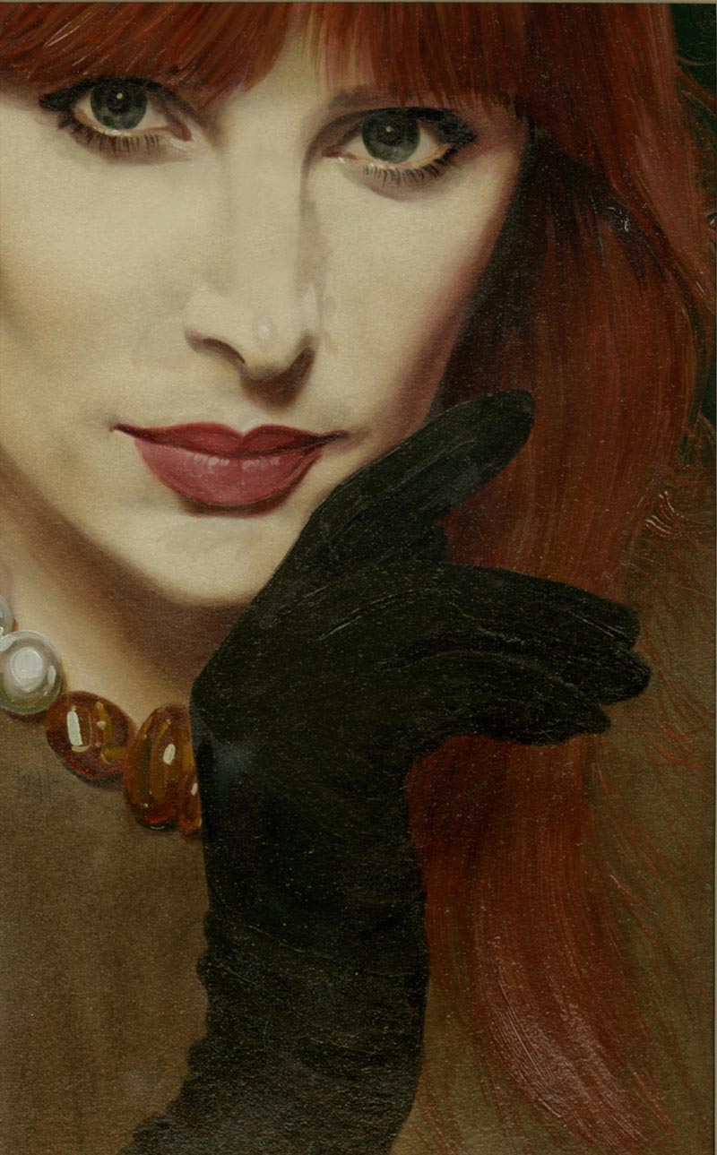
MH: As I say, you've got a good eye. you picked up the differences, but what's happened in recent years is that there's been a change in the market. There's been a change in the art scene in general - not only talking about covers - but in the fine arts, gallery arts too. As you know there's been a shift in recent years to a more realistic way of painting., a return to drawing of the figure. We see it now in galleries and museums where even ten years ago it was not accepted. Now there's been a return to a more realistic way of painting. I changed my work in that direction.

(Below, a 1980s Mitchell Hooks cover painting, "Hannie Richards", courtesy of Joe Jusko)
Hooks73

MH: I did it consciously and deliberately, starting about a dozen years ago, getting away from that line style and going to a more realistic style. It was easy to do because I actually started out as a kid painting very realistically. So what you see in "The Dying Trade" is a very recent cover, and you're right, it's very realistic.

Hooks74

MH: It's the way I work now.


* Continued tomorrow

* The text above is copyright 1988 & 2013 by Gary Lovisi and originally appeared in Paperback Parade #7 (Gryphon Books) 

Gary's website: www.gryphonbooks.com


* Thanks to UK Vintage for the use of his Mitchell Hooks paperback cover scans in today's post.