Tuesday, October 21, 2008

The "biting witty 'Fritz' Siebel"

Long-time reader's will remember Anita Virgil's moving recollections of her late husband Andy's life. During that series of posts, Anita mentioned that one of the other artists who also worked at Rahl Studios (where Andy began his professional career) was Frederick Siebel. Anita called Siebel "Fritz" and fondly described him as "biting witty" and one of the artists whose company Andy enjoyed.


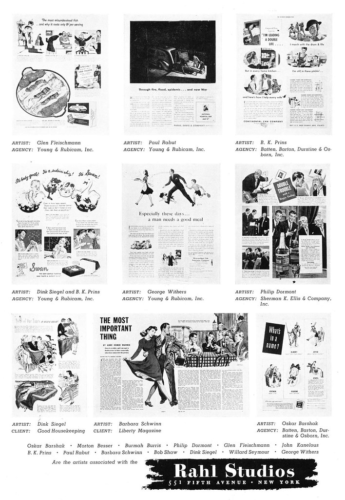
The only ad I've ever come across for Rahl Studios is this one, from the 1942 Art Directors Annual. Siebel isn't listed among the studio's staff of artists, suggesting he was either not yet in the business, working elsewhere, or in the service, like so many other illustrators.

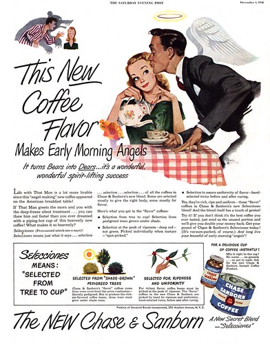
Below, a 1945 ad from the Saturday Evening Post, illustrated by Fred Siebel. Clearly already very accomplished and doing work for national accounts, Siebel must have been at least somewhat established as a professional illustrator.


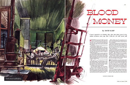
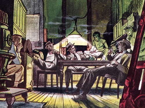
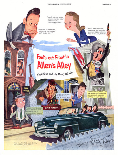
Later, he would become a regular contributor to Collier's as a story artist, contibuting covers and interior art in a variety of styles. Here once again, we see Siebel trying something different that reminds me a little of Denver Gillen's work. Funny though, his success there never translated into any editorial assignments for the Post.


Perhaps Siebel's refusal to stick to one style made him too much of a wild card for the Post's editors. Generally speaking, Collier's tended to embrace a broader range of stylized artwork.


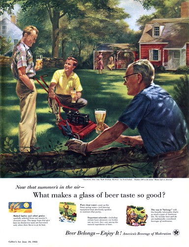
Finally for today, a Siebel painting for the long-running American beermakers "Beer Belongs" series. Some of the best illustrators in the country regularly received these assignments: Haddon Sundblom, John Gannam, Douglass Crockwell and others, a prestigious group for Frederick Siebel to have been associated with.


* My Fred Siebel Flickr set.

* Also, be sure to visit Charlie Allen's Blog today for a 'spaced out' installment of the CAWS!

Monday, October 20, 2008

Frederick Siebel: The Versatile Illustrator

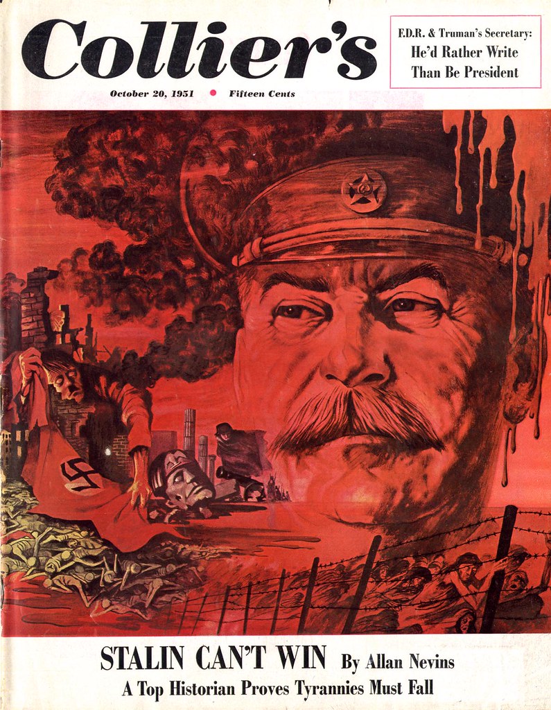
On October 20, 1951, this issue of Collier's hit the stands sporting a remarkable cover by Frederick Siebel. Fifty-seven years later, on October 20, 2008, we begin a week-long look at the work of this versatile illustrator.


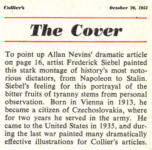
Not much information is available on Siebel. The paragraph below from the contents page of that same issue very nearly sums up everything I've been able to find.


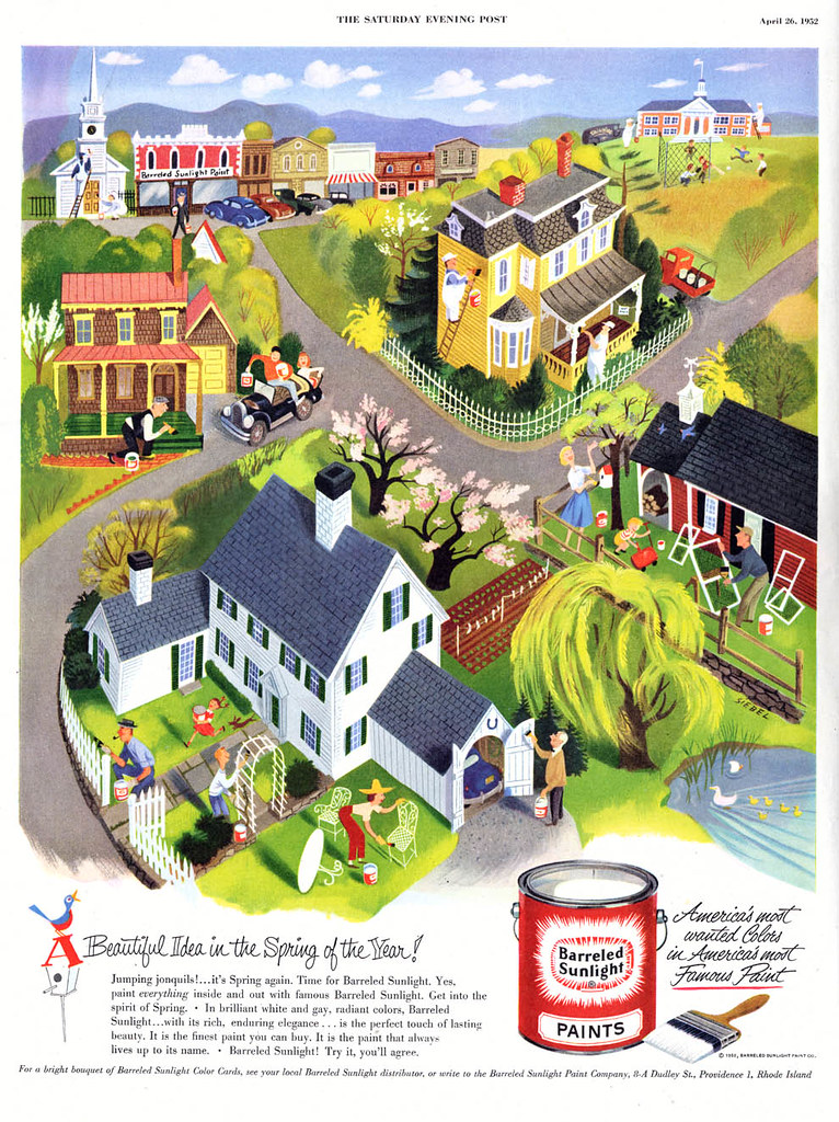
Frustrating, because Siebel was tremendously prolific. Flip though almost any major mid-century magazine and you're likely to come across his signature on ad or editorial art -- or both! Thank goodness Siebel regularily signed his work, because you just never know which style (always appropriate, of course) he'd choose to employ for any given assignment.


Siebel was equally adept at literal realism, exaggerated (cartoony) realism, caricature...


... even storybook styles! How many illustrators can boast that sort of diversity?

Its actually kind of surprising that Frederick Siebel was so successful. The business does not generally reward those among its ranks who do a lot of different things, even if they do them well. Most art directors tend to want to pigeon-hole artists as much as most artists want to specialize in one personal 'look'. Think of all the illustrators whose work you know well, who landed high profile assignments on a regular basis, and try to name five who did work as diverse as what you see in today's post. Try to name three!


I've been setting aside examples of Siebel's work for a very long time, hoping to discover an article about him, or hear from someone who knew him. No such luck. Perhaps someone who knew him will find these posts and tell us more about this artist I find both appealing and intriguing -- the versatile Frederick Siebel.

* My Frederick Siebel Flickr set.

Friday, October 17, 2008

David Stone Martin: "Bending a wire"

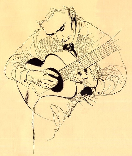
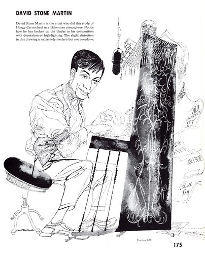
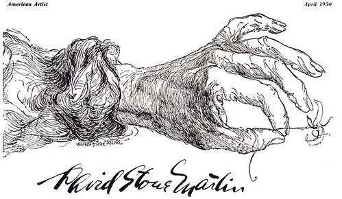
David Stone Martin, writes Henry C. Pitc in the April 1950 issue of American Artist, "is a superb draftsman. He has a penetrating interest in human beings and the ability to reveal character. He has technical mastery. All this is sparked by physical energy and mental curiosity."


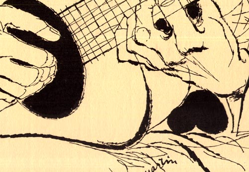
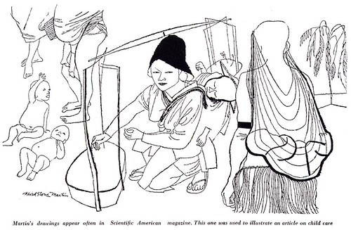
"He has tried practically every pictorial tool, but one of his favorites is the crowquill pen-point. He uses it like a brush, freely, but deliberately. At times he allows it to produce the thin whisper of a line that it is so well fitted to do; then, when he needs emphasis, he applies pressure, the nibs spread to their maximum and a line of about one eighth of an inch appears. The crowquill was never meant to withstand this treatment - they usually live a short but expressive life in Martin's hand."


In his introduction to the book The Art of Drawing with Pen, Pencil and Brush, DSM himself said, "Searching out a line is like bending wire... volume, modeling, shape and motion can all be said in line and wash..."


"... or even more simply by line drawing alone."


Pitz wrote that Martin rarely made sketches unless they were requested by the client. He preferred to work directly in ink.


"He gives a great deal of preliminary thought to his problems, allowing the conception to take shape in his mind's eye."


"Then he attacks the picture directly often working from the model, sometimes from memory, seldom from photographs."


"Not many pictures are discarded, in spite of this direct approach."


"In his studio in Roosevelt, New Jersey, David Stone Martin is safely removed from metropolitan pressures. He has an agent to handle the routine and business side of his work; he can concentrate on the creative solutions of the problems that come to his drawing table."


"All he asks is that the problems be many and challenging."

David Stone Martin is represented in the Museum of Modern Art, the Metropolitan Museum of Art in New York, the Art Institute of Chicago, the Smithsonian, and in the collections of large corporations and private collectors. He died in 1992.

* My thanks to Harold Henriksen who provided most of today's and some of yesterday's scans.

* My David Stone Martin Flickr set.

Thursday, October 16, 2008

David Stone Martin: "...unusual pictures, vitalized by many strange textures"

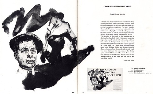
Norman Granz has rightly been credited with fomenting David Stone Martin's status as the premier visualizer of the mid-20th century jazz scene in America. Similarly, William Golden, art director at the CBS Network, should be recognized for nurturing DSM's success in magazine illustration.
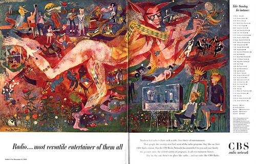

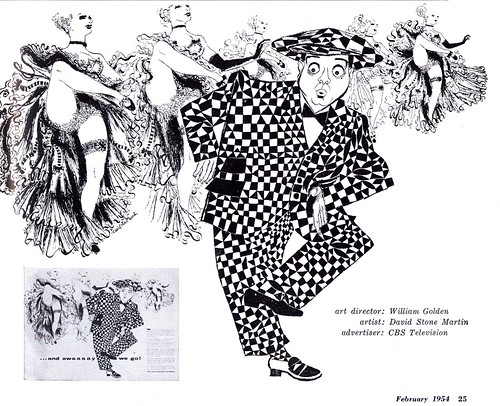
Golden, who worked with DSM in the Office of War Information in the early 40's, was an avid supporter of Martin's post-war freelance career. He frequently commissioned artwork from DSM for the CBS Network's expansive, high-profile print campaigns.
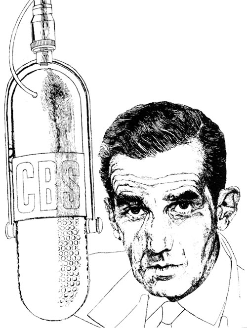

Those ads, which often mimicked the format of a typical double-page spread story layout, went on to win many awards from the New York Art Director's Club -- and likely led some (more daring) magazine art directors to consider DSM for story assignments.
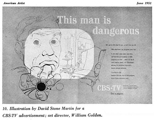

Likewise, credit must go to Martin's rep, Lester Rossin, who never passed up an opportunity to use DSM's work on the promotional pieces distributed to clients. In conjunction, David Stone Martin's work secured a consistent presence in a market described by Henry C. Pitz, author of an article on DSM, as mostly "rigid and inflexible".
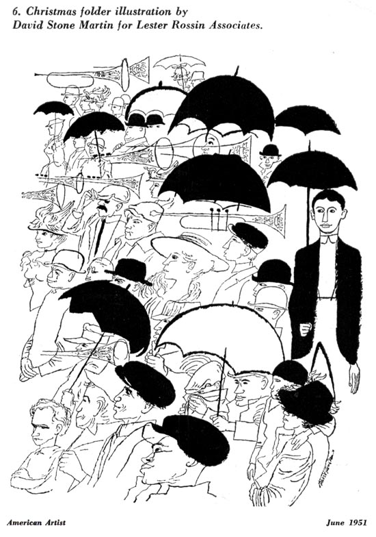

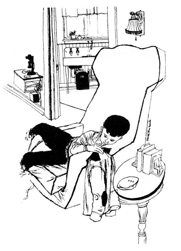
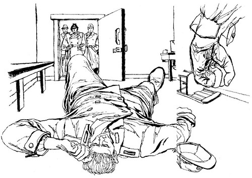
"Smugness and complacency has crept into the make-up of most of our mass magazines," wrote Pitz in April 1950, "built around a great similarity of layout; a too great reliance upon the close-up, with a resulting loss of compositional invention; a parade of stereotyped characters; and an insistence upon a literal and uninspired brand of realism."

From our perspective a half-century later, we may look back on this period with a nostalgic fondness, but Pitz makes a good point - the appeal of the classic 'boy/girl' set up and professionalism of the standard commercial art style of the day may have projected a comforting familiarity...

But familiarity breeds contempt.
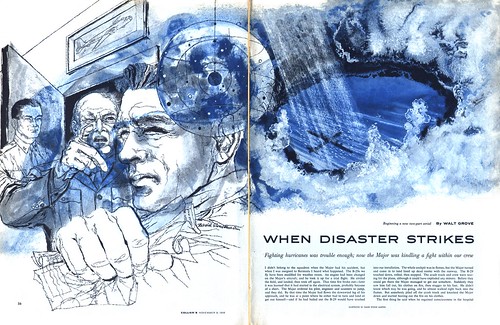

Pitz writes, "The newness of David Stone Martin's visual impact is not a matter of mere novelty. It goes deeper than that. He seems to have in him a union of forces which is becoming visible in other talents and in other fields. It is a true union, natural and without artificial compulsion, of the old and the new - of modernism and tradition."
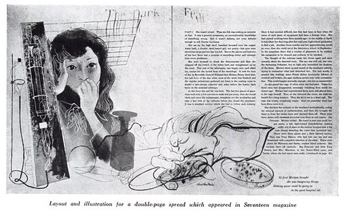

Again, Pitz nails it: the beauty of David Stone Martin's successful entrée into the mainstream is that he understood how to balance the avante-garde qualities in his work with the classicism the public (and the clients) were comfortable seeing.
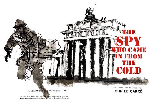

In doing so, he opened the door for other younger mavericks to walk through in the ensuing years. Remember that artists like Robert Weaver, Phil Hays and Jack Potter arrived on the scene about five years after it became normal to see DSM's work in a broad range of mainstream magazines alongside more typical fair from the Cooper Studio and the Sundblom Circle. Because as Pitz explains, "The large men of the beginning years are gone or are going; they have been replaced by disciples and the disciples of disciples. A vision has been contracted into a formula - a small formula that can be readily practiced by thin talents and that is confining as any invented by an academy."

But, writes Pitz, "a younger generation of artist is maturing, a generation that has grown up accustomed to the idioms of modernism, that finds no strangeness in it, but dares to question."
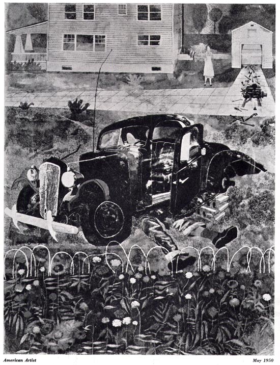

If that generation had been even more readily embraced, might things have turned out differently? As Walt Reed wrote in The Illustrator in America, "by the mid-sixties the traditional family magazine bases for illustration had shriveled as one after another of the major magazines died. Liberty was the first to go in 1950. Crowell-Collier, with its flagship, Collier's, succumbed in 1956. the mighty Saturday Evening Post was discontinued in 1969.

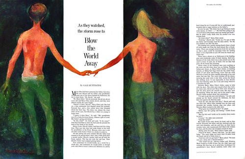
The Post had finally begun granting assignments to David Stone Martin, as in the 1962 example below -- but by then it was too late. And besides, Martin was no longer really creating cutting-edge work. Others were leading the look of illustration... and searching for new markets.


* My David Stone Martin Flickr set.
Wednesday, October 15, 2008

David Stone Martin: For the Record

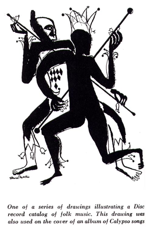
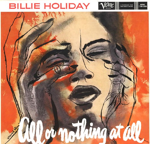
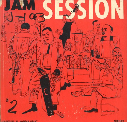
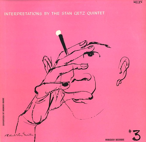
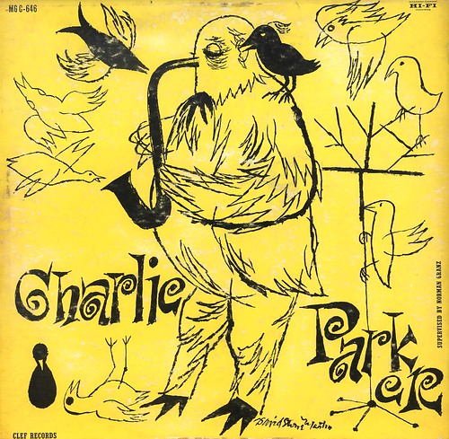
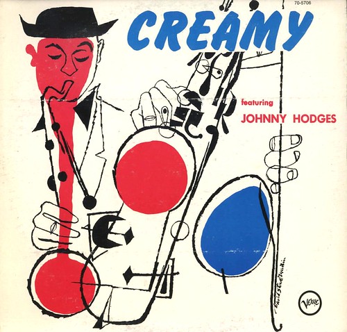
Look around the internet for David Stone Martin images and you'll find no shortage of his album cover art. Especially among jazz enthusiasts, DSM (along with Jim Flora and a few others) defined the look of jazz with his signature 'nervous' line style and modernistic sense of graphic design.


In an article in American Artist magazine from 1960, Robert Jones, art director of RCA Victor Records writes, "A consistently exciting and esthetically rewarding marriage between American art and industry flourishes in the phonograph record business. This country has been the leader in making an artistic success as well as a potent selling tool of what originated as a mere protective package for recordings."


Ten years earlier in another AA article, this one focusing specifically on David Stone Martin, author Henry C. Pitz points out, "[Martin's] designs for record album covers have probably received more publicity than any other phase of his work."


In fact by the time of that 1950 article, DSM had, according to Pitz, already produced "over a hundred brilliant designs for Mercury, Disc and Dial record albums." (From my research on the net, it appears that DSM went on to create approximately 400 album covers!)


In 1951, Pitz again praised David Stone Martin's album cover artworks, writing, "One of Martin's many entries [in that year's Art Director's Exhibition] has received a medal award. It is his album cover design for 'Women Blues' in the series of Disc records. It is typical of the many album designs he has done during the past decade and reminds us of the debt the field owes him for repeatedly demonstrating how much can be accomplished by two or three beautifully integrated line plates.


In spite of Martin's obvious importance as an iconic creator of jazz album cover artwork, detailed information about this aspect of his career is almost nonexistent. Several websites make passing reference his long relationship with record producer Norman Granz, but I was unable to find any recounting of how they met or what lead to Granz commissioning album artwork from DSM, apart from a mention that the two men were long-time friends.


What has survived is the artwork which, over time, has become highly collectable, greatly admired, and often imitated.


Despite the obvious success of DSM's album cover work, the artist felt that some of his best efforts had gone into his story illustrations. Tomorrow, we take a closer look at that aspect of his career.

* Many thanks to the Fox Music Company for generously providing all of today's scans. You'll find many more in their David Stone Martin Flickr set.

Tuesday, October 14, 2008

David Stone Martin: Early Days

David Stone Martin was born in 1913. He had no formal art training, but his passion for picture making was so intense that as a boy he spent endless hours in the galleries of the Art Institute of Chicago. There, in high school, at home and through whatever intermittent art classes he could find, Martin devoted all his free time to learning about and practicing his craft. One of his first jobs was helping to execute some of the large murals decorating the buildings of the 1933 Chicago World's Fair.


He worked on a W.P.A. mural project during the Great Depression and in 1935 accepted an invitation to join the Tennessee Valley Authority in Knoxville as a staff artist. During WWII, Martin joined the Office of Strategic Service as a graphic designer and eventually settled into the Office of War Information as an art director. Here he first met and worked with Ben Shahn, whom he assisted on several mural projects, and several others who were important to Martin's development and growth as an artist: Henry Koerner, Bernard Perlin, William Golden and Henry Koeller. The exchange of ideas and the opportunities for diverse projects, including a stint as an artist-correspondent for Life magazine and Abbott Laborotories made this period extremely stimulating for the young artist.


As the war was drawing to a close, Martin joined the Associated American Artist group where he began doing commercial art projects. He illustrated ads for Lucky Strikes, Abbott Laboratories and other clients. A war bonds poster for abbott Labs was his first truly commercial assignment and shortly thereafter, he began his free-lance career.


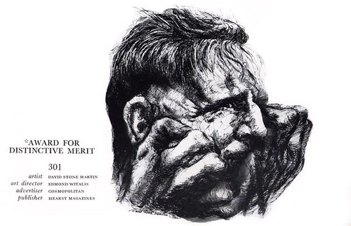
One early project, a hospital book DSM designed and illustrated for the Federation of Philanthropies, won a medal from the Art Directors Club. It was only the first of many awards that quickly followed. Martin won an Award for Distinctive Merit in both '47 and '48. He had 6 pieces accepted in the 1948 Art Directors Annual alone. The publicity propelled him to the top of the business.


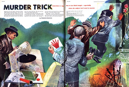
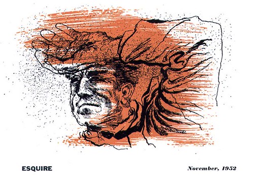
Somehow in the midst of all this activity, DSM found time to teach as well - at the Brooklyn Museum School of art in 1948-49, and at the Workshop School of advertising and editorial Art in New York in 1950, the same year he did this piece for Esquire magazine.


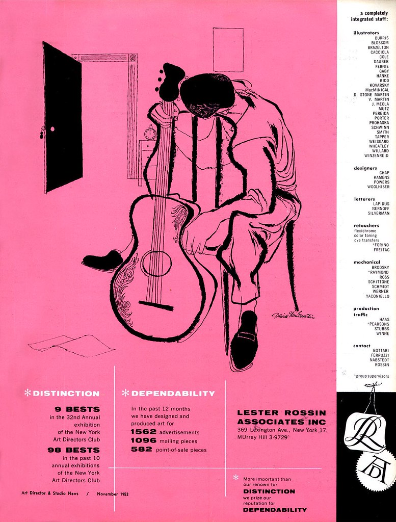
At some point in the late 40's, I'm not sure exactly when, he began his long association with his representative, Lester Rossin Associates. His rep clearly appreciated that they had a trophy in Martin. he produced many promotional pieces for them and his work appeared prominently in all their ads. In the example below, you see the style and subject matter that became synonymous with the name David Stone Martin. His jazz album covers are what he is best remembered for. Tomorrow, we'll take a closer look at some of them!


My David Stone Martin Flickr set.

Monday, October 13, 2008

David Stone Martin: Modernism meets Traditionalism

This one's been a long time in coming. Ever since David Stone Martin's work was first brought to my attention a few years ago, I've been under his spell.


Looking at the broad spectrum of work being done in the field of illustration during the mid-20th century, David Stone Martin, with his signature ink line style and his powerful sense of graphic design, seems somehow to have successfully forged his own path.


For the period in which he was most prolific, when he regularly received the most high-profile assignments, David Stone Martin was a genuine maverick. He brought to the field of illustration a hybridization of fine arts modernism and commercial art acceptability.


Other illustrators trod the safer ground of classical or contemporary literal realism (what I have called the Old School and the New School) but time and again, I've come across pieces by those illustrators that suggest they were seeing Martin's work and incorporating elements of his style in their own.

I would not hesitate to say that even such titans as Noel Sickles and Austin Briggs must have found inspiration in DSM's work and used it as a starting point for their own experimentations.


What's surprising is that there's very little written about DSM, in spite of how influential he was and the many awards he received from virtually the beginning of his illustration career (continuing right up to his induction into the Society of Illustrators Hall of Fame in 2000).


Recently I came across a 1950 article on DSM in American Artist. I was elated! At last (I thought) I have the material that will provide me with the insight I'd been hoping to present in conjunction with DSM's work. And don't get me wrong, that article certainly provides a good amount of biographical material... but there are no quotes, and no anecdotes - no real sense of who David Stone Martin was.


So while we will learn quite a bit this week, I feel we still will not come away satisfied that we have come to know David Stone Martin.


Hopefully though, through these words and this work, we will at least begin to know him.

My David Stone Martin set.
Friday, October 10, 2008

The (Cover) Art of British War Comics: Day 5

Today's entry rounds up work from some of the other notable artists who worked on the British war Picture Library comics .
Nino Caroseli


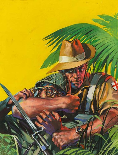
Like his fellow Italians Caroseli moved on from movie posters to war comic covers commissioned through the Milan based D’Ami studio . His earliest British work was for the detective series Sexton Blake but he soon moved over to the war titles and ended up painting almost 200 of them . His painting style was polished and slick like DeGaspari but perhaps without the same sense of the dramatic . On occasions though he could come up with a real classic, like the example here . He would appear to have drifted away from comics in the mid 60’s and I believe he moved over to fine art .


Graham Coton


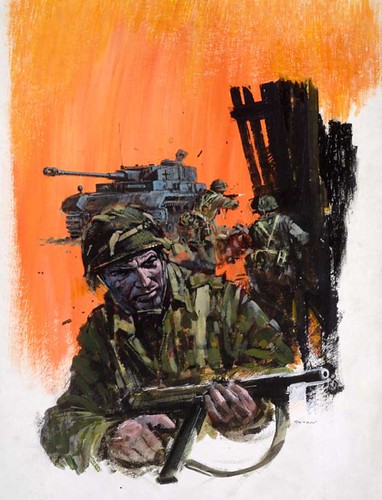
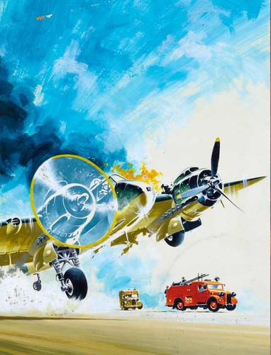
Not all the cover artist were Spanish and the most prolific of all was a Brit – Graham Coton . Coton started out as a comic book artist in the early 50’s and developed an incredibly detailed pen and ink style . Machines and vehicles were his speciality and he drew numerous strips featuring racing cars or aeroplanes . In the early 60’s his covers began appearing on Air Ace though at this stage he was using thin watercolour washes , By the end of the decade he had changed over completely to thickly troweled on oils , painted on enormous sheets of masonite , board or wood. His later covers – of which there must be well over 1000 are typified by grizzled , dirt encrusted soldiers and vast monolithic war machines, gesturally painted in a style that always reminds me of the great John Berkey. Coton was there until the end in 1984 and continued to turn out vast numbers of pictures for Look And Learn magazine and the fine art market .

Jordi Longaron


Best known in the states as the artist of the Friday Foster newspaper strip Jordi Longaron was a much more versatile artist than most people are aware . From the late 50’s to the late 60’s he was absolutely the top Romance artist in Britain providing countless strips the S.I agency to titles such as Valentine and Marilyn . In fact he so dominated the genre that his sleek , pared down style and knack for drawing pretty girls set the style of the genre for over two decades . In between the romance strips he squeezed in over 30 war covers in an ultra – dynamic , gritty style more reminiscent of Jordi Penalva than his own comic work . After Friday Foster was cancelled in the mid 70’s he turned primarily to western paperback covers which combine elements of his war covers with the realism of a Robert McGinnis . I’ve long believed that Longaron ius one of the giants of illustration but sadly his work is almost totally forgotten these days – it’s high time for a revival !

Ian Kennedy


A legend in British comics, the Scottish artist Ian Kennedy has had a long and varied career but his passion remains aeroplanes. Throughout the 50’s and sixties he drew numerous strips about cowboys , ballerina’s or spacemen but he really came into his own in the pages of Air Ace. His comic work was staggeringly detailed and precise and he revealed a masterful grasp of drawing dynamic hardware of all sorts from the most detailed cockpit control panels to rampaging Tiger Tanks , ships , jeeps or planes. In the mid 60’s he began to paint covers in the same tight, precise style that typified his comic work often employing a vibrantly bright palette. In the 70’s he jumped over to Commando and almost forty years laters he’s still there and still creating new masterpieces each month every bit as beautifully as he had in his youth. Kennedy remains one of the most popular artists amongst British comic fans with one of the most recognised styles in the business .

Oliver Frey


The final artist this week is the Swiss-born , but London based Oliver Frey. In 1969 the 21 year old Frey was studying in film school when he approached Fleetway hoping to pick up some easy money to live on. They loved his samples and he went away with a script . After a short while he began painting the covers to his strips and eventually became primarily a painter – his film career long forgotten. Freys work in this period is perhaps less realistic than his peers but he more than makes up for that with a real – in your face – sense of the dramatic and many of the most memorable 70’s covers are his. He went on to paint numerous covers for science fiction and video game projects and has amassed quite a following amongst British fans .

So ends our week peering into the dim and dusty past of British comic books – I hope you’ve all enjoyed it .

* Many thanks to David Roach, British comics artist of Judge Dredd, author, comics historian, and long-time TI subscriber for providing this week's enlightening series of posts! All this week's images are mostly taken from the original art and can be found in David's latest book, "The Art Of War" published by Prion books in the UK. An earlier volume "Aarrgghh It’s War" came out last year and each contain over 1000 of the best war comic covers.

This week's images are © IPC Media.