Wednesday, March 02, 2011

Propaganda = ... Advertising?

The word 'propaganda' certainly carries a lot of negative connotations. I'd say that's thanks mostly to its use in association with any regime that we consider to be our enemy. "Nazi propaganda," "Communist propaganda" ; growing up, that's how I always heard the word being used.

GE26

But go back to the word's origins, "propagare - to propagate", and you discover its true intent was more benign (or at least neutral) than malicious. It related to the gardener's practice of propagating plants by cutting shoots and planting them. Spreading propaganda meant spreading information in the hopes of persuading a group of people to see things your way.

GE22

Richard Alan Nelson defines propaganda in this manner: "Propaganda is neutrally defined as a systematic form of purposeful persuasion that attempts to influence the emotions, attitudes, opinions, and actions of specified target audiences for ideological, political or commercial purposes through the controlled transmission of one-sided messages (which may or may not be factual) via mass and direct media channels. A propaganda organization employs propagandists who engage in propagandism—the applied creation and distribution of such forms of persuasion."

Its political (and mostly negative) connotations really only emerged during World War 1 (and were further refined during WWII).

GE18

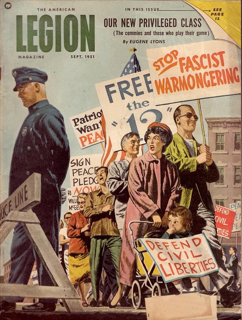
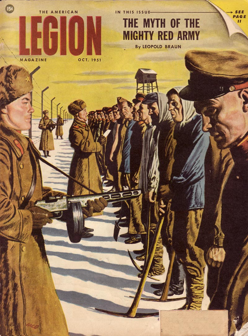
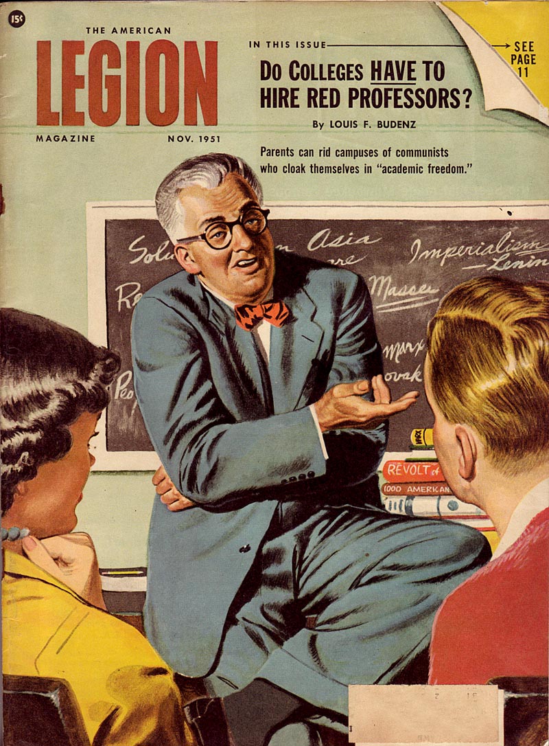
Propagandists on all sides used 'purposeful persuasion' to target their audiences by focusing on some very specific themes: fear,
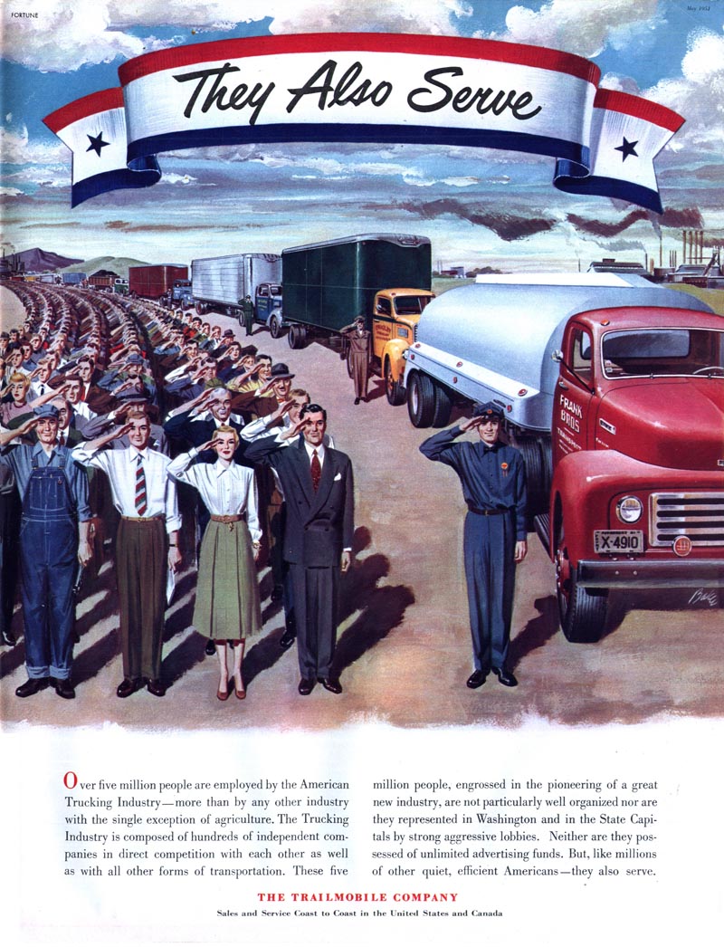
Unknown1004

... patriotism,

Baker05

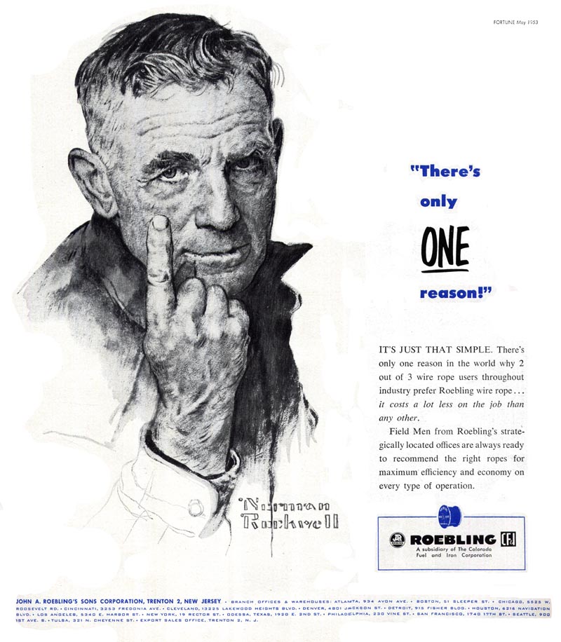
... single-minded focus on a very specific goal,

Rockwell20

... and a sense that power (and empowerment) is achieved through a united front.

Unknown1005

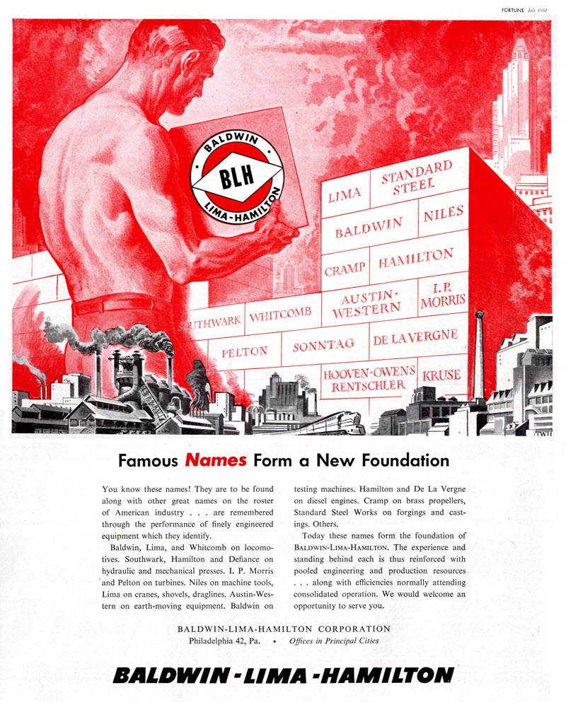
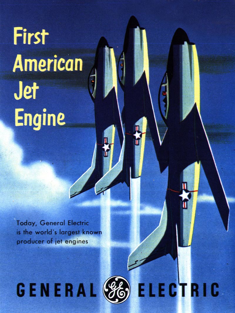
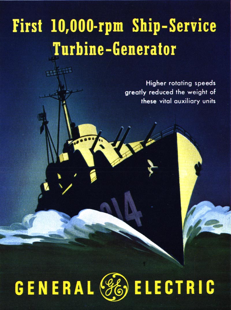
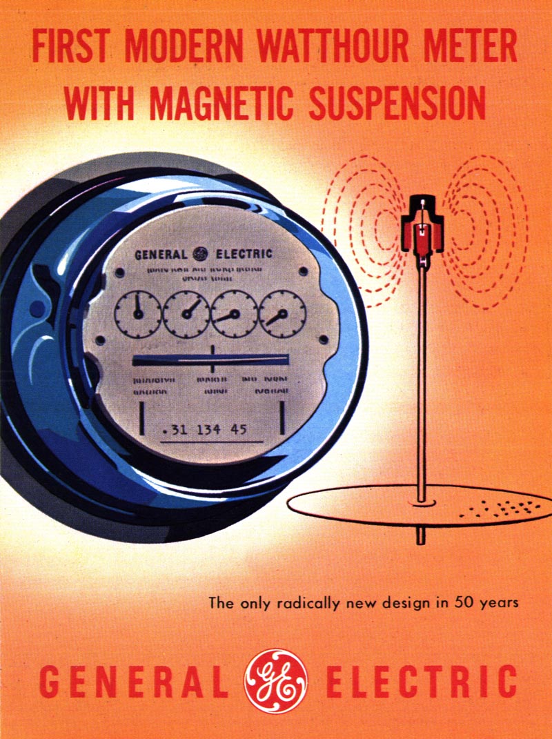
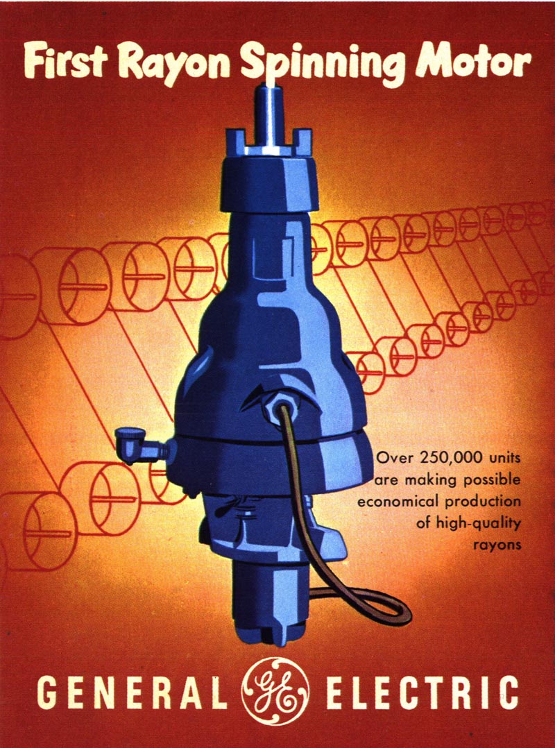
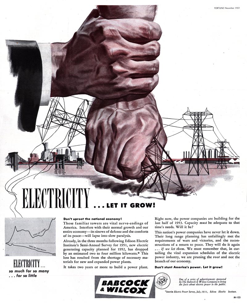
Those same themes continued to be extremely popular with industrial advertisers of the 1950s hoping to 'purposefully persuade' their target audiences.

Unknown1006

Above are some examples from early '50s issues of Fortune magazine. Advertising... propaganda... or both?

* All of these (and many others) are in my Industry Flickr set

Monday, February 28, 2011

The Propaganda of Capitalism

Last week's series of American Legion magazine covers resulted in an interesting discussion in the comments section about Communism, Capitalism and the nature of propaganda. It got me thinking once again about how industry presented itself to the public through advertising during the mid-century. So I pulled out my stack of early 1950s Fortune magazines and found something very interesting.

The cover of the February 1953 issue of Fortune describes how this issue contains an in-depth look at the Soviet military/industrial complex.

Fortune01

Ironically, those 4 articles on Russia share space with an ad campaign unlike any I've ever seen - in Fortune or any other magazine.

GE01

General Electric chose that issue to present a multi-page ad campaign extolling their seemingly limitless accomplishments in industrial innovation.

GE02

The design esthetic GE employed for this campaign - a multitude of propaganda-style mini-posters - is so similar to that seen in Russian Constructivist art, one could easily imagine these posters being produced behind the Iron Curtain by some Soviet "Ministry of Machine Parts."

GE06

Sometimes the imagery (and the message) is fervently militaristic.

GE04

GE10

Sometimes it is aptly industrial.

GE05

Often it is remarkably pleasing, despite some really dull subject matter...

GE07

... and sometimes its amusingly obscure (to anyone but the hardcore technician, that is).

GE08

But what really impresses me is how consistently visually excellent it is. I could stare at these posters for hours. I could see hanging them on my walls!

GE03

Page after page after page of clean, colourful, simple, beautiful poster design - about subject matter I (and I'm guessing most other people) have absolutely no interest in!

These posters make the dull, utilitarian mechanisms of industry seem like something actually worth celebrating!

GE09

But then, isn't that the role of advertising... and propaganda?

* You'll find many more examples of mid-century 'industrial propaganda' in my Industry Flickr set.

Wednesday, February 23, 2011

The Great Al Hirschfeld

Toby Neighbors has put together another fantastic tribute to a mid-century illustrator - this time its the great Al Hirschfeld. Visit Toby's site, illostribute.com for an extensive biography of Hirschfeld, a nice selection of his art and, of course, a whole series of wonderful 'tribute' pieces by contemporary illustrators!

Hirschfeld13

Hirschfeld11

Hirschfeld12

Hirschfeld10

Hirschfeld09

Hirschfeld08

Hirschfeld07

Hirschfeld06

Hirschfeld05

Hirschfeld04

Hirschfeld03

Hirschfeld02

Hirschfeld01

Hirschfeld14

All of today's images are © The Al Hirschfeld Foundation

More at illostribute.com

Tuesday, February 22, 2011

A Little More Lucia

Another gift from Steve Scott - one I'm particularly thrilled about: a 1956 magazine cover by Lucia Lerner - wow!

Lucia50

And a scan of the interior story art as well.

Lucia49.detail01

Lucia is one of my absolute favourite mid-century illustrators. If you're a new reader and would like to learn about her career, I collected the installments originally presented here on Today's Inspiration and republished them as one long story here.

Lucia49

Steve very kindly sent me scans from another story in that same issue of Redbook - this time by Walter Skor.

Skor04.detail01

Skor is an artist about whom I've never been able to find very much information... but he certainly did a lot of terrific work for various magazines back in the '50s, so expect to see more examples here some time soon!

Skor04

Once again, many thanks to Steve Scott for providing these great scans. Please visit Steve's blog, which celebrates the work of author John D. MacDonald. You'll also find many wonderful illustrations from various magazines and paperbacks by the illustrators featured here on TI.

Monday, February 21, 2011

American Legion Magazine, 1951

A couple of weeks ago my friend Steve Scott sent me an email:

"I purchased a lot of old American Legion magazines, as one of them contained a John D MacDonald story I was looking for. I now own all twelve issues from 1951, plus a few more, and noticed several familiar names -- familiar to me now thanks to following Today's Inspiration. I thought I would send them along to you for your collection."

AL01

What a great surprise! These covers are priceless. Not only are many of them by some of my favourite mid-century illustrators (like this one directly below by James R. Bingham)...

AL02

... but I also love their portrayal of American society of that era.

AL03

AL04

Often that portrayal is not dissimilar from what one might find on the covers of The Saturday Evening Post or Collier's...

AL05

AL06

... but sometimes there is a distinctly right-of-center editorial message that I suppose must have seemed perfectly appropriate to American Legion subscribers (and probably a significant portion of the broader American population).

AL07

This was, after all, the beginning of the Cold War era. Communists were everywhere!

AL08

Here's my favourite cover of the year. I love the tag line on that subhead: "Parents can rid campuses of communists who cloak themselves in "academic freedom." As Steve wrote in his note, "a typical left-wing college professor poisoning the minds of his students. I think the bow tie says it all." Yes. Yes it does.

AL09

AL10

Steve sent quite a few more American Legion covers, which we'll look at on another day. For now, to all our American friends, Happy President's Day!

* Visit Steve Scott's blog, which celebrates the work of author John D MacDonald and offers many great examples of mid-century art! Thanks again, Steve!

Friday, February 18, 2011

Robert Fawcett and Manuel Auad on Doing Your Best Work

Excerpt from David Apatoff's text in the new Robert Fawcett book:

As his work matured, Fawcett continued exploring new ways of making images. He was always willing to abandon conventional wisdom and experiment with new tools and techniques in his work. he told students, "There are no hard and fast rules. The more you look for them as crutches to support you, and the harder you try to produce something which 'looks professional' because it follows some procedure which you believe is standard..."

Fawcett163

"... the more you will stifle your own creative ability."

Fawcett161

Art Director Howard Munce described Fawcett's highly unusual approach to foraging for drawing tools: "Bob had a habit of poking around the studios of his friends and finding beat-up brushes that had known better days. The owner was always amused and pleased to give them to him when he showed an interest. Back in his own studio, he'd give the tired discards a shave and a haircut with a sharp blade and refashion them to suit his needs."

"Mostly he made wedged tips of various angles to serve special functions in his illustrations. In his hands, an old brush would begin a new life. he might use it to stroke in lines, to indicate a bit of rococo moulding, or to scrumble in a particular texture. But however he used it, it would always leave his unmistakable imprint."

Fawcett160

[Fawcett] urged young artists not to compromise to satisfy popular taste. "Young illustrators will not find guidance by studying the currently popular. The popular is usually just on its way out."

Fawcett164

He also warned young artists about the consequences of failing to do their best possible work: "The argument that 'it won't be appreciated anyway' may be true... "

Fawcett159

"... but in the end this attitude does infinitely more harm to the artist than to his client."

Fawcett162

Excerpted from David Apatoff's text in the new Robert Fawcett book

And speaking of doing one's best work, here are some final thoughts from Editor/Publisher, Manuel Auad:

"Some transparencies that were taken from the originals, and I have to assume that when they were made, the colors from the illustration were already fading. I spent many hours trying to make sure I didn’t overcompensate with the colors and have them end up looking like neon signs... Since Fawcett’s colors are rather subtle and understated it made it rather difficult to try and bring it back to its original colors. In some cases I would have to scan an image from a tear sheet, and then place it over a transparency, thus, getting the best part from each. Above all, I tried to stay as faithful to what Fawcett’s illustration should be. The other ‘obstacle’ I came across was to eliminate moirés as much as possible without losing the quality of the image. At times it seemed like after solving one problem another would pop up."

"I can’t recall when I worked as hard as I did with the Fawcett book. But I enjoyed every minute of it. It was always a labor of love for me."

"The other day I received a letter from a doctor from Idaho and he wanted to know what moved me to produce this work. I said to him; I suppose I could give you several answers to your question, but in the end, it simply comes down to a dream that you carry with you for many years."

"I believe, if you dream long enough, the dream eventually happens."

The new Robert Fawcett book is available now from Auad Publishing.

Fawcett120