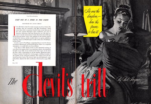
What the heck was up with Austin Briggs in 1951?! Not only does he paints a naked male butt for Cosmo, but he takes "the clinch" romance scenario way past "torrid" and all the way up the scale to "erotic". This is what one might call "pushing the envelope".
Just take a look at this piece (take a long lingering look) and marvel at how thoroughly successful and accomplished it is in every way - Briggs has rendered a true masterpiece evoking a sense of true passion that must have taken the breath away from every woman who flipped open the magazine and set eyes upon it back in 1951.
I think its as powerful an image today as it was 55 years ago.
That's a great posting, Leif. I have two reactions: first, Austin Briggs was a genius and it is always a treat to see his work. I'm glad you're doing a series on him this week. Second, the art director for Good Housekeeping during this period (I believe it was Frank Eltonhead) was the single worst art director in the history of the universe. He vandalized countless illustrations by talented artists such as Briggs, Gannam, Parker etc. with these noisy, garish inserts. It was rare for him to superimpose less than three different styles or type faces on a single illustration. I appreciate that some of it was the fashion back then, but IMO Good Housekeeping was the worst.
ReplyDeleteWell... I hadn't really considered art director Souren Ermoyan's page design or type elements as ugly or intrusive, David, but in trying to see it from your perspective I suppose things could have been handled with greater sensitivity.
ReplyDeleteIn general though, I really like the approach Ermoyan and the other AD's used back then in designing the page.
"Single worst art director in the history of the universe" *whew*... that's harsh. ;-)
If the art director was Ermoyan back then (I believe his wife later went on to write a classic book about the great illustrators) I apologize for slandering poor Mr. Eltonhead. I have some originals from Good Housekeeping circa 1954-56 by John Gannam and Joe de Mers. When I compared them with the printed version, I found that the art director (at that time, Eltonhead) had chopped off about 30% of the picture and superimposed those inserts on some important and lovely details. I recognize the AD has to make room for the title and some text, and perhaps even some little star burst "grabber" or comment. But in the samples I've seen, Good Housekeeping was a prime offender at selecting intrusive and incongruous sizes, colors and type faces. They hired good people, but they didn't seem to respect the integrity of the artwork the way that the Post or Colliers did.
ReplyDeleteYou're right about "the universe" crack. How about if we limit it to the solar system?
LoL - ok, David, I'll take that as a reasonable compromise. ;-)
ReplyDelete