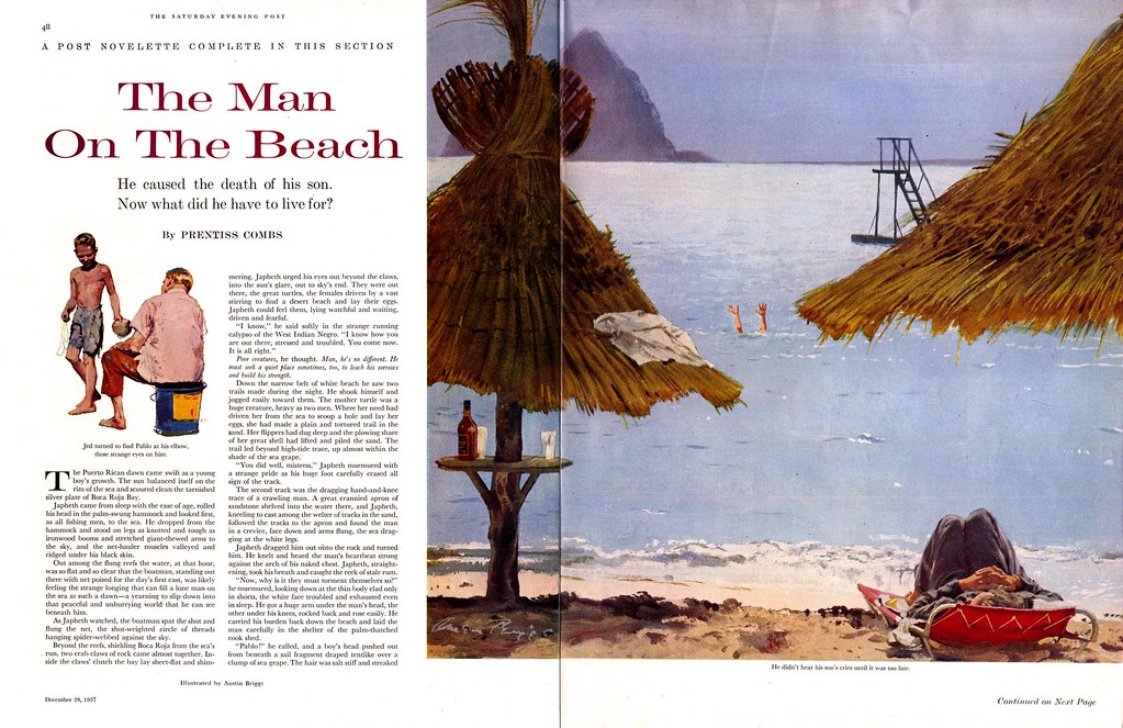
What other illustrator but Austin Briggs could have come up with such an interesting concept for this story of a man who has lost his son to a drowning accident? Briggs paints for us a sun-dappled Puerto Rican bay straight out of a tourist brochure - and then we see the two struggling hands in those placid waters.

The image is at first surreal, absurd, even amusing - until we comprehend the full horrifying implication of what we are seeing: "He didn't hear his son's cries until it was too late."

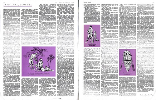
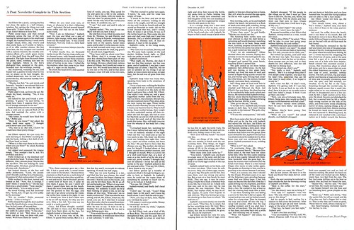
This Saturday Evening Post novelette provides the Briggs aficionado with a real bonus gift... beyond this spread are three more, each featuring three line drawings, for a total of eleven Austin Briggs illustrations in one article.

You can see all those pieces at a good large size in my Austin Briggs Flickr set.
Interesting post , thanks for sharing.
ReplyDeleteLook at how masterfully Briggs controls the viewer's eye. The picture consists largely of two dark triangles, and where their two points almost touch, he leaves a small bright space with two frail arms sticking out of the water. With any other composition such tiny arms would be lost, but here it is as if two huge arrows are pointing right to the boy.
ReplyDeleteBriggs was too good to be obvious about his stagecraft; the thatched roofs are slightly different sizes, on slightly different planes. It never occurs to you that you are being led by the nose, yet there you are.
Very well put, David - thanks for that! This would have been a perfect example for the composition and pictorial design section in the FAS course. ;-)
ReplyDelete