You've heard the expression, "He's got a great face for radio"? If one transposed the concept behind that expression over to illustration, perhaps one might say of Noel Sickles, "When it comes to full-on painting, he makes a great line art illustrator". I mean "line art" in the broader sense, because Sickles' chiaroscuro inking technique gave his black and white art an incredible range of tonality as well as a painterly quality.
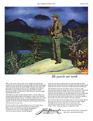
Sickles' colour work was most successful when it was transparent colour over black and white art. When the artist attempted to work with opaque paints, the results were less than spectacular.
 The fact that Sickles is so rarely represented in magazines like the Saturday Evening Post compared to the likes of say, Fred Ludekens or Bruce Bomberger (when it comes to the kind of fully painted adventure assignments for which he seems so perfect) might confirm my suspicions that the ADs also did not consider him as their first choice.
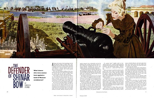
 But not to disparage Sickles; because underneath those paintings was a fabulously strong composition and rock solid drawing. I messed around in Photoshop with these two pieces in an attempt to get across what I mean.
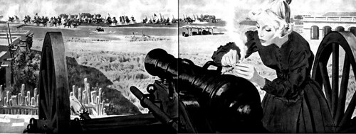
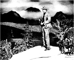
Here one can almost imagine what Sickles' initial pencil and ink treatment might have looked like. Sickles once said, "Rather than work in minute detail all over my drawing, I have found that if I take pain to use careful and exact detail in the right places... I can handle the balance of my drawing in a broad fashion. The eye will infer a complete statement from such indication." This was the essence of what made Sickles' work so brilliant. Even in his less successful painted work, that quality shines through.
Sickles' technique has been related to impressionism because he broke everything down into light and shade. Many great oil painters, such as John Singer Sargent, have stressed the importance of simplifying a picture's values into two or three ranges (shadow, midtone, highlight). Sickles perfected this approach in his black and white work.
ReplyDeleteHis only flaw seems to be that he just couldn’t get rid of the black. I wonder how much knowledge he possessed on color theory?
Still any colorist could take some lessons from his mastery of value simplification.
Well put, Jacob. I find Sickles, like Fawcett, could not escape his deep roots in b/w comic strip art (or perhaps didn't care too). As you know from reading the Comics Journal interview, Sickles was self-taught and enjoyed experimenting - but I don't get the sense that he would have sat down to study tried and true art course colour theory. Perhaps that speaks to why his paintings (at least the few I've seen) leave something to be desired.
ReplyDelete