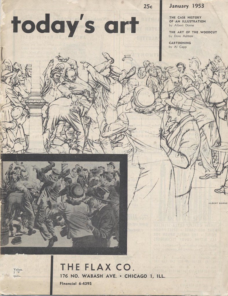
 My friend, David Apatoff (who's always excellent blog, Illustration Art is required reading for anyone who visits this site) must have been reading my mind, because a couple of days ago he emailed me the scans below. "I'm forwarding you a short article with some examples of Dorne's great drawings of a crowd scene," wrote David, "hopefully you can make something of these."
 So here we have a real treat: a behind-the-scenes look at how a master illustrator designed a complex composition. Many thanks to David for his generosity in contributing this delightful and informative article!
To read this article and see Dorne's sketches at full size, go to my Albert Dorne Flickr set, click on an image, then on the "All Sizes" tab.
Oh, that's beautiful. They're going straight into my reference folder, along with the scan yesterday of the "how-to" for wrinkles and folds. (Incidentally, that woman with her back to us in the foreground appears in both).
ReplyDeleteThat's good to hear, Colin. I recommend you try ebay for a set of FAS binders - they're chock-full of similar instructional and inspiring art!
ReplyDeleteYou are too kind, Leif.
ReplyDeleteAfter all this time, your blog continues to live up to its name. You do provide inspiration in daily increments. Thanks for an informative week of Dorne. I saw some new work I'd never seen before. Can you imagine living in a world where "Mr. Coffee Nerves" was viewed as sophisticated advertising? Or that hilarious poster about vacationing at home by sitting in front of your electric fan with your dog? Too much!
Coming from you, David, that's high praise indeed - thanks!
ReplyDeleteYes, it is funny how that element of hokiness in much of Dorne's work was viewed as sophisticated - indicative of the times, I guess. And that brings me to *next* week's theme...