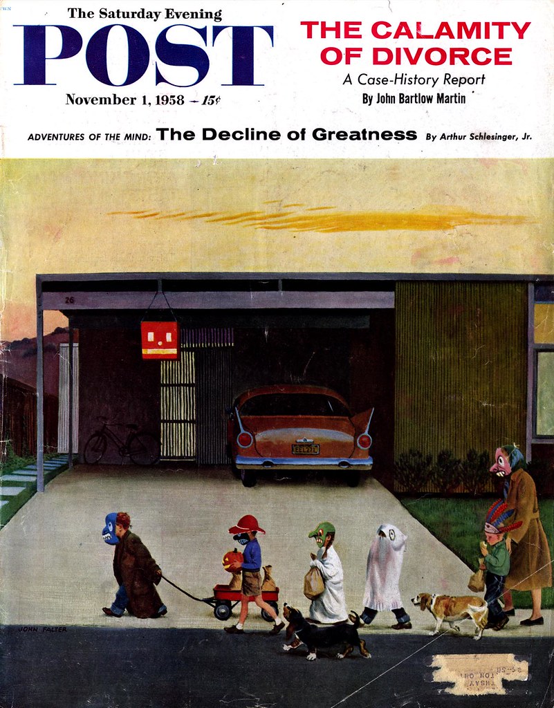
 When I look at this illustration by John Falter, I'm reminded of the stripped-down environments Charles Schultz used to draw his Peanuts characters into during the early years of his strip: the shoebox houses, inconsequential trees and indoor/outdoor carpet lawns, devoid of landscaping, that represented 50's suburbia. here Falter presents us with a more fully realized version of Charlie Brown's world.
 John Falter(1910-1982) has never been one of the illustrators of the 50's that I really get worked up about. But here he has captured a quality of typical childhood experience that is so astute and understated that it is spectacular in its mundanity.
I can't disagree with any of what you say there, neil - I think you're dead on. Normally that's what turns me off about a Falter piece, but as I wrote, its that mundanity that I think works so exceptionally well in this particular case. ;-)
ReplyDeleteI agree, Leif. I think Falter captures the sheer tedium of the life in suburbia (then and now) with it's flatness and predictibility. The mother with the mask is just doing her job totally without inspiration or excitement. I want to believe that the owners of the house the group is travelling in front of have some personality due to the whimsical pumpkin head/ lantern hung in front of the garage. Your thoughts?
ReplyDeleteThanks for your comment, q. - actually I think the pumpkin head lantern, with its minimalist design, is another fabulous confirmation Falter is giving us of the dispirited nature of the suburbs. No involving decorations here - just this one blockhead lantern stuck up in the corner of the garage.
ReplyDeleteTruly, the more I analyze it, the more I come to appreciate the subtlty with which Falter expressed his opinion of suburban living.
Nice to know that at some time some editor at SEP picked a real offbeat piece of art for the cover. Thanks, as ever, for this, Leif.
ReplyDeleteAnyone remember a John Falter documentary decades ago on PBS? I remember the told a story about an illustration he did that had a picture of a portrait that could be read as either Abraham Lincoln, or a nude woman.
ReplyDeleteMike; Thanks - and don't dispare - there are actually quite a few off beat SEP covers (which we will look at now and then)
ReplyDeleteBenton; Abe Lincoln and a naked lady portrait?! Are you playing a trick on us for Hallowe'en...? ;-)
I don't get a sense of tedium or dispirited nature of suburbia. Rather think that Falter painted what he saw. That suburb is probably new, that's why it looks flat and unlandscaped. If you were to visit it now, you'd see a more lived-in landscape.
ReplyDeleteI see the mom-in-mask as more slyly humorous than just "doing her job." As someone who is roughly a contemporary with the ilustration, and who grew up in a smalltown suburb, this picture rings my deja vu bells.
And I can tell you that kids can make an adventure out of -- and transform -- even the "sheer tedium" of a newly-born suburb.
Thanks for reprinting this piece!
No doubt, Robert - and your opinion about it is as valid as any. I'm filtering my opinion through a bias agains subdivisions and your is coloured by fond childhood memories.
ReplyDeleteI've read that Falter grew up in a small town in Nebraska in the early 1900's - long before the concept of suburbia existed. His memories of his own childhood environment would have been quite different than this. Whether he felt the subdivisions of the 50's were a good or bad thing - or if he cared at all - is anybody's guess.
But I like to think he was expressing an opinion about it through his choice of composition and placement here: middle horizon, flat-on, festive decorations almost completely absent, and body language suggesting very little excitement.
That's just how I read it. :-)
a real sense of the time, but those masks just look so fake. painted on, as it were....
ReplyDeleteThat's beautiful. It's interesting how the mother is wearing a mask, too. Paging Dr. Freud??
ReplyDeleteThere aren't any "involving decorations" because this illustrates Halloween in 1958. It was nothing like what it is today. I lived in England in the 80s and coming back to America in the 90s I was stunned at how much Halloween had grown even over that one decade. For instance there were no "halloween lights" for sale in the stores in the 70s. At the most you would have seen an aisle with plastic masks and a few packaged costumes. In the 50s far less so.
ReplyDeleteNo doubt that may have been, anonymous - I wasn't there and it sounds like you were so I bow to your first-hand experience. But this isn't reality, its an artist's interpretation. Falter had the opportunity to illustrate whatever kind of "reality" he wanted to - and he chose the most mundane reality in every possible way so...
ReplyDeleteCharles Schultz could say more with a few lines of India Ink than many artists could with a gallon of oil paints. I lived (happily) through those years and Schultz nailed the mood with artistry and humor. He also taught me how to read! Life can be tedious in SoHo, North Beach or Oshkosh. Life is what you make it. Leif, thank you for your incredible contribution to the preservation of mid-century American illustration. MR
ReplyDeleteThanks for your comment, marble river. I spent my formative years in a 50's subdivision transformed by 20 years of maturation and even then it reminded me of the neighbourhoods in my Peanuts paperbacks. Like you, Schultz taught me to read - and how to draw, since copying Snoopy out of those paperbacks was my first lesson in what would one day become my career.
ReplyDeleteI really appreciate everyone's comments and I'm glad the topic has struck a chord for so many people. I've been thinking about doing a week on the 50's migration to the suburbs, and the response here has given me the inspiration to follow up on that - so stay tuned for next week! ;-)
I'm looking forward to that week about suburban migration in the 50s. Here's a book recommendation -- HOLY LAND: A Suburban Memoir by D.J. Waldie. It's Waldie's memoir of the creation of and his growing up in the enormous LA suburb of Lakewood. Think he may still live there.
ReplyDeleteAnd thanks to boing boing, whose like led me to your blog.
Hey - thanks for the recommendation Robert, I'm goint to look up that book and educate myself a little further on the subject.
ReplyDeleteLeif, here is a link to a photo of the beginning of suburbia (as we know it) in my hometown of Hamden, CT, The picture was taken ca late 50's early '60s. The huge greenhouses are Krott Tomato Farm, and that is the brand new Knob Hill development at the top of the photo. Interesting, no? - MR
ReplyDeletehttp://tinyurl.com/y4utyf
VERY interesting, marble river, in a chillingly familiar way: I witnessed a similar scene from a similar angle (thanks to the unique topography of my city) about twenty years ago.
ReplyDeleteThanks for the link!
Some clarification on the Abe Linclon/nude thing...
ReplyDeleteIf I remember correctly, the cover was a picture of someone's basement with all kinds of misc. junk in it.
In a corner somewhere, there was what looked like a portrait of Abe Lincoln's profile, but could also be interpreted as a nude woman. This was a little "Joke"
Falter put in, but it caused quite an uproar in the 50's.
I mention it mainly because I want to know if anyone else remembers or knows of the documentary. It was an "America Masters" type thing.
Thanks for that Benton - perhaps someone who reads this will enlighten us - sounds like a pretty amusing anecdote! ;-)
ReplyDeleteI haven't seen the Falter documentary, but have a couple of suggestions as to where you might find out about it.
ReplyDeleteThe Curtis Publishing Co, publsher of the Sat Evening Post, is still around and presumably their licensing dept would have given the OK for any of Falter's Post illustrations used in the film.
The Museum of Nebraska Art did a Falter exhibition last year, maybe someone on their curatorial staff has the info.
Good luck in your search, Benton.
This comment has been removed by a blog administrator.
ReplyDeleteIn my last post, I wanted to mention that I found Falter one of my favorite illustrators of the era. I see that you may not agree. I have never been very fond of this piece (mostly because I distrust people who can't draw a car right; makes me think of some bad Steven Dohanos illustrations), but I admit it's got something special. It's very untypical of his work, yet. I think you should take a look at the Falter pages in the site I've already signaled ( http://www.fulltable.com/vts/aoi/index.htm ), and what Chris Mullen says about him. You might change your mind.
ReplyDeleteThanks for that, Ted - on your recommendation I will definitely keep an eye out for more of John Falter's work. ;-)
ReplyDeleteIt is very interesting to read through the commentary on Falter. As a representative from the The Post archive, I can tell you behind Rockwell and Leyendecker the most merchandised goes to Dohanos and Falter. Their artwork hands down appears on product more than the others. Perhaps a comprehensive look at all the Falter covers would change everyone's mind?
ReplyDelete