
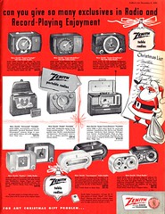
Seems like back in the 50's every art director charged with laying out an ad featuring anything from teevees to toasters arranged his square-ish product photos and type elements and then came to the conclusion that some sort of little cartoon element was needed to seal the deal.
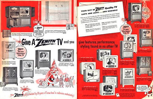
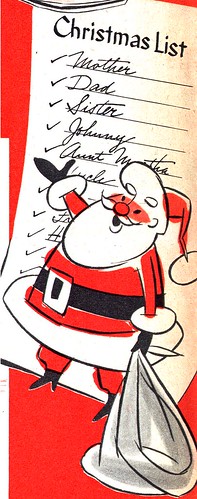
More often than not the job of providing these clever little stylized artworks was passed to that studio/ad agency/printing house's staff artist - a talented multi-tasking jack-of-all-trades who could go from pasting up an art board to rendering a happy family to fill the hole in an ad's layout.
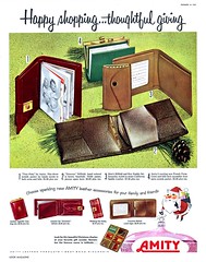
I'll bet that sometimes it was an aspiring young illustrator who would go on to a full-time career of drawing and painting who rendered these unsigned spots. But just as often - more often, I suspect, it was probably the job of a seasoned studio vet. Somebody who preferred the security of a 9-to-5, in spite of the mostly mudane day to day tasks, over the "thrill" of full-time freelance illustration.
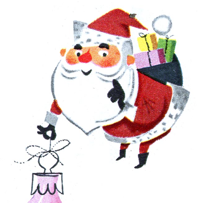
In spite of their anonymity, these talented folks deserve a little recognition for the work they did. The multitude of stylistic variations they producedare not only a reflection of their individual personalities, but are part and parcel of "that 50's look" we all intrinsically know and love so much.
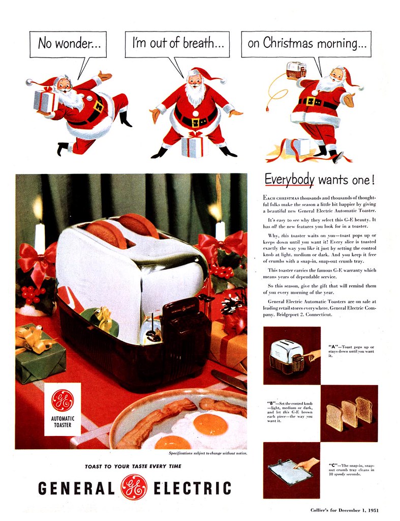
You'll find today's illustrations and a whole bunch more in my most popular Flickr set:
Ads with Cartoon Elements.

 Seems like back in the 50's every art director charged with laying out an ad featuring anything from teevees to toasters arranged his square-ish product photos and type elements and then came to the conclusion that some sort of little cartoon element was needed to seal the deal.
 More often than not the job of providing these clever little stylized artworks was passed to that studio/ad agency/printing house's staff artist - a talented multi-tasking jack-of-all-trades who could go from pasting up an art board to rendering a happy family to fill the hole in an ad's layout.
 I'll bet that sometimes it was an aspiring young illustrator who would go on to a full-time career of drawing and painting who rendered these unsigned spots. But just as often - more often, I suspect, it was probably the job of a seasoned studio vet. Somebody who preferred the security of a 9-to-5, in spite of the mostly mudane day to day tasks, over the "thrill" of full-time freelance illustration.
 In spite of their anonymity, these talented folks deserve a little recognition for the work they did. The multitude of stylistic variations they producedare not only a reflection of their individual personalities, but are part and parcel of "that 50's look" we all intrinsically know and love so much.
 You'll find today's illustrations and a whole bunch more in my most popular Flickr set: Ads with Cartoon Elements.
Santa and Superman both have something in common besides the color of some articles of their clothing. Cool illustrations.
ReplyDeletethetermpapers.org