
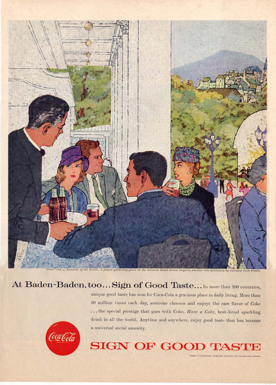
While Pepsi stayed the course with its Sociables series of ads, Coke, which was running photographic ads that year, suddenly commissioned a dozen illustrations by a relative newcomer, Jack Potter, whose style could certainly be described as 'avante garde' for the time. Not only did Coke leap into the abyss - but they chose to run these ads on the high profile and expensive back covers of major magazines like Life, Look and The Saturday Evening Post.
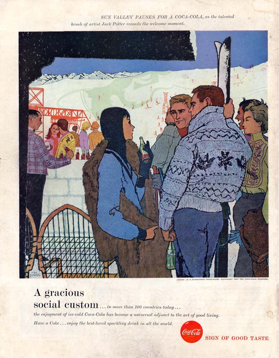
Imagine what this commission must have meant for the 30-year old Potter! Though he had relatively little published work at that point, he was about to be the visual representative for a major national ad campaign lasting an entire year and occupying some of the most prestigious media real estate in the country. I have to wonder what other, better established illustrators of the day must have thought of this...
And perhaps more importantly, what did Pepsi think of Coke's full-bore assault on the brand's carefully nurtured marketing strategy? Was Coke's year-long experiment the catalyst that pushed Pepsi into 'modernizing' its visual presentation?
If yesterday's examples from 1959 represent a stylistic shift in approach then this series of ads (below), which Pepsi also ran during that year, suggest that the company was indeed casting about for a new identity. The style and design (if not the subject matter) are really quite a dramatic departure from what had been a solid, steady and long-running brand identity.

Illustrated by Roy Besser, this series strike me as having been designed to appeal to the same demographic that was seeking out the just-that-year released Barbie doll.

Why did Pepsi run these ads in mainstream magazines like The Saturday Evening Post? They feel like they'd have been more appropriate for the readership of Seventeen magazine...

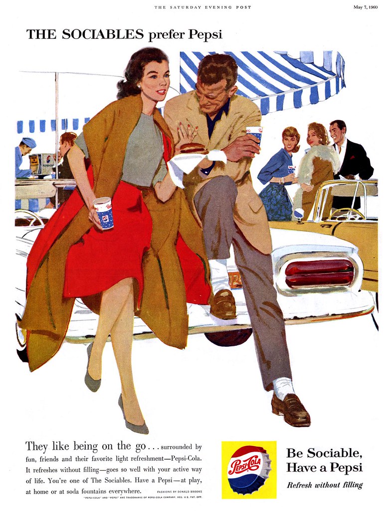
In 1960, Pepsi returned to the tried and true look that had been its hallmark throughout the 50's. The Sociables were dating again!

Yes, they were socializing with others -- but clearly they had eyes only for each other. The focus was on the couple while everyone else remained in the middle distance.

In an odd bit of brand continuity, each ad seems to have required the illustrator to include a powerful red motif as an element of clothing on the beautiful woman which, in my opinion, would have had the viewer subconciously thinking about drinking... a Coke!
Whatever the case, the point becomes moot after 1960. Like so many other advertisers, both Pepsi and Coke shifted their focus to photography. With the exception of Haddon Sundblom's Coca-Cola Santa Claus, relatively little illustration was used by either company from then on. The Sociables quietly faded away.
All of today's images have been added to my Beverages Flickr set.
Love these illustrations! Thanks!
ReplyDeleteWhat a great series, Leif...and your commentary/analysis added so much! I truly enjoyed this week--thank you!
ReplyDeleteFinally got time to catch up here with "The Sociables" and coke vs. pepsi girl...
ReplyDeleteGreat stuff, Leif--the images and your commentary both!
I'll be directing some of my students here, too. Sadly, they won't be a class of smart young design students---oh how I wish I taught a class like that!
No, they will be from the freshman comp course I carry every semester as per my contract. I emphasize writing about visual culture, so the old analyze-an-ad-essay is standard. And usually it helps to postdate it a few decades: the semiotic cues of the past seem more obvious to them and help erase their blindness toward their own world.
And maybe they'll pick up style, taste and a sharp aethestic eye by osmosis...
Thanks so much for your comments, guys! It means a lot to me to know you're enjoying this stuff. :-)
ReplyDeleteprofessor estevez, I'm very flattered that you find so much merit in my humble blog. Thank you for the great compliment... You made my day!
I represented Roy Besser in arranging a three city tour of his original paintings in Japan, but they wanted his newer Nagel style paintings. I felt his previous work with Pepsi, the Saturday Evening Post, and other leading magazines was superior. The Japanese show was a great success, but it got him going in a wrong direction, in my opinion. I probably have about 15 to 20 of his earlier original works from the 50's and the 60's, including a Pepsi piece. For me, these earlier works were his best works. For me Roy Besser's works were similar to Rockwell's, but with a gritty, sophisticated quality, instead of a wholesome Americana.
ReplyDeleteI DO like these Coke ads, but looking through the lens of time, the Pepsi ads amuse me far more...
ReplyDelete