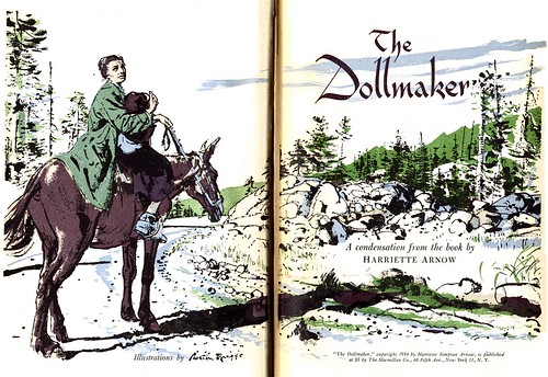
A couple of weeks ago I hit paydirt. While scanning the dollar table of a local used book store I found the Autumn 1954 volume of RDCB. It was absolutely brimming with fantastic illustrations by five fabulous 50's artists, all done in line plus that distinctive Reader's Digest limited colour palette.

Each day this week I'll be showing you all of the illustrations from one of the five stories in that book - beginning today with the five pieces Austin Briggs did for Harriet Arnow's The Dollmaker.

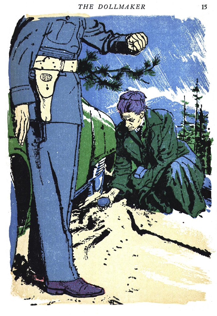
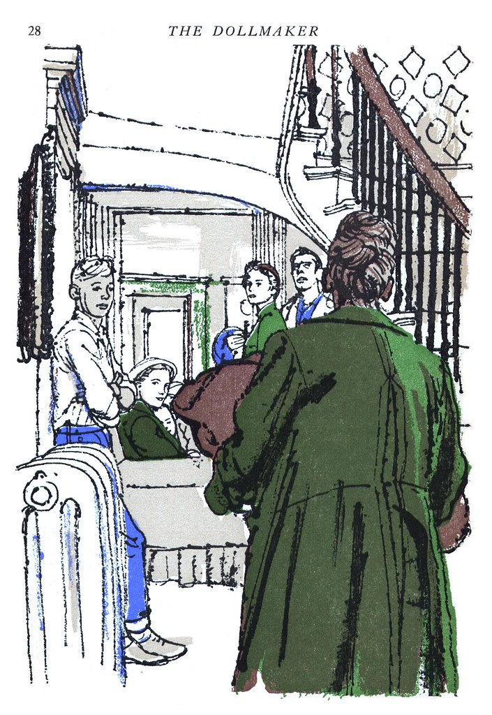
Here once again Briggs has employed that interesting inking style he used for that Look magazine article we examined recently... and, since both assignments were done in 1954, perhaps Briggs was really enjoying this particular inking style at that point in his career.
While all of his work here is rewarding to look at, I think its this simple drawing of a pair of hands whittling that really captivates me. Sometimes its these relatively inconsequential visuals, handled with such tremendous sensitivity, that reveal how masterfully accomplished an artist really is.

I know you'll want to see these images at full size so be sure to check them out in my Austin Briggs Flickr set.

Leif, it's always a pleasure to greet the day with a new illustration from the great Austin Briggs. Thanks for posting these. However, I have to comment that I have always found the quality of reproduction at the Reader's Digest deeply frustrating.
ReplyDeleteBriggs called the publication process the "great equalizer" for art. "If you do a lousy illustration, when it is reproduced, it looks okay. And when you do what you think is a great illustration, when it is reproduced it looks okay."
I love those old books. I found one that has Briggs, Sickles, and Fawcett all in one volume - great stuff.
ReplyDeleteAnd this Briggs work is fantastic. The shot from page 15, with the policeman, is damn near perfect. The linework, the use of color, the rendering, the choice of cropping on the policeman, all are stunning. But look at the composition - everything about it leads your eye to that rock in the woman's hand. Makes me want to hang up my pen and turn to beekeeping or something....
Have not been familiar with Briggs---thanks. Terrific line technique....
ReplyDeleteZT
when i was a kid, i used to babysit for someone who had shelves and shelves of RDCB. as i've been reading your site, i've seen a lot of artists whose work i recognized from my perusal of RDCBs. it is nice to see some featured work that i remember here.
ReplyDeleteThose books were/are great. I picked up a ton at an estate sale. I still see them used as props for instore displays because they have such an old school spine. Guys like Briggs and Fawcett worked into the 60s, but the use of illustration continued into the 70s, with some nice full color work. I have at least a 3-ring binder worth of work by the likes of Beckhoff, Sickles, Stahl (done in ink wash!), Schmidt, Dohanos, and David Stone Martin, also a story by the British illustrator, Francis Marshall.
ReplyDeleteI agree with David that the reproduction sucked (yellow pulpy paper!) but the very basic, crude nature of the reproduction made for some simple and solid work produced by some of the best illustrators in the field, known and unknown.
An exquisite blast from the past.
ReplyDeleteI love the "pulpy" feel as a result
of the cheapo reproduction.
I'm going to see how this line quality translates to flash animation. Thanks buddy.
I swear I read somewhere that Briggs inking this job using a matchstick dipped in ink??
ReplyDeleteAnyone ever heard that?
-Josh Sheppard
Josh; I've never heard that... but I hope its true - because its such a great image!
ReplyDeleteJosh; I've never heard that... but I hope its true - because its such a great image!
ReplyDelete