
Garland was a regular contributor to The Saturday Evening Post, doing both story illustrations and covers. In Ashley Halsey's Illustrating for the Saturday Evening Post, Garland says, "My mother was a pretty well-known artist in England, and she insisited on me following in her footsteps. I... would much rather have been a plumber or an engineer. I am sure some of my less kindly contemporaries think I should have been."
I suppose that under the circumstances of this week's topic its inevitable that Garland's efforts will be compared (probably unfavourably) to those of Briggs'. I'm not going to do that, though. Briggs is unquestionably a titan among illustrators of any century and his work will always stand head and shoulders above even most recognized professionals. But there are a lot things to like and learn from in Garland's work and I'll focus on those aspects instead.
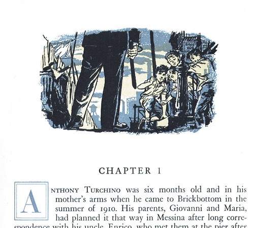
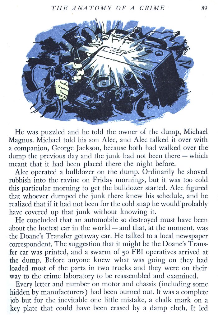
For instance, the tall, narrow piece below. I love its composition and point of view, and how Garland has made excellent use of his limited colour palette, concentrating most of his heavy blacks in the foreground and allowing the line art to drop out to pure colour without any black at all for elements in the distance, creating a real sense of depth-of-field.
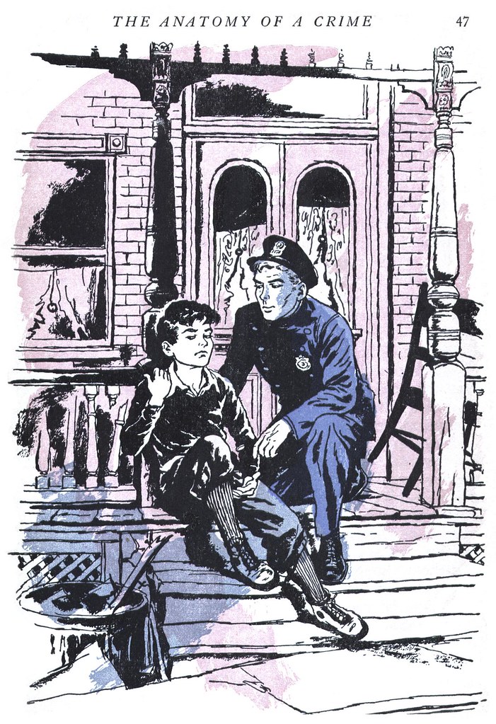
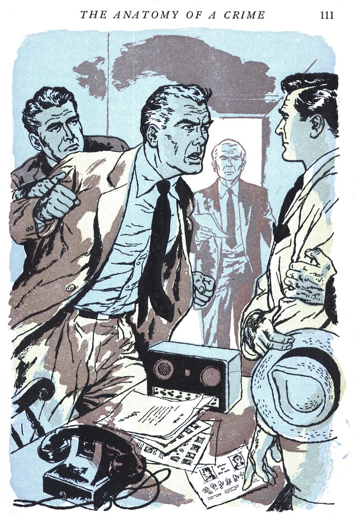
Or this piece, which again makes good use of the limited colour palette. Garland's inking technique is better appreciated when examined up close and here he has given us some nicely rendered bits: the phone, the radio, the papers on the table as well as the subtlety of expression and hands of the man on the right.
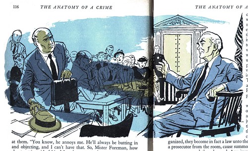
Garland's splashes of overlapping, uncontained colour also somehow work, pulling together in an energetic way that makes even an otherwise less interesting scene, like the courtroom below, more visually dynamic.
Many interesting and thought-provoking comments yesterday! My thanks to everyone who added something to the discussion. Personally, in spite of the limitations and poor quality of the printing process Reader's Digest used, I really dig the way these illustrations came out. Though I can imagine the disappointment many artists must have felt to see their efforts diminished by poor reproduction, there's something wonderfully visceral about the crudeness inherent in the Reader's Digest illustrations. Not only do I not mind it - I really love it!
There's an element of rough print-making that comes through in this process and - as Ron described in his comment yesterday - a lovely "pulpy" quality that you'd never be able to get from better printing on slick paper. I don't see that as a flaw or a failing of the process - I'd rather celebrate it!
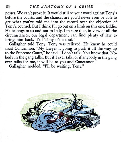
This quality I'm talking about is best appreciated when you scrutinize these images at full size. Take a moment to do so by looking at the largest versions in my George Garland Flickr set.
Neil; I can't thank you enough for your acknowledgment -- you made my day!
ReplyDeleteGreat work to discover, thanks Leif.
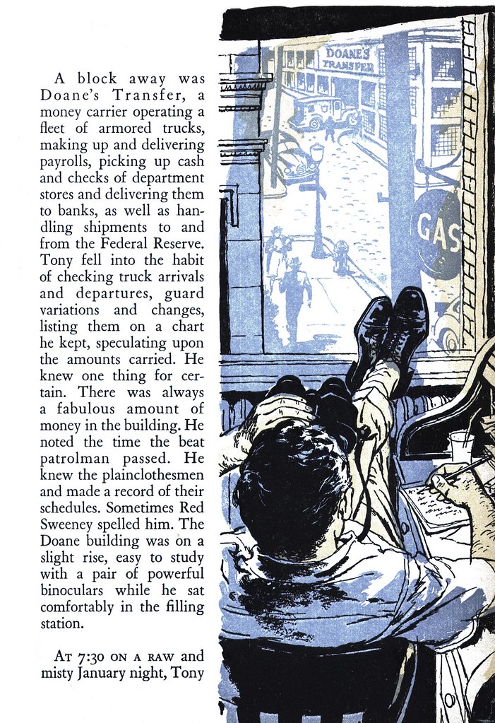
ReplyDeleteBeautiful stuff, esp the piece with the guy looking out the window with the binoculars. Stunning.
ReplyDeleteHello,
ReplyDeleteJust saw this post, and thought you would be interested. I happen to own 2 George Garland original gauche illustrations done in 1955 for the Saturday Evening Post. They are really great! There is great detail in them, although unfortunately my pictures aren't the greatest.
http://picasaweb.google.com/hannahldee/GeorgeGarlandIllustrations#