Last week I talked about how there was very little difference between the elements of the Old School's advertising and editorial illustrations... both types of art contained full scenes and characters and really, the only difference might be that everyone in an advertising illustration would be holding a Schlitz, for instance.
Not so for the New School. While many New School illustrators did wonderful graphic experiments when given the opportunity on an editorial assignment, its rare to see them utilizing all their design skills when we see their advertising work. The Pepsi campaign we looked at a few weeks ago was one exception... and Al Parker's decade-long American Airlines account was the other.
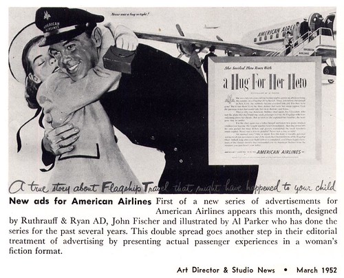
Here's a little article from the March 1952 issue of Art Director & Studio News that specifically talks about how Parker will continue his editorial style treatment of AA's magazine ads.
No other artist, not even Norman Rockwell, had such an arrangement (and I mean over a period of years and years!) That, I think, says a lot about Al Parker's status during those times. "In the exciting profession of illustration," wrote the editor of Cosmopolitan in the November 1953 issue, "there is usually one artist who sets the standards for others. The leader today is Al Parker."
This past week Barbara Bradley did an excellent job explaining the nuances of Al Parker's work so I won't try to go into too much detail about why Parker was considered the leader in his field by editorial and advertising clients. The article from Cosmo sums it up perfectly: "Parker refuses to do the stale, the easy or the obvious."
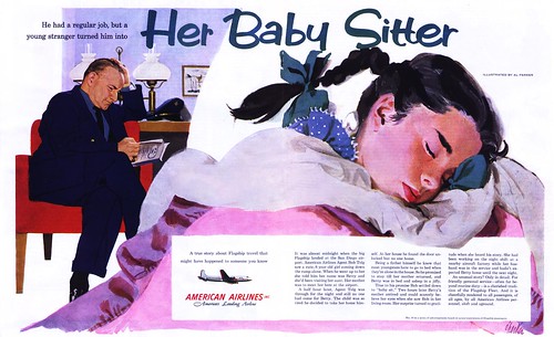
While most illustrators would provide a client with the idealized, generic "types" in the typical advertising poses, Parker's keen sense of observation allowed him to create scenes and populate them with real people the viewer could identify with. For instance, take a look at the scene below...
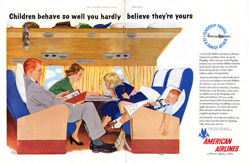
Its hard to imagine any other illustrator designing such a snapshot scenario.
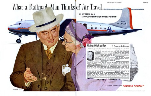
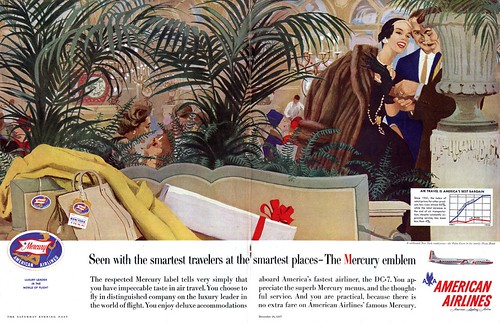
Or this scene from later on in the 50's... who but Al Parker could have suggested a sense of elegance and luxury in a huge double page spread that is mostly an illustration of potted plants and cast-aside luggage?
Of course there are compromises that any professional must make when addressing the needs of the client -- they are, after all, trying to sell something. But among the hundreds and hundreds of 50's ads I've looked at, this long running campaign by Parker is noteworthy for its distincive approach and tremendous duration.
*Paul Giambarba emphasizes the point I'm trying to make here most succinctly on his excellent blog, 100 Years of Illustration and Design, with several more American Airline ads by Al Parker.
*The Norman Rockwell Museum is about to showcase Al Parker's work in a major retrospective. Go to the Rockwell Museum's site for more information.
Advertising for me is being creative. I strongly belive that ad advt in Newspapers brings business. Then why not the same advt works on the Internet.
ReplyDeleteStop website (5 pages) put your desired product and send to target
clients. It will cost you Less - You will get MORE
I work as a marketing man on the above principle I also am for
Slogans. Thats it. People will not have to go thru the 5 pages of website. If need be they have your webist addres in the Advt.
I would appreciate to have your comments.
B. Shah
shahwin.khi.wol.net.pk
The challenge in my mind is the symbiosis that ties people, jobs, manufacturing, selling, advertising, and buying together. With a huge global population, I struggle to envisage a world where we’re not consuming goods of all sorts in order for everyone to work and put food on the table. Granted, I’m not an economist so my view may be naive and I work in adtech, so I might also have an unconscious (or perhaps quite conscious) bias.
ReplyDeletehttps://thetermpapers.org/term-papers-for-sale/