When I first found this group of illustrations in the November 1968 issue of Boy's Life magazine - and then realized they had all been done by Al Parker - I was quite frankly shocked. This was unlike anything I would have guessed to be the work of Al Parker. Though knowing of Parker's tireless urge to experiment, I suppose it should not have come as a surpise. There's a famous story of how Al Parker once illustrated an entire issue of Cosmopolitan magazine in the 1950's using 9 different styles and 9 different names.
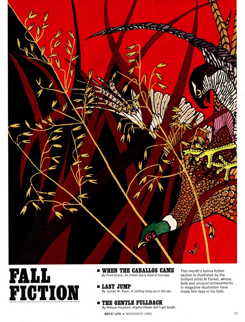
Below is the highlight from that late 60's issue of Boy's Life table of contents page. I asked Barbara Bradley if this is how she remembers Al Parker from that period in his life.

she replied, "The Parker in the photo looks very much like the Parker I most remember, although his hair became pure white. He often wore red and always looked stylish no matter how casually he dressed."
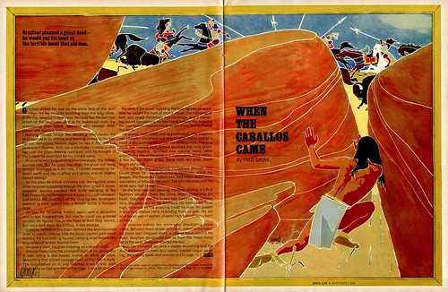
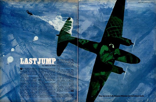
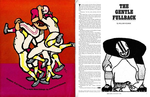
So what to make of these unusual illustrations by this masterful artist? I have to admit, I felt out of my depth with this batch. It was only when I happened to see them in thumbnail view, as I've indicated below, that I began to genuinely appreciate what I was looking at.

Luckily, Barbara came to my rescue when she sent me her knowledgable analysis:
"Leif, you remember that we were recently discussing the elements of fine illustration: I think of these as: Concept/ or content; 2 technique, and 3 design. Drawing, color, perspective, all fall under the category of concept/content, because they are necessary to visual communication.

Some illustrators have great ideas and are superb in concept. Others, such as Rockwell, are superb in content. My premise is that every fine illustrator is unusually strong in two of these elements and at least acceptable in a third. It is hard to think of many who excel in all. Parker was one. He was great in everything!

These four illustrations, like all of them we’ve seen this week, demonstrate Parker’s great ideas, command of any technique he tried, and his extraordinary design sense. The fact that all four appeared in one issue is astounding. Parker said that he liked illustrating for Boys’ Life particularly as there was such a variety in subject matter. They were a special treat to me because I had not seen any of them. I’m blown away by “Last Jump” (no pun intended) and delighted by the design and fresh suitability of the “Caballos” technique and staging. I’d like very much to read what other blog viewers notice and enjoy.

I'd like to thank Barbara Bradley for her wonderful analysis, commentary and insight into the life and work of Al Parker and I hope readers of this week's posts will take her up on her request for your thoughts and comments!
*Because there is so much to be said about Al Parker, and because we have barely scratched the surface, there will be two additional posts this week - one tomorrow and one on Sunday - before we bring this topic to a close.
*Barbara Bradley is an illustrator who began her career in the early 1950's at the famous Cooper studio in New York. She later moved to San Francisco and eventually went on to become the Director of Illustration at the Academy of Art University. Barbara knew Al Parker personally and professionally and I am most grateful for the keen insight she has so generously offered to add to this week's posts. Barbara was recently fêted at The Society of Illustrators in New York. She received the Distinguished Educator of the Arts Award for 2007.
Barbara's fascinating career will be the topic of an upcoming week here at Today's Inspiration but in the meantime, take a moment to visit this blog which was set up in her honor.
*The Norman Rockwell Museum is about to showcase Al Parker's work in a major retrospective. Go to the Rockwell Museum's site for more information.
I liked Al Parker's work before: thanks to all the new images you showed us this week, I like his work even more: thanks.
ReplyDeleteLief, amazing amazing! You have gold in your hands. There is no where else in the world to find this much al parker is there? what is it going to take to get an al parker art book published? If you come across more al parker please please share with us!
ReplyDeleteWow. The "Last Jump" and "Caballos" illustrations are now among the best illustrations I think I've ever seen. Enjoyed these a lot.
ReplyDeleteIt's really great to be able to see Al Parker's range and level of expertise with different styles!
ReplyDeleteLast jump in really amazing, I love the graphic quality and the close up of the face on the plane is clever and really illustrates the terror of the story.
The football player is so different but also great, especially when looked at close-up his gentle expression paired with his lumbering shape is precious.
As always, thankyou Lief! And many thanks to Barbara Bradley, it's great to read your insights, I can't wait to see the posts on your work!
Thank you all for your comments!
ReplyDelete