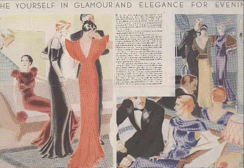
As a historical reference point, it provides a fascinating look at how far the young Al Parker would go.

About a decade later, in the early-to-mid-40's, when almost all illustrators were utilizing the styles and techniques of the Old School, Al Parker was creating innovative artwork that caught the attention of his peers (and no doubt spurred many of them on to try their own experimentations).
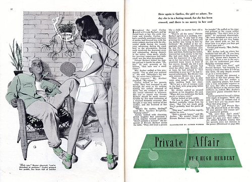
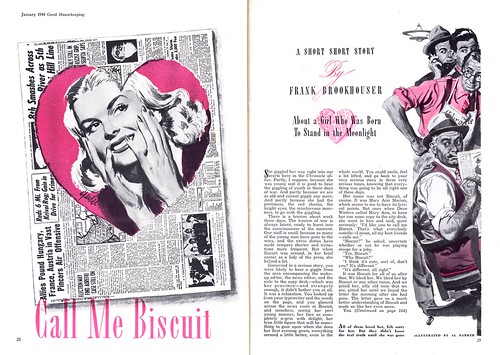
I asked Barbara to comment on the three mid-40's Al Parker illustrations seen here today, and she graciously provided the following thoughtful analysis...

"Even in these early ones," writes Barbara, "Parker showed his extreme versatility: He approached every job as a separate challenge. The basic compositional design and approach for it, the technique, the lighting, all would differ greatly. The common grounds were that each was completely appropriate to the story and that his inspiration for each came from the story. They were never interchangeable for other stories as were illustrations of some of his followers. Every one, even in the forties, had a freshness and Parker touches that were unique to him. Props and design were like clasped hands. You can't tell which came first. On the first (above), look at the accents of dark, the placement of the plants and what they do for setting and composition, the spot of the ping pong ball, the pattern of the pillow and its delightful askewness. Value, line quality, types of people, perfect."

Regarding Al Parker's art for "Call Me Biscuit" (above), Barbara comments, "I like the contrast of texture in this one too, such as the rough heart edge and the dragged newspaper shadow. I might not have spotted the right hand page as being Parker but would have had no doubt about the left."
Of "The Search" (below) Barbara writes, "Very clever combination of full color and duotone on opposite page. the guitar head works for both."

"The design of the lettering and the way the "S" holds the key looks very Parker-like. I suspect he indicated exactly where he wanted the caption's letters to be (Parker was a great lettering designer). In the later forties, you'll find so many in which he did the captions himself. (How often he did the lettering on the Mother-daughter LHJ covers.) The keys are neat, mother of pearl inserts are simple but 'read', the cord ends are casually perfectly designed. The guitar inlay may even relate to the character in the story. I also like the combination of high contrast lighting on the figures and the hand combined with a flat graphic guitar."
*Barbara Bradley is an illustrator who began her career in the early 1950's at the famous Cooper studio in New York. She later moved to San Francisco and eventually went on to become the Director of Illustration at the Academy of Art University. Barbara knew Al Parker personally and professionally and I am most grateful for the keen insight she has so generously offered to add to this week's posts. Barbara was recently fêted at The Society of Illustrators in New York. She received the Distinguished Educator of the Arts Award for 2007.
Barbara's fascinating career will be the topic of an upcoming week here at Today's Inspiration but in the meantime, take a moment to visit this blog which was set up in her honor.
*The Norman Rockwell Museum is about to showcase Al Parker's work in a major retrospective. Go to the Rockwell Museum's site for more information.
I asked a friend yesterday who works at the Norman Rockwell Museum, and he mentioned they'd have about 80 originals.
ReplyDeleteIt just might be worth a trip! ;)
=s=
You bet, shane!
ReplyDeleteThis comment has been removed by a blog administrator.
ReplyDeleteThat early Parker is quite a treat, Leif. It's great the way he developed such confidence and style over the years.
ReplyDeleteI had heard that Parker was terrific at lettering (another dead art, made obsolete by the computer). I think it's instructive that some of the most wildly creative, innovative illustrators built on a foundation of solid technical skills. It obviously empowered Parker that he could summon up lettering or any other tool he needed to achieve an effect, but he also knew when to let it go-- there's nothing the least bit mechanical about his illustrations. Bernie Fuchs is the same way. His wife once mentioned casually that he had hand lettered the street sign on their block. I nearly dropped my teeth-- it looked utterly precise-- exactly as if it had been done by the city's machine. When you look at his art you don't think of him that way, but it's all beneath the surface.
Thanks for your comment, David;
ReplyDeleteI love hearing stuff like that because it relates so directly to what I've seen first-hand among illustrator friends, old and young. I suspect that that's because illustration is a craft, and its practitioners, craftspeople.
Sometimes I think is not stressed enough... too often the focus is on the "artiste" and not nearly often enough is there appreciation for the merit of craft.
I definitely liked your blog very much, because each of your articles is a real cognitive story.
ReplyDeleteMy gosh, you need to read this tips https://essayclick.net/blog/exam-tips in a short period of time!
ReplyDeleteWhen you need to prepare a movie critique paper, you have to provide a high-quality piece of writing. Regardless of the genre, you have got for the film critique, the structure and organizational pattern of the movie critique paper is more or less the same. But, without a doubt, you have to watch the assigned film, analyzed it, and present your personal evaluation or attitude towards it. For most students, it's impossible, because of different reasons. That is why there are a lot of online services, that provide movie critique help. Your task is to choose a reliable one. As I also was a student, I can surely recommend https://top-papers.com/movie-critique/. I always use the help of this online service, not only for movie critiques, but also for other writing assignments.
ReplyDelete