This gave Barbara a unique opportunity to hear, firsthand, what some of the most successful illustrators of the 50's thought of Al Parker's work.

I asked Barbara if she could recall how those artist reacted to Al Parker's work and how she, as a young up-and-coming illustrator, had felt about the Parker art she encountered back then. Here's what she had to say:
Having saved Parker’s work from high school and on into college and Art Center, I had a fairly good Parker file, by the time I was at Cooper’s, the only one there. Everyone I spoke to about him admired him greatly. I did notice more flat shapes in some of their work after some particularly neat flat Parker’s had appeared. I can tell you little more than that except… sometime before I left, the file disappeared.
When the Academy of Art gave Parker an honorary degree many years ago, I compiled a recording to be played while the work of the speaker was shown. It consisted of statements from other artists. I’ve probably got it somewhere. Joe Bowler interviewed an ailing Coby. Coby said so much but, as he had a difficult time speaking, the part we used was “I just loved Al”. Bernie Fuchs, David Stone Martin, Jon Witcomb all contributed. Of course, when we ran Al’s illustrations we played the St. Louis Blues. I remember that both he and Evelyn were in tears by the end. So was I.
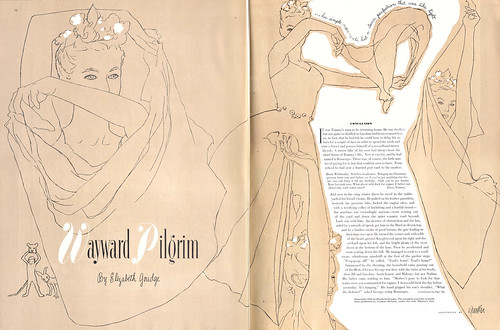
“Wayward Pilgrim” (above) reminds me of something I notice almost whenever I see a Parker. Even if another illustrator, (mortal, that is), had the same photos and used the same technique, Parker’s design sense was so fresh and original that he would almost always do something no one else would think of or leave out something most others would put in. Look at the beautiful negative space and the way in which he so neatly left tone around the edge of the center figures.
Quite often, in a Parker’s illustration, you’ll find design elements such as the little line of lettering around the dancer’s arms and scarf. Have you seen the illustration in which he wrote,”Al Parker did the drawing” as a curved line because the curve worked better in the design than his usual signature? I watched him once, as he was about to sign a piece for me. Before signing, his hand wandered around the piece as he figured out where to put the element of whatever he wanted to write.
I saw a tiny bit of his fabulous design sense at work once when he described a piece for American Boy that he was mulling over. He described that he would put some cat tails in it and, as he described it, his hand made three chopping motions at different diagonals showing how he would use them compositionally.
Another time, as we were chatting in a pleasant no-longer-there-bar high above the SF Airport, he stopped in the middle of a conversation to briefly note two seagulls that were perched just so on some antenna or other. He immediately went on to resume the conversation. Such moments give a little insight into his great sense of observation.
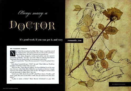
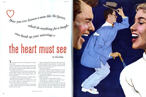
Of these five illustrations, “Always Marry a Doctor” (above) is one of my very favorites. However, four of the five show a bit of Parker’s amazing variety of line and contrast of texture: the simple line on the first, the scratchy texture of the pen and ink on the woman contrasting with the original use of a pressed rose, the contrast of dragged shoulder and bold brush of the woman with delicate rendering on the trousers of the guy with a backwards coat, and the bold brush line of the Comedian.
I can pull out Parker’s pieces to demonstrate to students so many concepts of illustration, of composition, and of drawing. I often pull out a group to discuss only line quality and variety of line, another group to discuss contrast of texture and/or technique in any one piece,
And... Parker’s humor speaks for itself.
*Barbara Bradley is an illustrator who began her career in the early 1950's at the famous Cooper studio in New York. She later moved to San Francisco and eventually went on to become the Director of Illustration at the Academy of Art University. Barbara knew Al Parker personally and professionally and I am most grateful for the keen insight she has so generously offered to add to this week's posts. Barbara was recently fêted at The Society of Illustrators in New York. She received the Distinguished Educator of the Arts Award for 2007.
Barbara's fascinating career will be the topic of an upcoming week here at Today's Inspiration but in the meantime, take a moment to visit this blog which was set up in her honor.
*The Norman Rockwell Museum is about to showcase Al Parker's work in a major retrospective. Go to the Rockwell Museum's site for more information.
Are all these great pieces up in higher resolution in your flickr pool? Usually you have a link, but I haven't seen it. Am I being dense?
ReplyDeleteYou can find them in my Al Parker Flickr set, Colin. Just scroll down to any post where I've included a link to my flickr archives and navigate your way to the Al parker set. :-)
ReplyDeleteincredible!
ReplyDeleteI'm not surprised at how you qualitatively make up your content, because it is your blog very interesting full of necessary information.
ReplyDelete