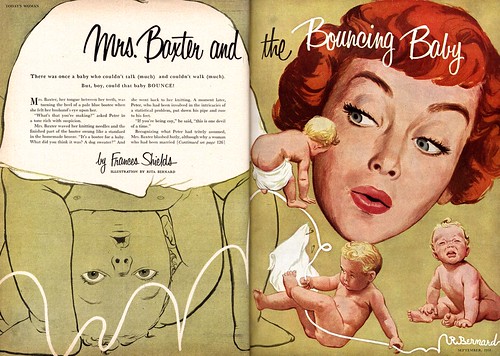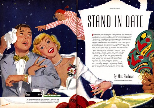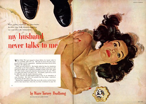
"15 guys" is a pretty accurate estimation of the top tier of New School illustrators who had the best magazine accounts sown up. And behind them, a hundred (two hundred?) talented others, all working on the occassional editorial/story assignment between more mundane, "bread & butter" advertising projects - what Chicago illustrator Carl Kock once described to me as "A beautiful girl leaning against a television set."

Look at the four pieces by the four New Schoolers featured today. If you'll agree with me that having your work appear in Ladies Home Journal, Good Housekeeping, McCall's, The Saturday Evening Post and a few others represented the pinnacle of success for every illustrator of the 50's, then (to the best of my knowledge) none of these talented artists, whose illustrations I scanned from an old Fawcett magazine called "Today's Woman", ever made it to the top.
Why?

Certainly they were all very professional - their work is of excellent quality and they are incorporating the elements of design, composition and technique that would qualify them for top-notch assignments. Obviously, with competition so fierce, the best assignments went to those who brought something more to their work -- who went beyond being simply good and following the rules.
Even among those illustrators who enjoyed regular assignments from the most high profile publications, who brought a premium quality to their work, and who could be counted on to bring freshness and inventiveness to their assignments, there was one artist who all eyes watched - who made the New School rules - then consistently broke them and re-invented himself.

Next week: Al Parker.
The choice of camera angle on the "My Husband Never Talks To Me" piece is really nice - it really caught my eye!
ReplyDeleteGreat round of illos Leif. This new school is something I'm actually hoping to dabble in here pretty soon. I had seen that Bob Peak show at the Society back in '05 and he had a few pieces that were distinctly from this period that got me thinking.
ReplyDelete=s=
This gives some great insight into how "the other half" was doing. It's easy to over-romanticize an era, thinking life was great for illustrators. But imagine just how difficult it would've been to stand out in that crowd, especially when particular styles and conventions were so rigid.
ReplyDeleteWith great rewards comes lots of competition. And despite all the great stuff we've seen, no doubt the vast majority of work was the "beautiful girl leaning against a TV" (or some other repetitive theme that would eventually make you want to kill yourself.)
Makes me wonder if things are actually better for illustrators today.
Wow, wonder what the story is behind that choice of images for "My Husband Never Talks To Me". The woman's empty, vacant expression is right on the money for the title of the illustration, but she should have been laying naked with smeared lipstick in a dishevled bed as hubby walks out of the bedroom with a copy of the Post under his arms (even though I know such an illustration would be WAY to riske for a family magazine back then). But what's with the husband standing over his wife as she lays on the floor??
ReplyDeleteGreat art needless to say.
Les;
ReplyDeleteI'm reminded of that great scene from Carnal Knowledge with Jack Nicholson and Ann-Margaret where she has stopped getting out of bed and just sleeps all day and finally Jack blows his stack and says: "How about cleaning up this G*d D*mn apartment once in a while!"
Hilarious!
Spacejack - things are most definitely NOT better for the average illustrator today! Back then, even these "second string' artists were getting several hundred dollars for one of these double page spreads ( back when hundreds of dollars was a LOT of money). Advertising paid even better. If you were a staff artist, you were making 4 or 5 times as much per week as the average well-paid working stiff.
ReplyDeleteAnd as an illustrator you at least had a shot at celebrity and financial fortune.
Those days are gone - and they ain't comin' back!