
So far this week we've mainly focused on the editorial - or story - illustrations of the New School artists. These same artists did a lot of advertising art as well... though generally the results were not nearly as memorable.
But let's not blame the artists for that.
"Whenever there is a trend toward realism there comes with it a trend toward sameness in advertising," writes Stephen Baker in his March 1953 editorial in Art Director & Studio News. The advertiser demands more and more realism and soon magazines begin to look like a Montgomery Ward catalogue."
"The art director's experience in buying art now becomes an all-important factor. To most clients "realism" means one thing: photographic reproduction of nature. Art directors, familiar with various techniques, know that isn't necessarily so. On today's art market there are hundreds of techniques available."
"Direction towards realism should not mean the end of ingeniously concieved ads. There is as much opportunity to make every advertising campaign unique and interesting as there was while "pure" design held the fort."
Charles E. Cooper, who oversaw the most celebrated and successful group of New School illustrators in America, encouraged his artists to take on editorial assignments (and did not take a commission on such work) rightly believing that the high profile exposure his artists received from those prominent and widely ditributed magazine illustrations would drive advertising clients to his studio door.
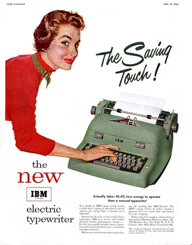
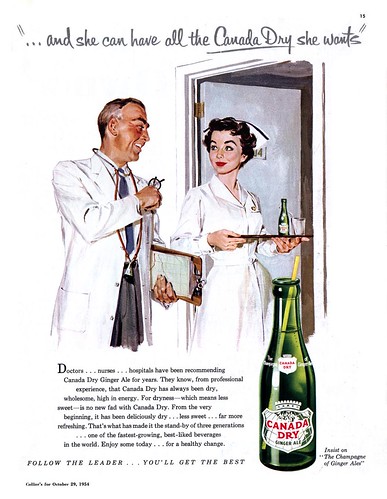
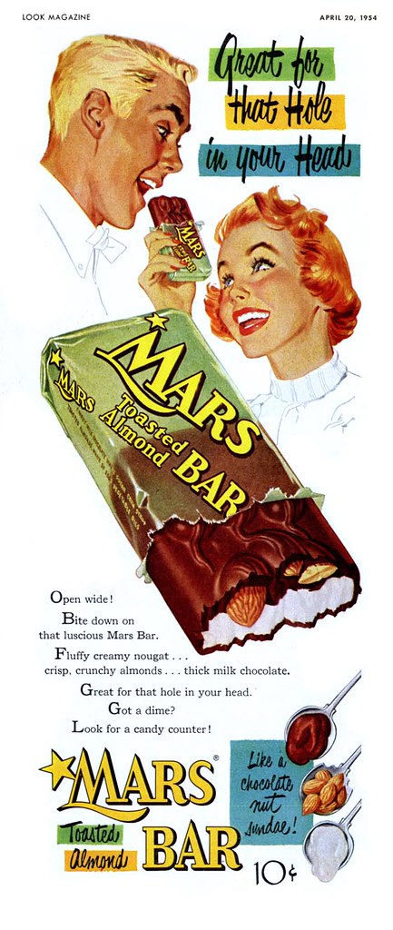
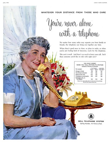
If only more of those advertisers had been willing to allow the New School illustrators to show off their graphic sensibility - as the magazine art directors had done. You can see from these examples how those artists tried - using that same minimalistic approach to environment, close cropping on the face and hands, that same wonderful roughly painted gouache technique -- but ultimately, too often, clients forced the New Schoolers to dial it back a notch. Too frequently their ads look like little more than rendering exercises in contemporary realism.
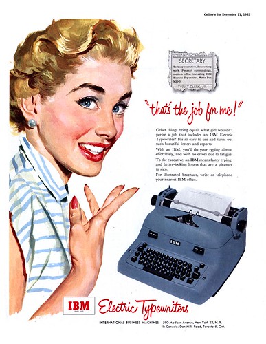
As Stephen Baker wrote, there were hundreds of realistic techniques available - and as often as not, advertisers chose Old School illustrators to provide the visuals for their ads. But aside from the addition of product placement in those illustrations, old school advertising art usually differed very little from old school editorial art. Figures in a fully realized environment was the norm.
Almost no advertisers granted New School artist the same freedom of expression. Pepsi, as we explored a few weeks ago, was one exception.

And there was one other... but that's a part of next week's topic.
That Mars Bar ad is so nice I think I'd frame and hang that pup over my fireplace. :)
ReplyDeleteHa! ;-)
ReplyDeleteAdvertise here FREE:
ReplyDeleteFree Advertise