
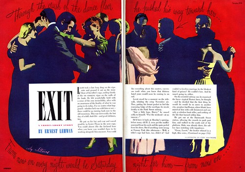
But this is Coby Whitmore too! Frankly, I was shocked to discover just how experimental Whitmore was when I first saw the illustrations below. If I covered the signature you'd never guess that he had painted "Exit".
And though the woman in "That Special Face" has a hint of that special Whitmore look, the illustration in its entirety could easily be mistaken for an Al Parker.
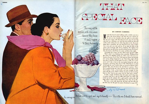
Finally there's this piece from 1955, when Whitmore was probably at the zenith of his glamour girl painting career, when he had moved well beyond the Old School style he learned in Haddon Sundblom's studio -- and all of a sudden he gives us this fully rendered scene, complete with classic small town middle age male characters - and not a New York debutante in sight!
Surely these departures from his more typical subject matter must have been a tonic for the artist - and an opportunity to show his clients and competitors that Coby Whitmore was no one-trick pony.
Take a closer look at these illustrations in my Coby Whitmore Flickr set.
The first illustration with that kind of “femme Fatale” have so much glamour, reminds me Liz Taylor :)
ReplyDeleteGifted illustrator, and we are very lucky to know all these old masters
Regards
Pablo
Well put, Pablo - thanks for your comment! :-)
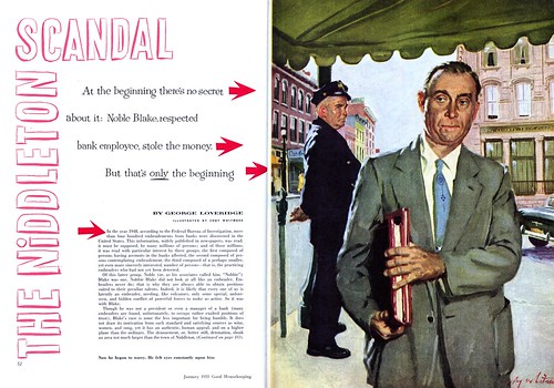
ReplyDeleteIn the Editorial Spread 'SCANDAL' above, you will notice a few things regarding compositional devices.
ReplyDeleteThe entire story is one of 'apprehension' derived from the Z motif, that holds together the interested parties. On the right side of the Z, which is composed of the portfolio of carried documents, fits the main character, while to the left of the Z, is the policeman on his beat, looking at the manner of the main character, and the way he's intent on securely holding the portfolio of documents. The stopper is the 'parking meter', which gives a rational for the policeman's being in the picture in the first place. As much as there are questions in an episode like this, there are answers too. Also, notice how the rooftops of the buildings are used as pointers, as to assist how the characters view each other.
The sad part of this so called 'enlightened era' we are supposed to be living in, with new computers, iPods and other distractions is, that when you break it all down, great craftsmanship is very simple. It's how it's used that is what makes a creative master. Coby Whitmore knew how to express his thoughts in a delightful forthright manner, and we should be grateful, and appreciate the fact that he did, and did it so well. I know, I do.
Randy Ranson
What a wonderful analysis, Randy - thanks for taking the time to put it down for us to enjoy and learn from.
ReplyDeleteI share your sentiment about the simple truths that lays beneath the surface details the illustration masters of the mid-20th century presented us with.
Thanks for putting it so succinctly and eloquently.