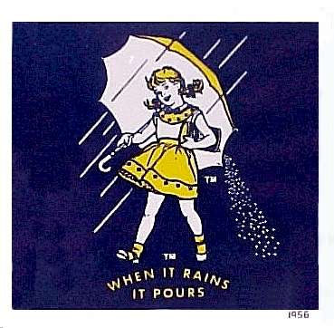
I found two ads from the 50's of the Morton Salt girl - but this one, from 1952, looks like it came out of the Sundblom studio (or perhaps it is also by Ballentyne).

I thought I had hit the jackpot with this 1957 ad... but Will Nelson, who worked alongside Lucia during those days tells me, "[This] Morton Salt girl looks like a version done after Lucia's ...hers was more of an outline technique. This one could have been done by any number of illustrators around Chicago in the fifties."
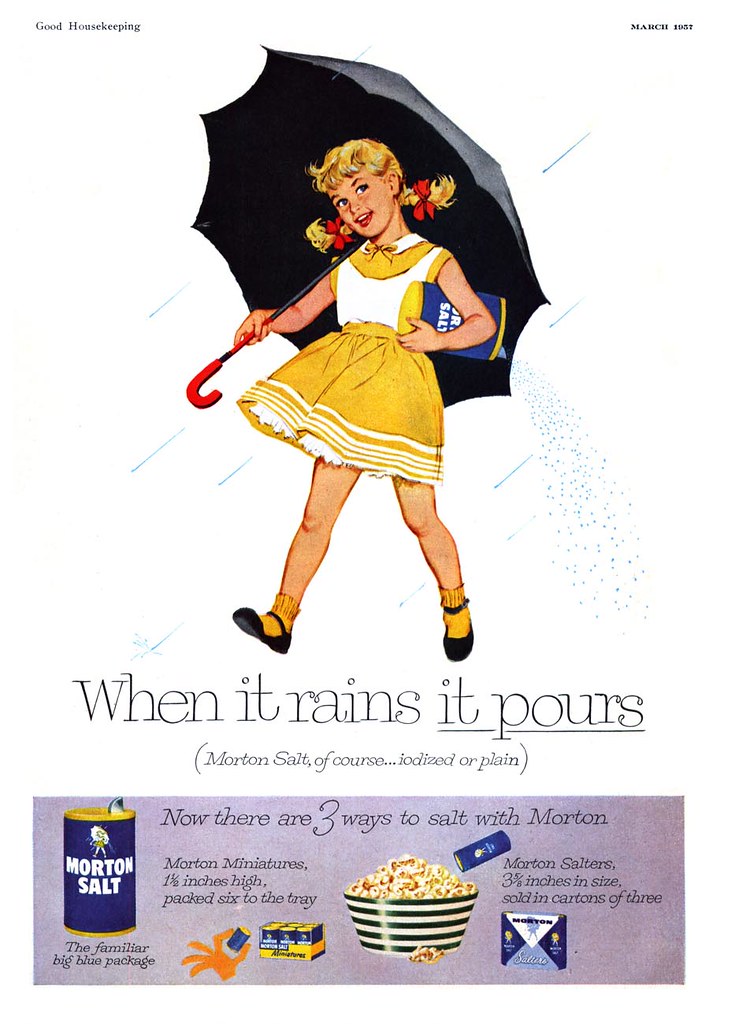
Nonetheless, all these pieces are great examples of the type of work top illustrators in Chicago like Lucia Lerner might have been expected to do.
Some time ago I spoke with another Chicago artist, Carl Kock, who began his career at Stephens, Biondi, DeCicco in the late 50's. As Carl put it, he did not fit the mold of the typical commercial artist who could draw "good-looking people standing next to a refrigerator". His work was too avante garde, too stylized. But this was the type of work Lucia excelled at. It was the sort of high paying, high profile work SBD wanted its artist to do, and that made Lucia a valuable commodity for SBD's salesmen.

Will Nelson writes, "Hotpoint was one of the accounts we had for quite some time. Lucia was always in demand in the ad agencies. The sales people were always trying to get her for their respective accounts."
"Her studio was the only one with a private counter and sink....the rest of us shared individual two man studios. You knew you had "arrived" when you were placed on the north side of the building."

For those of us working in commercial art today its a point of interest to hear how similar - or different - the circumstances of payment were half a century ago. We've learned in previous posts that at the Cooper studio in New York the artists were free to keep all the money earned from editorial assignments -- the studio took no commission at all. And at Rahl studios, where Andy Virgil worked, in-house artists received 60% of commissions while the studio took 40%.
Will explains the circumstances at SBD in those days:
"All of the staff artists were on commission...no salaries, but very comfortable "draws". From my stand point....my monthly draw was like a salary, which was brought up to par with quarterly updates...referred to as extra draws which picked up the additional amounts credited to my account from billing activity. I was fortunate in that I was always ahead of the amount of my draw."
"The sales rep [at SBD] was Vince Salerno and he was always crossing swords with Lucia over fees quoted. She had her own idea about what her work was worth...and held her ground until she got it."
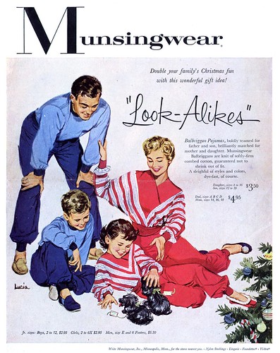
"Like I said earlier, she was a class act."
*You'll find the full size versions of today's images in my Lucia Flickr set.
I am really enjoying this woman's illustrations, and I look forward to learning even more about her in the days to come!
ReplyDeleteI am so glad to hear that, Evan. Its a real thrill for me to be able to bring Lucia's work to the attention of a broader audience... she has been one of my favourites since the very beginning of Today's Inspiration - back when it was just a small subscriber list and years before I began the blog.
ReplyDeleteI know you'll very much enjoy the rest of this week's posts - and thanks for commenting! :-)
I’m very glad to know about Lucia’s work in these days...
ReplyDeleteRegards
Pablo
While looking at Lucia's luscious illustrations, I recalled in the late 50's, my illustration teacher Bob Foster, giving us the formula for illustrating the ideal attractive female: Oval shaped face; high prominent cheek bones; a soft but well defined chin and jaw line; an elongated graceful neck; high curved forehead; gracefully arched eyebrows; slightly tipped up nose; full well defined lips; well proportioned breasts; a small waist and long shapely legs. He also emphasized the importance of well drawn hands, especially female hands. He would explain that if an illustrator doesn't learn to draw hands well, or sluffs them off as unimportant, the whole illustration will suffer. He was convinced that excellent draftsmanship was a major key to becoming a successful illustrator. And he also believed if you learn to draw and paint the human form correctly, you can draw and paint anything correctly.
ReplyDeleteLucia certainly accomplished all of Bob Foster's rules of the ideal female. I was particularly drawn to the hands in her illustrations. Perhaps, because of her fashion illustration background, she gives personality and a wonderful feminine gesture to the female hands. They are very real, very natural and very beautiful. This not only displays her keen insight, but her excellent draftsmanship. Every Lucia illustration example posted on TI, exhibits her strong drawing skills and a very solid grouping of both figures and props.
It is no wonder Lucia was such a big success in Chicago and New York. Even though women competing against men in the 50's was not common in most fields, Lucia seemed to have rose to the top of her profession, not in spite of her sex, but because she was an exceptional illustrator... and perhaps her feminine point of view gave her an advantage on certain assignments. And why not!
Male or female, if you had the illustration skills and the good taste that Lucia had, you were in demand.
Tom Watson
Pablo; Thanks as always for your comment! :-)
ReplyDeleteTom;
You raise some excellent points that merit further investigation. For those who care to read a bit more on the importance of drawing good hands, David Apatoff 's posts on the subject are well worth a look:
Click here and here
Good share,..Really helpful material found.
ReplyDeletecommercial illustrators