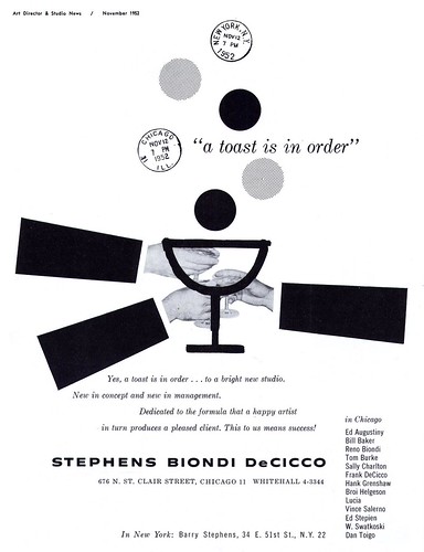
The November 1952 issue of Art Director & Studio News (the "Special Chicago Issue") contains a couple of interesting pages relevent to Lucia and SBD: first is this ad announcing the formation of the studio.
"I do remember that starting SBD required getting some top talent to come in...one of those was Lucia," writes Will.
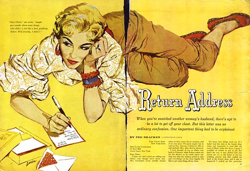
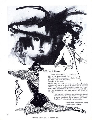
Second is this page highlighting a tradition of fashion illustration in the Chicago commercial art scene. Will writes, "Lucia was a unique individual. We often played chess on lunch breaks...I seldom won a match...and she would talk about her art and how she grew into illustration from a newspaper, fashion artist, background. I think her style evolved from the desire to be different from the several other figure artists in the studio."
"You have to remember that Chicago was the "product" center of the U.S. We were heavy into foods, electronics, fashion related areas like cosmetics, etc. So...Lucia was always in demand in the ad agencies. The sales people were always trying to get her for their respective accounts."
"We were always competing with Cooper for editorial assignments. Barry Stephens constantly sought new samples from all of us to show in New York."
"I think [Lucia] enjoyed the work out of New York more for the change from agency assignments than for the work itself. She was very confident in her career and had her own idea about what her work was worth."
"She seemed rather indifferent to other illustrators and rarely commented on changing styles or other artists."
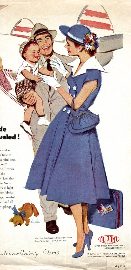
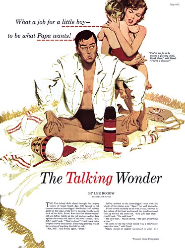
* Many of this week's images came to me from my friend David Apatoff - who passed them along from his dad's old clipping files. By coincidence David's dad, who was an art director and freelance illustrator in Chicago in the 50's, worked occassionally for Stephens, Biondi, DeCicco as well. I am most grateful for David's generosity in passing along these fantastic tearsheets so we could all enjoy seeing them this week. All of these images are now in my Lucia Flickr set.
Oustanding illustrations produced Lucia, know about her it’s like discover a treasure.
ReplyDeleteRegards
Pablo
Thanks Pablo - I feel the same way. Though her work was very similar to that of many top 50's illustrators, it has a certain unique quality that I find very appealing. I think that may be her fashion illustration influence showing through... it lends a certain elegance to the quality of her line.
ReplyDeleteValues, during the 1950's, have been trivialized and even criticized by writers and some historians, as being the age of insignificance and marginal contributions. Since I started my illustration training in the 50's, I disagree with such a sweeping assessment... especially in the category of taste,elegance, sophistication, grace and good manners to name a few. Lucia and many other illustrators during the 50's gave evidence to this. It is evident in their clean and well organized compositions, their sophisticated and tastefully dressed ladies and gentlemen models, and their subtle yet eloquent symbolism. Lucia's illustrations were grounded in solid academic training of all aspects of picture making. These illustrations of the 50's didn't have to "let it all hang out", and apply the typical "in your face" strategy , to get the viewers attention. Illustrators today can learn from Lucia's sophisticated tasteful illustrations, of which few art schools teach any more.
ReplyDeleteOnce again I salute Leif Peng for finding and exposing these "civilized" examples of illustrations of the past to give a little light to the present.
Tom Watson
*whew!* Thanks so much, Tom - for your very fine compliment AND more importantly for your always excellent analysis! I could not have put it better - actually, I wish I could have put it as well as you did. :-)
ReplyDelete