
All the rules of making pictures that attract specific audiences we've learned from Mark Wiseman's article this week are based on solid research - and common sense would seem to support the findings he presents. But we need look no further than these three ads by three of the finest illustrators of the mid-20th century to appreciate that the rules are made to be broken.
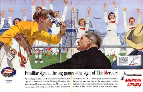
Both Austin Briggs (at top) and Al Parker (directly above) understand how to capture the attention of all readers with their flawless composition, interesting character types and subtle accentuation of relevant detail. Man or woman, young or old, its almost impossible not to want to invest a little time studying these pictures. There's just nothing generic or typical about them. They are just so eminently relateable and appealing on an entirely uncontrived, human level.
And since this topic really began last Friday with a Pepsi ad, it only seems right that it should finish with one - and one of the best, by the great Joe DeMers.
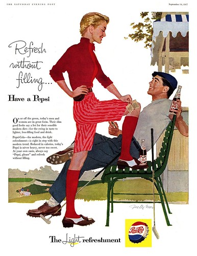
While DeMers' people are certainly far more idealized than Briggs' or Parker's, he transcended the intent of Pepsi's campaign to target a female audience by creating an image that gives almost equal weight to the man and the woman. Where many other Pepsi ads show only a woman, or where the man is reduced to just body parts (as in last Friday's ad) - good examples of how to follow Wiseman's recommendations for using picture content on audience selection - DeMers uses the woman's victorious body language and superiour positioning in relation to the man to send a subtler message - one that is still interesting and non-threatening to a male audience.
Its a truly masterful composition.
"If you use the wrong sex in a picture, you risk missing or misleading your audience, " writes Mark Wiseman. "The two sexes follow definite behavior patterns." The best illustrators prove that everything Wiseman says is the truth... and everything he says is a lie.
Al Parker was always leading the pack when it came to innovative compositions, even in the 50's. Although this rendering is pretty traditional, the composition is not. He had a great sense of design, and everything fit together like a puzzle. The American Airline plane in the sky is placed exactly in the right spot in the sky. The cheerleaders are an excellent example of the design principal, "repetion with variation". Only one cheerleader is fully shown, and the rest are in pieces and parts, giving them variety and interest. Notice subtle variations of their hands. In the background, the player on the left is angled to the left, the player on the right is angled to the right. The man in the foreground consists of two simple shapes, head in profile and part of the back and shoulder. But the woman is made up of a number of various animated shapes... head in profile, body leaning forward, game program in hand, arm holding purse and other items of different shapes... plenty of body animation. For every angle from left to right, he counters it with an angle from right to left... which creates energy movement and balance. Finally he compliments all the angles and various shapes with a straight horizontal pipe railing, and the stadium architectural line that spans the entire width of the painting, tying everything together. An absolutely perfect composition.
ReplyDeleteI visited Al Parker in his California studio, many years ago... and he told me he gave up a career as a musician to become an illustrator, but he used the same principals in composition as he did in music. Well, I certainly hear the music in this Al Parker illustration. I might add that I agree with Leif, Joe DeMers also had a great sense of composition and design. So did Austin Briggs, but I don't think this is one of his better illustrations.
Tom Watson
Thanks for revealing the details lost to the digital rush, Tom. Your words are like any of my instructors and bosses who came up the ladder drooling over Parker work! (Three decades later, they were still pointing out similar solutions of his, with awe in their voices.)
ReplyDeleteAs a young punk, I was amazed by gazing on original works (Loomis, Whitmore and Peak come to mind), wondering where the lettering had gone. It was a revelation that our studio had a guy on staff (about fifteen years older than the boss) who labored over script and other novelty lettering 40hrs/week, to later "strip" together into camera-ready art... the work only *looks* casual...