The Reader Analysis Bureau of the Crowell-Collier Co., publishers of Collier's, "covering research among men and women readers of eight magazines", came to these conclusions:

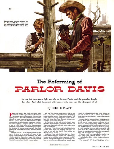
"Illustrate a story with men, and the women's readership decreases; and put only women in the illustration, and male readership diminishes."
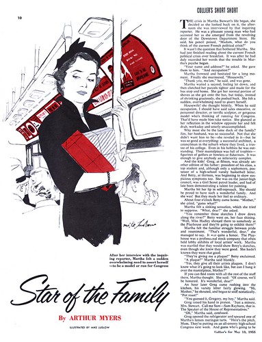
Illustrations of children seem to attract women very strongly, and, generally speaking, animals (especially dogs and horses) seem to have more attraction for men."
"Composite illustrations, men and women,
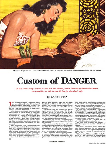
including 'clinches', are halfway between these two extremes."
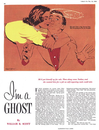
Of course there were other sorts of clinches that were popular as story illustrations at the time. Unfortunately, The Reader Analysis Bureau did not provide information on which audience found the other type most appealing.
But author Wiseman leaves us with this telling conclusion:
"Pictures that readers can most readily understand (in their own personal terms), in which they can most quickly 'see themselves', or that offer solutions for their problems, are apt to engage their attention and hold it."
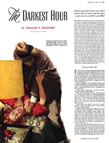
* For the purpose of context, I thought it would be interesting to show all the editorial illustrations from a single issue of Collier's magazine for today's post.
Very interesting post. Thanks for sharing.
ReplyDeleteI have no scientific proof, but It seems to me that generally, small town America today is made of a mix of locals that never left, locals that have moved to the larger towns and cities for education and work, and then returned to raise their kids and those that grew up in the city and moved to a small town for lifestyle advantages. In the 50's, my experience was that small towns in America consisted mostly of people that were born and raised there or had lived there a long time.
ReplyDeleteAlthough the structure and therefore the mentality of the small town may be a mixture, compared to the 50's, the "hard wiring" differences between male and female interests, preferences and taste, perhaps hasn't changed as much as some would like to think. When I do a landscape painting in soft impressionistic pastel colors, men show little interest, but women are attracted to it and make favorable comments. When I do a painting in bold aggressive brush strokes using a pallet of primarily earth tones, women show less interest, but men are more apt to take notice and comment. I find no surprise or great mystery in that, nor do I have a problem with it.
Tom Watson
Frank McCarthy is illustration royalty. His talents are great and vast and it's always a huge thrill to come upon one of his pieces. It's nice to know there's a truck-load of his work I've yet to see since the only work of his I'm familiar with is in Leif's Flickr collection--er...and McCarthy's James Bond posters.
ReplyDeleteInteresting topic, Idon’t know very much about North American illustrators, but I’m learning in your blog.
ReplyDeleteToday starting my vacations, but I’ll be right back :)
Regards