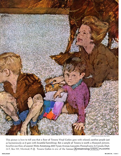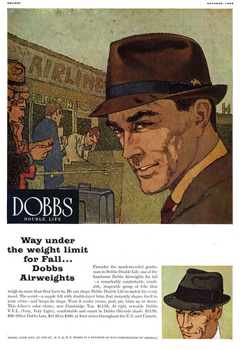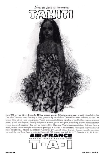
I now think of the period around 1960, from which all of today's images are taken, as the "transition period": when photography was supplanting illustration in magazine advertising and editorial - even as the total number of assignments was diminishing along with the page counts of those magazines.

To compete in this changing marketplace, illustrators who wanted to make their mark - and art director's determined to have their projects stand out from the crowd - needed to present the public with something other than traditional realism.
Enter the "Avant-gardes": Jack Potter (at top), Phil Hays (below), Tom Allen (at bottom) and others began capturing the imagination of the industry even as it seemed to be turning its back on illustration in general.

This is a group of artists who still had roots in the previous decade of commercial art. You can see its influence and the respect they had for it in spite of the "distortion" in their work. An article in the December 1958 issue of American Artist about Jack Potter says of the artist, "Art for him is not manner, style, or trend. Art is a search for the significant in life, for expression in form, for self-realization in work. For him, his illustration is art... it enhances and distinguishes Jack Potter as it serves his clients." (Italics mine)

There is an important message in that passage... one that applies as much today as it did in 1960.

Consider today a preview of next week's topic, when we'll look at several "Avant-gardes" in greater detail.
I wonder if one of the characteristics of this genre is the routine use of black as the deep shadow colour; perhaps it's a concession to photography. But as one who grew up during the "illustrator years", I find many of these images muddy by comparison; in this sense, a falling away from a high standard.
ReplyDeleteBob Bollini
In reference to Bob's comments, I have seen originals by some of these illustrators posted today, and their colors are richer and more intense than these reproductions show. In the early 60's, 4 color separations and magazine print production were not much better than the 50's. Darker tones tended to go a little muddy, partially because the paper stock was not very high quality... to keep production expenses down. Those illustrators knew color, but the print market (particularly magazines) had not caught up with, and adapted to experimental illustration techniques and color. Also, some quality is lost in the scanning for posting on TI. By the 1980's, I was using Dr. Martin's dyes on my illustrations, and it drove printers nuts... trying to duplicate the intensity. They even tried florescent inks, but we were never completely satisfied when comparing it to my original illustration. Clients generally won't spend extra money to satisfy the illustrator's self inflicted high standards.
ReplyDeleteTom Watson
Tom, it may well be the case that the originals are more vibrant than the repros. Perhaps it was the ad people or the younger art directors that consciously aimed at the visual impressions made by colour photography. (B&W rotogravure is another case; see the magnificent work done with it in Henry Luce' *Fortune* before the war)I have to say, tho, that the old inks (and pressmen) could make even the most delicate values sing. (so long as the paper was coated!)But I take your point; Dr. Martin's may have been forbidden fruit, but who could resist!
ReplyDeleteAs a layman and design fan,I *love* this style, it is my favorite era in commercial illustration. It just resonates with me.
ReplyDeleteThat shot of the crusaders done like a mosaic is just wonderful.
ReplyDelete