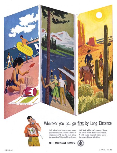
You know you've seen this style before - its often been used for travel ads - and 13 years earlier in the pages of the same magazine a different illustrator used a similar style for this Union Pacific ad below. Of course there are nuanced differences that reflect some 1940's characteristics and perhaps in a small way, the personality of the artist... but I place it in the same general retro category.

I'm sure you could find many examples of the same style from decades earlier (with subtle variations) - and you still see it being employed by illustrators today. Why, when so many other styles have come and gone, does this one keep resurfacing time and again?
Some years ago I read a fascinating book called "Understanding Comics" by Scott McCloud. One interesting concept McCloud discusses is "amplification through simplification": taking a realistic image and simplifying it - making it more 'cartoon-like' - to amplify an audience's ability to relate to that image.
For instance, the simplified, faceless couple enjoying a horseback ride at a dude ranch (below) could represent a great many people - and therefore a great many people could imagine themselves in the saddle when they look at the image.
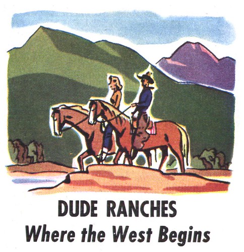
"By stripping down an image to its essential 'meaning', an artist can amplify that meaning in a way that realistic art can't," writes McCloud.
The ultimate example of this symplifying process is, of course, the symbols of a man or woman on the door of a public washroom. Stripped of all realistic characteristics, the essential meaning of those symbols is emminently clear to anyone.
While different styles of illustration have come in and out of fashion, the 'retro style' stands the test of time because it fulfills this essential purpose as an "information graphic".
Todays images can be seen at full size in my Travel Flickr set.
Leif, in my opinion, McCloud’s quotations and your analysis are both right on the money. We used to call them "stock illustrations" and I’ve heard it referred to as "spot illustrations". As you point out, they simplify or eliminate detail, use relatively flat color and use as few brush strokes as possible. It's not as easy as it looks, and there is always that temptation to put a little more resolve into it. It takes a keen sense of design, understanding values and free confident brushwork. The result was a stylized, eye catching, generic illustration that doesn't spell it all out to the viewer. Therefore, the concept is timeless, and with a bit of updating, I think it works as well today as it did back then.
ReplyDeleteTom Watson
Another appeal to this style is it is almost invariably used to depict a "friendly universe." One can't imagine a depiction of misery with this style in terms of color and vividness. Of course, that would make sense with its use in ads. But I think its not just the simplicity, but the conveying of a happy world. Old Nat'l Geos used these alot, and sometimes in black and white, too. Same effect: pleasure in a colorful world.
ReplyDeleteNice holiday Illustration really love it.
ReplyDelete