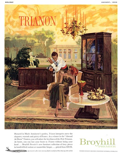
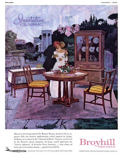
What in the world was the Broyhill Furniture Company thinking when they ok'ed this bizarre concept?
"Honey, whattaya say we drag everything out of the livingroom and set it up on a windswept cliff in the dead of winter - and then sit out there!"
Now there's an idea that'll really appeal to the furniture buying public.
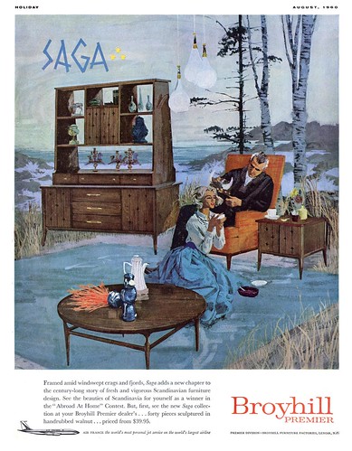
But surreal concept aside, these ads really are beautifully illustrated - and illustration is afterall our raison d’être, isn't it?
The same August 1960 issue from which I scanned these three ads also contains the spectacular Bernie Fuchs ad below (although my scan is from a July 1960 issue of the Post) and I couldn't help but marvel at how influential Fuchs had become on the look of illustration in the short time that he'd been on the scene.
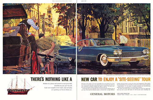
I don't think Bernie Fuchs illustrated these oddball furniture ads... but compare his auto illustration to these furniture ads and you can see his influence in the anonymous illustrator's work.
In his epic retrospective of Bernie Fuchs' career for Illustration magazine #15, David Apatoff wrote about how "for years, Bernie set the style for American illustration and attracted many followers."
In this series you can see the work of one of those artists David called "the Bernie Fuchs imitators".
How to categorize today's images... "Bizarre ad concepts"? "The virtues of indooor outdoor carpeting"? With a wink and a nudge, I am placing these pieces in my Architecture and Home Decor Flickr set.
It is definitely beautiful in its absurdity. These paintings create a wistfulness in me and makes me want to re-peruse all of the Reader's Digest Condensed books from this era. I do wish there was a way to buy prints of these paintings.
ReplyDeleteI rarely disagree with your comments on TI Leif, but I really like the atypical concept to these furniture ads. Compared to much of today's ads and TV commercials, how can these ads be considered anything but removing the ordinary and placing it into an uncommon but familiar context. I believe it was done to attract attention and combine and relate the beauty of the furniture with the beauty of nature. Maybe it leans towards surrealism, but it works for me, because the rendering is not only superb, but very believable. We are defiantly on the same page that the illustrations look amazingly similar to Bernie Fuchs early style. If Fuchs didn't illustrate these, it was somebody that was just as good, in my opinion.
ReplyDeleteThanks Leif, for these inspiring ads that I have never seen before... truly examples of high quality illustration.
Tom Watson
Tom, that's ok - I understand your argument and can even appreciate the strategy - in theory - behind these ads... its just when I look at the actual scenario that I laugh out loud.
ReplyDeleteI really do think the AD was being overly clever and that the results are comical... but I agree that the execution is beautiful. Whoever the anonymous artist was, he was damn good!
Nate;
thanks for your comment - and by all means, do peruse those old RD condensed book... they are veritable treasure trove of great illustration!
I don't believe the furniture is meant to literally be outdoors, but the illustrations are tryung to express the idea that the exotic quality of the furniture "transports" you to those places.
ReplyDeleteI don't think it's really an uncommon idea. In a contemporary commercial, the walls of the room would fade into the background.
"I don't think Bernie Fuchs illustrated these oddball furniture ads"
ReplyDeleteBut you're right Leif! These ads look distinctly Fuchsian-- especially the people in that "Trianon" ad.
It's amazing how from the end of one decade (the 50s) to the next (the 60s) commercial illustration immediately took on this extremely sophisticated look. Like practically overnight!
You're right, anonymous - the meaning here was clearly not intended to be taken as literal.
ReplyDeleteIt still looks hilarious. Uh, erm, ...but maybe only to me. ;-)
Very nice. Surreal design -- yellow sky, lamps hanging from nowhere, elegance plopped into roman ruins. Was the theory similar to use of "negative space" in the background to highlight the reality of familiar objects? Furniture itself is pretty bland now, but probably "cool" back then. Thanks for this website, I view it daily.
ReplyDeleteAs silly as those Broyhill ads are, the art is gorgeous and I particularly love the color schemes chosen for each. Instantly adds mood to each different scenario.
ReplyDeleteHiya Leif!! As usual, I love your blog, and in response to your Holiday feature, I've scanned some illos from Holiday mags of my own (specifically April 1961)... see my Dong Kingman tribute...
ReplyDeleteThis comment has been removed by a blog administrator.
ReplyDeletevery Nice post. The artist not finished the work by simply painting, he/she lived in their painting.
ReplyDelete------------------------
teffjohn
house for sale by owner
though i cant accept that the furnitures depict an outdoor kinda things, rather, it tells how cool it is.. but then, its just me.
ReplyDeleteregards,
Bedroom Furniture
though i cant agree that they really depict an outdoor kinda thing, rather, it tells how cool it is. but then, its just me
ReplyDeleteregards,
Bedroom Furniture
These paintings are inspiring. I personally love the concept.
ReplyDeletewhat a superb surrealism, works for me, very believable
ReplyDeletehttp://www.conceptfurniture.co.uk magicalness
ReplyDelete;)
ReplyDeleteEnjoyed the article, really explains everything in detail. Thank you so much and I'm waiting for your upcoming articles. If you want to buy furniture item like this, you can check this website: Indian Furniture Manufacturers. They guys have great furniture designs & collection.
ReplyDelete