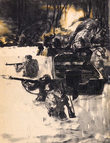
He uses bold perspective to lead us into the action. Although his figures are always well drawn and well designed, more importantly they are animated with intense energy... they really MOVE! Kossin only puts in enough detail to describe important information for our clarity... the rest is merely suggested.
On the right is a vignette of paratroopers missing their landing point and sinking to their knees in a slimy swamp.

Kossin indicates the awkward landing, through design tension... with strong diagonals in two dark masses... a large mass on the ground and a smaller cluster of parachutes in the sky. Kossin is a master at clustering or grouping his elements into larger masses of interesting well designed shapes. The strained expression and tense body language of the troubled paratrooper, tells us volumes.
My thanks to Tom Watson, who clipped the these pages for his files back when this issue of Life magazine first came out, in May of 1963. This week Tom provides his insightful analysis as well as all the scans, giving me a nice break!
My Sandy Kossin Flickr set.
Sandy Kossin's the best.
ReplyDelete