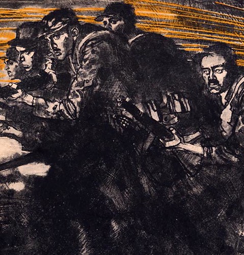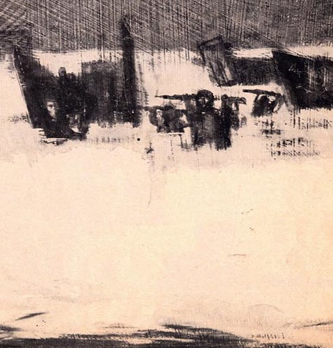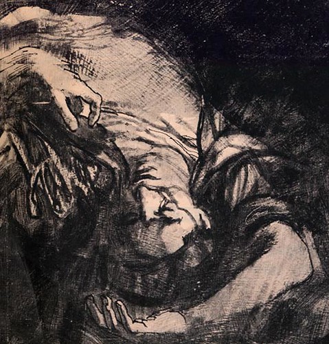
Again, powerful and dramatic is the best way to describe all these illustrations. This spread is the perfect example of mixing abstraction and realism to portray the sheer essence of this story. Kossin scrubs in a dark abstract pattern and then brilliantly contrasts it with nearly pure white shapes that carves out recognizable forms. Notice on the left, the figures merge from the dark,

and on the right Kossin uses counter-change in the distance with nearly black silhouettes of figures, set against a sea of white.

There is a driving force from right to left that is heightened by his excellent use of perspective. The fallen soldier lying in an awkward upside down position on the ground, stops us and sends us back into the illustration.

Kossin's technique is spontaneous, intense and gritty... an ideal way to describe intense combat scenes. He cleverly shows how texture, contrast, functional shapes and a minimum use of color, can speak volumes.
My thanks to Tom Watson, who clipped the these pages for his files back when this issue of Life magazine first came out, in May of 1963. This week Tom provides his insightful analysis as well as all the scans, giving me a nice break!
My Sandy Kossin Flickr set.
Barbara Bradley asked me to post this comment on her behalf:
ReplyDeleteThank You, Tom, for sending this wonderful series and for your fascinating analyses of Sandy Kossin's beautifully composed and executed illustrations. It's been a long while since I saw this series but I was knocked out by it then and impressed even more this time around. You referred to Kossin's use of large masses of dark shapes. Keeping detail and contrast within the dark shapes to a minimum made his important light areas ( such as those near heads) all the more effective. His use of dark holding essential light is masterful. His drawing is great, including the expressions, both body and facial. And, the textures are still gorgeous.
thanks again.
Barbara
Can you mention what media these artists use in your blog? It'd help a lot, thanks!
ReplyDeleteJess;
ReplyDeleteWhen possible, I will mention what media the artists used but, as I'm sure you can appreciate, most of the time we can only guess - since there's very little documentation about these artist (in most cases).
As luck would have it, you're going to get to learn all about Sandy Kossin's work process some time soon here at Today's Inspiration, thanks to this week's guest host, Tom Watson. ;-)