And how better to approach that than with a look at some illustrations from Holiday magazine?
So let's start with this great, classic 1953 watercolour piece by John Pike.

From what I've seen, relatively few 1950's illustrators worked in watercolour. In fact, when I see a really obvious watercolour technique in a 50's illustration, I immediately look for John Pike's signature. That's what I did when I first saw the ad below: assumed it must be by Pike.
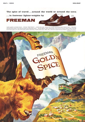
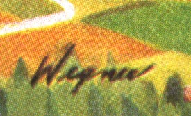
But then I spotted this signature which reads, I think, "Wegner"(?)
Not a name I've come across before... but clearly an accomplished watercolourist. And then I found a second ad in this series.
You know, technique aside, I really love the audacity of these ads. The credit must surely go to the AD who designed the series. Just the idea of sticking a giant animal's face in the foreground (and choosing not particularly attractive or cuddly animals) was a daring move that makes these ads jump out and grab the viewer.
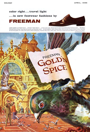
And the torn paper motif, sort of clichéd after many years of overuse, would have still been a novel design element back in 1960, I think. These are fun ads... and I like 'em!
My John Pike Flickr set.
My Wegner Flickr set.
Having grown up 45 minutes North of the Adirondacks along the Canadian border John Pike and Frederic Remington were the two artists talked about most.(Remington's Museum was only 30 minutes away!)
ReplyDeleteI've always enjoyed watercolor, it was the first color medium I ever used. To this day I refer to Charles Hawthorne's book Hawthorne on Painting as a constant reminder of how to see.
Wegner has a great look to his stuff too. I especially like that Pigeon piece...reminds me of Hitchcock's THE BIRDS!
=s=
=s=
I like that Hitchcock reference, Shane - you're right - it IS kinda freaky having a big pigeon eyeball staring you in the face!
ReplyDeleteI've alsways heard watercolour is the toughest medium... very unforgiving... so I've generally shied away from it. And now that I work exclusively in Painter its kind of a moot point - but man, I respect well-done watercolour - and all three of these pieces look great to me. :-)
The torn paper effect is similar to trompe l'oil -- rare in illustration, and not rendered too realistic here. These are bold designs, but probably were too odd to be successful, particularly as you note, with the use of strange animals. But they are great!
ReplyDelete