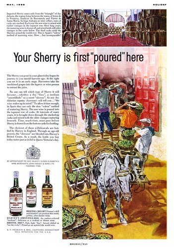
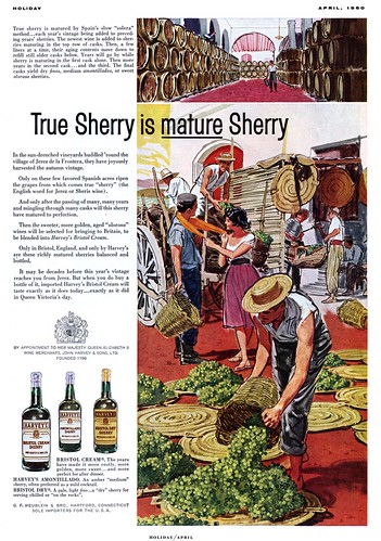
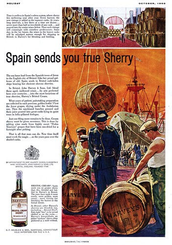
I really like the rich, saturated colours, strong compositions and well drawn subjects the anonymous artist employed in all three of these ads.
One thing I'm unsure of is the medium these pieces were done in... although I have a sneaking suspicion that this might be magic marker on bond paper. As mentioned in an earlier post, when magic markers first became popular, it was not unheard of to see illustrators use them for finished art as well as layout work.
Something about the way the colours interact here, especially in this last piece makes me think these ads are done with markers.
No idea who the artist is... so these pieces will for now be filed in my Beverage Ads Flickr set.
21 Leif, I agree with you that these wonderfully authoritative ads were done with markers. The line quality, especially in architectural areas is typical of markers. Also, changes of hue within color shapes that can be done easily in watercolors are time consumers in markers. I greatly admired illustrators who could get such great effects with markers. Hunting for the exact colors I wanted drove me to such distraction that I couldn’t stand working with them. This anonymous illustrator is so skillful. The orange shirt, in particular, has such wonderful strokes that they look as though they were done with brush. For a while, I thought it was done in brush. What a thorough command of shadow shapes and uses of dark holding light he shows. (It reminds me of the Western illustrators such as Ludekins and Galli. Sargent shows this command in his watercolors.) The bits of light, as on the figures, are so effective. Thank you Leif. It’s wonderful to be able to appreciate work like this once again, and probably, even more than before.
ReplyDeleteThe artist is Mitchell Hooks, I would guess the medium is Dr. Martins dyes or a similar product.
ReplyDeleteHarald, how do you do it? Now that you mention it, it does look like Mitchell Hooks' style... but can you confirm? Or are you taking an educated guess?
ReplyDeleteI still suspect this could be marker though... possibly used on a cotton swab for the larger areas and in the actual felt tipped marker for the tighter bits.
Barbara, in regard to colour and shadow shapes: I particularly like the violet blue shadow treatments in the third piece... especially in the back leg of the foreground figure at extreme right! The way (Hooks?) contrasted that violet shadow against the green pantleg and the red cobblestones is just gorgeous!
I remember these ads I may have the clips in my files. Hooks was such a good artist that perhaps he could have used markers. Since these aren't signed I will try to find something he did in this style. I liked his work a lot.
ReplyDeleteYou know Leif suffice it to say, I think watercolor and marker are very similar in their approaches.
ReplyDeleteSo if you're good with the Chartpaks and Marvy fine points, you'd probably do pretty well with watercolor. It's just laying one color over another and building up to dark.
But you have to be fast and clear-headed in your approach! :)
Ahhh Mitchell Hooks...I hope you're right, harald.
=s=