Pitz could not have imagined how right he was. As realistic illustration lost ground to the relentless charge of television and photography, the storybook illustrators of the 50's were steering illustration in a new direction that the public likely found more palatable than the sometimes impenetrable work of the avantegardists lead by Robert Weaver.
A few enlightened art directors and their clients were early adopters of the storybook style...

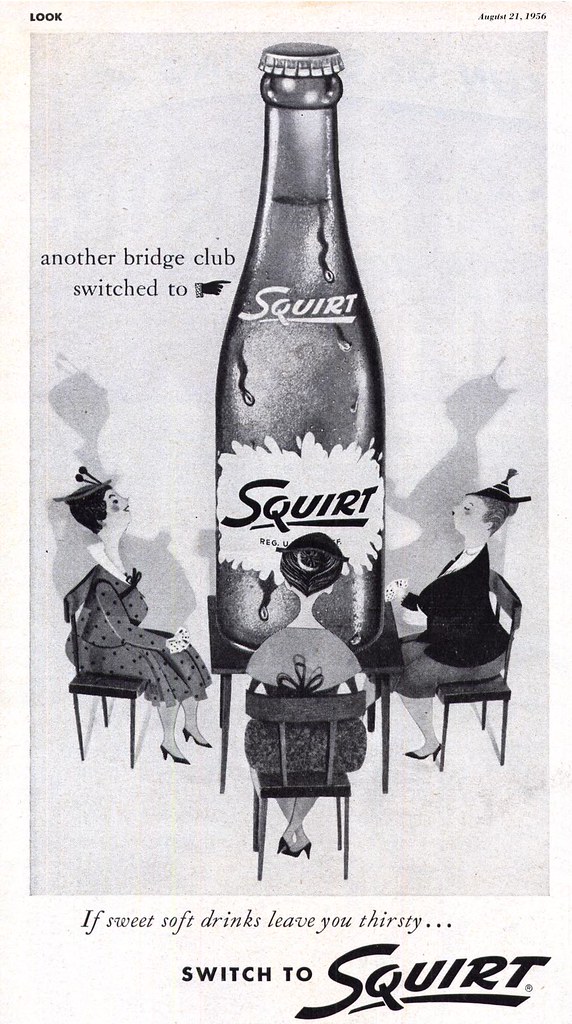
... giving even the most mundane ad concepts an attractive, eye-catching flare that realism (photographic or illustrative) simply could not hope to compete with.

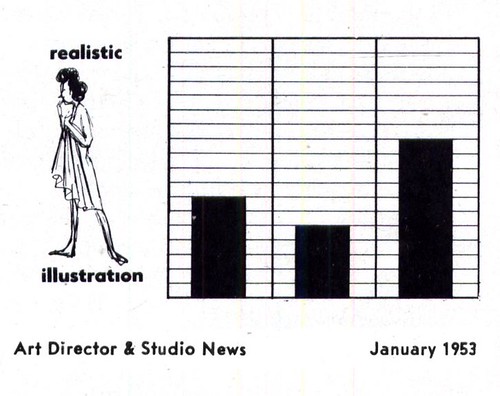
As early as 1953, members of the Art Director's Club of New York seem to have supported the idea of using more storybook styles. An unscientific survey in the January 1953 issue of Art Director and Studio News shows the following cleverly presented results.
Asked their opinion of which types of visiual devises used in advertising they felt were on the increase, most art directors seem to have felt that fine art and decorative art was on the increase...
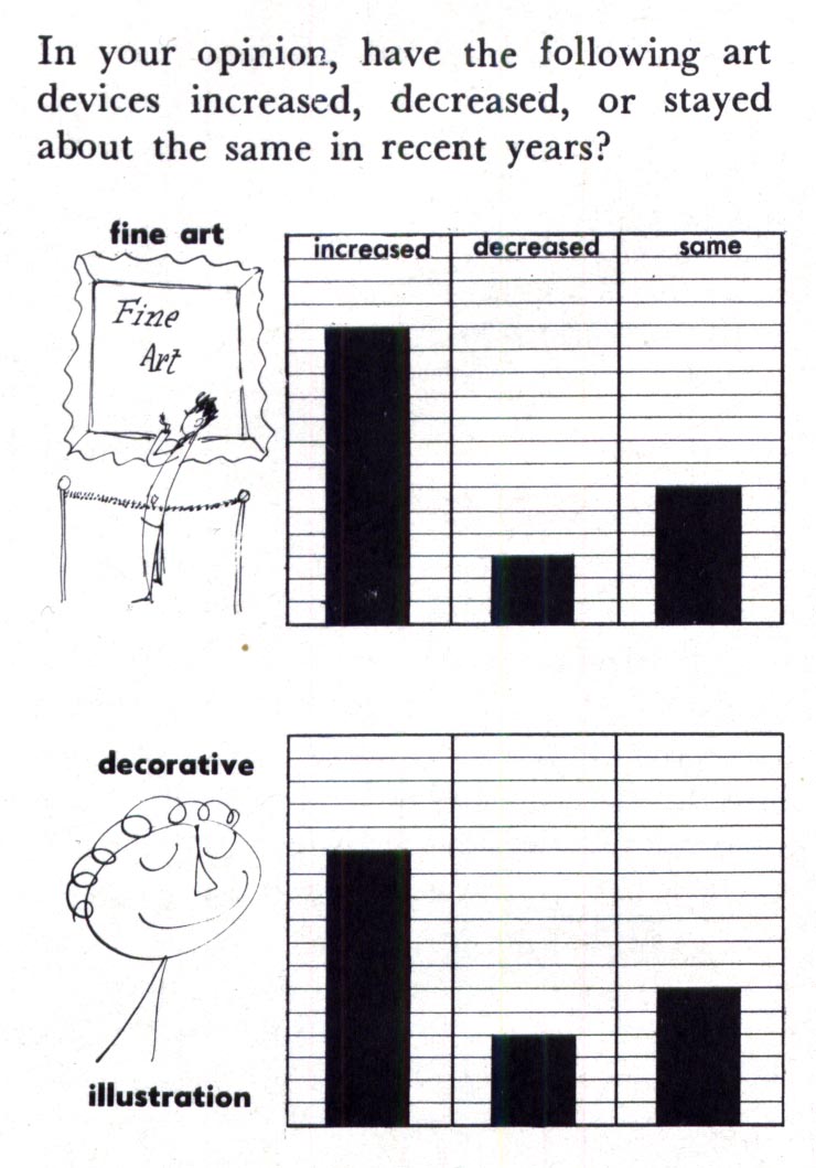
... as well as more cartoon art and photography...

... while most seem to have felt that realism was, if anything, just holding its ground. This is quite telling.
Art directors are the ones developing concepts for client presentation. If they can convince advertisers to try something different, something that might make their product stand out from the competion, then they can be credited with having played a significant role in more storybook style artwork being presented to the public.
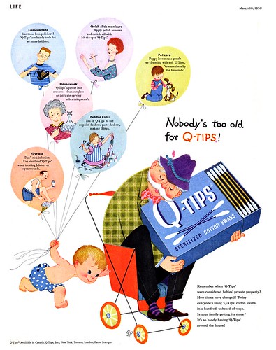
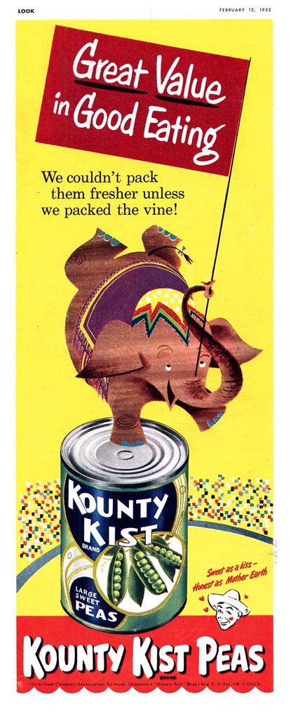
The pieces you see here and throughout this week are but a tiny sampling of clients who were convinced by their art directors to try something other than realism.
"The way for book illustrators has been paved by a growing audience for picture books, particularly among children," wrote Henry C. Pitz. "Americans love pictures, often without discrimination, but that raw appetite has given the book illustrator his opportunity."
"Our book illustrators are a concientious and devoted company, frequently giving much for very little. Certainly no one considers book illustration a road to riches. As a result, there is much less frantic opportunism and obsequious awareness of every breath of fashion than in the fields of advertising and magazine illustration. In a world of snatch and discard, the book illustrator retains some liason with permanent things."
So permanent, in fact, that they have flourished for half a century while many others have come and gone.
See my Ads with Storybook Styles Flickr set for many more examples.
I find this quite enlightening reading.
ReplyDeleteAlso that "unscientific survey" is interesting to compare. Things in that field are very dynamic to the day. I wonder how such a survey would look nowadays in 2008.
That's an excellent question, Rick - one I'd love to hear answered by some of the art directors (and designers) who frequent this blog! From my perspective as an illustrator, I would say that many ADs are enthusiastic even today at the prospect of using illustration of any type - but one thing that hasn't changed in all these decades is the client's reistance to anything that doesn't present their product in crystal-clear realism.
ReplyDeleteIt takes not only an enlightened art director but a daring client to do what seems obvious to stand out from the crowd: something that looks *different* from the competition! Illustration, in all it mutitudinal variations of style, is the natural solution, imo.
Heya - I couldn't find an email address. I'm sure you know about this but just in case not, here is a link:
ReplyDeletehttp://www.cmom.org/exhibits/exupcoming.html
The Children's Museum of Manhattan has an exhibit called the Golden Legacy: Original Art from 65 Years of Golden Books. The exhibit runs from July 4 to August 28.
Yeah, leif, an enlightened art director in combination with a daring client...that looks quite promising.
ReplyDeleteJust as an example of everyday experience: Passing by the local cinema, there's the usual look at those poster ADs. Don't know the exact percentage, but photographic and digital stuff must be accounting for at least 98% nowadays.
Haven't seen the new edition of the Indiana Jones movie, but the poster at the cinema was one hand-made, with paint and brushes. As they used to be. It just struck me as a rare exception. So there may be a particular story behind client and art director in this case. I venture to say, Mr. Spielberg would like your blog too...
Thanks, Leif! I loved the elephant and I hope you don't mind me stealing it.
ReplyDeleteThanks for letting me know - and thanks for linking back here to the blog, p-e :-)
ReplyDeleteRich;
ReplyDeleteI can recall an illustrator (who's name I'm sorry to have forgotten) coming to my art school 25 years ago (!) to tell us about his meeting with Drew Struzan, the illustrator of countless Speilberg, Disney and other movie posters.
The fellow explained how Struzan had developed a process by which he could sand away part of a painting ( you know how they are usually a collage of scenes and big heads? ) to accommodate the endless changes the studios would request before the art finally went to print. He worked on huge sheets of, I guess, masonatie board, then gessoed them, then drew and finally painted in thin washes of watercolour? Doc Martin's? whatever...
The point being, the assembly of many scenes and head shots and the countless changes made life difficult and time consuming for Struzan, or any other movie poster illustrator... but all of this could be accomplished with relative ease in Photoshop!
In the space of a few short years, almost no illustration was being used for movie posters. Plus, with a photo collage, there's no worry about the *stars* complaining about their likeness on the poster... always a contentious issue illustrators had to deal with.
I'm sorry to see things have gone this way. I understand those posters were extrememly lucrative for illustrators and frankly, Struzan's work had a wonderful energy and flare that photography can't hope to match. He used a lot of subtle linear art in his paintings... chalk pastel? pencil crayon? maybe both... but they were a joy to scrutinize... masterful work, beautifully composed.
And going back further, the caricatured comedy movie posters of the 60's, like Jack Davis' "It's a Mad, Mad, Mad, Mad World" blow modern comedy movie posters out of the water.
We have lost a fantatsic pop art niche market with the demise of the illustrated movie poster - and the general public, which has not nearly enough exposure to artwork of any kind, is poorer for no longer being able to enjoy these wonderful high-profile illustrations.
Thanks leif, for that exhaustive answer. I'm getting the whole picture now.
ReplyDeleteSo my hope is, that all the Spielbergs in this world are capable to understand what you're talking about and that the general public will one day get tired with monotonous photoshop...
Kind of a Renaissance looming?