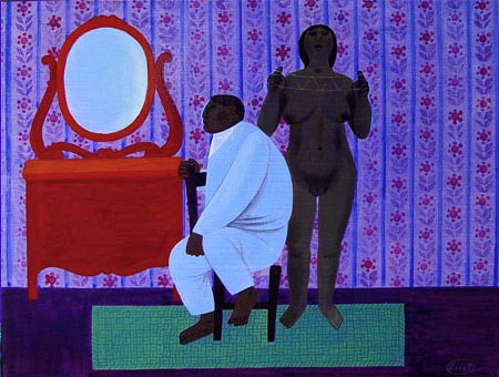
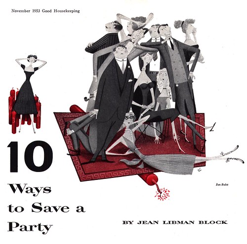
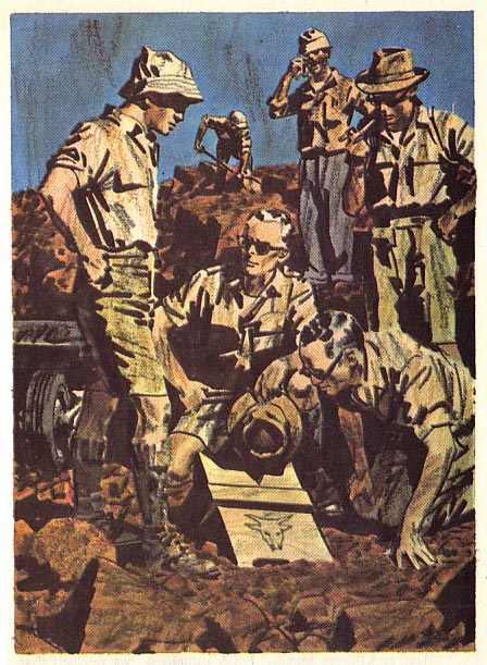
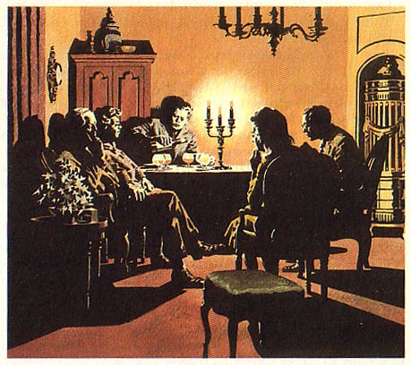
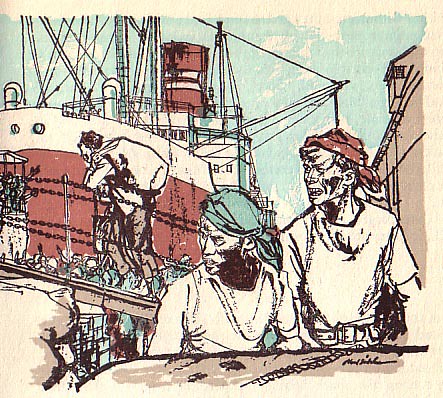
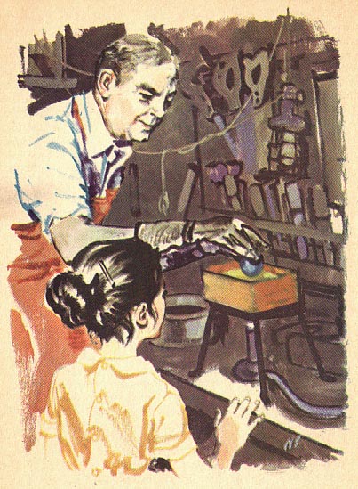
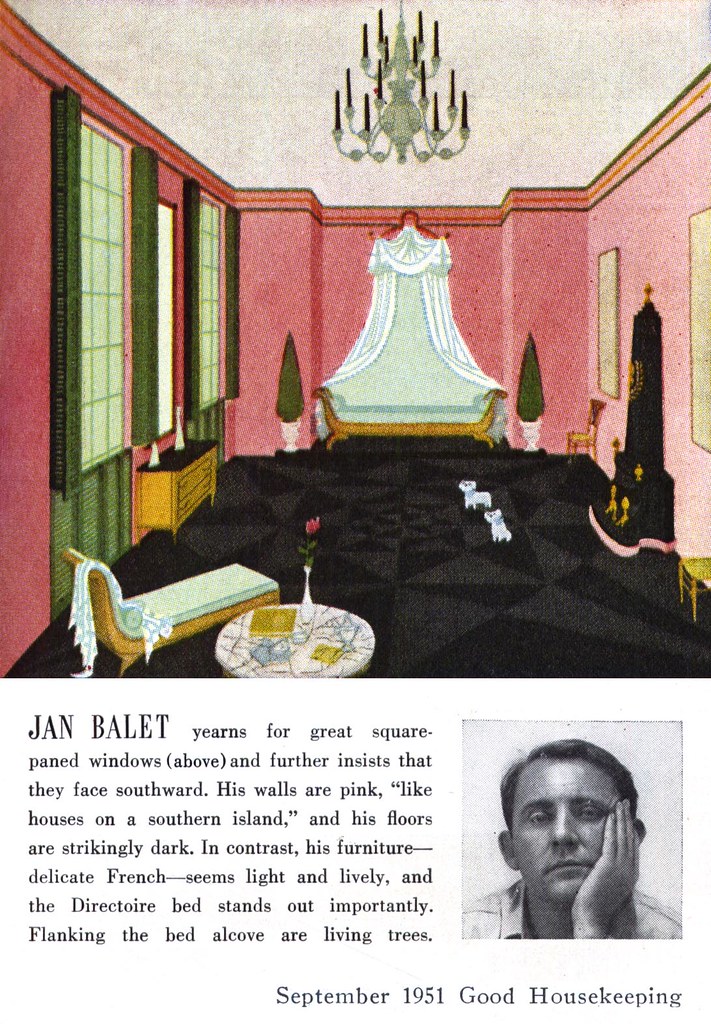
In September 1951, Good Housekeeping magazine asked eight contributing artists to "paint bedrooms they themselves would like." A quirky idea for a magazine article, and one you're unlikely to ever see in a magazine today, but given the minor celebrity status of the illustrator in those days, why not?
Among those eight who contributed to the article was Jan Balet. I thought it might be fun to conclude this week's look at the artist with this oddball item...
... whether or not it reveals anything more about Balet, I'll leave for you to decide.
My Jan Balet Flickr set.
Celebrating illustration, design, cartoon and comic art of the mid-20th century.
Saturday, August 30, 2008
Friday, August 29, 2008
Whatever happened to Jan Balet?
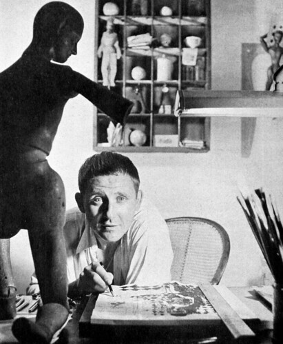
Illustration must have been good to Jan Balet. By the time the feature article on him appeared in American Artist in 1946, he already had a residence and studio in New York City, a summer home in Long Island and his own plane. Not bad for a German immigrant who had arrived broke and unknown just eight years earlier!

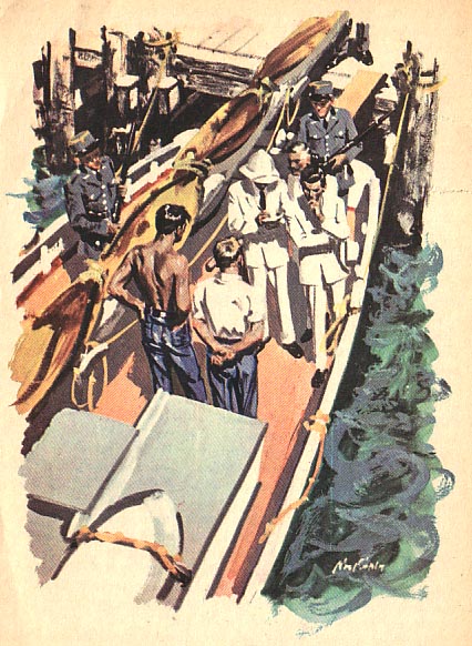
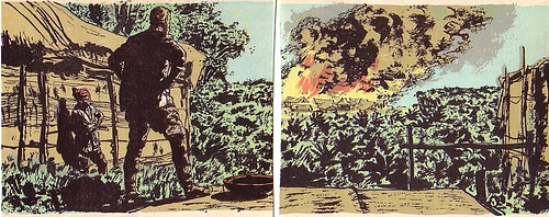
Jan Balet's work began appearing in Collier's magazine around 1955. Though Balet was still doing his popular "graphic whimsy" style for the Lees Carpet ads and for clients like Good Housekeeping, the Collier's work suggests that Jan Balet was searching for new directions.
In the mid-50's the Cooper Studio/New School style commanded the lion's share of the illustration market. The Avante-Gardists like Robert Weaver were making inroads with some art directors and the Decorative style was still an emerging flower. The Storybook stylists like Art Seiden, Aurelius Battaglia and the Provensens really were focusing their efforts on storybooks...
Just how did Jan Balet fit into 'the big picture'?
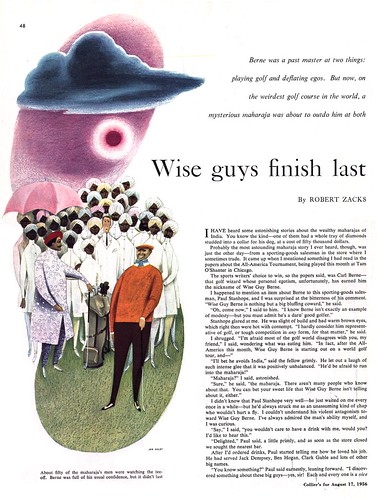
Perhaps he felt a bit like the odd man out...
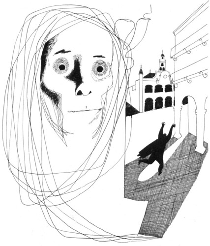
Jan Balet loved to travel. In 1961 he visited Texas, Arizona and New Mexico. The experience must made quite an impression. The three pieces below came out of that trip and, in their naiveté, show a new sophistication.
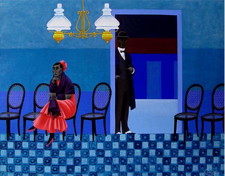
Keeping in mind that the early 60's was a difficult time for the illustration business, when many artists were searching for new markets, new directions...... could this - and Balet's desire to explore his creative potential - be why he returned to Europe in 1965?
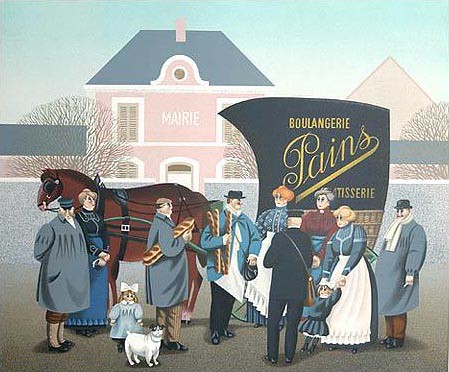
Balet settled in Munich and began doing lithographs, like the ones show here, for the fine art gallery market. Later, in 1978, he moved to Estavayer-le-Lac, Switzerland and continued to produce limited edition prints and posters. A quick search on the internet turns up many examples like these available from galleries all over the world.
One gentleman who knew Balet years ago writes at askart.com, "He was a great person to know, with an honest, salty sense of humor which one sees in his artworks."
If Jan Balet is still with us (I found nothing to suggest he has passed away) he will be 95 this year.
My Jan Balet Flickr set.
Jan Balet's work began appearing in Collier's magazine around 1955. Though Balet was still doing his popular "graphic whimsy" style for the Lees Carpet ads and for clients like Good Housekeeping, the Collier's work suggests that Jan Balet was searching for new directions.
In the mid-50's the Cooper Studio/New School style commanded the lion's share of the illustration market. The Avante-Gardists like Robert Weaver were making inroads with some art directors and the Decorative style was still an emerging flower. The Storybook stylists like Art Seiden, Aurelius Battaglia and the Provensens really were focusing their efforts on storybooks...
Just how did Jan Balet fit into 'the big picture'?
Perhaps he felt a bit like the odd man out...
Jan Balet loved to travel. In 1961 he visited Texas, Arizona and New Mexico. The experience must made quite an impression. The three pieces below came out of that trip and, in their naiveté, show a new sophistication.
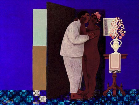
Keeping in mind that the early 60's was a difficult time for the illustration business, when many artists were searching for new markets, new directions...... could this - and Balet's desire to explore his creative potential - be why he returned to Europe in 1965?
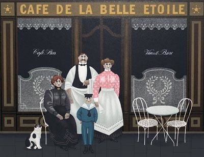
Balet settled in Munich and began doing lithographs, like the ones show here, for the fine art gallery market. Later, in 1978, he moved to Estavayer-le-Lac, Switzerland and continued to produce limited edition prints and posters. A quick search on the internet turns up many examples like these available from galleries all over the world.
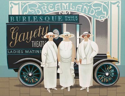
One gentleman who knew Balet years ago writes at askart.com, "He was a great person to know, with an honest, salty sense of humor which one sees in his artworks."
If Jan Balet is still with us (I found nothing to suggest he has passed away) he will be 95 this year.
My Jan Balet Flickr set.
Thursday, August 28, 2008
Jan Balet: Influences of an influential illustrator
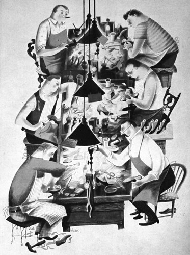
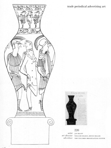
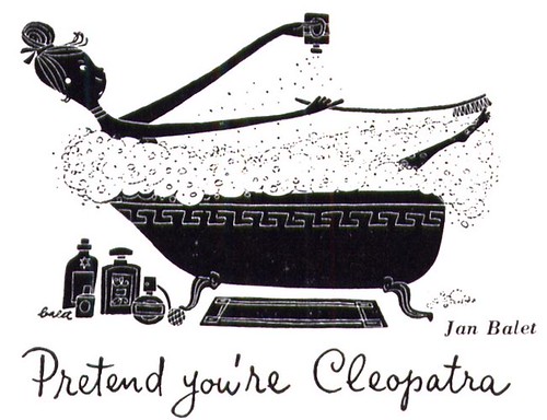
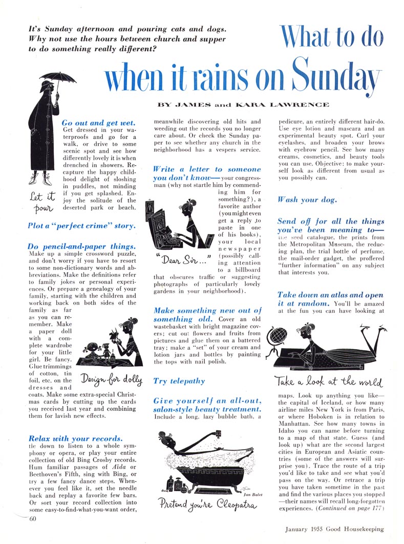
In the business and among his peers Jan Balet was known as a cartoonist or a 'decorative' illustrator who worked in a 'humorous' style.
But pinning a label on Balet is more complicated than that. American Artist magazine called his work "graphic whimsy", which is a fun way of putting it, I think.
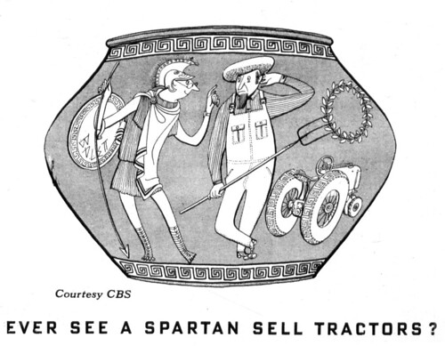
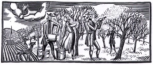
Balet himself said he drew inspiration from both ancient Greek and ancient Egyptian art -- something that might not be apparent until its pointed out, but it hints at the hidden complexity of Balet's intentions.
Personally, I see a broad range of influences,
...including the work of Balet's contemporaries, like Jim Flora and Roy Doty.
Roy told me he didn't know Balet well, but they sometimes crossed paths as they came and went from the offices of clients when picking up or dropping off assignments. Roy described Balet as "very much the European."
He was probably commenting on Jan Balet's character -- but I think that Balet's work has a sort of European character as well. On his studio walls Balet hung the work of Picasso, Chagall, Guys and Lautrec. He is said to have favoured the work of these "French Moderns" but that he was "Catholic in his tastes and likes all sorts of art that is good of its kind."
The small sampling here and the other work you've seen so far this week certainly lends credence to that statement.
My Jan Balet Flickr set.
Wednesday, August 27, 2008
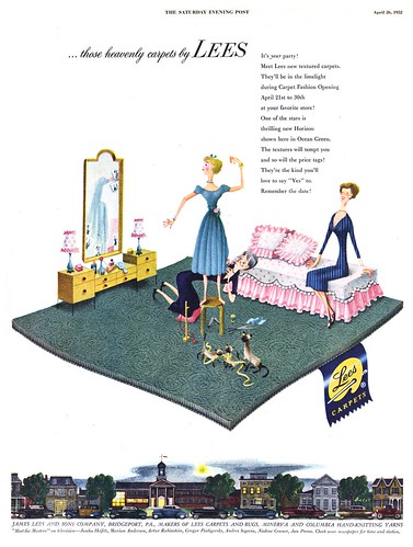
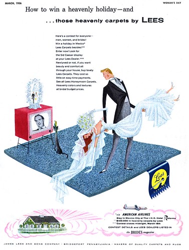
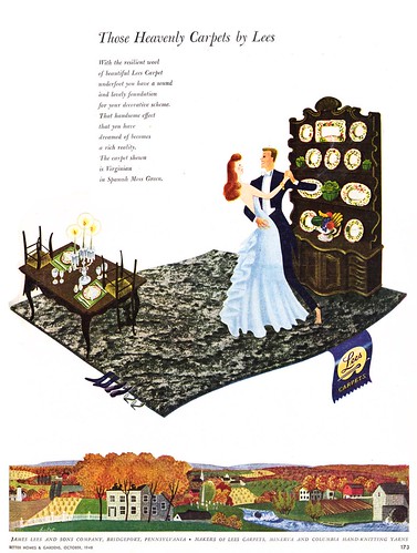
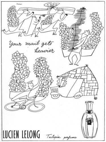
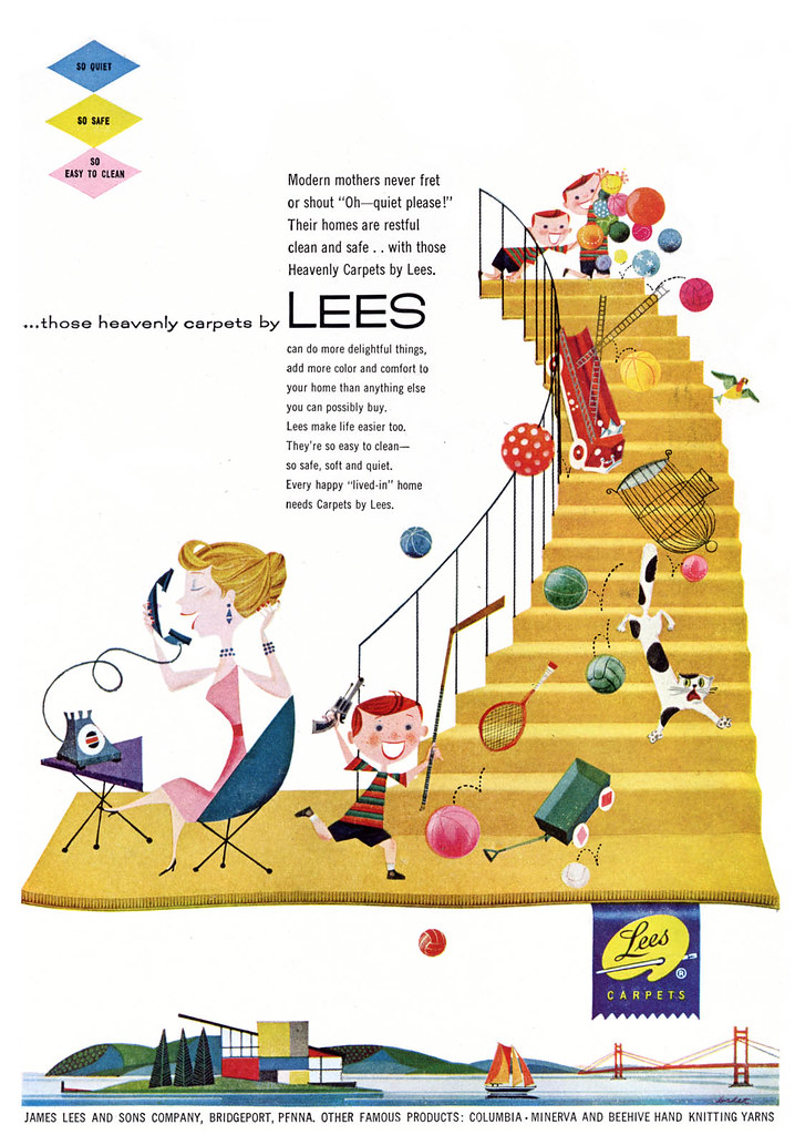
Jan Balet's Lee Carpets Ads: "a high-style humorous touch"
Back in 1947, art director Paul Smith of the D'Arcy Advertising Company had an interesting challenge before him: how to set his client's brand of carpets apart from the competition.
Smith said that his aim was, "to get as far as possible from the well-worn formula for carpet advertising: a wide-angle shot showing a lonesome woman in evening gown, viewing about three acres of carpet with a mixture of pride, aristocratic reserve and genteel melancholy, who is probably wondering why her husband hasn't come home yet, to take her out to a nice comfortable saloon with sawdust on the floor."
Part of Smith's solution was to find an illustrator who could bring to the ads, "a high-style humorous touch that could imply fashion leadership in the manner of the leading department stores and other top-flight retail outlets."
To accomplish this task Smith chose Jan Balet. When the ads first appeared in 1948, they won an Award for Distinctive Merit from the Art Directors Club of New York.
For the next decade Jan Balet produced a steady stream of Lees Carpet ads, always executed on the same design template Smith had originated, suggesting that the client must have enjoyed great success with their distinctive approach.
Their high profile and consistent year after year appearance must have meant that not only were the Lees Carpet ads a lucrative account for Balet -- but as a bonus, they would have been an excellent promotional vehicle, no doubt attracting many new clients.
As for art directors, 60 years later, the message is still clear: want your concept to stand out from the crowd? Use illustration!
* These delightful ads need to be seen at full size to be really appreciated. To best view them go to my Jan Balet Flickr set
Tuesday, August 26, 2008
Jan Balet: The "noteworthy victory of design over perspective"
Jan Balet was born in Bremen, Germany in 1913. His father was French and his mother was German.
Balet received formal art training at the Arts and Crafts Schools of Berlin and the Munich Academy of Fine Arts. As a young man he spent his summer vacations travelling extensively by bicycle through the Balkans, Spain, Italy and even Northern Africa. He counts the experience among his most important creative influences.
He might have begun his career in Europe but the rise of Hitler's Nazi regime in his homeland deeply disturbed him, and in 1938 he emigrated to the U.S. The transition was not entirely smooth. His first four years in America were tough ones, and he took any and all kinds of work to survive.
At last he began receiving assignments - and more - he took a position with Mademoiselle magazine, first as assistant art director, then as art director. The relationship lasted for two years.
Next came an offer to art direct Seventeen magazine. Balet stayed for a year and a half before choosing to go freelance.
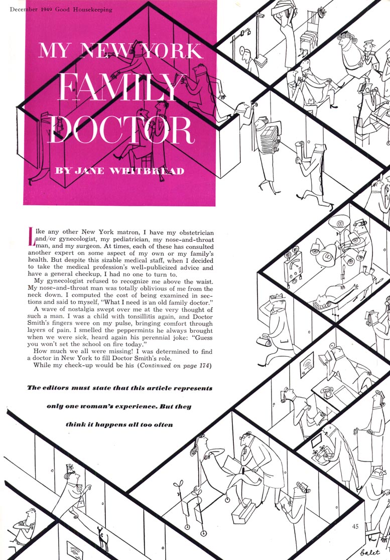
As projects began flooding in from magazines and ad agencies, Balet still found time to make pictures for children's books. The piece above, courtesy of Ward Jenkins, is from the 1951 Rand McNally book, The Lazy Lion. For those interested in seeing more of The Lazy Lion, Ward has kindly posted the entire book in his Flickr archives.
My Jan Balet Flickr set.

Sunday, August 24, 2008
At Last - The Story of Jan Balet!
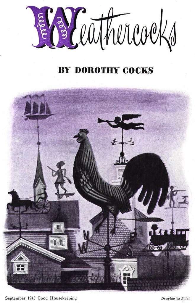
One of the first artists I took note of when I began Today's Inspiration was Jan Balet.
Not too surprising... compared to the more typical look of commercial art from the mid-century era, Balet's distinctive style (and unique-sounding name) are both thoroughly notable.
A lot of other people began taking note of Jan Balet about 65 years ago... his popularity with clients - both advertising and editorial - began almost as soon as he appeared on the commercial art scene.
Not long after, Balet started winning awards. The Art Directors Club of New York chose 5 of his illustrations for its advertising annuals in both 1947 and 1948.
But just who was this illustrator with the intriguing name and hard-to-categorize style?
Balet has no listing in Walt Reed's Illustrator in America, and although his work was included in Gene Byrnes' Complete Guide to Cartooning, the accompanying short write-up provides almost no information about the artist.
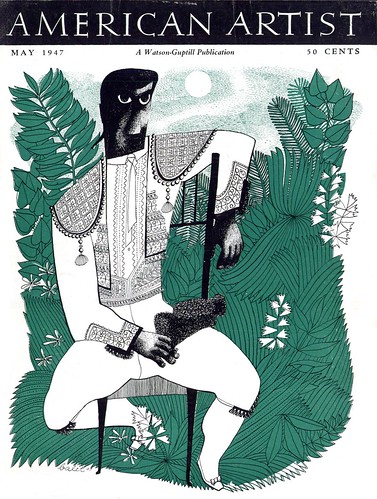
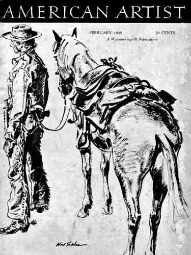
At last the story can be told! Back in late-1946 American Artist magazine did a feature story on the artist and only months later, in May 1947, showcased Balet's art on the magazine's cover. Recently I acquired both of those issues, so this week we will all finally learn a little about the artist.
I've mentioned before that I enjoy reviewing the details my Sitemeter collects on those who visit this blog. Many people arrive here because they have Googled an artist's name. You'd be amazed how regularily I see the name Jan Balet as the search term when I review my 'visits by referral'.
It will be a pleasure to finally be able to provide those searching for information (and all of you regular readers) with a biographical sketch of an artist who has long been one of my favourites: the always surprising, always delightful Jan Balet.
My Jan Balet Flickr set.

Friday, August 22, 2008
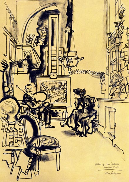
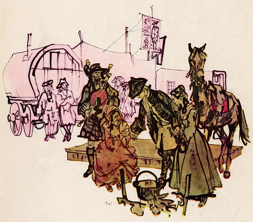
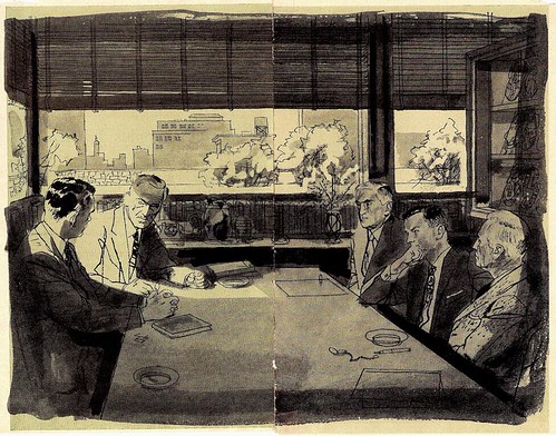
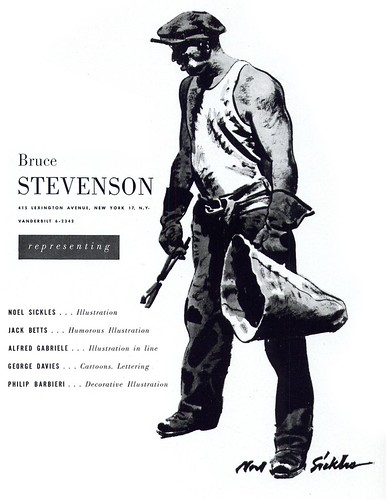
Noel Sickles: an "inquisitive, restless genius"
From Bruce Canwell's biography of the artist in Scorchy Smith and the Art of Noel Sickles:
Sickles's art reflects the exacting touch of a master craftsman coupled to a streak of inquisitive, restless genius.
That genius drove him to constantly gather knowledge and seek outlets for what he learned. It kept him endlessly experimenting, testing the boundaries in order to push through them.
Though not every experiment was successful, many were, and those successes allowed Noel to discover and explore exciting new creative directions.
The dedication to his craft kept him bound to a standard of excellence, driving him to tear up nearly-completed work and begin afresh, unmindful of the fact those castoffs represented a level of skill many of his peers were unable to match on their best days -- if it was not Right, it needed to be abandoned and replaced by something that was Right.
In his Society of Illustrators Hall of Fame tribute to Sickles, Harry Devlin wrote, "Noel had no hobbies - there was no golf or tennis. He had two loves - Louise and his work. He worked constantly, researching and ever improving that miraculous ability to draw."
Although decades have passed since Noel Sickles added the final piece to his oeuvre, the passing of years has not blunted the vibrant appeal of that work. The range of material bearing his signature is savored by a steady flow of devotees in America and throughout Europe. It is periodically showcased to allow a larger audience to discover it anew: the faithful share their treasures, knowing the sharing will cause their ranks to be replenished.
The love of his family - the admiration of his peers - the respect of his acquaintances - the lasting depth and breadth and power of his life's work. By any yardstick applied, one conclusion is inescapable: against standards so high few could aspire to them and fewer still could attain them, Noel Sickles measured up. As an artist. As a man.
* My thanks to Charlie Allen, Brian Postman and Tom Watson for providing scans for today's post.
* My thanks as well to Dean Mullaney for granting me permission to excerpt passages from Scorchy Smith and the Art of Noel Sickles. The book is available from Amazon and all bookstores, comics shops, and online retailers. If your local bookstore doesn't have it in stock, they can order it for you: ISBN 978-1-60010-206-6. The text excerpted is © 2008 Bruce Canwell.
* My Noel Sickles Flickr set.
Thursday, August 21, 2008
Alex Toth on Noel Sickles
"There are very few artists' artists left to get all hopped up about in our medium, but [Noel Sickles] still gets ovations from us all. He's got the talent and 'the touch'. "
"Okay, you all know what talent is: you know when you see it and when you don't. But what the hell is 'the touch'? you ask."
"Oftimes it's hard to verbalize... but let me try. I'll put it this way: It's just not enough to have 'talent'. How you apply that talent is what demonstrates touch. Noel's learnt to apply it very well from the start."
"[The touch is] a joyous thing to perceive in any work of art -- that elevates it far and above its contemporaries, and causes responses of wonder, respect, admiration, and professional envy. It is: "The Majesty of the Simple thing"! (Repeat after me -- 100 times -- "The Majesty of the Simple Thing.") "
"It is creating a piece of work by a subtractive process rather than an additive one! Once the necessary elements for a story telling picture have been selected and set down on paper in their most effective arrangement, the matter of delineating them remains."
"How one solves the problem, in the "finishing" stages, tells us either too much (more than we really need, or want to know) or not enough!"
"Ahh, but the artist with that "touch" -- he finds that magical, marvelous balance point between the two choices. His eye, intellect, taste, and hand find the razor's edge dividing them. The final assembly of lines tells us as much about the artist as it does his subject. In economy lies the truth."
"To add to the truth subtracts from it!" A beautiful quote. (Heard or read months ago. Sorry, can't recall the source.)"
"What I learned from Noel was... an appreciation for economy, clarity, line, mass, pattern, perspective, dramatic moment, subtlety, light source and drop shadow mechanics, negative and positive silhouette values, shapes and the overlapping of same, tension."
"How much of these studied observations and lessons learnt have actually found their way into my own doodles is a moot question... [But] with elegance, subtlety, and style honed with economy, and with that abundance of talent, Noel produced [artwork] that knocked 'em dead!"
Excerted from an article that originally appeared in The Buyer's Guide © 1977 Shel Dorf
* My thanks to Brian Postman for providing today's scans.
* The book Scorchy Smith and the Art of Noel Sickles is available from Amazon and all bookstores, comics shops, and online retailers. If your local bookstore doesn't have it in stock, they can order it for you: ISBN 978-1-60010-206-6. The text excerpted is © 2008 Bruce Canwell.
* My Noel Sickles Flickr set.
Subscribe to:
Posts (Atom)