
To be fair, the ads in Fortune were never intended for a broad public viewing. Those businesses advertising were directing their message to other businesses, as is the case with this American Airlines freight-shipping series - but I gotta tell you - boy, this is some dull stuff!
This is what we in the doodling racket call "paying the bills", and its lacklustre appearance is usually the result of an agency presenting the illustrator with layouts that have been nailed down tighter than a drum, with absolutely no wiggle room left for the poor soul tasked with rendering the final execution.
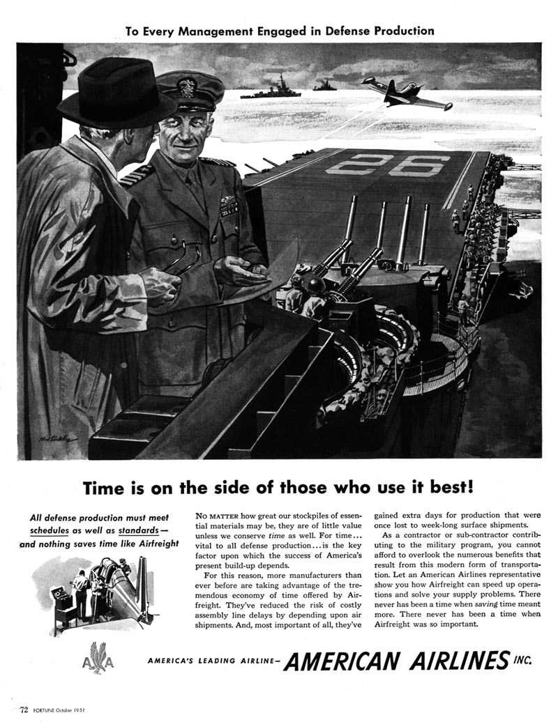
You'd think with a talent of Noel Sickles' stature and ability that he could somehow turn this water into wine, or that on principal he would have passed on such a tedious series if the client refused to budge from their lame concepts and dreary compositions. But the truth is everyone needs to make a living. And a series of national ads for a major corporation pays very well... even better in 1951 than it would today.

With a name like Today's Inspiration you might be wondering what merit there is in seeing these ads, but in spite of everything said above I wanted readers to consider several important points: that even unspectacular Sickles is still Sickles, that seeing work like this reminds us that illustration is the business of crafting art in the service of utility, and finally, to quote an old friend, "Indoor work, no heavy lifting... where's the down-side?"
* My Noel Sickles Flickr set.
* Is it too late to ask Santa for Scorchy Smith and the Art of Noel Sickles? I don't know - but it couldn't hurt to try!
* So how do you take what could be pretty mundane subject matter and set it on fire? Check out Charlie Allen's latest CAWS for the answer.
Right on Leif. My thought is that in spite of how boring the subject is, and the lack of creativity those American Airline freight ads have, they must have been effective or they wouldn't have spent so much money on a whole series. What is boring to us, may communicate to the people in the business it is directed to.
ReplyDeleteAs an Art Director/Illustrator and later a Creative Director, I would sometimes have to create ads that damn near put me to sleep, but they were very successful for the client and the agency. Sometimes my creative efforts would be circumvented or diluted by "client concerns". They knew their product or service and their market, and that couldn't be ignored. They were paying the bills, and all the A.D. or C.D. could do is make recommendations, based on client input and material. Advertising was a "team sport". Fortunately, the boring jobs were the exception, not the rule.
In the early 50's, advertising illustration was not very creative or innovative, especially business to business advertising, so illustrators didn't expect it to be a creative cake walk.
I never understood why many people in the creative field think they should have total freedom on every job they do, regardless of client facts or expertise. I took pride in being adaptable enough to produce an effective professional ad or illustration for the client, as attractive and creative as I could possibly make it, and meet my deadline. That can often be more of a challenge than being given total freedom to do as you please.
Tom Watson
Right on, Tom. I was always 'this brush for hire' kind of an illustrator....as long as the client paid the bills on time! I've rarely seen an assignment that couldn't be improved, challenged, or doing, as the recent pop phrase went, 'putting lipstick on a pig'. Was impressed to see the Sickles style on those ads. Where I parted with his low opinion of Whitcomb, and the 'boy/girl' illustrators.... can you imagine how Sickles would have handled a romantic boy/girl ad for Whitman Candies? I can't. Also can't imagine Whitcomb painting a Civil War battle scene! Kaiser used to have cement trucks with a sign, 'Find a need and fill it!' Both those talented illustrators did just that.
ReplyDeleteI think I would like these better if they were just done more quickly. In Sickles' best work, the brush doesn't touch the paper a moment more than it has to. Perhaps the art director asked for more polish?
ReplyDeleteEither way, the new Sickles book is my new favorite book.
As for me, I'm not in the least bored, looking at those depictions.
ReplyDeleteTheir message holds true to the day and is brought home most graphically and vivid. Still today one might do a management seminar around those depictions.
I am very interested in the articles that you serve. Provide enough knowledge for me. Thank you for posting useful and don't forget, keep sharing useful info. A huge collection of all the Celebrity net worth of the world. How much is celebrity worth? Compare yourself to your favorite celebrity.
ReplyDelete