During the mid-century period coloured chalk pastels became very popular for doing comp work. Though I can't help but think that even with spray fix this must have resulted in a lot of smudged layouts and stained shirts and pants around the boardroom table!
Still, in the right hands, a pastel drawing can be incredibly beautiful. Below, a comp done by Canadian illustrator Will Davies. Will preferred chalk pastel for comping and continued to use them long after they fell out of favour with the industry.
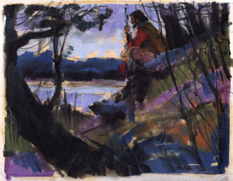
In fact, Will's pastel comps were so exceptionally beautiful that they were often used as finished art. When an art director at Ogilvy & Mather Toronto first commissioned Will to do an illustration for the Hathaway Shirt account, he was so impressed by Will's colour comp that he decided Will should do all future Hathaway ads in chalk pastel.

(Thanks to my friend Dan Milligan, who gave me this piece as a gift. It hangs in my livingroom and I had to shoot a picture through the glass - thus the lousy reproduction you see here)
The 50's saw the arrival of a new technology in art materials that changed how comps were done: the 'magic marker'.

Markers had the advantage of being fast-drying and permanent - no more smudging. They contained a felt pad (soaked in coloured dye and benzyne) that could be removed and flattened out like a small sponge, so that broad swaths of colour could be laid down quickly. The effect of marker was similar to that of watercolour but with a much shorter drying time. In the fast-paced world of advertising, this made markers an ideal tool for the comp artist.
"Marker rendering" became an artform of its own. Not easy to master, and used almost exclusively for presentation comps. Many people will give illustrations like these only a cursory glance. For me, there is an impressive quality of energetic immediacy and a beautiful reductiveness in this type of work.
I suspect that a lot of artists shun comp work because they find it to be tedious. It is in many ways the most mercenary of the illustration arts. You are required to draw fast - and your creative input doesn't generally extend beyond your ability to make a thing look good. The subject matter is often mundane and repetitive.
And as I said yesterday, the artwork is seen as nothing more than a vehicle for getting a visually illiterate client to grasp an ad concept. As soon as the concept has been approved, your drawing loses its value. No one (or almost no one) appreciates it as a piece of art.
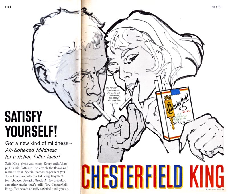
For a some time after markers became commonplace they were ocassionally employed to do finished art, as seen in the ad below. These experiments were, however, short-lived. Marker colours fade quickly and don't reproduce well in print. And I think there was always that nagging feeling among art directors that marker drawings were not valid artworks. There really has always been a sort of weird bias against markers and marker renderers in the illustration business. Believe me, I could tell you stories.
Behind the scenes, however, markers remained the essential medium of layout art and presentation comps for nearly half a century. Only in the last ten or so years did technology cause a massive shift once again: markers have been almost completely replaced by computers, Wacom tablets, and programs like Photoshop and Painter as the primary method of producing comps.
My Will Davies Flickr set.
My Andrew Loomis Flickr set.
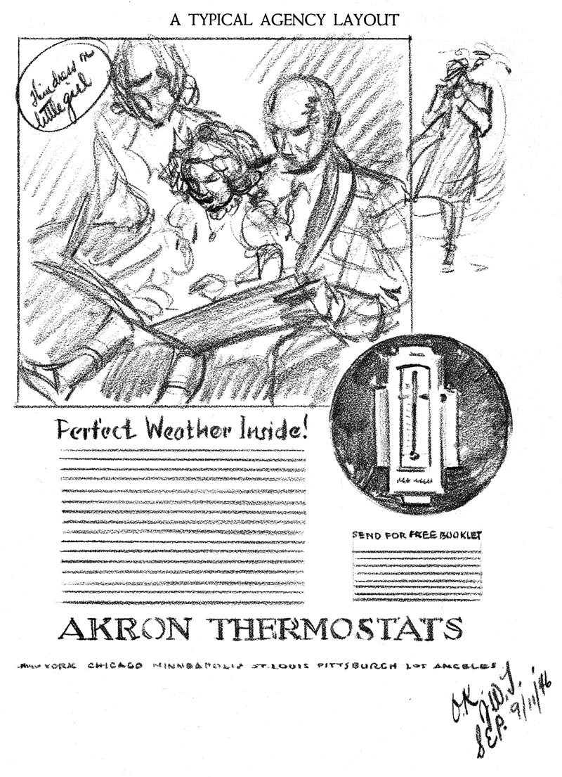
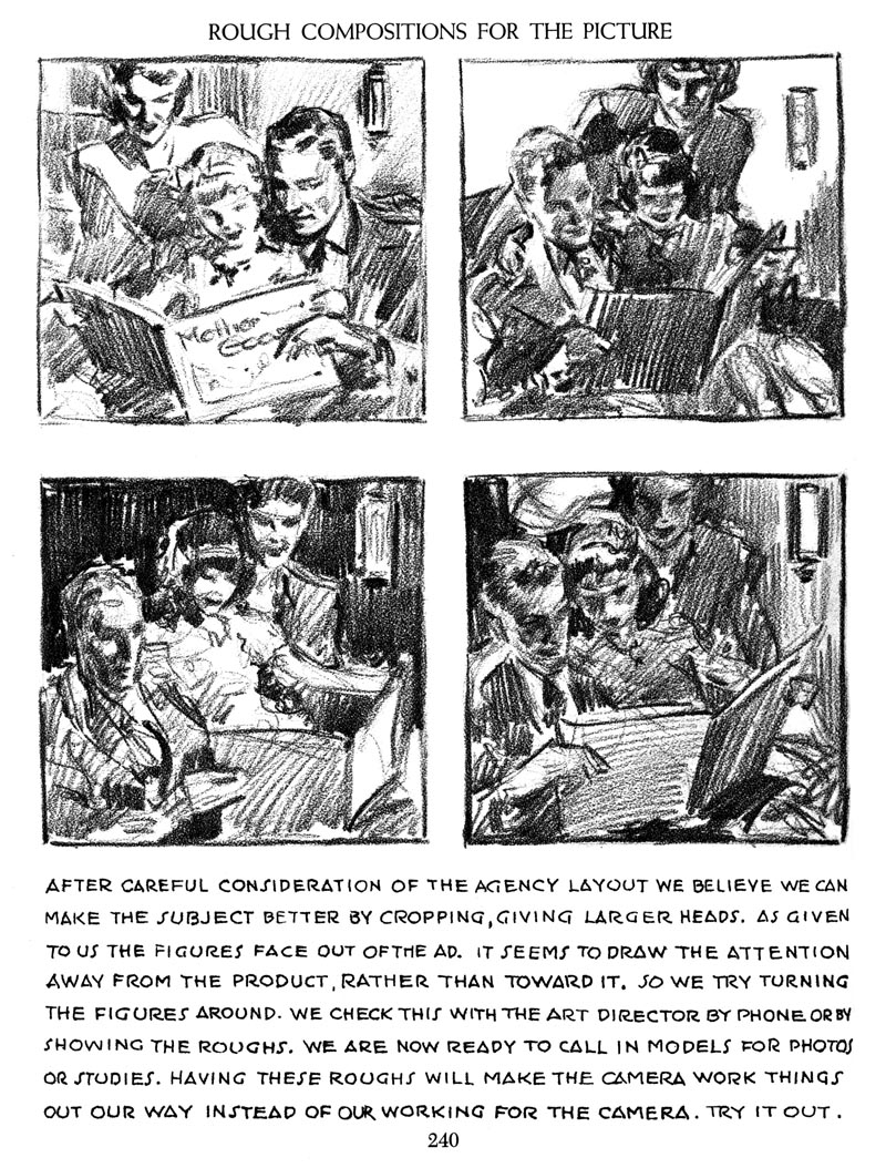
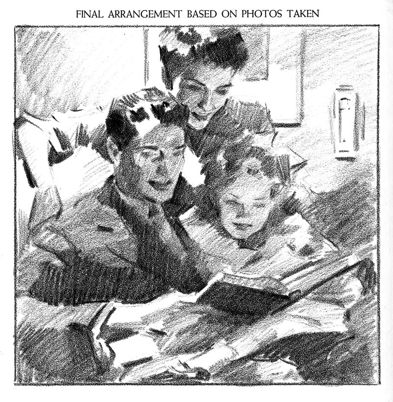
Comps were sometimes a guide to how a photo was to be shot or sometimes indicating style for an illustration.
ReplyDeleteSometimes the finished art was not
as exciting as it can be hard to top a really good comp.
The images you post are always lovely, but that chalk pastel of the eyepatch guy - the perfect balance between detail and blended color - really, really makes me want to go break out an old set of chalk pastels I have.
ReplyDelete^coming from a digital artist :)
Peng, once again you rock hard, baby! There's something about a loose line from a highly skilled hand; It's magic! Of course, Andrew Loomis was the Jimi Hendrix of illustration art, but his comps... like a Beethoven child's piece. Whew!
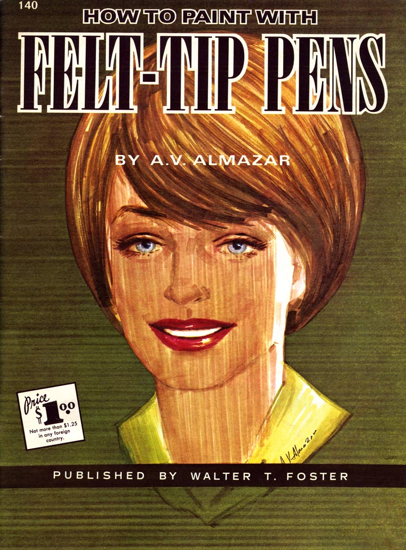
ReplyDeleteAlso, I've always loved those vintage Walter Foster books. The artists who did them were always of the highest caliber, but as a teaching tool... well, there're no short cuts to mad Andrew Loomis skills. The books probably scared more people away from drawing than anything else.
"Bare that out"? Please, Peng, watch the spelling! Spelling is to words what a clean line is to drawing.
ReplyDeleteThank you, Pete; After all the time, effort and money I invest into researching, writing, scanning and posting to this blog 5 days a week, its gratifying to know I can count on being rewarded with a comment like yours.
ReplyDeleteHaving the option to say something nice, say something relevant to the topic, or say nothing at all, you choose instead to point out a minor spelling error and publicly embarrass me.
You're right of course, but I think I'll leave both my spelling mistake and your comment as is and let others decide whose line is cleaner.
Harald; That's a good point - and a frustration for many an illustrator. Fawcett once wrote (actually, probably more than once) that he hated being brought in after an agency had pinned down a concept with comps. He felt (rightly so, I think) that the illustrator's skills would best serve the assignment if he was involved from the get-go.
ReplyDeleteI think Will's pastel comps make the case for that - and luckily the AD on the Hathaway account realized that.
Zenne; I'm glad you are stoked from seeing Will's work. This blog is, after all, called Today's Inspiration for a reason - and you clearly found it :^)
Deiter;
Thanks for your enthusiastic remark. I agree with you about those Walter Foster books - I love 'em - but I was well on my way to being a professional before I felt the confidence to actually apply any of the lessons in them to my own work.
Their main shortcoming, I think, is their brevity. They skip too many intermediary steps for the amateur or beginner. You need to already know what you're doing (or be pretty darn daring!) to pick up where Foster's authors begin.
Love this series, Leif! I was just talking with a friend about how we love to see the working process drawings, sometimes more than even the finished product. There is so much energy in them!
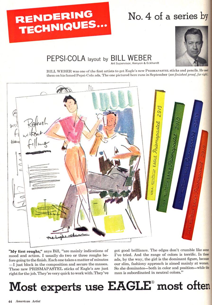
ReplyDeleteThe Eagle Prismapastels are basically the same thing as Prismacolor pencil media in stick form, correct? Those are a little tidier than traditional chalk pastels.
ReplyDeleteI avoid charcoal at any cost! We should realise that media used by cavemen is certainly not the best tool for a modern job!
Kim; I so agree - that's why I decided to spend a week on the topic. Always appreciated by fellow artist, rarely by the broader public - hopefully this week's series sheds some light on some 'hidden gems'.
ReplyDeletexyling; now, thanks to Corel Painter, we can paint like cavemen - but without the mess! ;^)
Let's forget about those bean counters
ReplyDelete- what's a spelling mistake? Nothing, absolutely nothing - it's the CONTENT that matters. And your posts are full of it, Leif. What's more important? The frame or the painting?
You write about a "visually illiterate client"...
"Visual illiteraticy" - another great theme you've raised up, Leif!
There are so many unknown forms of illiteracy!
Actually, Leif, I quite enjoy your contributions, and learn a great deal from them. Thank you! Bonus, that you are a fellow Canadian!
ReplyDeleteAs to the spelling mistake, my area of expertise is language--I'm an adult literacy instructor, freelance writer and editor. I see these "little mistakes," as you put it, literally all the the time, and have noted a deterioration in language use over the years. It becomes difficult to let things like this go by, in a blog that I care about and value. I'd agree that it would have been better to comment sooner, and more positively. So, if I name a mistake, please do not think I am clipping your wings--you do beautiful work and provide a great service.
Your expertise clearly is art and illustration--I bow to it. And to you.
Thanks for that, Pete; maintaining a respectable level of quality in my writing is important to me, but long days of work at my "real" job, followed by late nights of putting these posts together ... inevitably, some details will slip by me.
ReplyDeleteI won't mind - in fact I would gladly accept - your expertise (should you choose to give it) via private email. :^)
Actually, I ought to add a qualifier: I don't see the "little mistakes" all the time Here in your blog: I meant it more generally. This little bit was, if memory serves, the first such.
ReplyDeleteAnd in writing,as in art, there are times when breaking the rules is exactly the thing to do to achieve the desired effect.
Take good care of yourself--burning the candle at both ends is risky in the long run.
Great underground comic artist Vaughn Bode primarily used markers for his works into 70's trying to catch the same quality of coloring as in animated cartoons. His lettering and rendering was one of the main inspirations to the style of graffiti scene. Of couse it haven't made medium more highbrow!
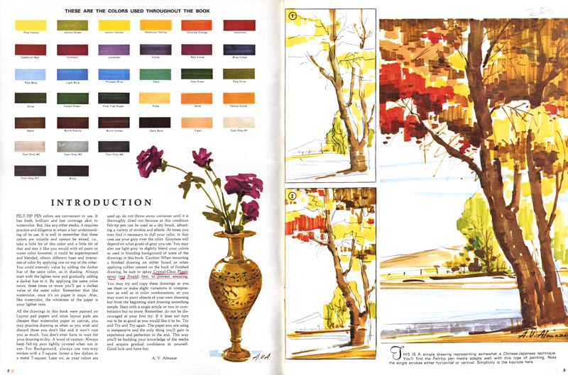
ReplyDeleteThis post was wery interesting and if it is possible to bring out more about ways of using felt tip pens/markers and scans from the book it would be great.
Alexei
I remember back in the 60's watching my uncle (an Art Director at Ketchum in San Francisco) doing roughs and comps with those little bottle markers. When I was in 6th or 7th grade he gave me a set and that was it...I was going to be an artist.
ReplyDeleteGreat to see! I was a student at the tail end of the magic marker, airbrush, rapidograph days. I've spent a whole day going through your site from 2011 down... still got a lot to look at. Such an inspiration!
ReplyDeleteYou have a fascinating blog. I think that would also be a good idea to learn more about this https://beste-spionageapps.com/handy-hacken/ thing.
ReplyDeleteNice work blogger....World is moving towards different technological experiments. One of them is RPA-Robotic Process Automation. In software industries, people can use RPA tools for automation. But in your field, did you ever think about automation initiations?
ReplyDelete