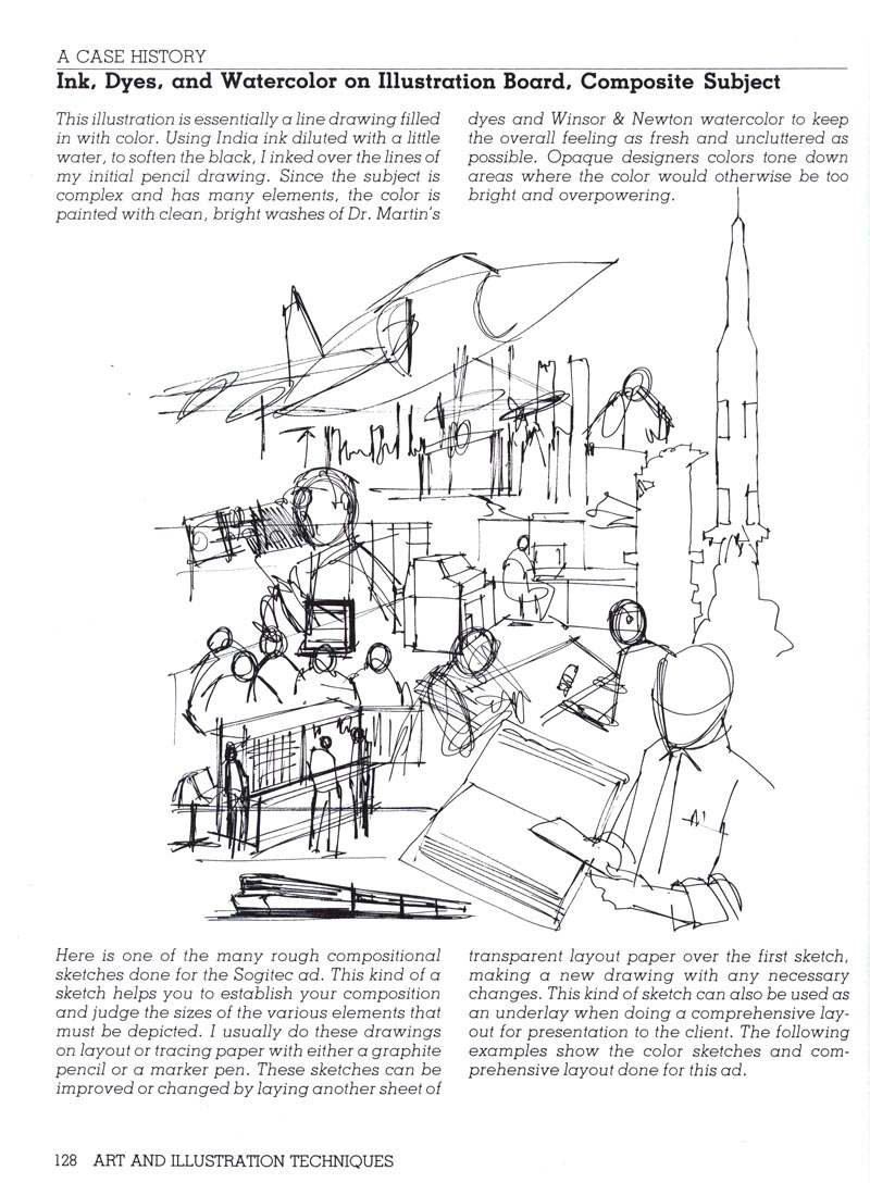
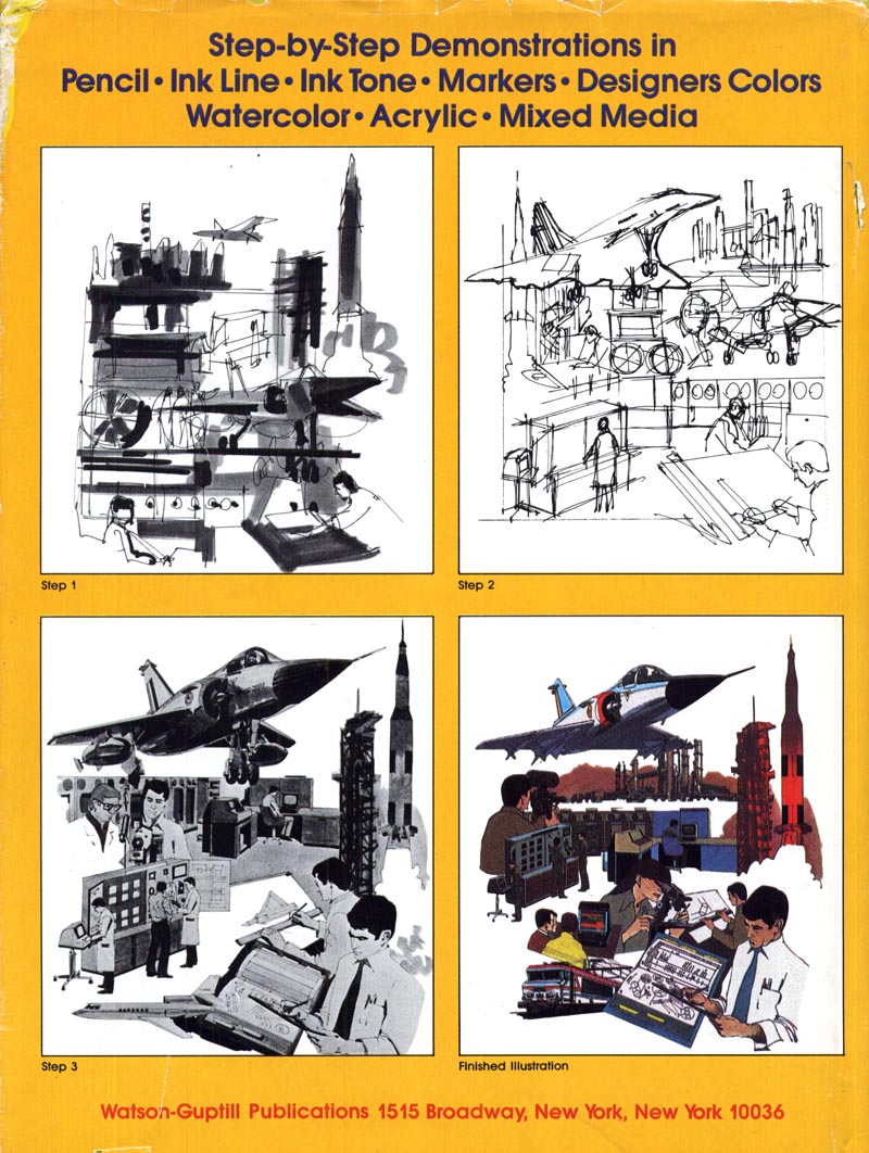
"Comp", short for "comprehensive rough" is just one term for a broad spectrum of illustrations the public never gets to see. Roughs, sketches, marker renderings, storyboards, layouts - these are all terms thrown around in the business that fall under the same general category. In its latest incarnation, these kinds of illustrations have been recast as 'concept art'. Over the past few years, a huge community of artists and companies has grown on the web at a site called, appropriately enough, conceptart.org

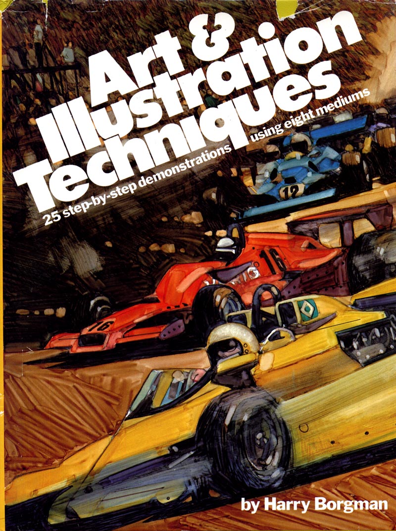
One of our past subjects, Harry Borgman, has literally written the book on comps! I was lucky enough to stumble across a copy of the original 1979 hard cover edition on a recent used bookstore visit.

I began my professional career doing comps and storyboards... and in fact Today's Inspiration, when it was only a mailing list of a dozen or so members, was comprised entirely of storyboard artist friends.
Few people, even fellow 'finished art' illustrators, know much about or have an appreciation for the tremendous skill and discipline it takes to do this type of work. After twenty years in commercial art, I am still in awe of those who do comps well, and still struggle to achieve the quality of work I see coming from the studios of friends and associates. The best make it look maddeningly easy. It is anything but!

Comps, storyboards, and layouts are the precursor to almost any ad - be it for print or television - the public eventually sees. Sometimes drawn by art directors, more often by a 'renderer', they are the initial visual the agency uses to sell an ad concept to the client. Renderers need to be both fast and good. They need to be able to draw anything and everything at the drop of a hat. There is almost never enough time to do a good job. You are expected to do a good job anyway.
Harry Borgman drew comps and storyboards for 40 years. On his blog, he wrote an excellent assessment of what life is like for these unsung heroes of the illustration business. You can read that post here.

There is a tremendous amount of beauty and vitality in comp art, as Charlie Allen wrote in his post this week.
What I've always found a little dismaying is how rarely that has been acknowledged. Renderers are largely anonymous, and renderings are considered worthless trash after a client presentation comes to a close. In my years working in-house at a Toronto ad agency, I watched countless comps being thrown in the garbage. Many of them were, in my opinion, far superior to the art or photography that eventually made its way to the printed page (or television screen).

This week, we'll try to rectify that inequity a little. This week the comp artist gets his due.
* Be sure to visit Charlie Allen's blog and Harry Borgman's blog for some stunning examples of comps, sketches, and storyboards.
It might be worthwhile to point out that the comps and roughs done by an agency or production house actually belong to the client.
ReplyDeleteFor that reason, the preliminary artwork doesn't make it out-of-house -- the piece itself is considered to be the final ad or commercial.
So, any of the other work, great as it might be, is a sort of liability to the client: it can't be shown as art because it dilutes the commercial intent of the piece. Sometimes these comps can be saved or rescued, if the client doesn't claim them, so that long after the fact they can be shown, as they are here in this blog.
We are usually required to recycle material of that type, so that it doesn't reach a secondary market.
(^)...nevertheless, I completely agree with Leif that "many of them were...far superior to the art or photography that eventually made its way to the printed page (or television screen)." The process is just as valuable and probably more interesting than the final product. Too bad for the unknowns.
ReplyDeleteGreat post!
Another killer week in store I hope Leif.There's something fascinating about looking at the development of an idea from the ground up. Also you often get to see and assess the raw drawing ability of the artist before its all posed out and referenced. I remember Fawcett saying how he dumped all his prelims into the bin at the end of a job.Lost forever...!
ReplyDeleteWay to go, Harry...stunning comps! I plan to show several more down the line, and hope you will as well. Also thanks to Leif for displaying a largely unseen and unknown part the illustration biz.
ReplyDeleteHarry Borgman's book is great. Another one by him is "Advertising Layout Techniques" which is pretty much all about comps (with a few a pages devoted to storyboards). Both these books are never far from my side, not just for the lessons and common sense they impart, but also because the art is so damn good.
ReplyDeleteThis website is great, BTW. It provides the daily kick in the pants I need.
How much I aggree that many of concepts are better than final rendering! Concept has all the action which may be lost in final careful rendering. It usually has contrast, masses of colour which give pleasure from the viewing. And you can actualy see how pic was done and skill of artist becomes more apparent.
ReplyDeleteAaah, finally a place to discuss this strange part of the business. I too find that there is something about the comp , often better than what it morphs into for final art....has a wonderful energy that never makes it to the final piece. With the use of clip art and photoshop there are fewer and fewer of us comp artists that can
ReplyDeletemake a living wage in this form of art. Not sure there are any art directors out there that can draw anymore.
Where do you think this is all headed?