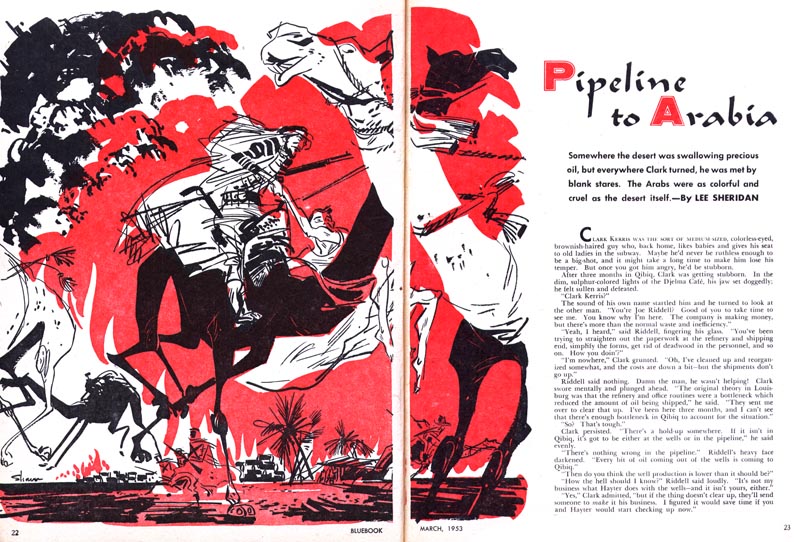
First up, a pretty wild double page spread from Blue Book magazine. Remember, this was 1953, people. Incredible, in my opinion.

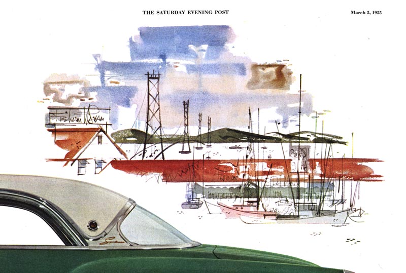
Below, a spot illustration from a 1955 automotive ad. The art director must have realized the otherwise mundane photo of a car on a white background needed something to create some visual interest and wisely chose to include this atmospheric piece by Shaw.

Finally, from a 1958 Reader's Digest story, a beautiful series that comes courtesy of frequent TI contributor, Harold Henriksen. Thanks Harold!


* My W. David Shaw Flickr set.
Wow, wow, wow - that first piece and the procession of bicycles... incredible. Don't we all over-think it sometimes? What a master of pairing it all down to the essence of the image... and the design of these pieces is just SICK!
ReplyDeleteKyle
This comment has been removed by the author.
ReplyDeleteThanks for that, Kyle -- based on what I see on your blogs (beautiful work, btw) I can appreciate why you would be especially enthusiastic about W. David Shaw.
ReplyDeleteAs mentioned in the early posts on his career, his background in sign painting likely played an important role in the development of his style, his design-sense, and his skill at 'paring it down'.
When I look at this work, I still marvel at the thought that Shaw worked directly in ink almost all the time - no pencil sketches. Amazing.
These are wonderful--especially the David Shaw!! Thank-you so much for sharing!!
ReplyDeleteAlso, I've always received plenty of inspiration from the scans on your blog and flickr sets. They're incredible and your dedication shows through all the wonderful work you've collected. We're all lucky that you're nice enough to share them.
Your blog is really interesting! I'm glad I found it!
ReplyDeleteThank you Haylee and plkg! :^)
ReplyDelete