That's where you'll usually find a huge, delicious ham. More on that later.
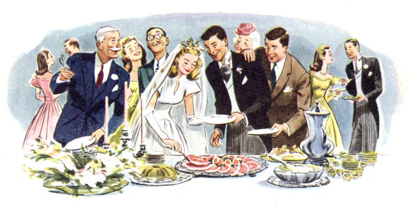
On Tuesday I cooked up a bit of a situation here that caused a lot of folks to gravitate to one end of the table or the other.
Recent weeks on Today's Inspiration showcasing Robert Fawcett and Austin Briggs have emphasized a message the resonates with those who value the tradition of disciplined craftsmanship, and from their comments on the last post its clear they had little or no regard for the winner of the 1940 Award of Merit piece: "it's just a banal drawing" , "the choice of the frogs is baffling" , "just a bad drawing", etc.
On the opposite end were those who feel personal expression trumps classical training. They were offended by the reaction of the traditionalists. "After all, its not a drawing contest, is it?" asked one defender of the frogs. ( Actually, in the context of the Award of Distinctive Merit for best black and white illustration - yes, it is).
Unfortunately, what was missing from the discussion was a balanced evaluation: that merely being chosen for inclusion in the Art Directors Annual is acknowledgement of your work's merit... the award simply recognizes distinction in an already meritorious crowd.
This is a nuance that was not lost on Robert Fawcett or Austin Briggs. In his book, 'On Drawing' Fawcett wrote, "One who illustrates should give it his best. His stature as an artist is beyond his control, so he will be better for not pondering too much about it. But the technique of his craft is not only under his control, it is also possible of development, so the wise worker will concentrate upon it." And in last week's series Austin Briggs said, "... I set about learning to draw, which I never could do before, in spite of the fact that some of my illustrations had been more or less acceptable."
I don't believe either illustrator was encouraging us to pursue a goal of literal realism with relentless drawing. To me, both artists are actually telling us to sincerely and unflinchingly evaluate the limitations of our personal abilities and do our best work. You know that old saw of scorn regarding artwork like Leonard Leonni's frogs: "my six year old could have done that!"
But what if your goal is to do the best possible six-year-old drawing you can do?
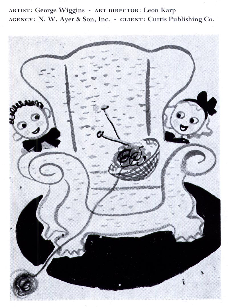
What if you have the urge to make pictures and you simply will never draw well realistically? Isn't it better to draw as well as you can within the scope of your personal style and abilities? And in that context, if your work stands out from a crowd, is it less worthy because it looks 'simple'?
A lot of my thinking on this subject began with an excellent post David Apatoff wrote on his blog back in January 2006. David wrote, "Seymour Chwast is among the first to say that he avoids techniques and media "that require craftsmanship and a drawing ability that I do not have." and that Chwast's "art may be brilliant, but [he] could not have found [a] job as an apprentice sharpening pencils in the era of Noel Sickles, Robert Fawcett or Austin Briggs."
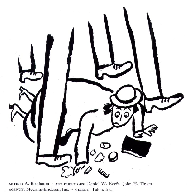
You know, I've never been a huge fan of Seymour Chwast's work ( I'm much more of a Sickles, Fawcett and Briggs man) but I have to respect Chwast's willingness to admit he'll never draw like Fawcett - but he'll do his best darn Seymour Chwast.
Which brings us back to the ham.
Charles T. Coiner (whose remarks on squirrel drawings graced the first post of 2009) is fast becoming one of my favourite writers on the subject of advertising illustration. In the 1940 Art Directors Annual, Coiner laments the abundance of "squirrels" in that years advertising art submissions. He writes, "The same old subjects are handled in the same old way month after month. Looking through the magazines one wonders how the Art Director's Club can assemble enough work showing originality to make up a complete exhibition."
"I remember one jury of selection," Coiner continues, "which decided before looking at the material submitted to include only one pretty girl, one baby, one heroic figure..."

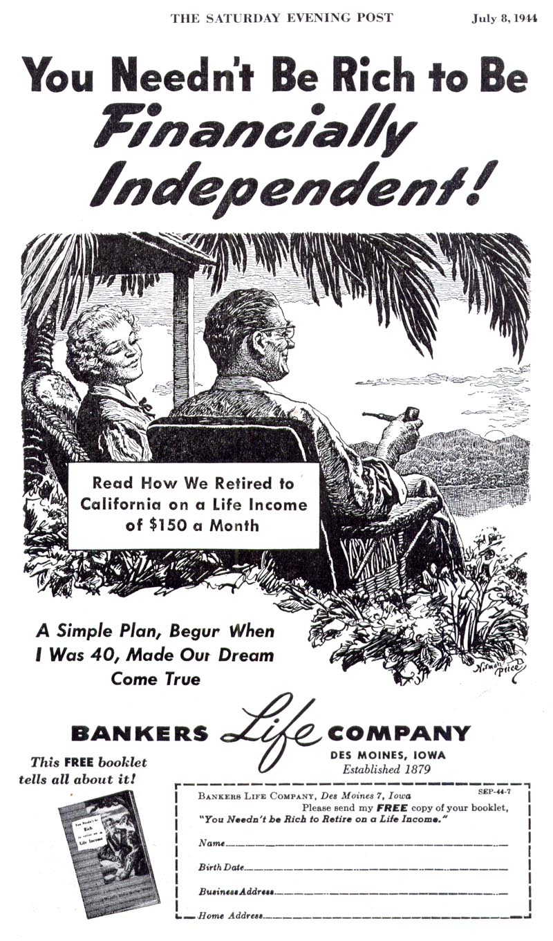
"... one elderly couple looking towards the sunset from front porch..."
"... and only one slice of ham."
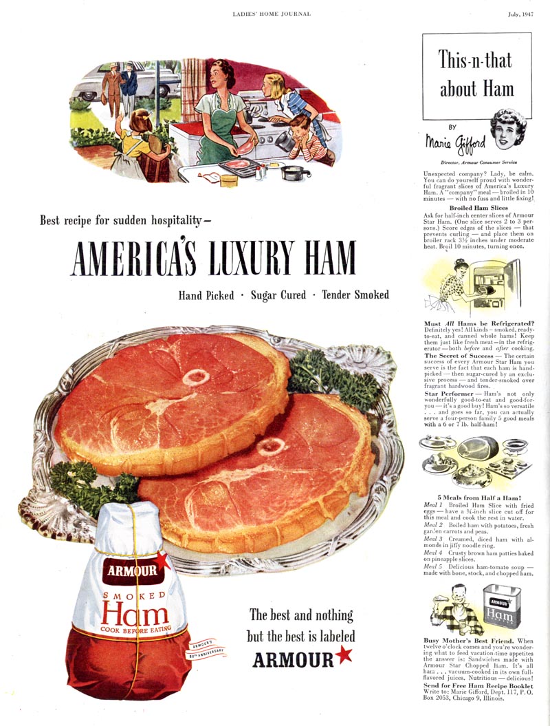
"The exhibition," he concludes , "was not very large that year either."
Coiner's comments shed light on the jury's choice of Leonni's frogs for the Award of Distinctive Merit. In an era of literal realism, even work by the likes of Fawcett, Bundy, Dorne and all the rest must have smelled a little like ham. By comparison, Leonni's frogs were a rare delicacy.
This has always been a reality of the illustration business. You do tend to get asked to draw a lot of ham. Everybody does it... but there are those who refuse to admit it, even to themselves. They pretend they are serving up truffles or fois gras. The truth is, over the course of a career your work is probably going to be more about ham than fois gras.
When I'm asked, what's your favourite colour?" or "What's your favourite food?" -- I'm at a loss. When I'm at the buffet table, I want to sample a bit of everything - and I tend to like a lot of what I try.
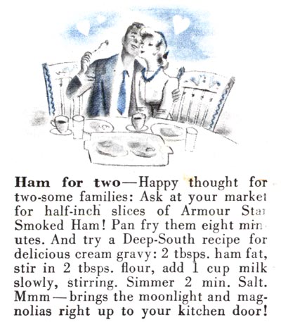
For instance, I'm just a pleased that John Averill's work was recognized in the 1940 Art Directors Annual as I am that Fawcett's was - I like Averill's work as much as Fawcett's. I think Averill did the best John Averill he could and if he drew and drew and drew (which he did) his work would never have looked like anything other than John Averill.
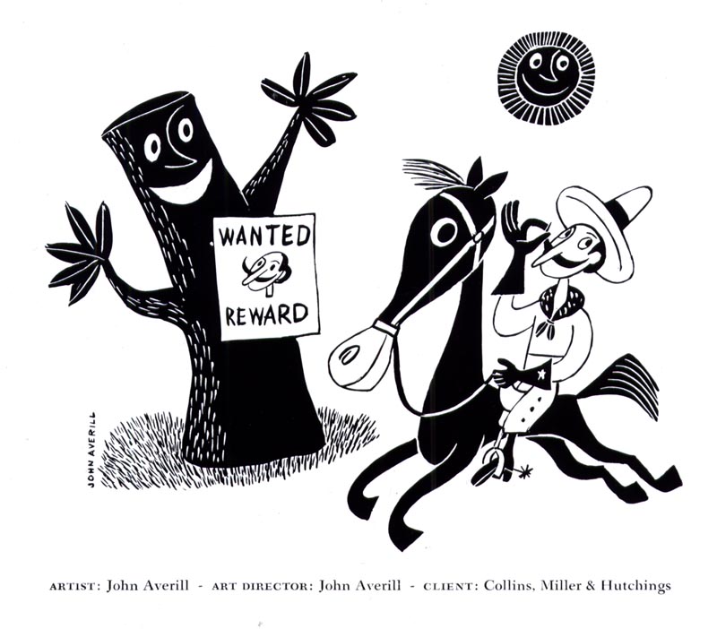
To my way of thinking, the jury chose well. In fact, they may have even been a little prescient; Leo Leonni would go on to art direct Fortune magazine and edit a little trade publication called Print. He eventually became the author and illustrator of over 30 children's books, some of which received the highest honours. No small accomplishments.
My point is, let's try to keep an open mind.

This blog has always been about the smorgasbord of illustration and I plan to keep it that way. I hope to tempt those with a limited palate to try a taste of something that perhaps looks a bit exotic.
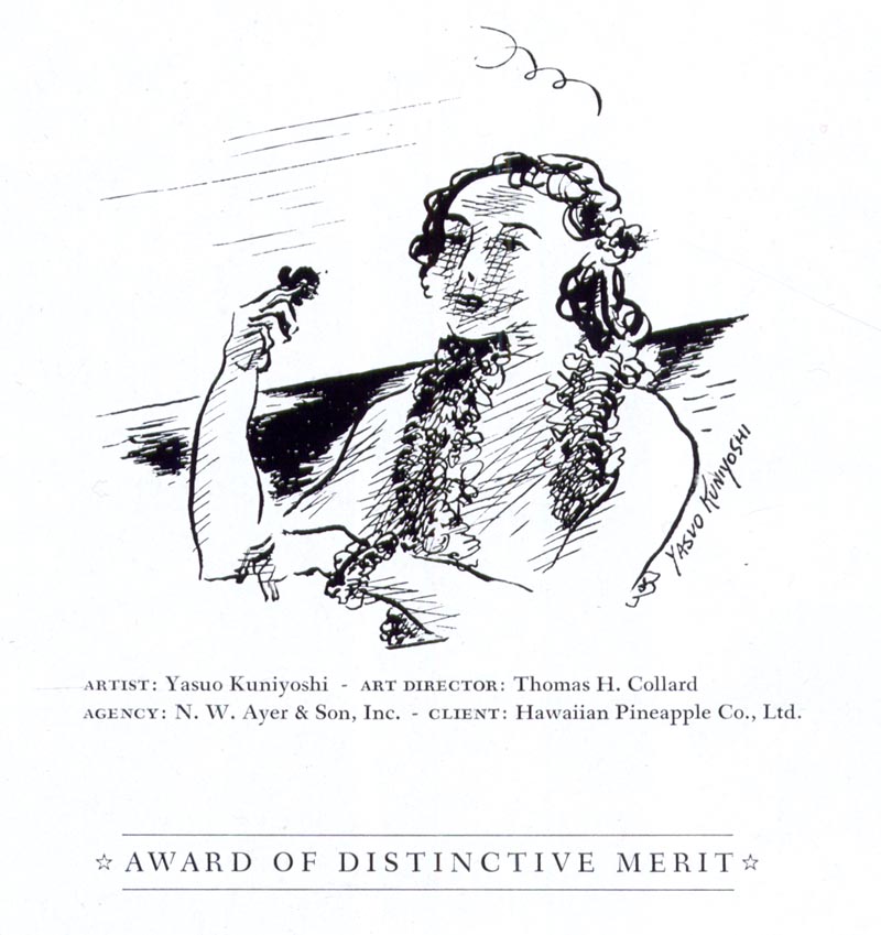
Likewise, I hope those hovering by the desserts will not scorn the ham.
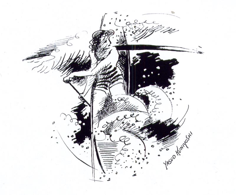
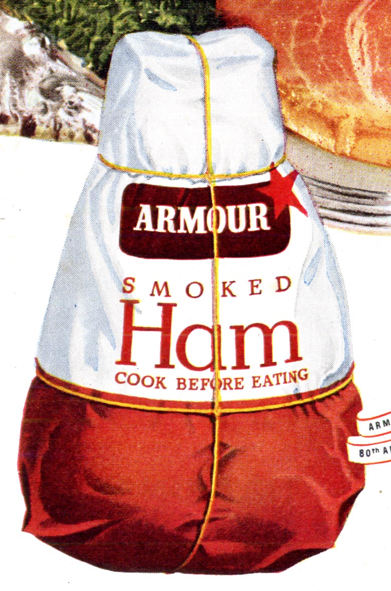
There is a lot of merit in a well drawn ham.
Excellent post Leif.You're correct to suggest we need to keep an open mind on these things and judge the work in context.
ReplyDeleteSpeaking of context,when I said it wasnt a "drawing contest" I meant in the sense of who could produce the most realistc,technically perfect,drawing.
You have articulated thoughts that have been percolating inside me for years, and articulated them beautifully. Really wonderful post! I'll be sure to send people to it whenever they ask me what the key to drawing is.
ReplyDeleteThank you both!
ReplyDeleteKyle2; I sort of realized that - but the line just presented too good an opportunity to say something flippant ;^) and since (ironically) your guy won this drawing contest, I figured you'd forgive me.
Zack; That means a lot to me - these thoughts have been percolating in me for years as well. They are a large part of why I started Today's Inspiration in the first place. They are also why I present - not just the artwork - but, as often as possible, the story of the person behind the artwork.
Well said, Leif -- and your John Averill insert is a clincher!
ReplyDeleteOooh, I loooove that John Averill image.
ReplyDeleteWell said Leif, I think you put it in the right perspective. I know I've touched on this before, but the discussion of what constitutes good illustration and even good ideas, goes back to when I was in art school... and the debates were in many respects similar: Is a loose stylized drawing or rendering better than a tight accurate realistic drawing or rendering? Is the design of an illustration more important than good drawing? Is impressionism better than realism? How much can you push color before it doesn't work? Is it important to clarify everything or leave some things vague? How much can you exaggerate or simplify before it turns into a "cartoon"? Are cartoons illustrations? Are comic book illustrations serious illustration? Is technique and style more important than drawing well? Why not just project photos and then you don't have to really be a good draftsman? Is drawing from photos cheating? Does drawing well make you a better illustrator? Do all the illustrators in the Illustrators Hall of Fame deserve to be there... and if so, why?
ReplyDeleteOf course, the answer to some of those questions is that it depends on each individual assignment and the targeted audience. The best way to communicate an idea however, is often debatable. Personal preference will always play a major roll.
I agree with the "open mind" comment, but having an open mind doesn't mean you can't draw your own conclusions, and have a strong personal opinion based on education, research, history, knowledge and personal experience.
That ham really looks good Leif, but isn't ham high in fat and calories? ;-)
Tom Watson
Bob and Harley; Thanks, fellow Averill fans ;^)
ReplyDeleteTom;
Great points all, especially the qualification regarding strong personal opinion based on those many important factors you listed. I have hesitated until now to express much of my personal opinion because I felt unqualified to do so. But putting together this blog over the last few years, and the education that has come almost incidentally (thanks largely to the generosity of good folks like yourself and so many others) has given me a measure of confidence to begin doing so.
I feel a bit badly about leading everyone down the garden path with the way I constructed Tuesday's post. I knew it would get a strong reaction from both camps if I did that, but I wanted to illustrate (hah) a point. Not surprisingly, things played out exactly as I expected. This has been my experience throughout my career... and a source of much frustration.
But as you point out, Tom, personal preference will always play a role. Such is the nature of art (and illustration) and our relationship to it.
* Oh, and I checked the package of Black Forest Ham in the fridge: only 40 calories per two slices and just 0.4 grams saturated fats - that's pretty good! ;^)
This ham's comment was supposed to be on the Wed. TI....not Tuesday's. Hang in guys!
ReplyDeleteYou know, there's ham and then there's HAM. I've seen fancy meals made from Spam that sure looked tasty. I once enterd a pumpkin carving contest in a studio where I worked. I spent two days whittling out my best spooky expression, but the prize went to a guy who just drew a goofy face with a marker. Sometimes life seems unfair.
ReplyDeleteAn award of merit can be for all sorts of things besides rendering skill. It also depends on who's doing the judging.
Your pumpkin story sort of reaffirms my point about Leo Leonni and Savignac, doesn't it, db? As we seem to be establishing, it comes down to communication. Sometimes an elaborately carved pumpkin (or an elaborately rendered illustration) doesn't communicate as well as a quick, goofy cartoon.
ReplyDeleteUnfortunately, as was demonstrated on Tuesday, we illustration afficionados are often too quick to judge what is well drawn based on our personal bias (literal realism on the one hand, total freedom of personal expression -stylization - on the other).
In the case of Leonni's frogs, the Award of Merit was in the black and white illustration category, so rendering skills or otherwise, my conjecture is that the judges felt Leonni's frogs were 'well drawn'.
What does well drawn mean? If we look at the ADC President's message in the introduction to the book, he writes, "It cannot be stressed too strongly that the exhibits in this book had more to do than sell themselves. Their mission, their function, their sole purpose in being was to sell a product or service. They are a means to an end - not an end in themselves."
"The reason, then, that these illustrations were selected out of some six thousand entries is because of their functional as well as their artistic excellence."
i.e.: communicate.
Well drawn illustration is that which best communicates the message for which it was created.
Leif
ReplyDeleteI have about fifty original block prints signed, numbered and titled by John Averill...was going to give them to charity to raise funds for a special cause...do you know where I could find their value? They are are wonderful bird prints..
Thanks for your good work...I'm a fan.
Jan
Jan;
ReplyDeleteI'm sorry, I have no idea what their value might be. You could try, perhaps, Heritage Auctions ( ha.com )
Go to the "Illustration" section and look for the contact info of their art experts in the left-hand sidebar. There's a fellow there named Don Mangus who might be able to advise you. Good luck!