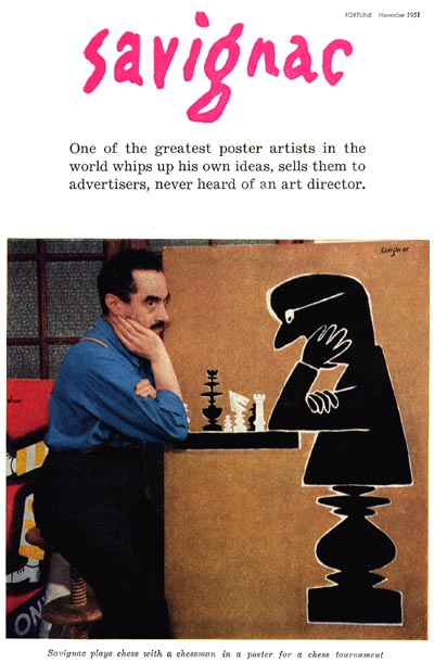
Fortune magazine, under the art direction of Leo Leonni (there's that name again) had some of the most progressive illustration of the 1950's both on its covers and as interior content. Even more remarkable for a staid business and industry publication, Fortune regularly included a portfolio section showcasing the work of a specific artist. In November 1951, Fortune presented the remarkable Parisian, Raymond Savignac.
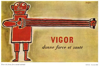
From the accompanying article:
Quiet, introverted Raymond Savignac is the author of the most flamboyant and extroverted posters in Europe. He is not a frustrated painter; nor does he suffer any delusions that he has prostituted his talents. His art is art for posters' sake.
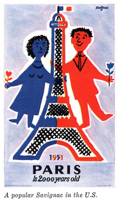
Art critics and poster fiends the world over have been charmed by his delightful humor, his unorthodox imagination, and his unmistakably personal style. (emphasis mine) What is more important, French manufacturers are buying his non-commissioned posters.
That, my friends, is how you draw a ham well.
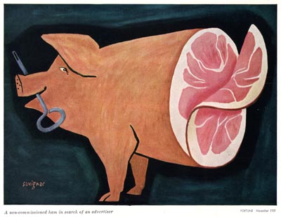
Savignac refused to draw happy consumers enraptured by the client's product. In the words of Charles T. Coiner, he refused to draw 'squirrels'.
To U.S. admen, continues the article, who know that most commercial art is conceived, controlled, and invariably changed by art directors, writers, account executives, and clients, the idea of an independent, self-starting poster artist may sound shockingly foreign.
No kiddin'! I would venture to guess it sounds pretty outlandish to most illustrators as well. I'm in the middle of an assignment right now (yes, its a ham), and the client has just about sucked all the flavour out of it, believe me. The sad thing is, the changes are largely inconsequential, based on (a lack of) personal taste, but they have eradicated much of the charm and interest from the piece. But anyway, enough whining from me -- back to our story...
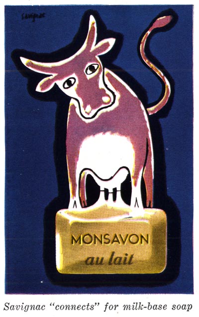
Savignac said, "The man on the street walks with his eyes turned to the inside; fixed on his torments and passions. Only a scandal can turn him away from himself and confer on him a certain altruism. The scandals of the street range from the pickpocket, to the fire, to the crime, etc... The poster is a visual scandal."
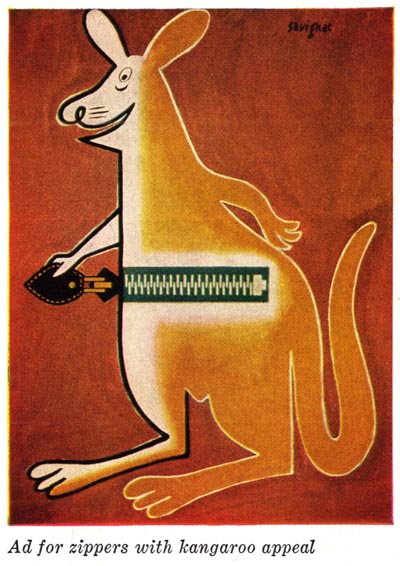
"If I express myself with gags, puns, and graphic clowning, it is first of all because I like that, and secondly because the man on the street is so bored with his daily routine that I believe advertising has the duty to entertain him."
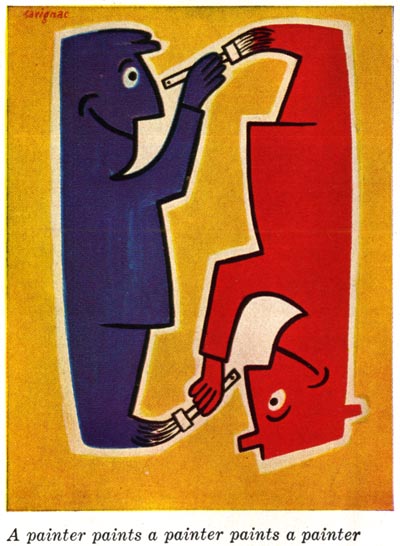
What a breath of fresh air! Imagine, an artist who happily chose to employ his creativity in the service of promoting the most mundane and commercial of products (meat extract, soap, zippers, etc.) and circumnavigated the traditional power structure of the client/ad agency relationship to directly engage the manufacturer and the public with his art.
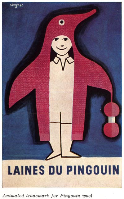
Some might suggest there was a lot of luck involved in Savignac's success. That is the lazy, self-serving artist's attitude.
There was a clear understanding on Raymond Savignac's part that his art must addressed the needs of the client, and that success lay down the path of clever concepts drawn well in his own way.
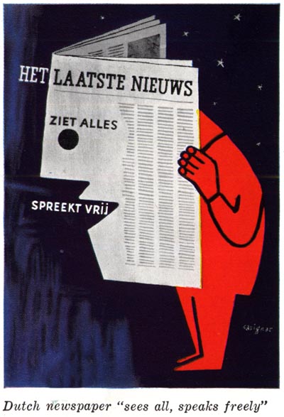
Again from the article:
In this turbulent atmosphere of intellectualism, Savignac posters are like a fresh breeze loaded with the smell of garlic and good rosé. They are simple, catchy, memorable. They have the directness of children's drawings, the humor of a Fratellini clown, the simplicity of a trademark.
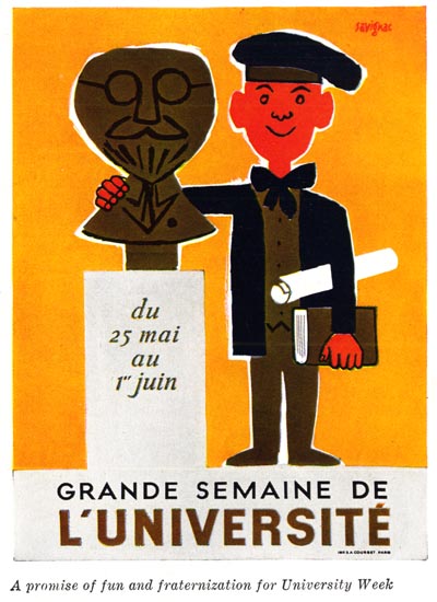
Just give any of these gay posters a quick look and then try to forget it. Even better, try to avoid looking at them altogether and you will see how hard it is to escape Savignac's visual scandals.
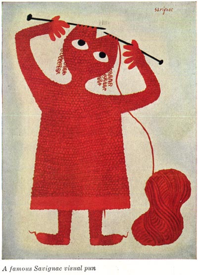
* My Raymond Savignac Flickr set.
Love Savignac! More please!
ReplyDeleteWhy, you greedy little robot! How dare you!
ReplyDeleteThanx for your insight, Leif - as always! I think the salient point is that good communication is what it's all about - sadly, many of today's underdrawn, over-rendered digital illos make lottsa noise but have little to say.
ReplyDeleteA quick anecdote: years before the Simpsons, but back when he was already one of the most insightful and funniest social commentators in print, I met Matt Groening. I showed him my latest airbrushed Iron Man extravaganza and he kinda whinced and said that he'd always wanted to do superheroes, but all he could draw were his crappy rabbits!
I was quite taken aback, and told him I wished I had his amazing ability to edify and amuse with just a few deft strokes. We shook on that, and then he did me a terrific sketch of Bongo with a cape, and I did him one of Binky as Iron Man!
Ken;
ReplyDeleteThat's a great story - and excellent commentary. Ultimately I think it does come down to good communication - in concept and execution. And your example of Matt Groening is really ideal! Who would even want to see an overwrought Matt Groening drawing? His genius is in his writing and grungy cartoon style. The results are always perfect!
Thanks for sharing your thoughts on this.
My buddy Rich sent this comment via email and has agreed to allow me to copy and paste it here. It is relevent, I think, that Rich is both an advertising AD and an artist:
ReplyDeleteI must admit that I don't read your blog that often, but when I do, I sincere appreciate your well researched topics and your intelligences and extensive knowledge.
You are multi- talented, dude!
I agree with you Lief, that the advertising business has grown way to much for it's own good! Part of the problem I have noticed, is that there are basically
two types of people in advertising, those that are in advertising to do business, and those that are in the business of advertising.
Cheers!
richART
Savignac blended creativity, design and illustration together beautifully. He would have made a great C.D. if he could have put up with the B.S.
ReplyDeleteBriggs is an example of the very best of well edited literal illustration. Savignac is an example of the very best in highly stylized simplistic illustration. They both require taste, talent and sophistication, and they both certainly have an equally important place in commercial art.
Ken Steacy's comments in his first paragraph is sooo true in my opinion. Thanks for pointing out and clarifying "over rendered-computer illos "so eloquently... I could never quite put my finger on what annoyed me about so many computer illustrations I see.
Tom Watson
Well, Savignac is a real worldwide recognized master and I appreciate his presence here in this ham-driven discussion. Masters of drawing like him, Steinberg or more contemporarily, Michel Quarez and Dan Perjovschi are not that opposite to Norman Rockwell standars!
ReplyDeleteWell, that exactly has been my point all week, 40jos. But since you raise it again, why not elaborate for the benefit of those who don't see that? :^)
ReplyDeleteLeif: you have already elaborate the issue now. Lots of samples and poignant comments. It´s been a real pleasure sharing this ham.
ReplyDeleteBut, gentlemen, if I could choose, I'd go for the option never to see a Matt Groening drawing again.
ReplyDeleteTo make myself sure, I've just checked a few of his cartoons from the 80s. Yup, his writing is funny and worth re-reading, but the drawings contributed nothing, in my eyes.
Savignac is, in so many ways, a very different artist.
Let's start from the premise that it all comes down to good communication. What does a good communication consist of, and what would be the adequate literature to consult? On the second question, perhaps "Getting to Yes" would be a good start. On the first question, one should be wary of showing himself as a brilliant communicator all too quickly, in order to avoid complacence and entrenchment in formulas. Communication is about people, and its always partly an adventure. I guess so.
Oh yeah, I love Savignac's deceptively simple work.
ReplyDeleteBrilliant mixture of design, illustration, and CONCEPT.
Savignac's work always leaves me feeling REFRESHED, and that may be my single favorite quality in illustration/design of that era.
I'd also like to give Ken props for pointing out the problem of "today's underdrawn, over-rendered digital illos (that) make lottsa noise but have little to say."
That's great insight, Ken.
Thanks Leif.
Oohhh no, Traven; I'm not going down that path! It leads to the Moebius Loop of trying to quantify the parameters of "good art" vs. "bad art". I leave those debates to my friend David Apatoff! ;^)
ReplyDeleteHarley; I love how you put it... that Savignac's work leaves you feeling refreshed. I wish I had said that!
ReplyDeleteBravo! :^)
Savignac's approach to the commercial art game was iconoclastic. His vision, coupled with an admirable audacity are inspiring.
ReplyDeleteThanks Leif, your blog is a nice daily grounding...
Happy to share your enthusiasm for Savignac. I was very lucky to meet him in 1998. He realized a poster for "Le Havre 99". As a PR, I was promoting this event and I became friend with Savignac and his charming wife. He very kindly offered me several of his original works which are a permanent joy.
ReplyDeleteVanina. Paris France
Imagine the plight of the busy career person struggling for fulfillment within the business world, while trying to effectively balance the responsibility of school-age children on the one hand, and in home senior look after elderly or housebound Best Personal Care Services relatives on the opposite . Child care has become almost a natural a part of the working world and there are many facilities developing to supply a secure , supervised environment for youngsters of all ages. In fact, many companies are providing child - care facilities or other assistance as an employee benefit.
ReplyDelete