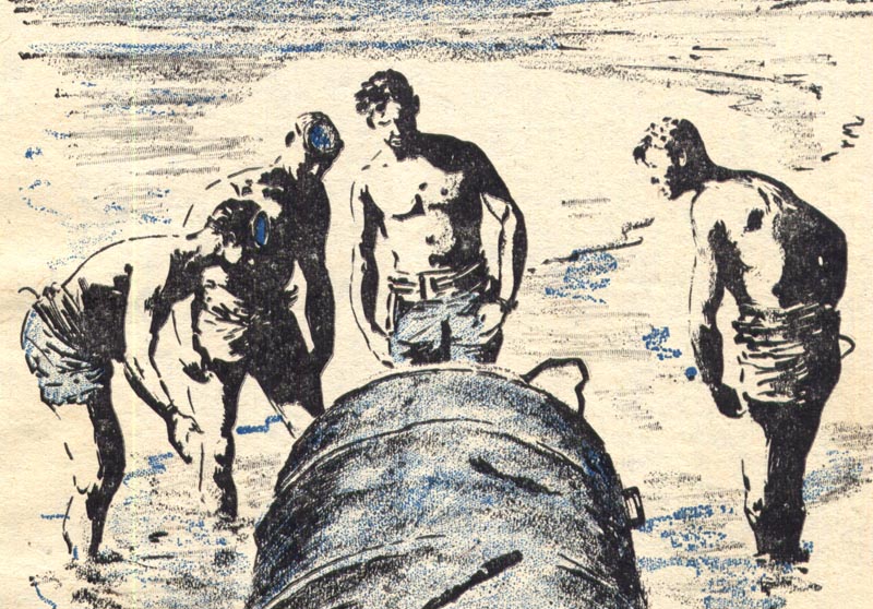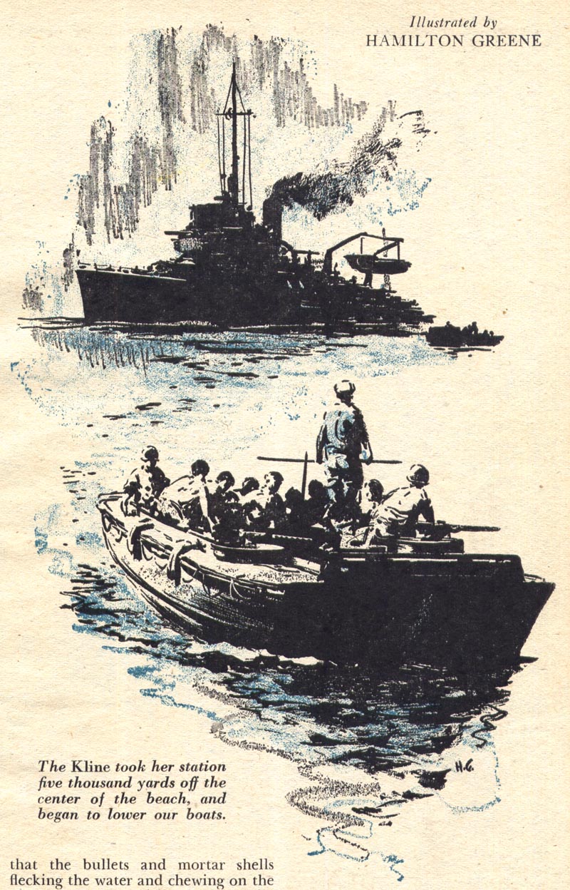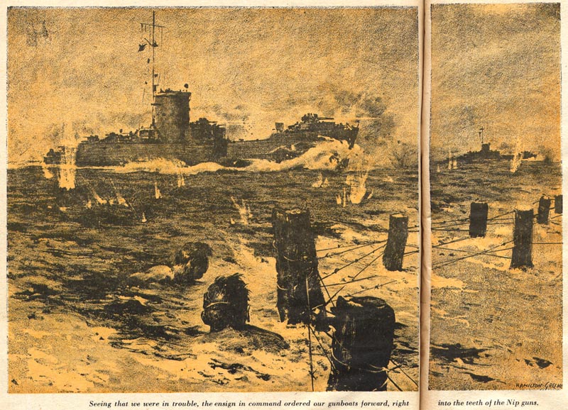
As I said in that earlier post, I find a striking similarity in Greene's style to the ink drawings of Frank Frazetta. Perhaps its the way both artists defined the figure by expertly rendering them as large masses of deep shadow...

Even when Hamilton Greene added a broader tonal range, its that beautiful understanding of how to effectively make high contrast work that provides the solid foundation of each of his illustrations.


Hamilton Greene was Blue Book's war correspondent in Korea in 1951. I have some other illustrations he did for the magazine that, unlike this series, are based on his reportorial experience.

We may revisit the artist later this year to look at those pieces.
* My Hamilton Greene Flickr set.
This last one has Sickles-ish look to it.Very interesting week Leif,I'm not familiar with any of these artists.Thanx.
ReplyDeleteThere are a lot of striking similarities in the work of the Blue Book artists to Sickles, Bandito - excellent call.
ReplyDeleteI guess they all fall into that category of illustrators who boldly employed that chiaroscuro style of inking Sickles is so well regarded for.
...to get those darks right! It looks so simple. But how easily they will just look awkward. If you don't get them absolutely right!
ReplyDeleteThis work is also reminiscent of the British illustrator Neville Dear who used a similar technique in his Readers Digest story illustrations.
ReplyDelete