The broad-ranging discussion involved some challenging opinions about the merit of developing a 'signature' style vs being adaptable to changing trends.

Some people felt that adapting elements of style or technique made popular by other illustrators was synonymous with "aping" that artist's style.

They were insistent that success lies only down the path of studiously developing a very personal look - and that any borrowing from others was "a dead end".
While I support their choice, I personally believe there is a creatively and financially rewarding alternative - and offered myself as living proof. If you compare my editorial art portfolio with my advertising art you'll see that I have managed to live by my word (and pretty well at that).
For twenty years I've enjoyed a stimulating career by being what some would call a 'jack-of-all-trades', dabbling in many styles, often tailoring my work to suit my clients' needs - and the changing tastes of the industry and the public at large. When I see work by others that intrigues me, I want to "play with their toys". Personally I feel your own style emerges no matter what surface technique you cloak it in. I've always been restless when it comes to style, and never felt much need to steadfastly hone "The Leif Peng Style".
No, my choices have not made me famous.
Fame has never been a high priority on my career agenda, but I can understand why it might be for some. I've often thought that illustrators are sort of "shy actors" -- we let our work take the stage in our place. Naturally, we want the audience to like us and acknowledge our skills. In that sense, some degree of fame enters the picture, I suppose.
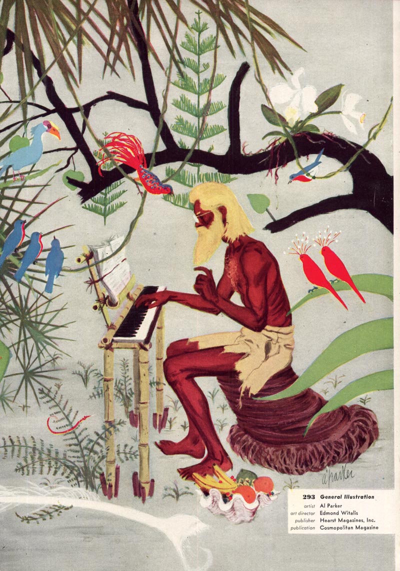
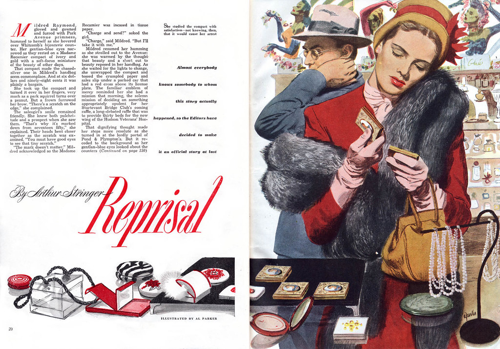
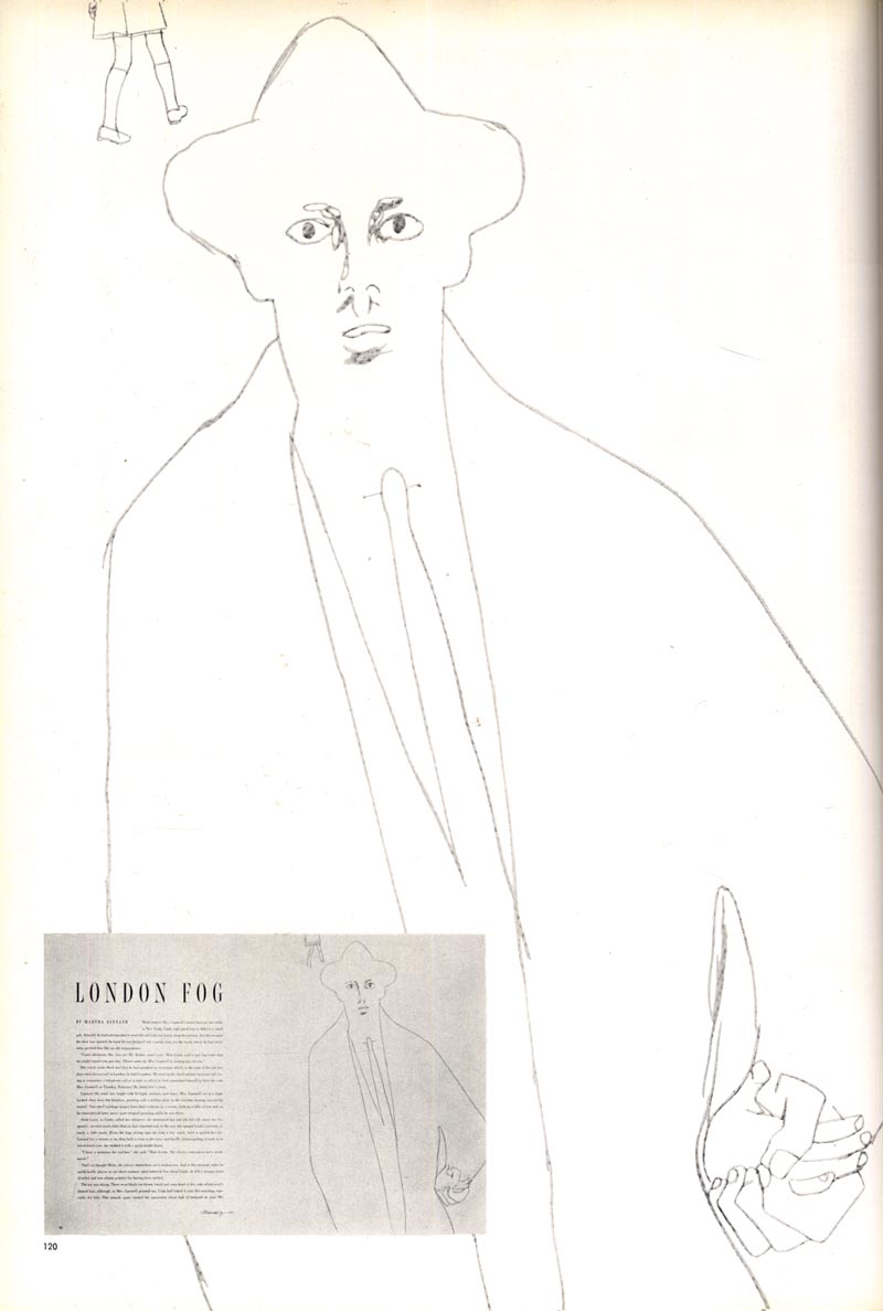
So this week, a selection of "famous" (and I use that term with some chagrin) artists who did pretty well by experimenting with styles and techniques as they pleased - or as their clients pleased. Let's begin with the best: Al Parker.

Parker was known for his experimentation... always six months ahead of his competitors. As I said in one of my comments, of course it would be ideal to be the trendsetter. Al Parker enjoyed that status for a very long time. But even if you can't be an Al Parker, you could do a lot worse than to follow his lead.

This last scan is from Charlie Allen, who attributes it to Al Parker (and I agree). Last week Charlie showed some great examples of how a pro adapts to changing trends, just as Parker did in the late 60's piece above. Regarding his efforts to work in the 'groovy' early 70's style, Charlie wrote "I felt out of my 'comfort zone' on these...but as usual, had fun trying something new."
This week, Charlie has a new selection of images at Charlie Allen's Blog that again demonstrate what a consummate professional he was.
* My Al Parker Flickr set.
leif,
ReplyDeletei whole heartedly agree with your outlook. there are both positive and negative elements in having one style or mixing it up.
at sheridan college i was taught to develop a style as art directors like to see one vision. however over my career my style has morphed and changed depending on the subject matter. i believe every story, article, advert has its own voice that the art adapts too. that and i like to push myself artistically, trying new things, approaches...
by being so stylistically flexible it has allowed me to have a broad range of clients and survive when client might go under or push my career in various directions. i also have clients who look forward to seeing what i will surprise them with next being that i change my approach on a per illustration basis.
that all said, i think you are correct in stating an artists particular voice always permeates their work no matter the stylistic divergence.
cheers,
ramon.
btw/ great selection of pieces today!
Al Parker was a great choice to start with here because his strong drawing and design skills are evident in all the examples of his art you posted today. Perhaps the other thread running through these pieces is his obvious joy in creating.
ReplyDeleteI always knew how good Parker was,but I didn't know just how good you'd gotten Leif seriously.Good for you ,that you don't lock your self into one style ,almost assures artist growth.
ReplyDeleteJ
Thank you all for your comments!
ReplyDeleteRamon; Good to hear that diversity is working for you as well. At times like this, survival is key - and I also have found flexibility means more opportunity (and sometimes even greater creativity).
Larry; you hit the nail - Parker said in the Masters Course of the FAS "How I Make a Picture" that a solid foundation in drawing was essential, and that surface technique wouldn't fool anyone without it. How can we do anything but agree with that wisdom - and yes, it shows in every piece along with, as you say, his joy of creating. Similarily, I had a great year-long run doing editorial art for the National Post for a fantastic editor who allowed me that kind of Al Parker freedom to experiment. While the money was not great and the deadlines absurd, I have never had more fun - and every assignment looked different from the last.
Jay; you are too kind - thank you my friend :^)
sadly i know many an illustrator that get by all on surface technique and lack a good structural foundation. kinda aggravates me...
ReplyDeleteI think all of these comments have gotten to the heart of Parker's greatness, and to the heart of what illustration should be. Although Parker was the exception in the inventive category, that was part of his style, as Larry and Leif point out. Parker was ahead of the curve early in his career, and by the late 50's he was like a run away train, a new look in virtually every illustration he was assigned. He was perhaps the single biggest influence on nearly every editorial illustrator in the business, after the 1940's and into the 60's. In my illustration class, we were encouraged to study Parker's work, but discouraged from copying him. In 1958, my illustration teacher anticipated Parker illos as the wave of the future in editorial illustration. But, my teacher stuck to his own academic painterly rendering style, and adapted Parker influenced compositions and design to his illustrations, which were rendered in oil over acrylic under-painting. He had his own personal style distilled out of many influences, which I think is the key to keeping your identity.
ReplyDeleteAndy Virgil was a very good illustrator, but after the 50's, I thought he perhaps tried to adapt too much to the changing trends, and lost his identity in his work in the process. His illos began to look like hundreds of other very capable illustrators, that were doing the same thing.
In S.F., most of us illustrators were in the advertising market, not the editorial market. So, as long as our work didn't look dated, it didn't require a lot of inventive experimental styles, compared to the N.Y. editorial market. Most of us in S.F., went from gouache in the late 50's and early 60's, to acrylics through the 60's, to water based dyes or mixed media in the (decorative) 70's, and during the 80's, the stylized air brush look was popular with a few younger illustrators, and through the 90's there didn't seem to be a particular look... I went back to traditional realism) because that is what the A.D.'s seemed to want from me.
Tom Watson
Leif
ReplyDeleteYour philosophy regarding style reminded me of my attempts to branch out of storyboards into finished art in the early 90's. I too had a variety of styles which I proudly displayed in my portfolio. I remember showing my stuff at 3 in a Box (or maybe it was 4) and being described rather derisively as a 'service illustrator'. Needless to say I was not put on their roster.
Tom; thanks for summing things up so perfectly.
ReplyDeleteRich; great anecdote - it describes in a nutshell the challenge we illustrators face in this business. Only two niches really respect literal realism today: comics and comps (storyboards). Editorial art directors and the stylized illustrators who work for them are, after two or three decades, so far removed psychologically from the literal realists that they can't relate at all to what we do.
*I will say that I hold out some hope for the trend in recent years of ADs embracing comic art and comics embracing illustrators. I see a lot of cross-pollenation in comics and magazines in the last few years so we may actually see a revival in the use of literal realistic illustration in print. If there still is anything printed in the next few years!
Your last point is a good one, Leif. The magazines themselves now are forced to adapt. Hopefully that will allow the old to become new again.
ReplyDeleteAlthough some may see it as artistic prostitution, Ad storyboards have allowed me to keep drawing in the manner that I've always enjoyed. Although Sheridan was good at sharpening some skills, in the end I left somewhat confused by what direction I should take with my 'talents'.
ReplyDeleteAt a certain point it maybe has something to do with personalities & possibly I don't have the inherent flexibility to make a career doing finished art, especially when it comes to the editorial side.
The thought of trying to develop a marketable style makes me break out in a cold sweat. If it hadn't been for storyboards, I doubt if I'd still be an illustrator today
As an illustrator you will possibly need a help with a content. This service http://payforessaywriters.com can produce a tons of interesting essays for your needs!
ReplyDelete