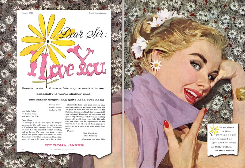
Well here's a curiosity... an advertising illustration (below) that also appeared in Good Housekeeping - eight months later. Is it by Buckham? It seems likely... but another Cooper artist may have used some of Buckham's reference from the same photo shoot. I can almost imagine that the genesis for the ad concept was the client (Palmolive) taking Buckham's story illustration to its agency and saying, "This is exactly what we want our next ad to look like!"
During the 1950's advertisers often tried to mimic the look of romance story art in their ads for women's magazines. The ad agency would have gone directly to Cooper's and asked for Lynn Buckham. But looking at the two images displayed together we can see how inferior the ad piece is in almost every way.

Many hands are involved in the production of ad art - many meddling hands. I'm not even sure if Buckham did the artwork. No matter who it was, I know too much about the process of consensus by committee (and clients who want more, more, more) to blame the illustrator for the results.
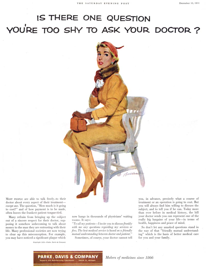
Here's another ad - this time definitely by Buckham - that again under-utilizes the artist's input. I'm all in favour of making good use of white space -- giving the visual room to breathe -- but this is ridiculous. Again, what a shame to invest in employing the skills of a Cooper studio artist and have this as the results. What a waste of potential.
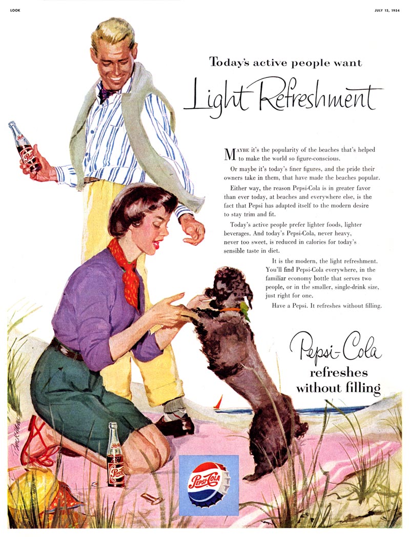
One client that made the most of its illustrators was Pepsi. Back in February of 2007 we spent a week looking at Pepsi's 'Sociables' campaign. Many Cooper artists worked on that decade-long series, including Lynn Buckham. This July '54 ad below is from relatively early in Buckham's career at Cooper's. I said at the beginning of the week that Buckham was sort of a 'hit-and-miss' kind of illustrator, and compared to some of his other work from the same time period, I'd call this piece a miss.
Since we don't know what circumstances Buckham had to deal with in getting this piece done, I'm not going to blame him too much. He may have had to crank this out over night, or the client may have asked for endless changes. It happens.
I want to end the week on a high note, and I couldn't do that better than to show you this new scan of the very first Buckham illustration I ever saw. It still knocks me out, and I think its one of the nicest pieces by Buckham I've ever seen. Amazingly, he produced this just a year after the one above and its most definitely a hit.
So what became of Lynn Buckham after this period in his career? TI list member David Roach managed to dig up a few clues:
"As magazine work dried up in the States," writes David, "Buckham moved to the U.K where he became one of the best and most prolific women's magazine artists and also found time to illustrate several books. In the mid 70’s he returned to the U.S where he found success as a portrait painter."
I'm hopeful that one day we will learn more about the talented Mr. Buckham. For now, that's all we know.
* My Lynn Buckham Flickr set.
I have to disagree, a little, about the overuse of white space in the Parke, Davis & Company ad. I think they were intentionally going for the effect of making the woman look isolated and nervous-- alone in all that empty space. I think it works fairly well that way. One could question the wisdom of provoking negative emotions like nervousness in your ads, and I do think the figure is not one of Mr. Buckham's better ones, but I don't really think it's the white space's fault. ;-)
ReplyDeleteColin;
ReplyDeleteThanks for your comment. To be perfectly honest, I disagree with myself just a little as well, and even wondered if I should be so harsh when I decided to write that, but since you offered me the challenge, maybe it would be fun to discuss why I feel this ad wasted Buckham's potential and how it could have been improved upon.
I wrote in my post that advertisers often tried to imitate the feel of a story illustration, esp. in the case of products targeted at women (as in this ad) so let's assume that this client and/or art director had that in the back of their mind going in, and that's why they chose to go to Cooper's and not use some other run-of-the-mill illustrator or photography.
As you say, the design of the ad is fine. Not the most interesting, but certainly fine.
But to have Buckham illustrate a small figure isolated in a field of white, and to use a 'bulls-eye" composition (focal point in the centre of the page) with the figure seen at standard eye level is a wasted opportunity, imo.
And I don't mind that they have chosen a strategy of negative emotion - creating anxiety in your audience is a time-tested successful strategy for advertising (think 'B.O.', bad breath, germ-ridden kitchen counters, etc.)
Two posts ago I showed a couple of Buckham's story illustrations that also used LOTS of white space and minimal props (and no environment cues). Copying either one would have made this ad much more effective. The first, a down shot of a couple in bathing suits, would have been great for this ad - not the bathing suits, of course, but the down shot. Visually, the image of the isolated figure shot from overhead in a large field of white space would have created a sense of isolation and intimidation - plus it would have been more visually interesting. The bulls-eye composition would have become extremely effective with this one change (creating a sort of 'being scrutinized under a microscope' sense of isolation) , and the unusual angle would have subliminally reminded viewers more of the typical story illustration, since romance artists like Buckham often employed downshots and other unusual angles and juxtapositions of the figure.
Equally (or even more) effective would have been an ECU on the woman's face, like the last piece from two days ago, where we see the close-up of the woman's face overlapped by the man's face and hand holding a cigarette. Just an ECU of the woman's face (perhaps partially cropped vertically on the right side of the page?) dominating the white space, looking worried, would have created more of an emotional connection for the viewer (like looking in the mirror) and a sense of tension about her circumstances.
Actually, the two top pieces in your Sunday April 11 posting on your blog demonstrate exactly what I mean, Colin. Both of your (very lovely) drawings show how this ad might have been improved dramatically. The one on the right especially, with the face dominated by deep shadow - that kind of lighting would have worked beautifully in the case of this ad!
Anyway, this has been fun - I hope you don't feel I was taking you to task - I just welcome the opportunity to elaborate on where my thinking was when I wrote that this was a waste of Buckham's talents. Its a pet peeve of mine when I look through all my old magazines and see ads done by Cooper artists (and other equally talented illustrators) that are so darn dull by comparison to their story illustrations. And having worked in advertising all these years, gone through the process so many times... nothing has changed.
Illustrators have so much to offer - are usually only called in when the client wants something different - then too often they are neutered by those same clients interfering in the process. The results are often a disappointment to everyone involved...
Part of the reason I present material like this is in the hope that today's professionals will learn from the mistakes of the past - and as well, learn from the forgotten successes of the past. That's why its called "Today's Inspiration" !
Thanks again, Colin! - Leif :^)
Leif,
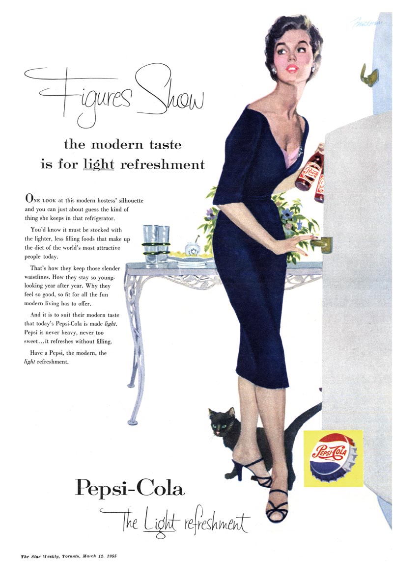
ReplyDeletesometimes I wonder what the fuss is about-- I enjoy looking at the work of these illustrators very much, but let's face it: they were trying to put food on the table and had to jump through whatever hoops their art directors and clients set them. The artistic feeling and design of their work was a distant priority compared to the more immediate one of SELLING THE PRODUCT. I was looking at a book of Peter Breugel's work this morning, and the incredible phalanx of thoughts and emotions that accompanied that perusal put the efforts of these illustrators to dramatize questions like "Coke.. or Pepsi?" and "Do people notice my dandruff?" into their true category of trivial ephemera.
Boy, you nailed it, Christina;
ReplyDeleteThat is the underlying reality of this business. However (there's always a however) since the point of this blog is to find inspiration in the work of the mid-century commercial arts, I think we can indulge in some illustrative navel-gazing now and then.
But yes, you are absolutely correct. As with comics of that same era, no one thought of what they were doing as 'Art' or that 50 years later anyone would be scrutinizing their efforts. The thought makes me nervous about what people will say should they dig up my work in 50 years! ;^)
No problem at all, Leif. I was very pleased to read your response (and to hear that you've visited my blog as well-- Thanks!). You're quite right that the composition is too flat, too straight ahead, far too ordinary in every way, and your suggestions for improvements are dead on, in my opinion.
ReplyDeleteKeep up the good work, it's always an inspiration!
Man, they sure knew how to make a woman back then.
ReplyDelete