
Well, if he's your co-star in a Pall Mall ad, he's simply telling you Pall Mall's modern design allows smoke to travel a 20% longer route - and that means a smoother, cooler, less irritating smoke.
See? Sometimes a cigarette is just a cigarette.
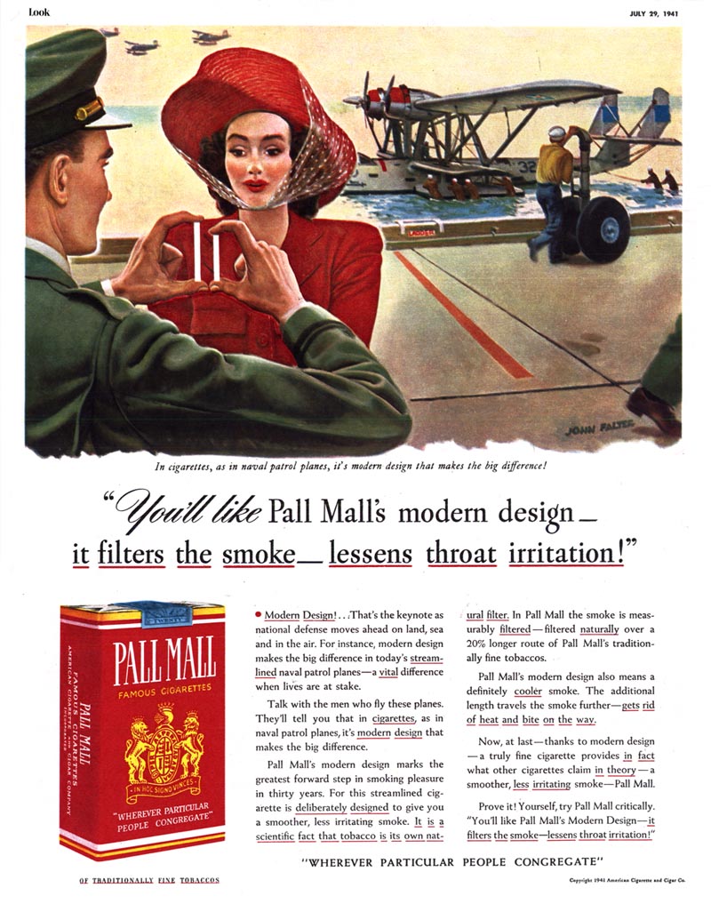
With the exception of the 1941 Pall Mall ad above, I can't say what the cigarette manufacturer's campaign strategy was for most of the 1940's. That one ad is the only example I have.
But for the 50's decade - wow - Pall Mall was to smokes what Pepsi was to soda pop. Pall Mall's decade-long campaign was a consistent, focused strategy, appearing regularly and frequently, employing the best Cooper studio artists (and other's of equal calibre) and defining the Pall Mall smoker as sociable, physically active, young, good looking, urban, sophisticated, independent and the centre of attention.
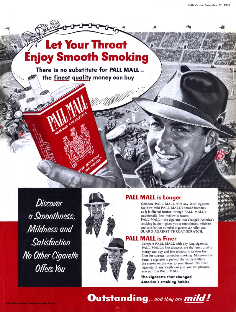
1952 - 53.
The Pall Mall "hero smoker" is very definitely front and centre.

But each ad is designed with a detailed crowd scene to reinforce that everyone smokes Pall Mall's (the effect is almost comical - but then that's why advertising is always so consistently absurd).
1954.
The execs at Pall Mall decide to go full bore. Ads are now huge DPS scenes of large groups of people engaged in fun, energetic activity. Our Pall Mall hero smokers are still front and centre, but the super close-ups have been replaced with a more middle-distance p.o.v.
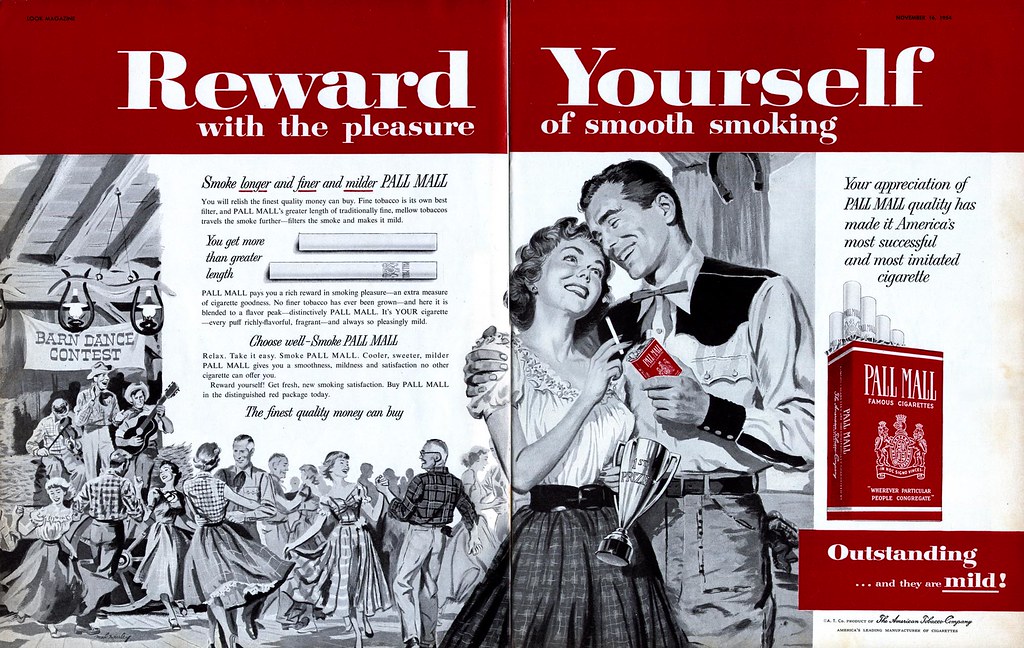

1955.
Pall Mall continues to commission gorgeous huge DPS's - but there's a subtle change of emphasis. Our Pall Mall hero smoker is now truly heroic. Previously the background crowd scenes were simply there to show that everyone and his brother smokes Pall Mall. Now the strategy shifts to turn all eyes on our hero smoker.
Pall Mall has its illustrators put them quite literally "in the spotlight."

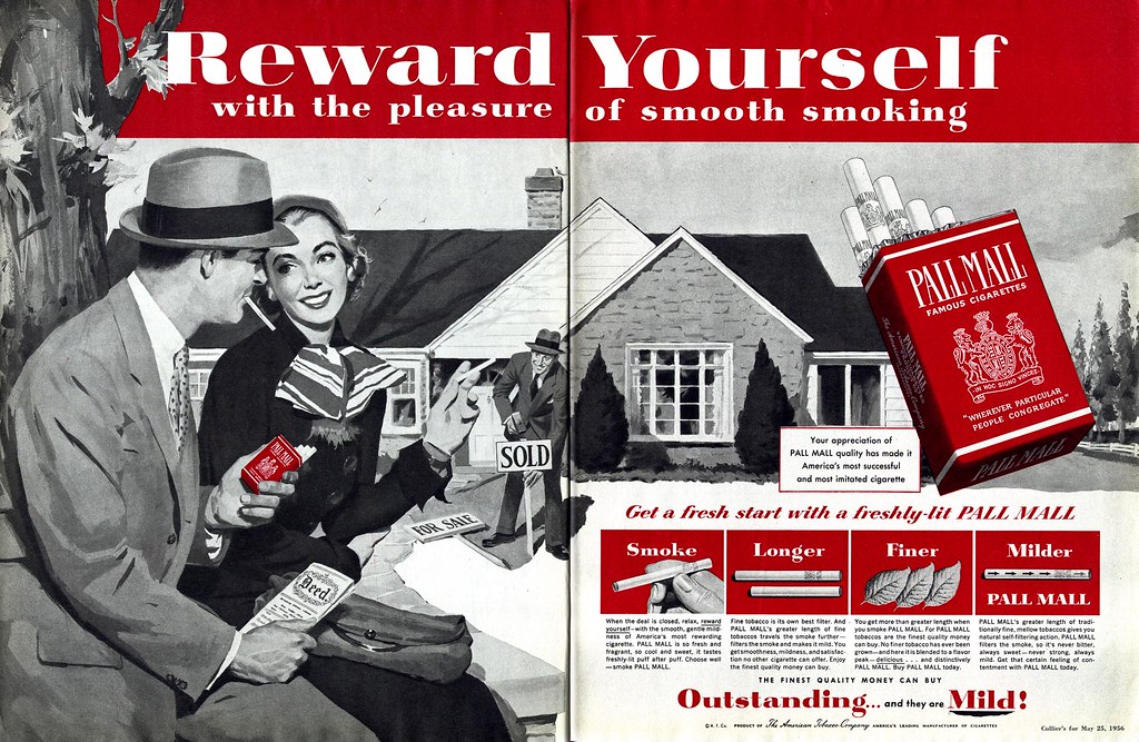
In 1956, just as the Pepsi Sociables did, the Pall Mall hero smokers settle down in a nice suburban backsplit.
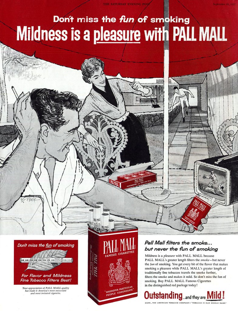
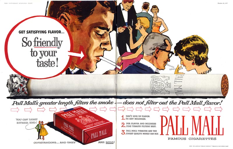
1957.
Another parallel with Pepsi: reinforcing the idea that they are the brand of the hip and sophisticated, Pall Mall seeks out hot young illustrators with a bit of stylistic flair. In fact, Pall Mall's astute art directors get bonus points for tapping Bob Peak two years before Pepsi did.
Stylized realism like this might not seem like a giant step forward from today's perspective, but for a major 1950's advertiser like Pall Mall, it must have been quite a stretch.
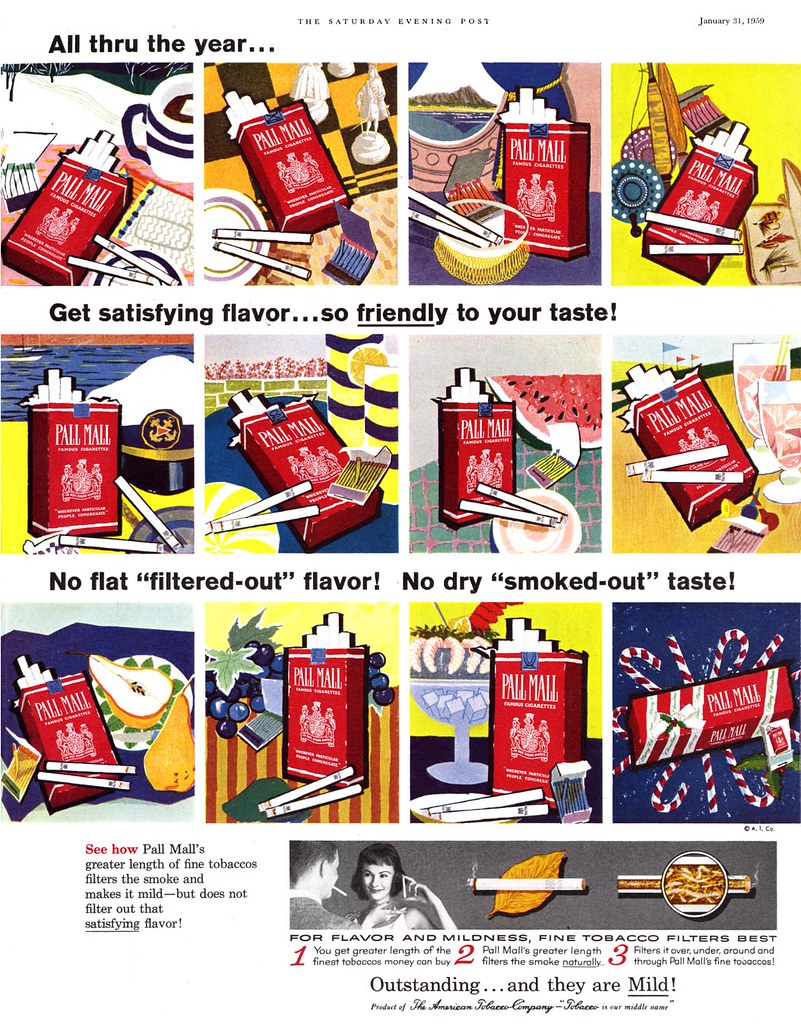
1958-59.
Pall Mall takes the plunge, producing easily the most avante garde ads of any cigarette maker. The group shot ad below collects what had previously been an inundation of colourful, nearly abstract single page ads executed (you may be surprised to learn) by much beloved children's book and Disney artist, Mary Blair and appearing week to week and month to month throughout 1958.
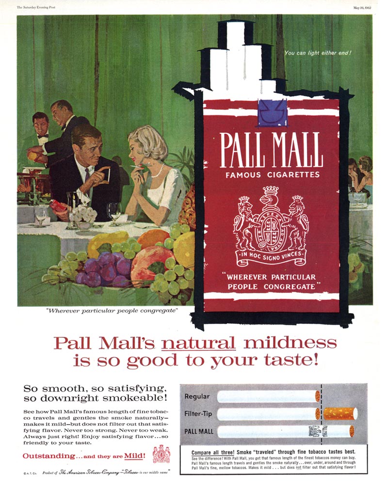
1962.
Times have changed. Or have they? The Pall Mall hero smokers have been through an awful lot since they first met; two young kids caught up in the chaos of W.W.II.
Pall Mall and the art directors who shepherded its ad campaign through the 50's get much respect from me. While other cigarette manufacturers zigzagged between illustration and photography and tried a wide variety of strategies to lure in new customers, Pall Mall stuck to its guns - and more importantly - consistently favoured illustration for its relentless presentation of the Pall Mall smoker heroes.
So after twenty years, two wars and a decade-long unwavering strategy featuring countless Pall Mall smokers "rewarding themselves", what did we learn...?
"Size matters."

* My "Smoking!" Flickr set.
*Addendum* Ger Apledoorn has posted a wonderful set of 1960's Pall Mall ads by Playboy cartoonist Eldon Dedini
Hahaha - incredible review, Leif. Simply one of the finest posts I've read here!
ReplyDeleteAmazing that they solidly used illustration through years of innovation from and enticement to use other media, as you said.
haha, that write-up was really great!
ReplyDeleteI keep snickering at that first image. All of these fun cigarette ads you've posted are a hoot! Thanks for sharing!
ReplyDeleteJust goes to show that size does matter when it comes to throat irritation.
ReplyDeleteHa ha ha - compliments, Leif.
ReplyDeleteThat was most rewarding!
Leif,
ReplyDeleteOnce again, A level blogging.
It was really cool to see the Mary Blair stuff. It's great, with those colors, the stylized fruits, and those fat lines around the product.
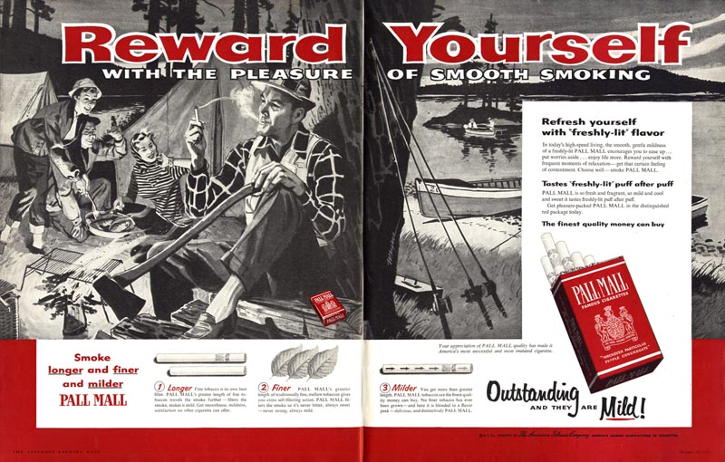
Aside from the Blair stuff, however, where I might normally side with the modernist stuff, I really enjoy the "Reward Yourself" series the most. It's just very charming and accomplished illustration and subject matter. Aside from the evil cigarettes, that is.
LEIF.... Thanks for for a great week. As the old song said, 'Thanks for the memories!'. In the west, there were were no tobacco companies....and the 'temptation' never came up. Didn't blame the illustrators for taking their money....it was plentiful. But, even though I smoked when I started working, I knew it was wrong for my health...we all did. Never portrayed anyone smoking in my ads, that I remember. Wait a N.Y. second....the first billboard, Rainier Beer...had a guy with a pipe. Can't remember any more. Again, great commentary, and an interesting week.... thanks.
ReplyDeleteMy dad was a 2 pack a day Pall Mall smoker. He died at 40. Thanks, Pall Mall.
ReplyDelete