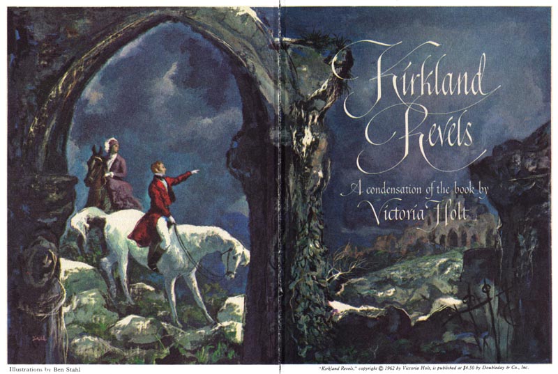
Long ago I purchased a book of drawings and sketches by Gustav Doré. When I saw this moody series by Stahl I was immediately reminded of the art in that book. Stahl's beautiful ink and wash drawings really evoke an earlier time and place...
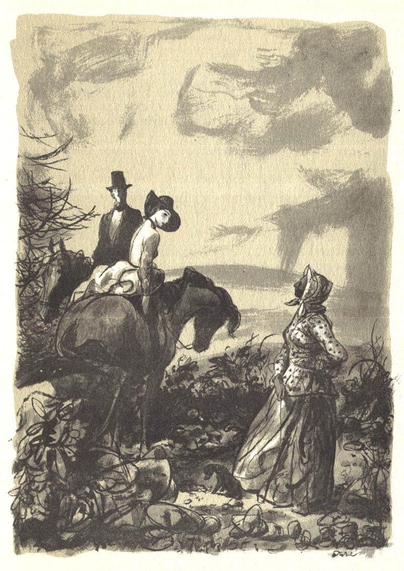
... and his very personal style is immediately appealing and gives the artwork a kind of magical quality.
This is not straight representational historical documentation...
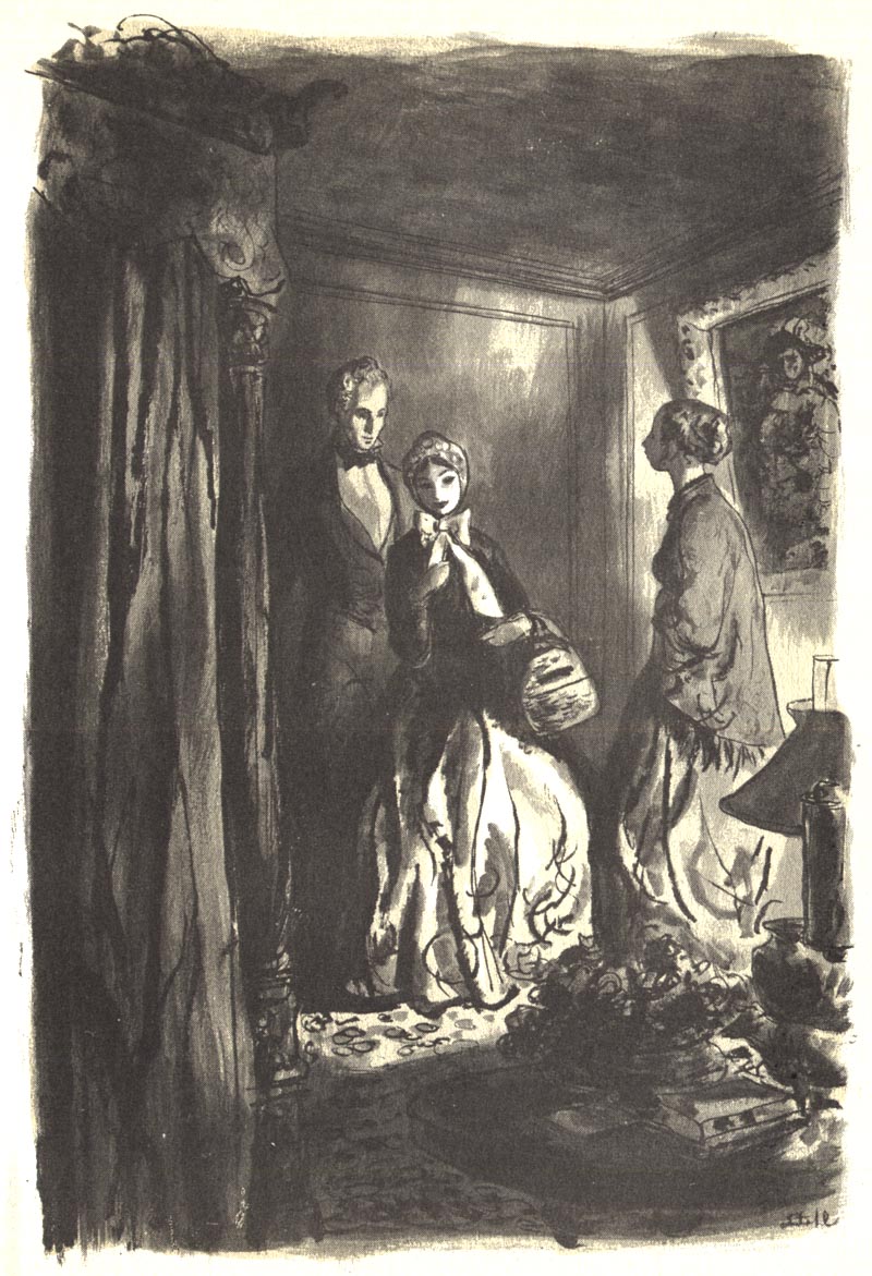
... there is an air of the storybook fairytale to this work.
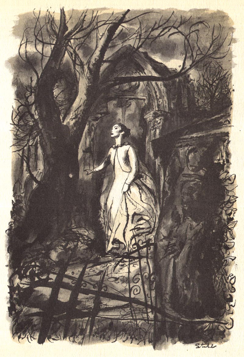
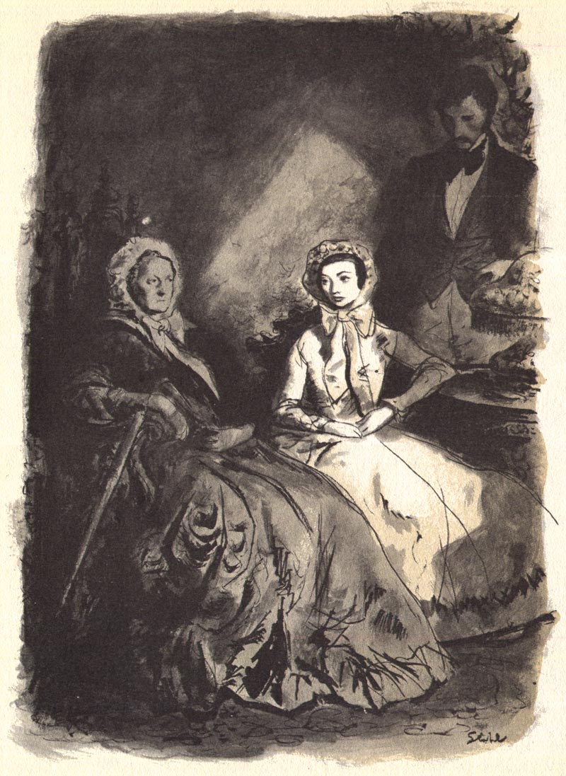
And while Stahl surely drew upon classical art for his own inspiration, there is something thoroughly modern about the artist's stylization...
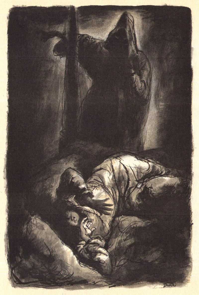
Born in a different time and place, I could imagine Ben Stahl designing the people and environments in a Tim Burton film!

This very classical look has come full circle in the 21st century and is once again evident in the work of artists like James Jean and Jill Thompson.

I've written about Stahl before ( though not recently). For those interested in reading a bit about the artist, click here.
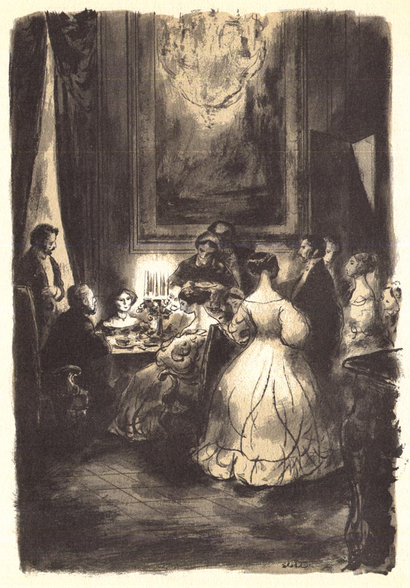
... and to read an astonishing story of the theft of Stahl's original art, click here.
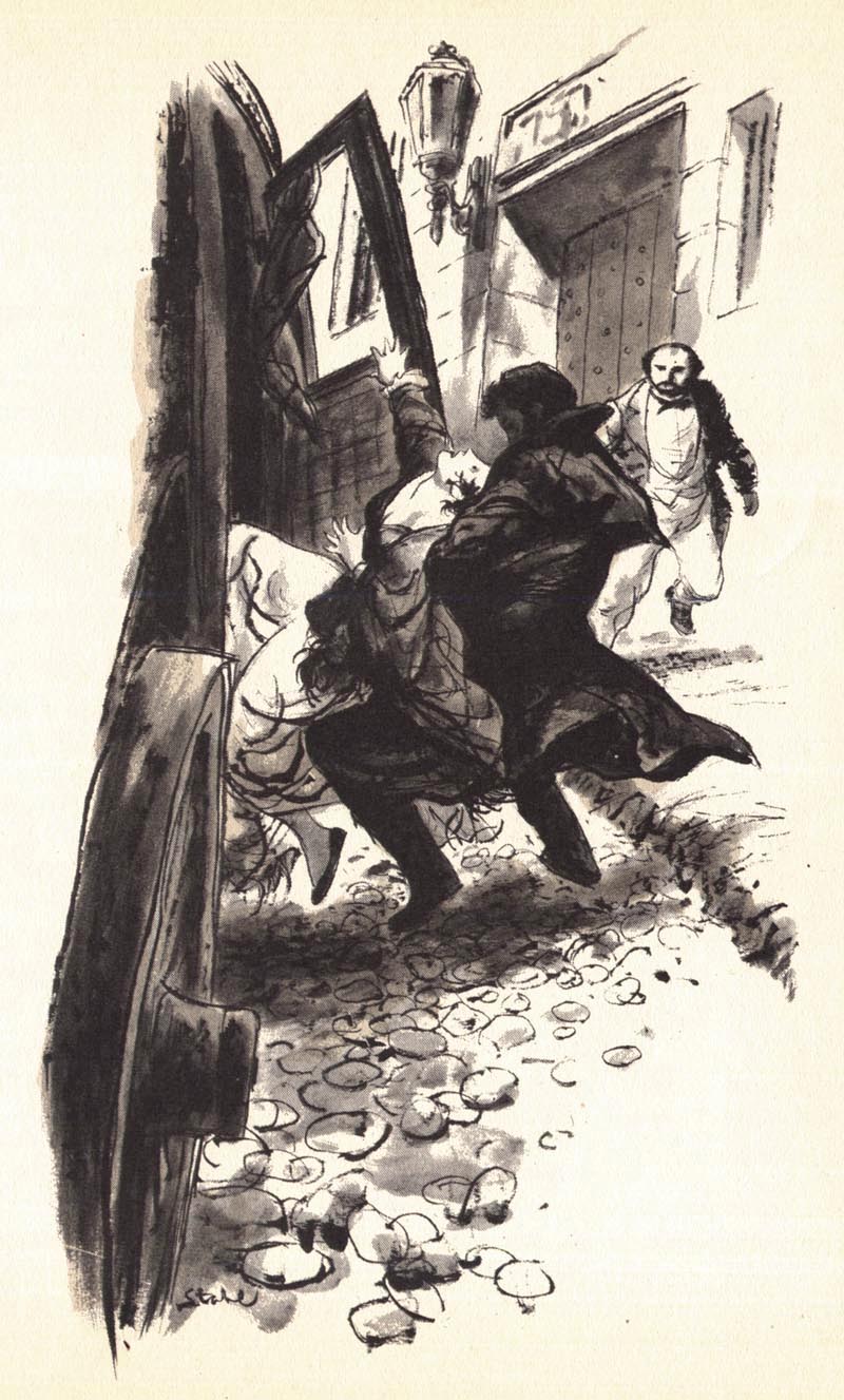

* My Ben Stahl Flickr set.
Burton - exactly. I also see a Gorey aspect to these - the shape of the heads, length of the bodies, and of course, the dark, sinister feel of the work.
ReplyDeleteAnother great post, Leif.
Great stuff! If anything these remind me of Goya's etchings. (See Los Caprichos and Disasters Of War). Very atmospheric, rich, and psychological picture making. Both men could draw in a way I don't think either Dore, Gorey, or Burton could ever wrap their heads around.
ReplyDeleteIt's official: Ben Stahl is my new hero. Leif, thanks a million for bringing this guy to my attention - he's a marvel.
ReplyDeleteThanks Leif
ReplyDeleteThese are absolutely terrific !
Very inspiring.
After having taken a second look at these amazing drawings I'm astounded by the lack of detail in them. By drawing the simple and solid shapes and clever use of lighting, Ben Stahl has completely delivered the necessary mood and atmosphere to tell the story with an absolute economy of means.
ReplyDeleteCount me doubly inspired.
These line and wash drawings also bring to mind the drawings of Honore Fragonard.
Guy Davis has a look very similar to this too, BPRD and Hellboy... that first image with the vague gray brush strokes just kills.
ReplyDeleteI remember seeing this volume as a kid and being very moved by the illustrations - so much that recently I searched for the original novel and the original RD volume
ReplyDeleteLeif, if you are going to continue down this path, I would urge a look at the 1960 volume 41 with Shirley Jackson's Haunting of Hill House, William Hardy's Wolfpack, and Arthur Hailey's Final Diagnosis - the illustrations are incredible - can't remember for sure, but perhaps all done by the same illustrator
thanks so much for these
It takes a lot of skill to do illustrations blk & white art in line & wash so effectively.
ReplyDeleteWilliam Hardy's Wolfpack illustrations were by Allan Kass.
These pictures remind me of old photos from black and white days,yes?
ReplyDeleteHarald - thanks for the info re Allan Kass - around that time (mid-50s to early 60s) RD did a number of WWII condensations, wondering if Kass did some of those too - did he do any work for mags like Argosy?
ReplyDeleteReminds me also of the graphic works by Delacroix. His illustrations of "Faust", for instance.
ReplyDeleteI echo the recommendation of another anonymous re the illustrations of Haunting of Hill House also from RDCB. I ripped those out of the volume I had and kept them. They are very similar to these and very very spooky and beautiful.
ReplyDelete