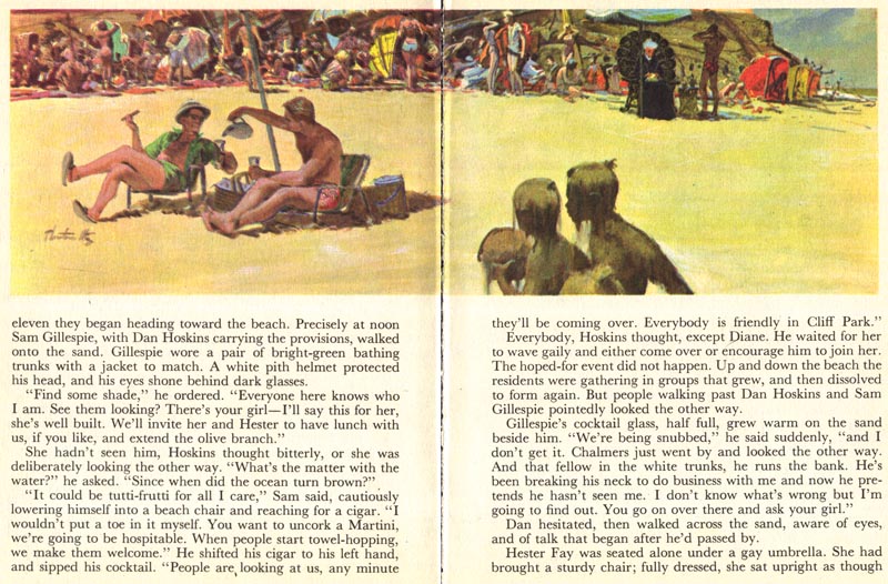
Thornton Utz, who has been the subject of a week-long series of posts here, enjoyed experimenting in his art. For this particular story, however, he mostly played it straight. That's fine... it gave him the opportunity to demonstrate his excellent draftsmanship, compositional skills and colour sense. Consider the scene below, for instance. There's not much less interesting than a room full of grey suits sitting and talking... but Utz manages to make even this subject pleasant and interesting to look at. Everyone is there own person, they all have individual, expressive body language... and in spite of choosing a straight-on 'static' camera angle the over-all composition is compelling.
And there isn't actually a grey suit in the room, is there?

No, there's nothing dreary about any of these illustrations. Thornton Utz lived in Sarasota, Florida, a land of sunlight and bright colours. He probably didn't have to look very far to find inspiration for the palette he employed on this job.

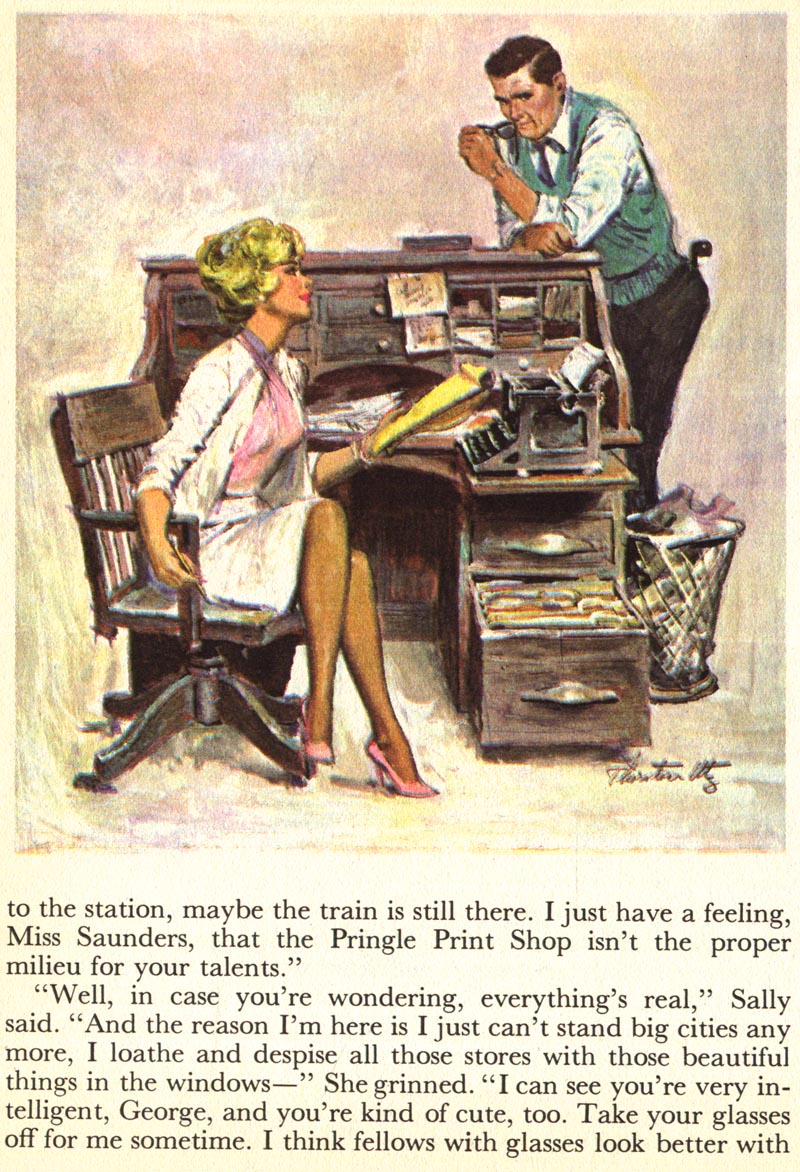
And - thank goodness - Utz found an opportunity to draw one of his trademark gorgeous girls. One of Thornton Utz's closest friends and neighbours was Al Buell, who did quite a lot of pin-up art during his career. I don't have any examples of Thornton Utz doing pin-up art, but he certainly had the skills to do so if he had wanted to, and I believe he did some pin-up art for Esquire magazine.
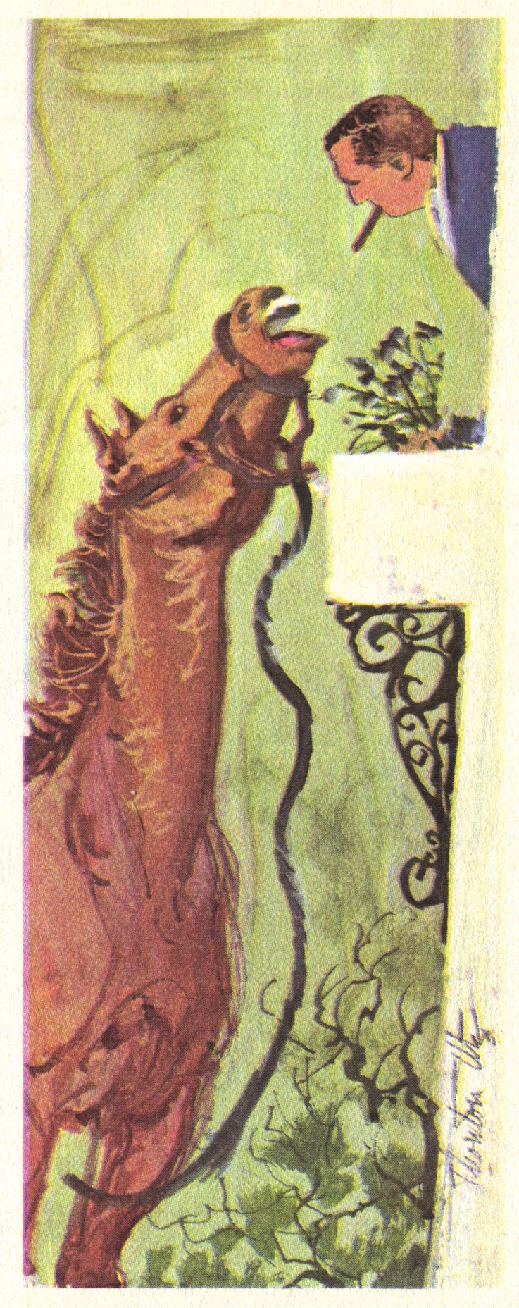
Two other aspects of Thornton Utz's skills are demonstrated in these last two pieces: one, his sense of humour and ability to create realistic art that is amusing without becoming caricatural...
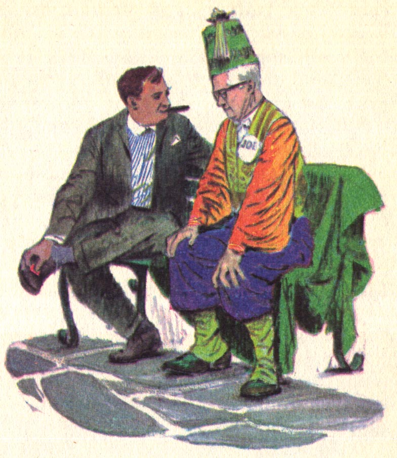
... and two, his passion for experimentation. Notice how Utz has incorporated realism, humour, and some interesting stylization in this final piece. Ernest W. Watson, writing in American Artist magazine about Thornton Utz said, "One is quickly impressed by Utz's inventiveness and ingenuity. He is always doing the unexpected in his painting and nothing daunts him."
Utz himself put it this way: "I dislike duplication. I am always experimenting - it's part of my work. I'd rather do the whole painting over than follow a tried-and-true pattern."
* My Thornton Utz Flickr set.
Great stuff! Thanks for your continued wonderful site.
ReplyDeleteOn a related note, I have a whole pile of Readers Digest art that I ripped out a pile of RD books awhile back. The artwork was amazing, as you have frequently shown. I'm wondering if anyone has written about the great artwork in RD books in the 50's and 60's -- seems like that was the golden age. Apart from your site, I can find nothing about it.
Thanks Anonymous; I think you may be right - I don't recall coming across any other sites that showcase these forgotten treasures. Over the last few years I've written extensively about the art of RDCB, and the monthly magazines and RD's main competitor during that era, Coronet magazine. Rest assured there will be much more RDCD art and info coming in the near future.
ReplyDeleteWhoa.. impressive post! keep it up, you will be soon get famous about this.
ReplyDeletei am a freelance writer..
see my works here ------> Suits