Tuesday, March 31, 2009

An Art Editor Discusses the Manly Art of Illustration

In the September 1954 issue of American Artist magazine, Norman Kent, art director of True - "The Man's Magazine" - talks about illustration.


"The great majority of contemporary magazine illustration is devoted to fiction and concentrates, for the most part, on the romantic boy and girl theme," writes Kent. "True magazine publishes no fiction, however; its stories are written primarily for a male audience and are illustrated in full color. And because they are true stories they must necessarily be as convincing graphically as photographs. By this I do not mean that our illustrators are asked to imitate photography. Quite the contrary; we demand that the painted illustration be unmistakably graphic, since about half of our pages are normally documented with photographs. But since the readers of this magazine form a highly critical audience, well versed in the arts of hunting, fishing and other manly pursuits, there can be no slighting of important detail; no vague passages to cover uncertainties. For this reason numerous illustrators, highly respected for style and imagination so perfectly related to the mood and mode of today's fiction, are unsuited to the exacting technical authority demanded by True."


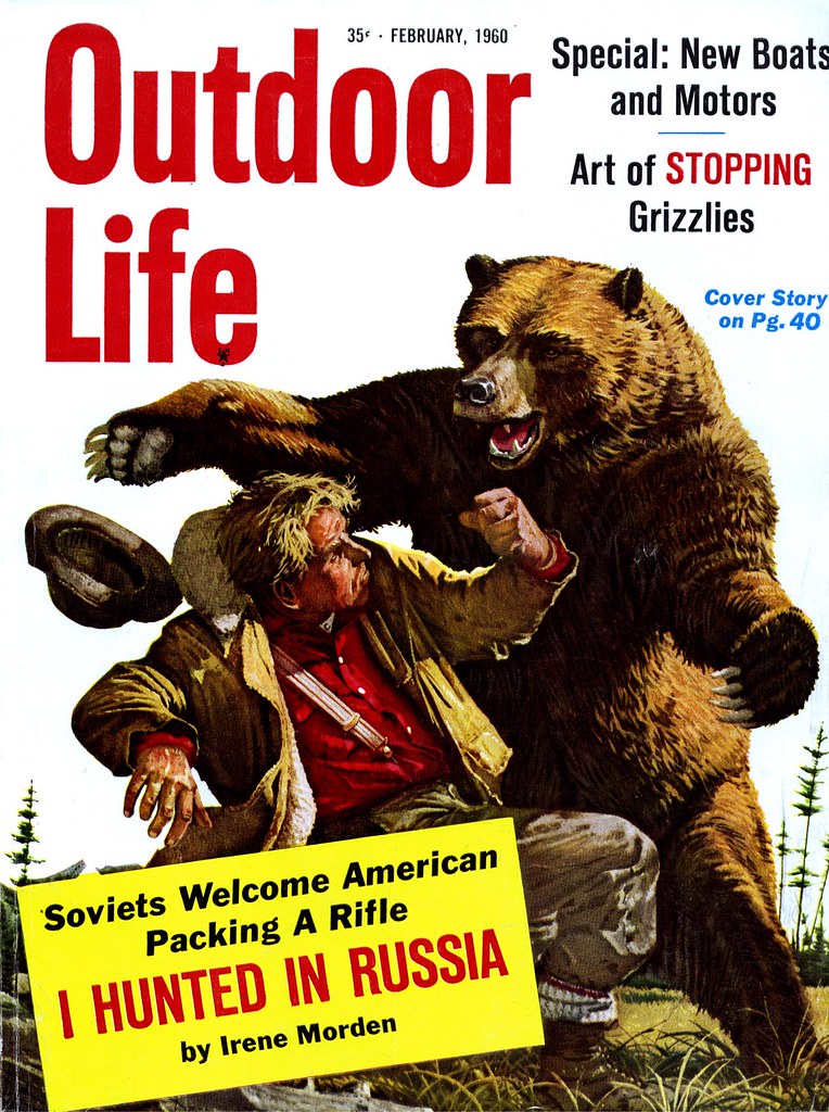
Sounds pretty lofty. Clearly, Norman Kent wanted to establish that True represented the high watermark of men's magazines and that only the best illustrators were worthy of delineating the "manly pursuits" chronicled in its pages. I can't speak for the writing, but based on the production values and paper quality of True, the status of the many national brands advertised in the magazine, and the top-notch artists who Kent regularly commissioned, I would have to agree. But sharing that top tier were two competitors: Argosy and Outdoor Life. many of the same artists worked for both of these other magazines illustrating largely the same type of articles.


Kent lists some of those illustrators who "are able to meet this test of accurate reporting while they carry over into the area of their commercial commissions the very qualities that mark them as individual artists" :

Warren Baumgartner, Mario Cooper, Henry C. Pitz, John Gannam, Peter Helck, John Pike, William A. Smith, Fred Ludekens, Robert Fawcett, Stan Galli, Bruce Bomberger, Glen Grohe, Tom Lovell, Bill Reusswigg, C.E. Monroe, Jr., and Harold Von Schmidt ( among several others). There's no denying that these really were the exceptional top rank among illustrators most often called upon to interpret scenes of manly action and adventure in the pages of more mainstream, family oriented publications like the Saturday Evening Post and Collier's.

You're unlikely to have found work by any of these artists in the more down market 'men's sweat' magazines, although they were very similar in content (not to mention intent). Recently we spent a week looking at how the editors of Bluebook felt the need to contemporize the look of that magazine. I believe it was their attempt to keep up with competitors like True and Argosy.

As we saw, there was a lot of terrific artwork being done in Bluebook - but the poorer production quality, cheap newsprint, and lesser status of its artists would have made that task daunting. The lack of decent national brand advertisers in Bluebook tells the tale.


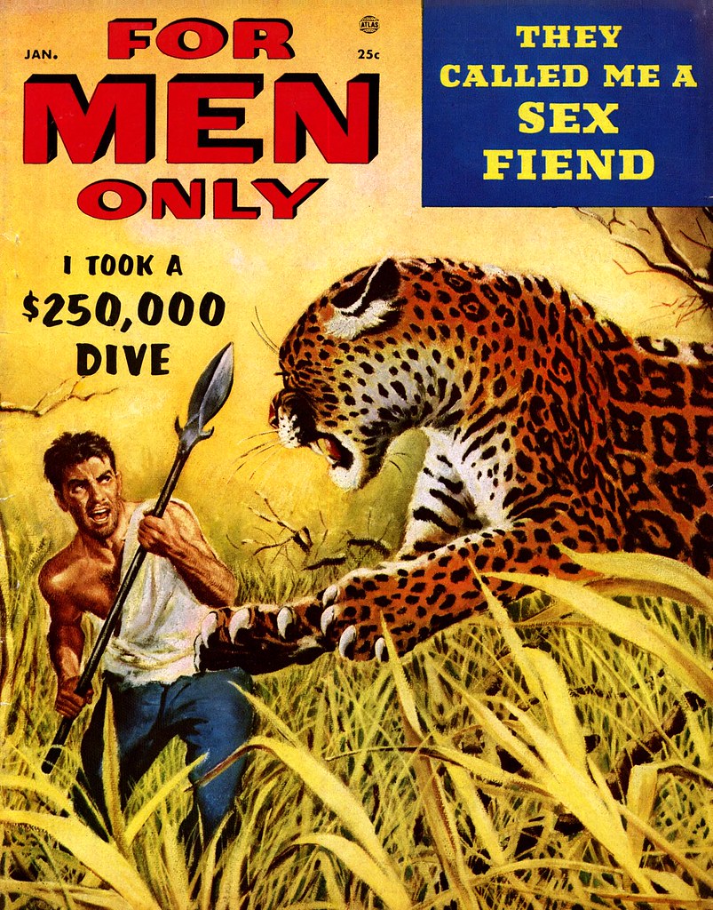
Even further down the ladder were the truly lurid men's magazines. Some even sported really great cover art by well established pro's, like this great piece by Frank Soltesz. But generally the interior art, if any, was second rate.


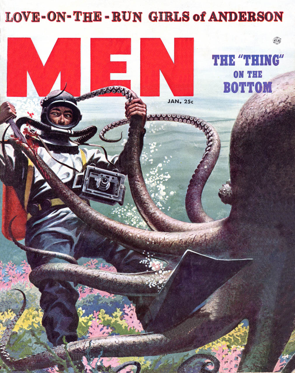
Here readers were less likely to read about hunting and fishing than to linger over crime scene photos of mob hits and tragic domestic disputes. I doubt you'd ever find any of our top tier illustrators even considering an assignment from these mags.


I've taken the time to go into all this background because, despite what might seem at a glance like a negligible degree of distinction among these publications, there was clear hierarchy in the men's magazine market - both in terms of quality and status.

This week, with the help of Norman Kent, we will take a closer look at the True nature of the best in manly illustration.

* And speaking of the best, you'd best be getting on over to Charlie Allen's blog for this week's CAWS!

Friday, March 27, 2009

The Art of Carl Erickson: "Easy or Impossible"

From Ernest W. Watson's Forty Illustrators and How They Work:

"It was Victor Hugo, I believe, who was asked if the writing of epic poetry were not tremendously difficult. His classic reply, "Easy or impossible!", may appropriately be applied to such drawings as come from Erickson's inspired brush. They give the impression of having sprung to life without suffering the usual labor pains."


"But his performance looks too easy; its nonchalance is deceptive. It is not accomplished without a struggle."


"Erickson, indeed, is a hard-working man, a very serious artist who is usually practicing when not actually performing. For every piece of work reproduced in the magazines he has made dozens of studies. In spare moments he is usually busy drawing or painting from the model - he never draws without a model - and his sketchbook goes with him to the restaurant and the theatre."


"Although few are aware of it, he has done a lot of painting in oil, principally portraits."


"All of which is no denial of Victor Hugo's epigram. Erickson's particular genius is pretty much a gift of the gods, even though he has met the gods considerably more than half way."


"Erikson's line drawings are usually rendered in Wolff pencil, charcoal or chinese ink. This latter comes in cakes or sticks which have to be ground in water in a small mortar designed for the purpose. It will yield a jet black or produce any tone of gray, depending upon the saturation of the mixture."


"Erikson's art is primarily an art of line."


"Color may be added, as more often than not it is; but the net result is a colored line drawing. [He] is an impulsive worker. Standing at his board, which is tilted at a slight angle, he attacks the paper with a free arm thrust that reminds one of a fencer wielding his foil. The drawing isn't always good. Indeed the studio floor may be littered with innumerable trials before one is certified by that well-known fixture, "Eric".


"There is no such thing as "fixing-up" an Erickson drawing: if it is not right as it first springs directly from his hand, it must be discarded and a fresh attempt made. The artist would no more think of going back to correct an error than would a musician during a concert performance."

* Many thanks to everyone who assisted with this first foray into fashion illustration - rest assured there will be more to come!

* My Carl Erickson Flickr set.

Thursday, March 26, 2009

Carl Erickson: The "Deceptively Simple Line" of the "Lifestyle Illustrator"

Below, a scan courtesy of TI list member Tom Whitmore, Coby Whitmore's son, who writes: "Eric [is] one of my favorites and one of my father's as well as I recall. This drawing by Eric was done in 1917 when he still signed his work Carl Erickson. I have no idea who it depict, or what the job was. Although it has considerable water damage we love it." Many thanks to Tom for sharing this beautiful image with us.


In 1917 Carl Erickson was working in New York as an advertising illustrator, a career he had pursued in Chicago until 1914.

The idea of Erickson working in advertising brings me to an excellent comment left on yesterday's post from Melanie Reim, the Chair of the MA in Illustration program in the School of Graduate Studies at the Fashion Institute of Technology, that bears further examination. Melanie wrote, "rarely is there a class in gestural figure drawing, fashion illustration, nor documentary art at the Fashion Institute of Technology, where I teach, that the likes of Eric, Rene or Jack Potter are not mentioned, amongst other fashion/lifestyle greats. The knowledge and foundation of their understanding of the figure resonates under the deceptively simple line."


Melanie's reference to "lifestyle" illustration really made me stop and think...

As someone who has only ever given fashion illustration a passing glance, I had never thought of fashion artists like Eric as lifestyle illustrators. This, to me, is the realm of the advertising artist... but Melanie is absolutely correct -- its because artists like Eric were such keen observers of the form and so adept at translating the figure into "deceptively simple line" that their work is so remarkable - and so well suited for interpreting lifestyle.


Several people have commented to me privately this week that they don't really 'get' fashion illustration (and I'll bet there are many more). But consider that some others with whom we may be far more familiar (and perhaps relate more directly to) similarly embraced the philosophy of keen observation and a "deceptively simple line"...

Was Eric an influence on such artists as Austin Briggs as well?


All of this brings us to what I think is a rather remarkable circumstance.

Carl Erickson died in 1958. That year he received an Award of Distinctive Merit from the New York Art Director's Club for his work on a direct mail pamphlet for CBS Television.


I find it not a little ironic that the artist who spent a lifetime portraying the elegance and sophistication of the fashion world in the pages of Vogue received, as his final honour, recognition for his interpretation of a lifestyle as mundane as the act of watching television.

Here we see no "chic femininity" -- just the backs of people's heads as they stare, transfixed by the "boob tube".


As we know, television would soon choke the life out of the magazine industry upon which illustrators of all types relied for their livelihood

There's an almost allegorical quality in the passing of Carl Erickson, the epitome of the illustrator of an earlier time, portraying, through his sophisticated style, the rise of America's new most popular medium.

* My thanks to Tom Whitmore for sharing his beautiful Eric original and to Melanie Reim for helping us to better understand the importance of the work of Carl Erickson. * Please note that there is a permanent link in the sidebar for those interested in further exploring the Fashion Institute of Technology's website.

* My Eric Flickr set.

Wednesday, March 25, 2009

The Extent of Eric's Influence

Several people have connected the dots for us this week, proposing that Eric must have been an influence on another prominent fashion illustrator of the time, René Gruau. But just how far did Eric's stylistic influence extend?


Interestingly, the editors of the 1952 Art Directors Annual chose to put the René Bouché piece above and the Eric piece below next to each other on the same page. Yes, they are both fashion illustrations from Vogue, from the same year. But did one artist influence the other? Walt Reed's biography of Bouché in The Illustrator in America doesn't say. However, Eric had already been an important regular contributor to Vogue for years by the time Bouché had his first piece published in 1938 in the magazine's Paris edition. I think its safe to assume Eric must have influenced all of fashion illustration during his time.


TI list member Daniel Zalkus put the book, Forty Illustrators and How They Work, into my hands and encouraged me to look at Eric's work. Daniel proposes another important connection: between Eric...


... and Jack Potter (below).

"Eric was Jack's favorite artist," Daniel wrote to me in an email the other day. "He told me that from time to time he was called on to do similar work to Eric. I think it was in part because Eric was either too busy or drunk to do the work. And Jack was able to do what was needed."


This, in my mind, raises the prospect of an even further influence for Eric: if he made such a strong impression on Potter, is it not possible he also influenced Bob Peak during his early days?


This is an exciting revelation for me... it explains the 'family tree' of how Eric's fashion illustration style found its way into mainstream illustration during the 50's.


Finally, also from Dan Zalkus, another photo of the artist. To accompany it, I had to copy and paste that magnificent quote Neil Shapiro shared with us in Monday's comments from Cooper Studio artist, Fred Smith:

"He would draw from the model & a few lines would tell everything. He lived in the building diagonally across from Cooper Studio. We would see him in the early morning. He had a bowler, beautiful clothes, a Chinese chef & a poodle. Sometimes he'd be standing out in the middle of the street at Lexington & 57th directing traffic with a newspaper when he when he was headed for Third Avenue, for his morning martini. He was the ultimate artist -- a magnificent artist. Never sober, but never disreputable in any way. He just led a charmed life. He would come into a bar where all the guys from Cooper's went -- The Venetian. It was just below the studio, on Lexington. He always had a carnation in his lapel. He generally had a walking stick with him. He loved the fights. He would come into The Venetian & demonstrate how Sharkey fought, how Tunney fought, & he would prance around. Everybody would go up to the Waldorf for lunch, & so would he. He had a whistle he'd blow when he got in there, & the waiters would come over & take him to a table. He would have a lot of martinis & eat a little something. He had a certain style that doesn't exist anymore."


*Thanks to Daniel, Neil, and everyone who has been helping to fill out the background details on the "ultimate artist", Eric.

* My Eric Flickr set.

* Daniel also brought to my attention a page on Eric at American Art Archives

*ALSO* For some truly gorgeous classic b&w illustration art, don't forget to check out the latest CAWS at Charlie Allen's blog.

Tuesday, March 24, 2009

Eric: "the suave delineator of chic femininity"

In Forty Illustrators and How They Work, author Ernest W. Watson writes, "There is no reason, of course, why the suave delineator of chic femininity, whose drawings for twenty years have given poignance to America's smartest fashion magazine, should not have been born in Joliet, Illinois."


"But it would not be expected. Such graphic sophistication one might insist must emanate from an artist Parisian born and Parisian bred."

"Erickson, as a matter of fact, has lived most of his professional life in France - from 1920, in the early years of his career, until 1940."


"With his wife and daughter he left France several weeks after its occupation by Hitler's legions; taking with him no more of his goods and chattels than could be jammed into a few suitcases."


"However, he had his fortune in his hands; he needed nothing but a brush and a little color to reestablish himself back home."

"Here he was right on Vogue's doorstep ready to continue his monthly contributions which have appeared in that magazine without interruption since 1923."


"He was also within arm's length of national advertisers who at once began to compete for his elegant drawings, as French merchants had done previously."


*Many thanks for all the entertaining and informative comments yesterday. For readers who missed them, they are well worth taking the time to read.

* Today's scans are courtesy of TI list member, Jeff Smith -- many thanks, Jeff!

My Carl Erickson Flickr set.

Monday, March 23, 2009

Carl (Eric) Erickson (1891-1958)

What I know about the history of illustration could fill a thimble, and when you're talking fashion illustration, I know even less. In fact, nothing. But I am keen to learn.


Luckily there are TI list members from many diverse backgrounds, including some who are intimately and passionately involved with fashion illustration. It is thanks to them that I ever even heard of Carl Oscar August Erickson, better known by his famous signature 'Eric'.


Walt Reed wrote about Eric in his book, The Illustrator in America. Reed said that the artist was "himself the personification of his elegant world... [he] wore a bowler and carried a walking stick, and he directly participated in the fashionable life of the international set."


Reed tells us that Eric "dominated the field of fashion illustration for over thirty-five years." That's a pretty remarkable accomplishment, unmatched, I would venture, by any other 20th century illustrator!

Eric became a staff illustrator for Vogue magazine in 1923, and most of this week's scans will be from that publication.


Reed also writes that Eric's "drawings and paintings are authoritative because he knew his subjects and their world; his taste and beautiful draftsmanship reveal him to be an artist of permanent importance."

With that in mind, I thought it would be a good idea to study Eric's work in greater detail. If you are in a position to teach us something about the artist, your contribution would be greatly appreciated!


And of course, comments from any and all are always welcome.

My Carl Erickson Flickr set.

Friday, March 20, 2009

Thornton Utz: Family Man

Thornton Utz must have really enjoyed working for Cosmopolitan magazine art director, Robert C. Atherton. He would have been the ideal client for an artist described as "a man who made his own rules, challenged the usual, and defied the ordinary".


Atherton usually handed out multi-image assignments for Cosmo's fiction pieces. Three from a series of five done by Utz for the August 1955 issue are shown below. You've seen several others this week, and they show how Thornton Utz used these opportunities to try many variations of style.


In the November 1957 American Artist article I've been referencing this week, author Ernest W. Watson writes, "He is always doing the unexpected in his painting and nothing daunts him - from employing the assistance of the ceiling-cleaning machine of New York's Grand Central Station to get a down-shot for a Saturday Evening Post cover, to enlisting the aid of the St. Augustine, Florida, Fire Department's hook and ladder for a motel shot to use for another cover."


Watson continues, "Friendly in manner, this smiling, six-foot-three illustrator loves his way of life and seems to enjoy everyone."

"Thornon does his best work from 5:00 to 9:00 A.M. when interruptions are few. After that the telephone starts ringing."


"He's an ardent family man and spends as much time as he can with his wife, Louise, and children, Wendy, sixteen, Merrily, thirteen, and David, eight. There are few places in this world to which his work hasn't taken him, and his photographic collection ... includes such spots as Rome, Paris, Bangkok, and Athens."


"When you live in Florida," says Utz, "your perspective is free of trend influences. This doesn't make a hillbilly of you. I belong to the Society of Illustrators, the Museum of Modern Art, and I subscribe to the best national magazines."


"Honestly, I think the best thing about living and working here is that it allows you to see the forest as well as the trees."

* My Thornton Utz Flickr set.

Thursday, March 19, 2009

Thornton Utz: Evolution of a Post Cover

In issue #13 of Hogan's Alley magazine there's an interview with Bud Blake, the creator of the newspaper strip, Tiger.

At one point in the discussion, Blake tells interviewer Rob Stolzer, "One of the things I made a little money on was selling roughs to the Saturday Evening Post, among other places. I didn't sell many, but I sold some. In other words, you did a little rough drawing that you think would be cover material and you rather hope that they'll say, "Oh, fine sonny, why don't you do this and we'll run it as a cover." But they never do. They would say, "Who should we give this to?" It always killed me. They'd give it to Gordon Utz or somebody. I did one of the railroad station at Red Bank, N.J. There was a train full of commuters with their hats and stuff. And running down the platform in her nightie was an obviously young wife, holding up her husband's briefcase. The drawing I made showed the inside of the train, with all of the smoke and gloom. And out of the window was the wife, really the star of the piece. So they changed it around and showed her in the front instead. Maybe he was right. Maybe he was wrong. But they paid me $150, so swell. I can't complain."


I read that interview last year and wished I could get a look at Blake's sketch that was ultimately executed as an SEP cover by 'Gordon' (sic) Utz. Months later, by a stroke of luck, I stumbled upon the November 1957 issue of American Artist magazine that contains the Thornton Utz article I'm using for this week's posts.

So what we see above must be the sketch Blake referred to!

Now comes the (frankly, astonishing) process, as explained by Utz, of how Blake's sketch evolved into something other than what he submitted. Utz begins, "Whenever I see humorous situations or episodes which suggest cover ideas I make up a bunch of thumbnail sketches and send them in. Friends often give me ideas, too. In most instances, they are returned 'rejected' by Ken Stuart, the Post's art editor, but with them may come several of his ideas which he thinks are my type of subject and the request that I do roughs on those I like best. These ideas are either in the form of cartoons or type-written suggestions. That's the beginning of a Post cover."

The article continues, The idea for this cover came to Utz from Ken Stuart in the form of a colored sketch which visualizes the episode as it would be seen by a person in the railroad car. Looking over the heads of commuters reading their papers, we see the frantic female through a car window.

Before the actual work was done, this interior viewpoint was discarded as less legible and dramatic than an exterior view. "Anyway, a girl is nicer to look at than a bunch of 'semi-Yul Brynner-type' commuters."

The first trial composition of this outside viewpoint (above) shows the car in direct side view, the girl running alongside.

Utz did considerable work on this, including many photographs of the running girl. "These were taken," he explained, "from atop our station wagon. Nancy Warden (Miss Sarasota), the model, ran for blocks wearing her heavy coat in the 90 degree temperature of that morning. Louise (Mrs. Utz) was driving, and I used two cameras shooting twenty-four pictures (Rolli), then reloading and starting over."


Dissatisfied with this presentation of the idea, Ken Stuart asked for another viewpoint with a perspective angle that included a part of the station and the wife's car standing with door open.


Then came the search for just the right railroad station. Thornton made many shots of stations on the New Haven and Reading lines but none seemed to be acceptable. The art director again generously got into the act. Ken Stuart, using the artist's rough sketch, arranged to block off stations near Philadelphia on a Sunday and, under his direction, a Philadelphia photographer got a picture that Utz finally used in his painting.


The streamlined train of his first sketch was discarded in favor of older cars which would be more generally identified as commuter trains.

Next came several line drawings (not shown here) from the photographs to project the action into the foreground, adjust the perspective to it, and bring the picture into suitable proportion for the cover space.

All of these changes, especially the great amount of photographic research, consumed so much time that the painting was completed too late for a summer issue for which it had been planned. It became a winter scene: snow replaced warm sunlight on the platform.


I didn't have a copy of this particular issue of the Saturday Evening Post in my collection so I 'borrowed' this colour scan from the amazing website, coverbrowser.com. If you've never visited that site, I suggest you go check it out - its pretty incredible.

* My Thornton Utz Flickr set.